Extended Project Data Data Visualisation and Presentation of




- Slides: 34

Extended Project: Data, Data Visualisation and Presentation of data

EPQ and Data • The extended project covers many different formats of projects, for example, a dissertation, performance or field study – This is reflected in the project reporting • In many of these projects, data collection and presentation is necessary or essential! – Good presentation is not necessarily easy – E. g. there are many examples of poor presentation in newspapers and magazines

Workshop Aims • In this workshop, we will • • Set out some simple principles Assist with clear data and information presentation Show you how to improve people’s understanding of the data Show you how to effectively get across the overall message of your dissertation

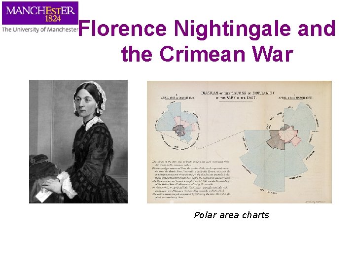
Florence Nightingale and the Crimean War Polar area charts

What is Data? Presenting data • A collection of facts, such as values or measurements What presentation formats are there? • The raw material of science • • • Contains the information waiting to be released • This is done through data presentation, interpretation and statisitics Summary statistics Tables Bar charts Line graphs

Activity Spend several minutes in groups coming up with answers to the following: • What different types of data are there? • Can you give some examples of each? • Where do they occur and what are the pros and cons of using them?

Types of Data • Qualitative • Descriptive e. g. from a patient interview • Numeric/quantitative – Nominal/Categorical • e. g. male or female – Ordinal • e. g. small, medium, large – Integers, countable, rational • e. g. 1, 2, 3… – Real, quotients, irrational • E. g. 1/2, 1/3, 1/4…

Numbers in Text • The general rules are as follows: • Numbers up to and including nine in text should be written in text • i. e. “one”, “two” etc. • Larger numbers should use digits, “ 11”, “ 37” etc • Use effectively rounded numbers for up to 10, 000; so use “ 6, 200” not “ 6, 248” • For numbers over 10, 000 use a mixture of digits and words; “ 13 thousand” not “ 13, 169”; similarly use “ 1. 1 millions” not “ 1, 148, 982” • Often believed most accurate number is better • In fact, this precision implies spurious accuracy and is often misleading

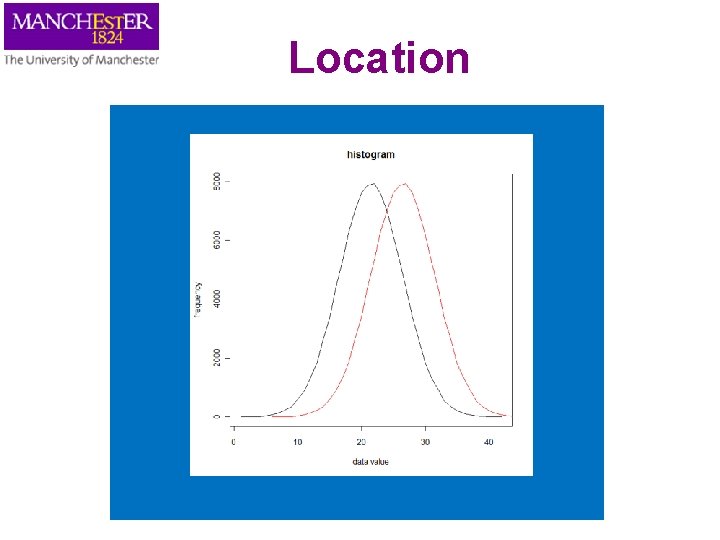
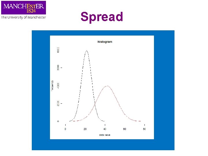
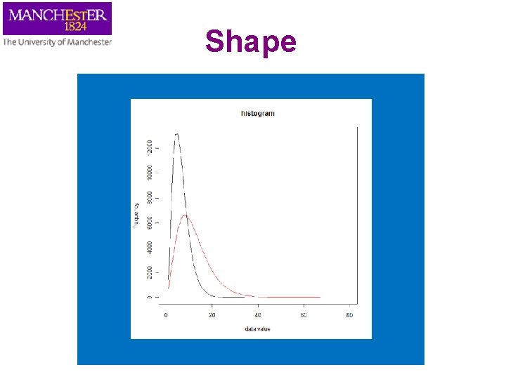
Summary Statistics • Used to summarise a set of observations – in order to communicate the largest amount as simply as possible • Commonly used statistics are: – measure of location, or central tendency • such as the average (mean, median or mode) – measure of spread like the standard deviation – measure of the shape of the distribution like skewness • This can be found by plotting a histogram – if more than one variable is measured, a measure of dependence such as a correlation

Location

Spread

Shape

Things to consider Consider the following before presenting data figures Understand • The type of data to be presented • Main feature to be presented: what’s the message? • How this information is used • Who the intended audience is Tables, charts and diagrams should assist with the interpretation of the data • Be representative of the data • NOT, as frequently occurs, obscuring the meaning of the data

Figure Placement • Make sure the size and fonts are large enough to easily read • Reference all the figures in the body of the text – E. g. see Figure 1 • Give all Figures appropriate self contained captions – include the figure description and analysis in the body of the text • Consider where best to place the figure – It should be soon after the reference in the text

Tables

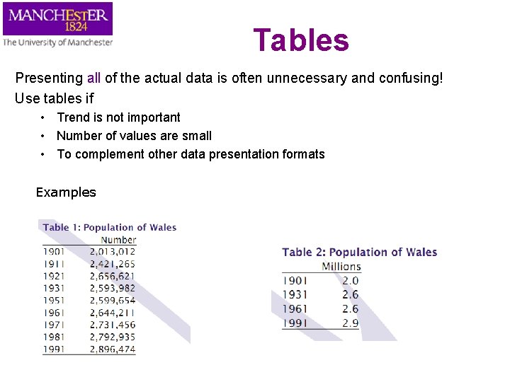
Tables Presenting all of the actual data is often unnecessary and confusing! Use tables if • Trend is not important • Number of values are small • To complement other data presentation formats Examples

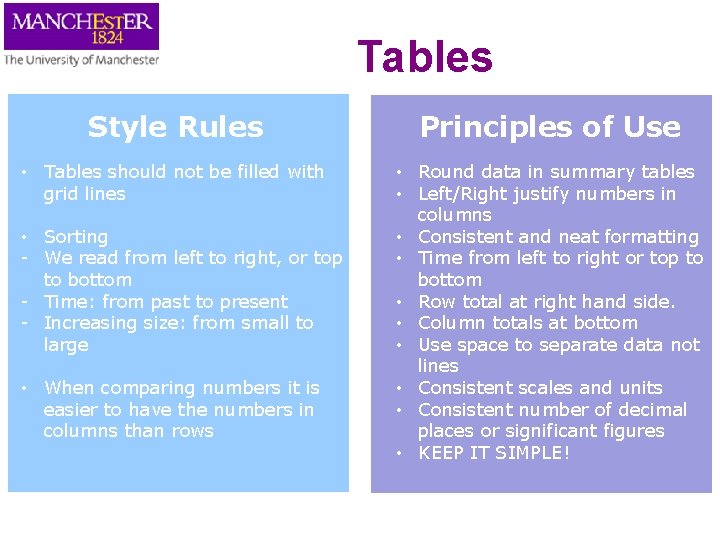
Tables Style Rules Principles of Use • Tables should not be filled with grid lines • Round data in summary tables • Left/Right justify numbers in columns • Consistent and neat formatting • Time from left to right or top to bottom • Row total at right hand side. • Column totals at bottom • Use space to separate data not lines • Consistent scales and units • Consistent number of decimal places or significant figures • KEEP IT SIMPLE! • Sorting - We read from left to right, or top to bottom - Time: from past to present - Increasing size: from small to large • When comparing numbers it is easier to have the numbers in columns than rows

Charts and Graphs

Charts and Graphs • As an alternative to table, these are usually better and easier way to present – – Trends Patterns large amounts of data Idea of how things change • Deciding between type of graphs, you need to consider the main questions – What is the aim of the diagram? – Does it meet the aims? • Sounds obvious but people don’t often do this! • Choose the right representation to get your message across

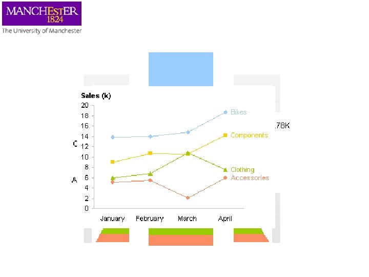
Bike Shop Sales

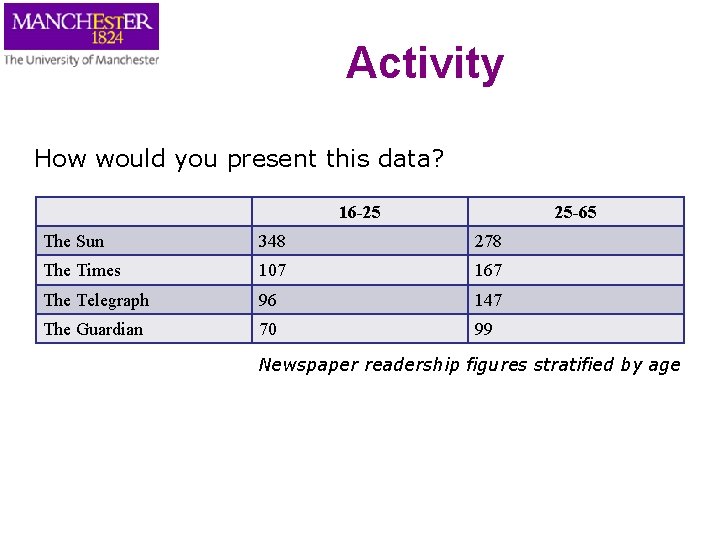
Activity How would you present this data? 16 -25 25 -65 The Sun 348 278 The Times 107 167 The Telegraph 96 147 The Guardian 70 99 Newspaper readership figures stratified by age

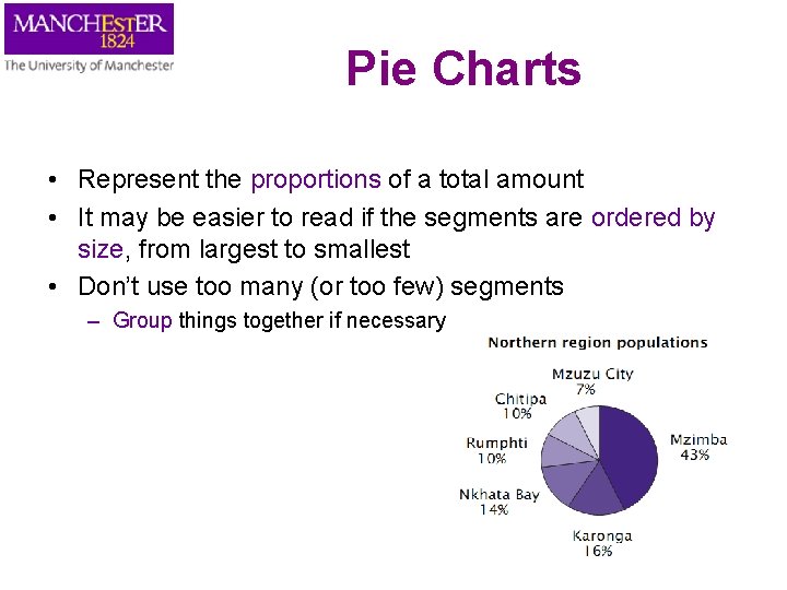
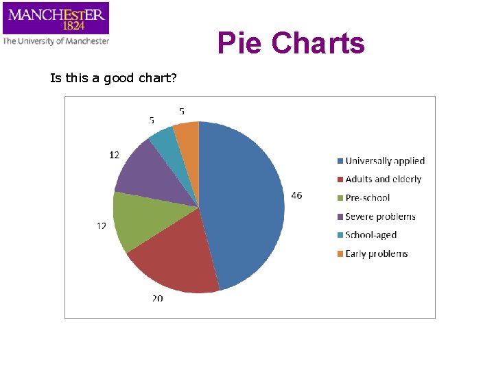
Pie Charts • Represent the proportions of a total amount • It may be easier to read if the segments are ordered by size, from largest to smallest • Don’t use too many (or too few) segments – Group things together if necessary

Pie Charts Is this a good chart?

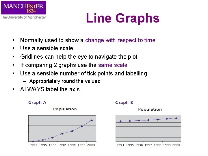
Line Graphs • • • Normally used to show a change with respect to time Use a sensible scale Gridlines can help the eye to navigate the plot If comparing 2 graphs use the same scale Use a sensible number of tick points and labelling – Appropriately round the values • ALWAYS label the axis

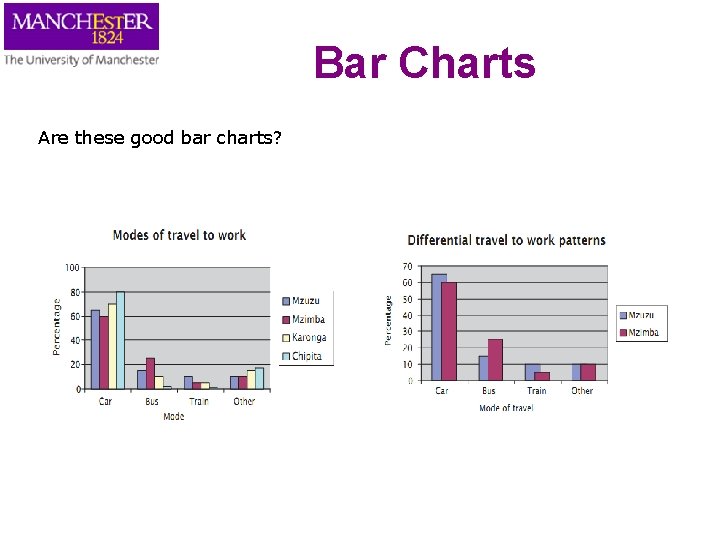
Bar Charts • • Represented by area of bars Show the origin Do not over-lap areas When several variables are considered together, what is the important message of the chart? – This will help us think about how to group the bars

Bar Charts Are these good bar charts?

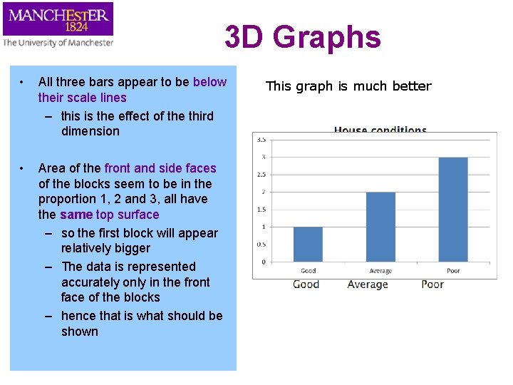
3 D Graphs • All three bars appear to be below their scale lines – this is the effect of the third dimension • Area of the front and side faces of the blocks seem to be in the proportion 1, 2 and 3, all have the same top surface – so the first block will appear relatively bigger – The data is represented accurately only in the front face of the blocks – hence that is what should be shown This graph is much better

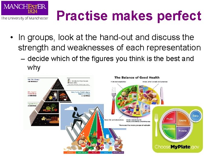
Practise makes perfect • In groups, look at the hand-out and discuss the strength and weaknesses of each representation – decide which of the figures you think is the best and why

Further Reading • Information is Beautiful by David Mc. Candless • Exploratory Data Analysis by John W. Tukey (1977) • TED talk Hans Rosling http: //www. ted. com/talks/hans_rosling_shows_the_best_ stats_you_ve_ever_seen. html

Hand-out figures
