Exploring Microsoft Office 365 Introductory Chapter 3 Charts



- Slides: 41

Exploring Microsoft Office 365 Introductory Chapter 3 Charts Copyright © 2020, 2017, 2014 Pearson All Rights Reserved

Learning Objectives 3. 1 Create a Basic Chart 3. 2 Use Other Methods to Create a Chart 3. 3 Create Other Charts 3. 4 Add and Format Chart Elements 3. 5 Apply a Chart Style and Colors 3. 6 Modify the Data Source 3. 7 Create and Customize Sparklines Copyright © 2020, 2017, 2014 Pearson All Rights Reserved

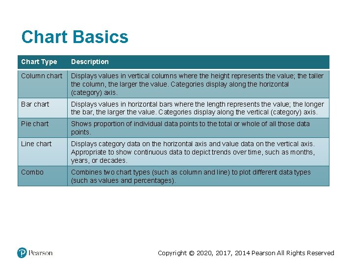
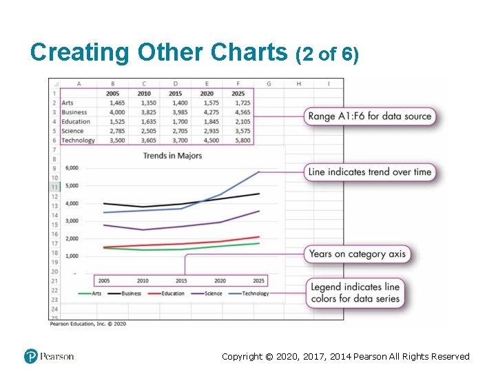
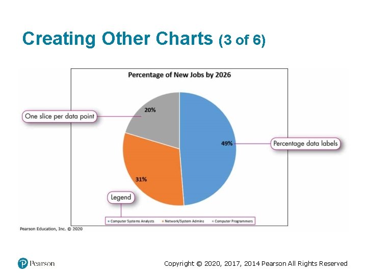
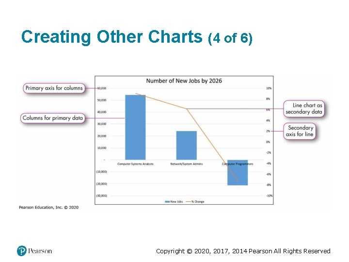
Chart Basics Chart Type Description Column chart Displays values in vertical columns where the height represents the value; the taller the column, the larger the value. Categories display along the horizontal (category) axis. Bar chart Displays values in horizontal bars where the length represents the value; the longer the bar, the larger the value. Categories display along the vertical (category) axis. Pie chart Shows proportion of individual data points to the total or whole of all those data points. Line chart Displays category data on the horizontal axis and value data on the vertical axis. Appropriate to show continuous data to depict trends over time, such as months, years, or decades. Combo Combines two chart types (such as column and line) to plot different data types (such as values and percentages). Copyright © 2020, 2017, 2014 Pearson All Rights Reserved

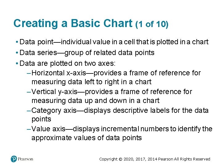
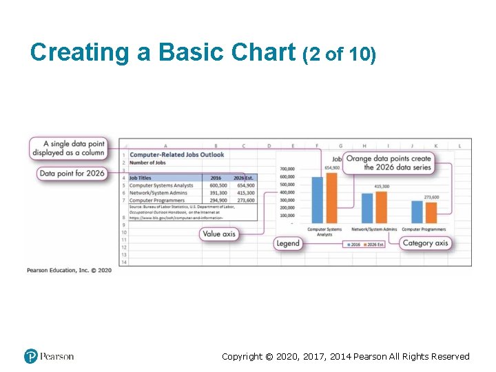
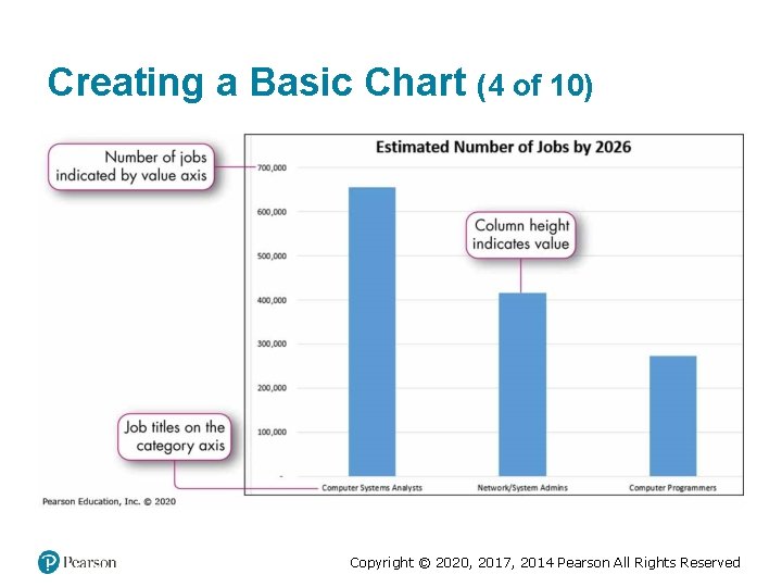
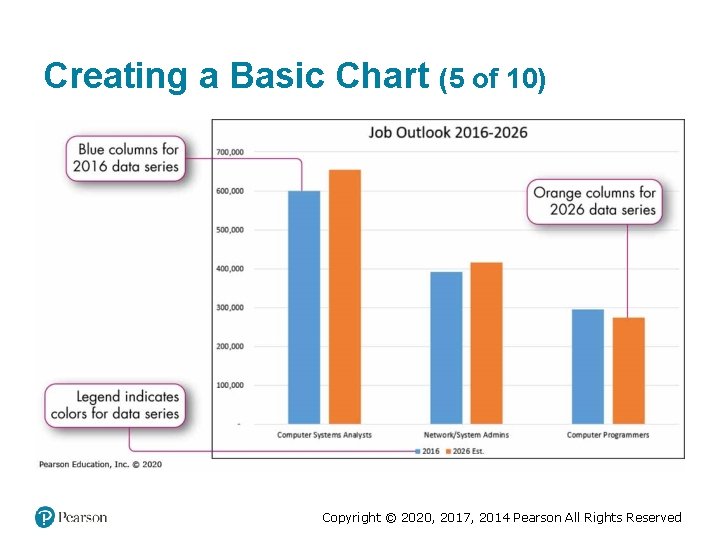
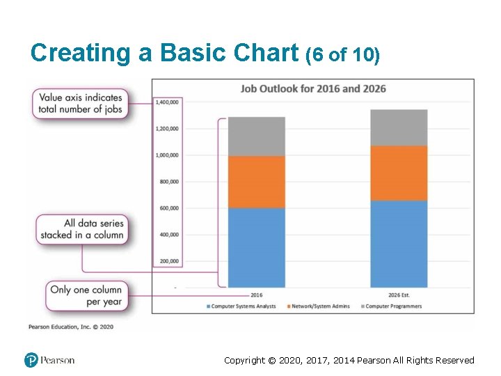
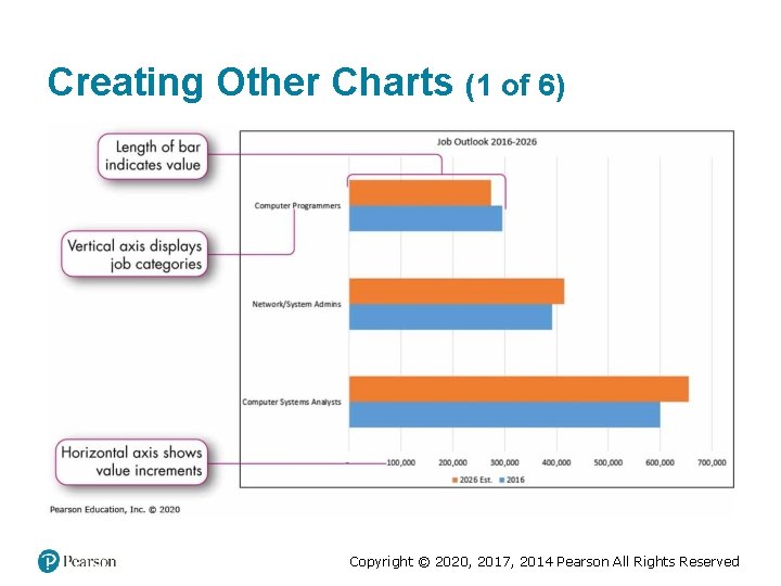
Creating a Basic Chart (1 of 10) • Data point—individual value in a cell that is plotted in a chart • Data series—group of related data points • Data are plotted on two axes: – Horizontal x-axis—provides a frame of reference for measuring data left to right in a chart – Vertical y-axis—provides a frame of reference for measuring data up and down in a chart – Category axis—displays descriptive labels for the data points – Value axis—displays incremental numbers to identify the approximate values of data points Copyright © 2020, 2017, 2014 Pearson All Rights Reserved

Creating a Basic Chart (2 of 10) Copyright © 2020, 2017, 2014 Pearson All Rights Reserved

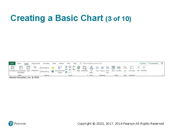
Creating a Basic Chart (3 of 10) Copyright © 2020, 2017, 2014 Pearson All Rights Reserved

Creating a Basic Chart (4 of 10) Copyright © 2020, 2017, 2014 Pearson All Rights Reserved

Creating a Basic Chart (5 of 10) Copyright © 2020, 2017, 2014 Pearson All Rights Reserved

Creating a Basic Chart (6 of 10) Copyright © 2020, 2017, 2014 Pearson All Rights Reserved

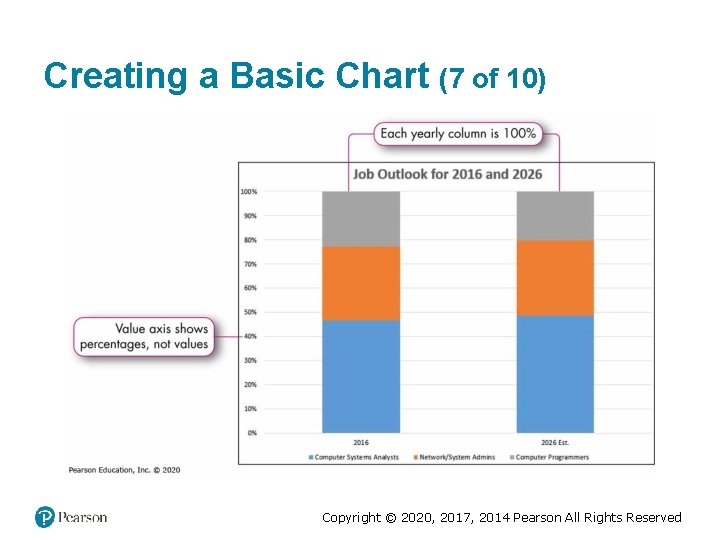
Creating a Basic Chart (7 of 10) Copyright © 2020, 2017, 2014 Pearson All Rights Reserved

Creating a Basic Chart (8 of 10) Moving a chart • Use the Cut and Paste commands • Drag the chart to a different location • Move to a chart sheet Copyright © 2020, 2017, 2014 Pearson All Rights Reserved

Creating a Basic Chart (9 of 10) Copyright © 2020, 2017, 2014 Pearson All Rights Reserved

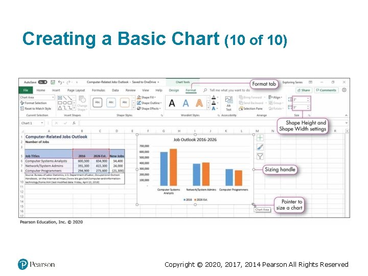
Creating a Basic Chart (10 of 10) Copyright © 2020, 2017, 2014 Pearson All Rights Reserved

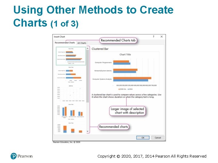
Using Other Methods to Create Charts (1 of 3) Copyright © 2020, 2017, 2014 Pearson All Rights Reserved

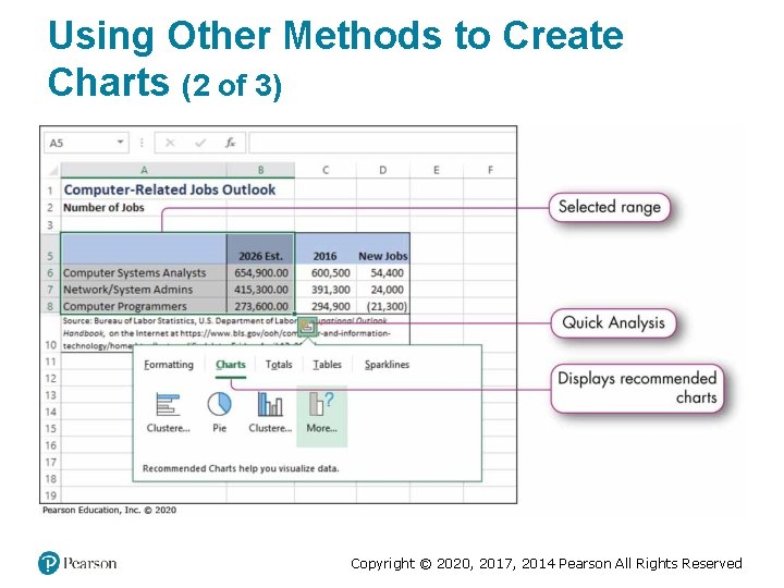
Using Other Methods to Create Charts (2 of 3) Copyright © 2020, 2017, 2014 Pearson All Rights Reserved

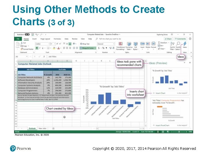
Using Other Methods to Create Charts (3 of 3) Copyright © 2020, 2017, 2014 Pearson All Rights Reserved

Creating Other Charts (1 of 6) Copyright © 2020, 2017, 2014 Pearson All Rights Reserved

Creating Other Charts (2 of 6) Copyright © 2020, 2017, 2014 Pearson All Rights Reserved

Creating Other Charts (3 of 6) Copyright © 2020, 2017, 2014 Pearson All Rights Reserved

Creating Other Charts (4 of 6) Copyright © 2020, 2017, 2014 Pearson All Rights Reserved

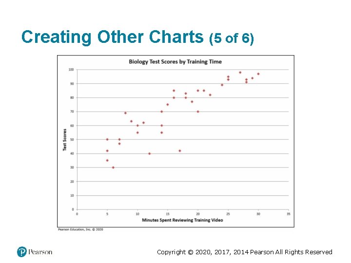
Creating Other Charts (5 of 6) Copyright © 2020, 2017, 2014 Pearson All Rights Reserved

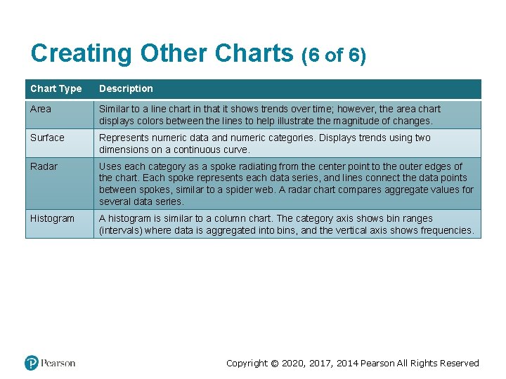
Creating Other Charts (6 of 6) Chart Type Description Area Similar to a line chart in that it shows trends over time; however, the area chart displays colors between the lines to help illustrate the magnitude of changes. Surface Represents numeric data and numeric categories. Displays trends using two dimensions on a continuous curve. Radar Uses each category as a spoke radiating from the center point to the outer edges of the chart. Each spoke represents each data series, and lines connect the data points between spokes, similar to a spider web. A radar chart compares aggregate values for several data series. Histogram A histogram is similar to a column chart. The category axis shows bin ranges (intervals) where data is aggregated into bins, and the vertical axis shows frequencies. Copyright © 2020, 2017, 2014 Pearson All Rights Reserved

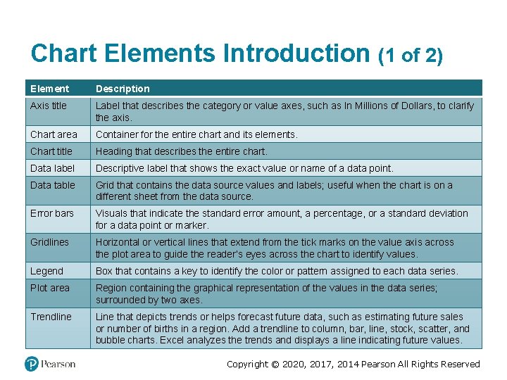
Chart Elements Introduction (1 of 2) Element Description Axis title Label that describes the category or value axes, such as In Millions of Dollars, to clarify the axis. Chart area Container for the entire chart and its elements. Chart title Heading that describes the entire chart. Data label Descriptive label that shows the exact value or name of a data point. Data table Grid that contains the data source values and labels; useful when the chart is on a different sheet from the data source. Error bars Visuals that indicate the standard error amount, a percentage, or a standard deviation for a data point or marker. Gridlines Horizontal or vertical lines that extend from the tick marks on the value axis across the plot area to guide the reader’s eyes across the chart to identify values. Legend Box that contains a key to identify the color or pattern assigned to each data series. Plot area Region containing the graphical representation of the values in the data series; surrounded by two axes. Trendline Line that depicts trends or helps forecast future data, such as estimating future sales or number of births in a region. Add a trendline to column, bar, line, stock, scatter, and bubble charts. Excel analyzes the trends and displays a line indicating future values. Copyright © 2020, 2017, 2014 Pearson All Rights Reserved

Chart Elements Introduction (2 of 2) Copyright © 2020, 2017, 2014 Pearson All Rights Reserved

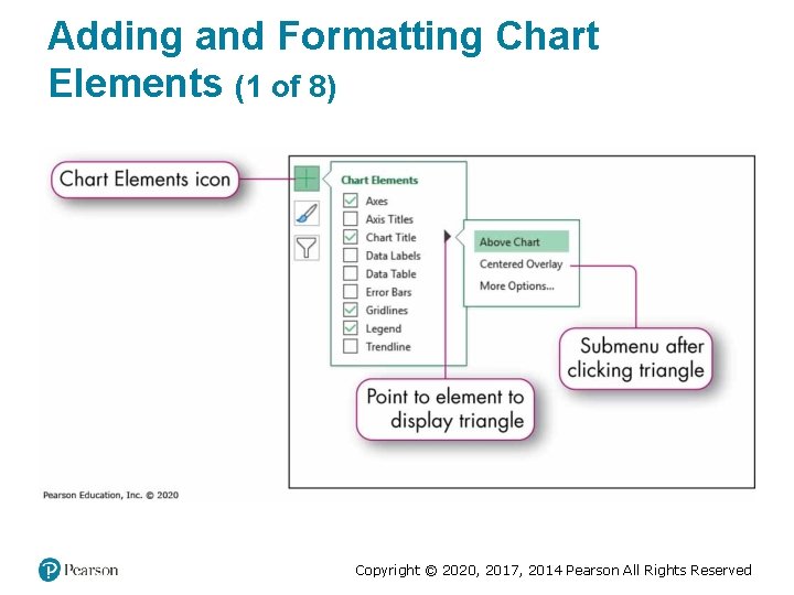
Adding and Formatting Chart Elements (1 of 8) Copyright © 2020, 2017, 2014 Pearson All Rights Reserved

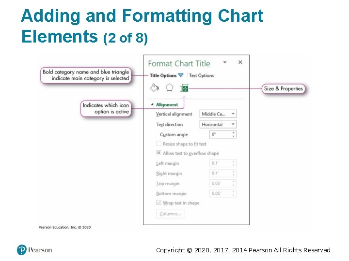
Adding and Formatting Chart Elements (2 of 8) Copyright © 2020, 2017, 2014 Pearson All Rights Reserved

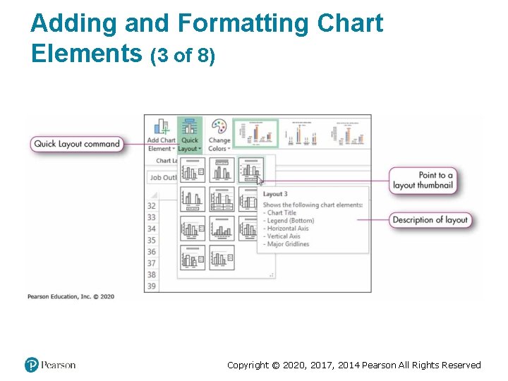
Adding and Formatting Chart Elements (3 of 8) Copyright © 2020, 2017, 2014 Pearson All Rights Reserved

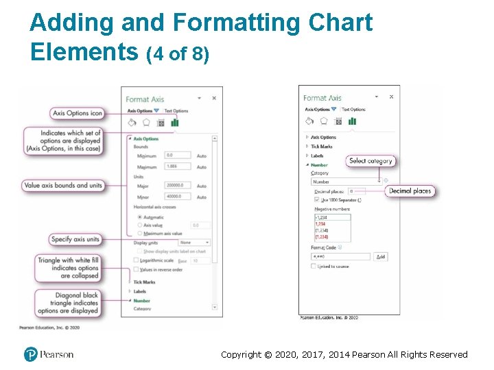
Adding and Formatting Chart Elements (4 of 8) Copyright © 2020, 2017, 2014 Pearson All Rights Reserved

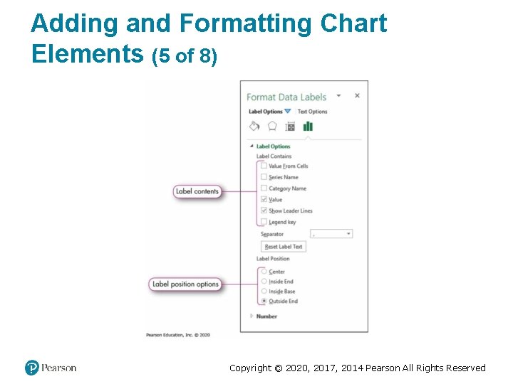
Adding and Formatting Chart Elements (5 of 8) Copyright © 2020, 2017, 2014 Pearson All Rights Reserved

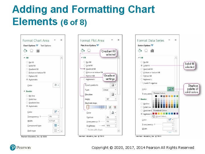
Adding and Formatting Chart Elements (6 of 8) Copyright © 2020, 2017, 2014 Pearson All Rights Reserved

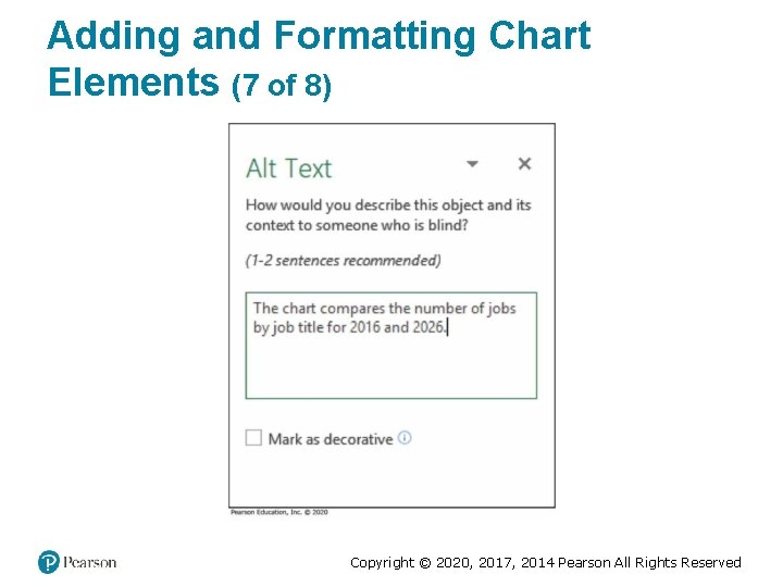
Adding and Formatting Chart Elements (7 of 8) Copyright © 2020, 2017, 2014 Pearson All Rights Reserved

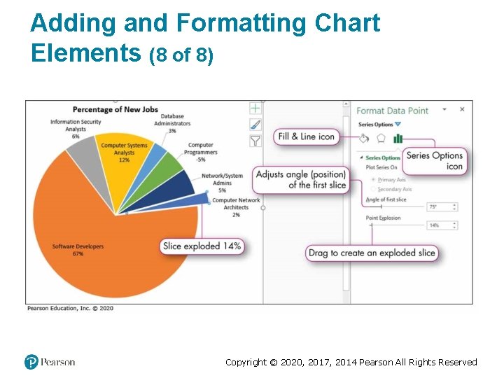
Adding and Formatting Chart Elements (8 of 8) Copyright © 2020, 2017, 2014 Pearson All Rights Reserved

Applying a Chart Style and Colors (1 of 2) • Chart style—collection of formatting that controls the colors of: –Chart area –Plot area –Data series –Title fonts and font sizes Copyright © 2020, 2017, 2014 Pearson All Rights Reserved

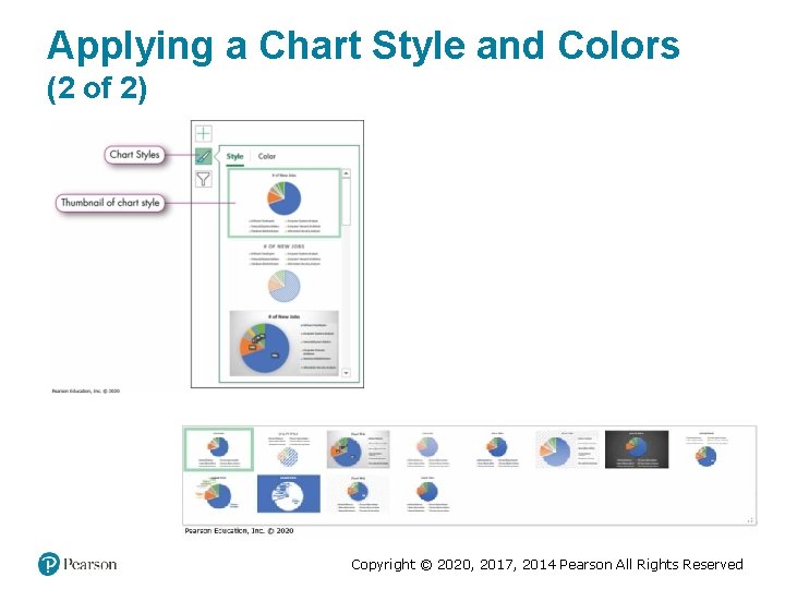
Applying a Chart Style and Colors (2 of 2) Copyright © 2020, 2017, 2014 Pearson All Rights Reserved

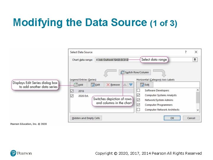
Modifying the Data Source (1 of 3) Copyright © 2020, 2017, 2014 Pearson All Rights Reserved

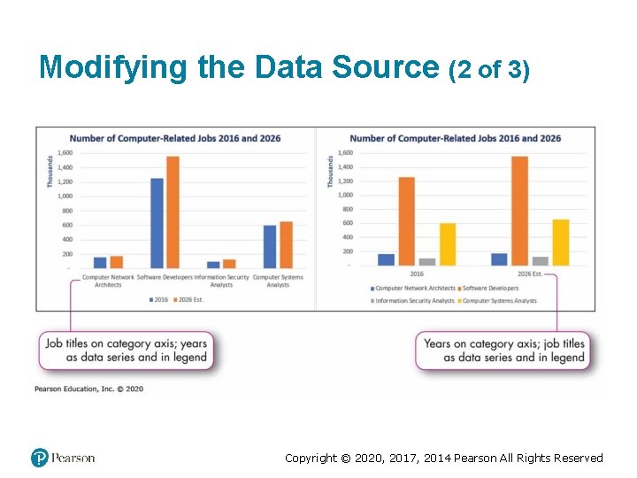
Modifying the Data Source (2 of 3) Copyright © 2020, 2017, 2014 Pearson All Rights Reserved

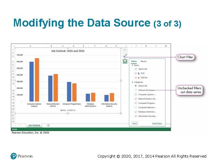
Modifying the Data Source (3 of 3) Copyright © 2020, 2017, 2014 Pearson All Rights Reserved

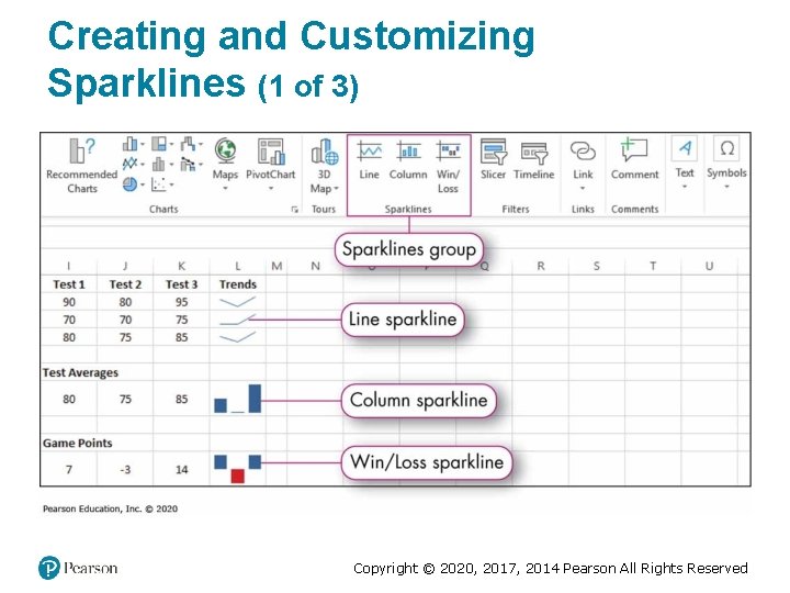
Creating and Customizing Sparklines (1 of 3) Copyright © 2020, 2017, 2014 Pearson All Rights Reserved

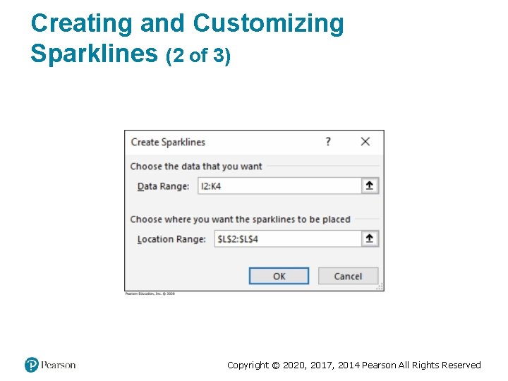
Creating and Customizing Sparklines (2 of 3) Copyright © 2020, 2017, 2014 Pearson All Rights Reserved

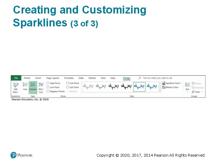
Creating and Customizing Sparklines (3 of 3) Copyright © 2020, 2017, 2014 Pearson All Rights Reserved

Copyright This work is protected by United States copyright laws and is provided solely for the use of instructors in teaching their courses and assessing student learning. Dissemination or sale of any part of this work (including on the World Wide Web) will destroy the integrity of the work and is not permitted. The work and materials from it should never be made available to students except by instructors using the accompanying text in their classes. All recipients of this work are expected to abide by these restrictions and to honor the intended pedagogical purposes and the needs of other instructors who rely on these materials. Copyright © 2020, 2017, 2014 Pearson All Rights Reserved