EXPLORING DATA SUMMARY STATISTICS AND VISUALIZATIONS CSC 576
- Slides: 28

EXPLORING DATA: SUMMARY STATISTICS AND VISUALIZATIONS CSC 576: Data Science

Today Exploring Data: Summary Statistics, Visualizations Python Crash Course

Exploring Data Exploration: a preliminary investigation of the data in order to better understand its specific characteristics 1. 2. 3. Patterns can sometime be found simply by visualizing the data (and then can be used to explain the data mining results) Summary statistics also used Aid in selection appropriate preprocessing and data analysis techniques

Summary Statistics Capture various characteristics of a large set of values Common summary statistics: � Mean � Standard deviation � Range � Mode Most summary statistics can be calculated in a single pass through the data.

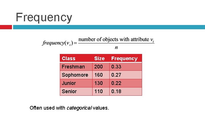
Frequency Class Size Frequency Freshman 200 0. 33 Sophomore 160 0. 27 Junior 130 0. 22 Senior 110 0. 18 Often used with categorical values.

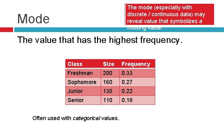
The mode (especially with discrete / continuous data) may reveal value that symbolizes a missing value. Mode The value that has the highest frequency. Class Size Frequency Freshman 200 0. 33 Sophomore 160 0. 27 Junior 130 0. 22 Senior 110 0. 18 Often used with categorical values.

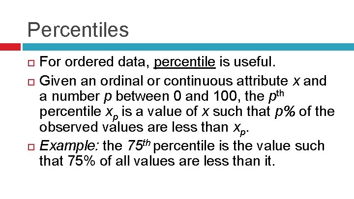
Percentiles For ordered data, percentile is useful. Given an ordinal or continuous attribute x and a number p between 0 and 100, the pth percentile xp is a value of x such that p% of the observed values are less than xp. Example: the 75 th percentile is the value such that 75% of all values are less than it.

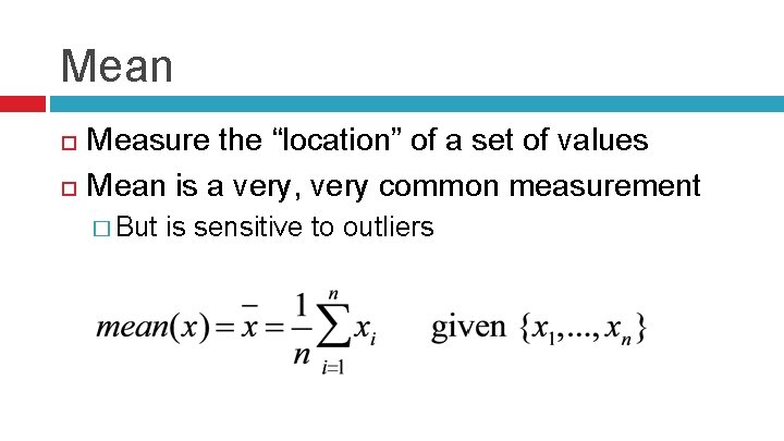
Mean Measure the “location” of a set of values Mean is a very, very common measurement � But is sensitive to outliers

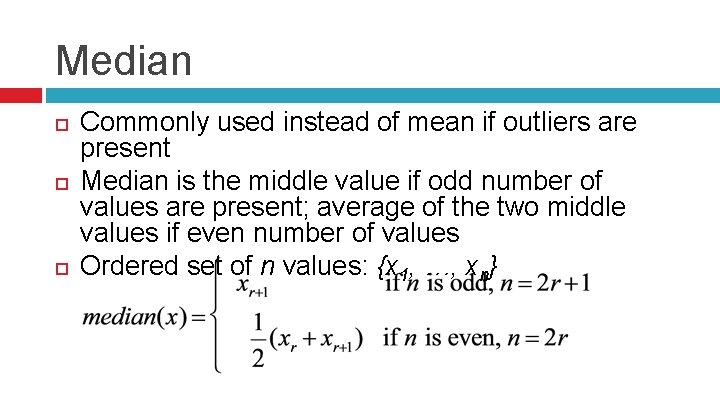
Median Commonly used instead of mean if outliers are present Median is the middle value if odd number of values are present; average of the two middle values if even number of values Ordered set of n values: {x 1, …, xn}

Trimmed Mean Specify a percentage p between 0 and 100 Top and bottom (p/2)% of data is not used in mean calculation � p=0, corresponds to standard mean � p=50, corresponds to median calculation

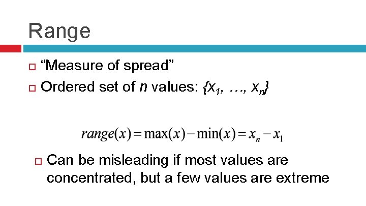
Range “Measure of spread” Ordered set of n values: {x 1, …, xn} Can be misleading if most values are concentrated, but a few values are extreme

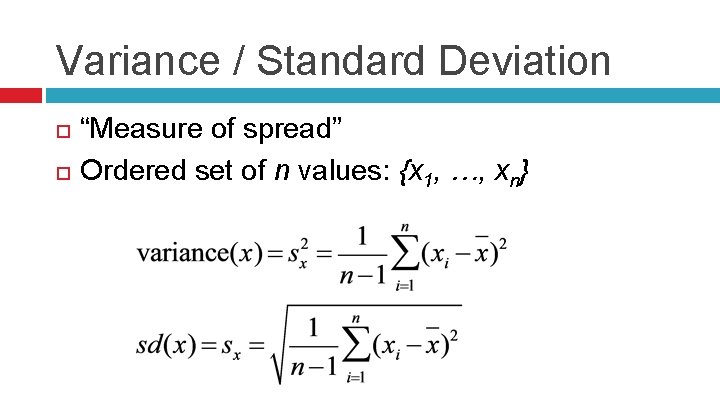
Variance / Standard Deviation “Measure of spread” Ordered set of n values: {x 1, …, xn}

Because variance and standard deviation measures use the mean, they can also be sensitive to outliers.

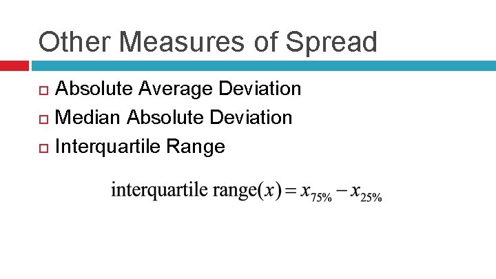
Other Measures of Spread Absolute Average Deviation Median Absolute Deviation Interquartile Range

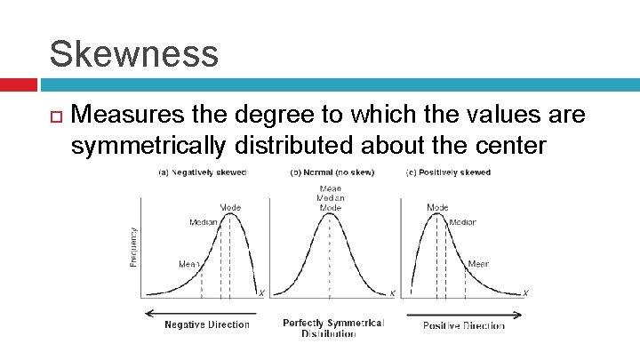
Skewness Measures the degree to which the values are symmetrically distributed about the center

Mean vs. Median If the distribution of values is skewed, then the median is a better indicator of the middle, compared to the mean.

Visualizations The display of information in a graphic or tabular format. Many visualization formats exist (contour plots, graphs, heat maps) to display high-dimensional information. Since this isn’t a visualization course, we’ll mainly use “traditional” two-dimensional graphic types. How can we transform a dataset with many attributes into two dimensions? � � � Selection: Typically by selecting two dimensions at a time Can also only “select” a subset of records to display Other techniques also exist

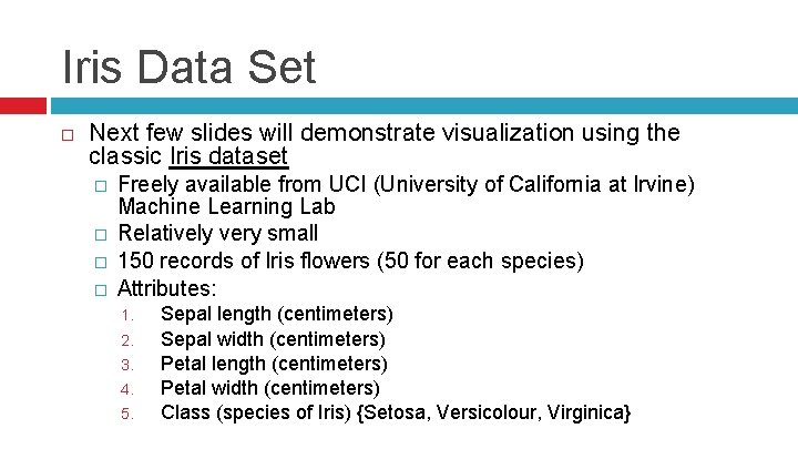
Iris Data Set Next few slides will demonstrate visualization using the classic Iris dataset � � Freely available from UCI (University of California at Irvine) Machine Learning Lab Relatively very small 150 records of Iris flowers (50 for each species) Attributes: 1. 2. 3. 4. 5. Sepal length (centimeters) Sepal width (centimeters) Petal length (centimeters) Petal width (centimeters) Class (species of Iris) {Setosa, Versicolour, Virginica}

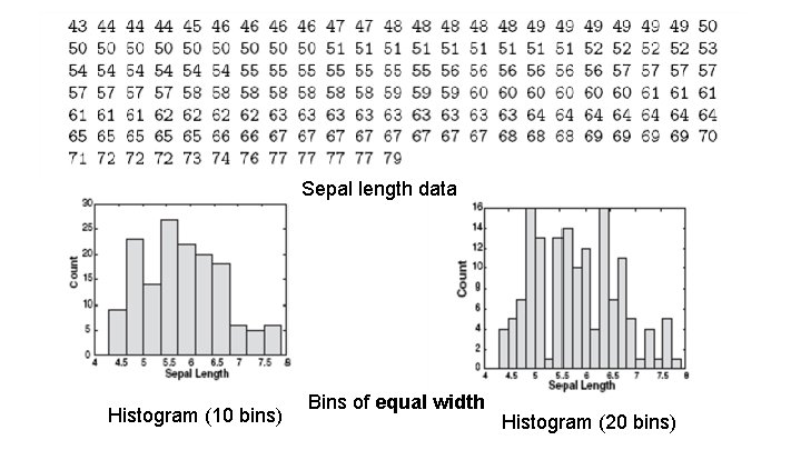
Visualization: Histogram For showing the distribution of values Divide values into bins; show number of objects that fall into each bin Shape of histogram depends on number of bins

Sepal length data Histogram (10 bins) Bins of equal width Histogram (20 bins)

Histogram Previous slide showed histogram of a continuous attribute For categorical attributes, each category is a bin. � If there are too many bins, then values need to be combined in some way.

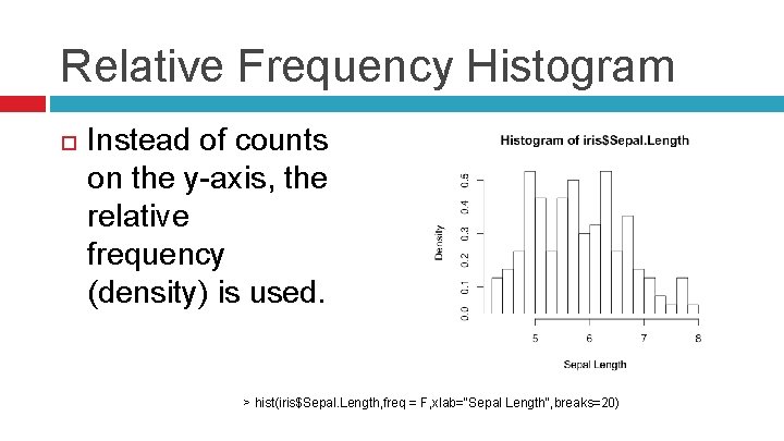
Relative Frequency Histogram Instead of counts on the y-axis, the relative frequency (density) is used. > hist(iris$Sepal. Length, freq = F, xlab="Sepal Length", breaks=20)

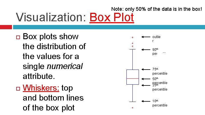
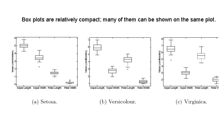
Note: only 50% of the data is in the box! Visualization: Box Plot Box plots show the distribution of the values for a single numerical attribute. Whiskers: top and bottom lines of the box plot outlie r 90 th percentile 75 th percentile 50 th percentile 25 th percentile 10 th percentile

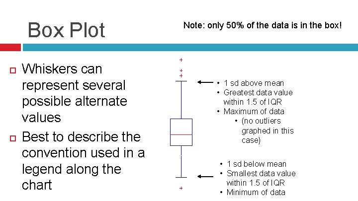
Box Plot Whiskers can represent several possible alternate values Best to describe the convention used in a legend along the chart Note: only 50% of the data is in the box! • 1 sd above mean • Greatest data value within 1. 5 of IQR • Maximum of data • (no outliers graphed in this case) • 1 sd below mean • Smallest data value within 1. 5 of IQR • Minimum of data

Box plots are relatively compact; many of them can be shown on the same plot.

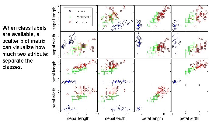
Visualization: Scatter Plot Data objects are plotted as a point in a 2 dplane: one attribute on x-axis, the other on yaxis � Assumed that both attributes are discrete or continuous Scatter plot matrix: organized way to examine a number of scatter plots simultaneously � Scatter plots for multiple pairs of attributes

When class labels are available, a scatter plot matrix can visualize how much two attributes separate the classes.

References Introduction to Data Mining, 1 st edition, Tan et al. http: //en. wikipedia. org/wiki/Box_plot