Exploring Data Chapter 1 Patterns from Histogram A
- Slides: 26

Exploring Data Chapter 1

Patterns from Histogram A Center: the value that divides the observations roughly in half Spread (variability): the extent of the data from smallest to largest value

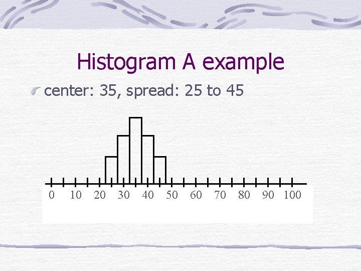
Histogram A example center: 35, spread: 25 to 45 0 10 20 30 40 50 60 70 80 90 100

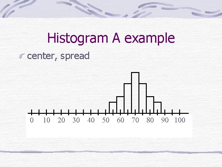
Histogram A example center, spread 0 10 20 30 40 50 60 70 80 90 100

Patterns from Histogram B Center: the value that divides the observations roughly in half Spread (variability): the extent of the data from smallest to largest value Shape: overall appearance of distribution

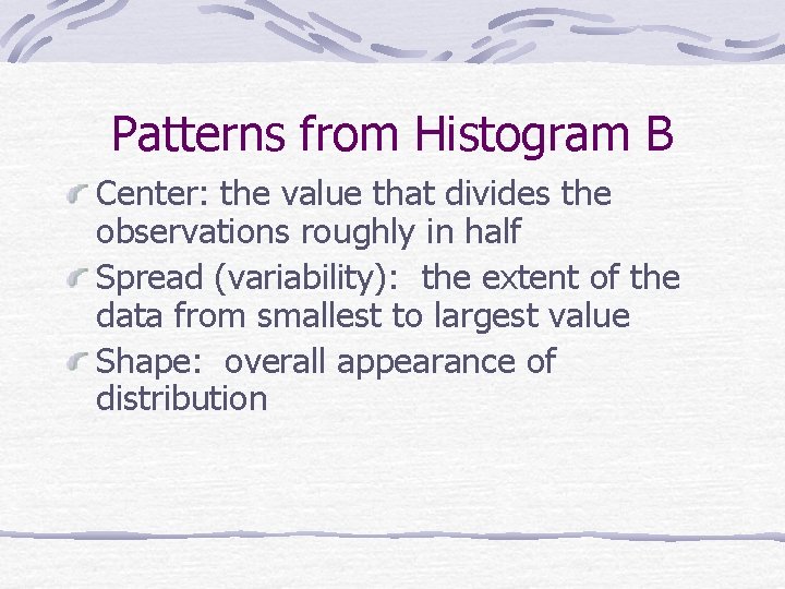
Histogram B example skewed right 0 10 20 30 40 50 60 70 80 90 100

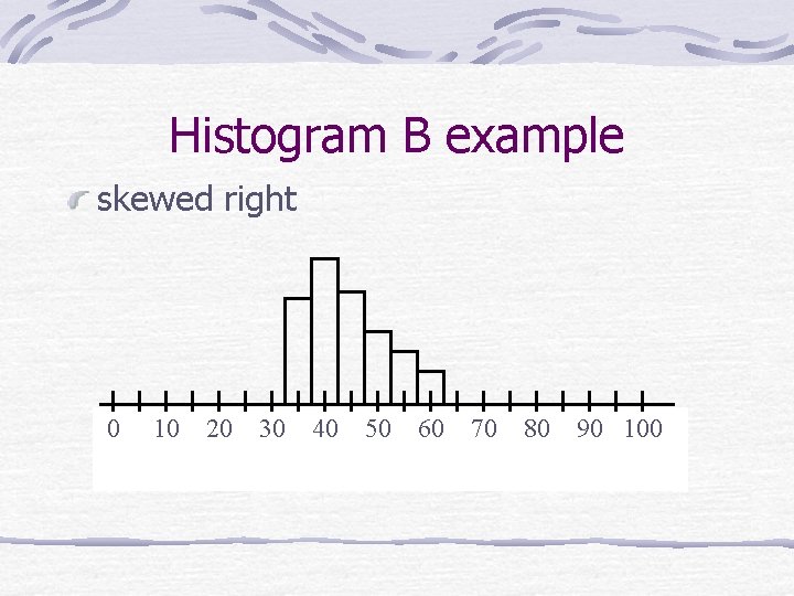
Histogram B example skewed left 0 10 20 30 40 50 60 70 80 90 100

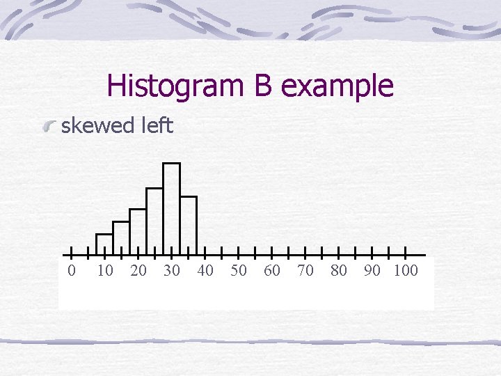
Histogram B example symmetrical, mound shaped 0 10 20 30 40 50 60 70 80 90 100

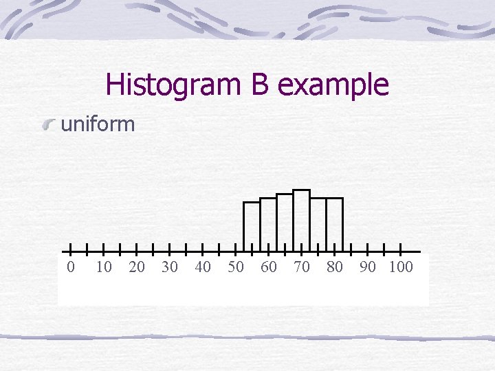
Histogram B example uniform 0 10 20 30 40 50 60 70 80 90 100

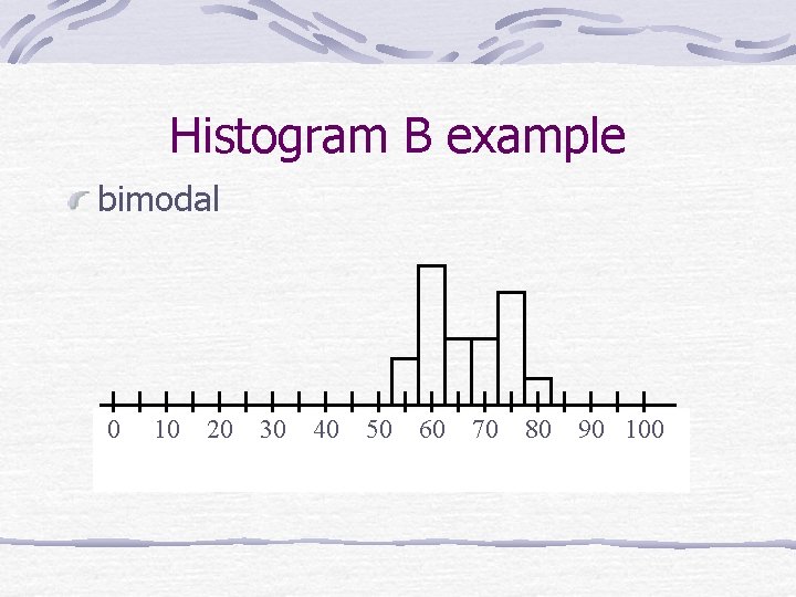
Histogram B example bimodal 0 10 20 30 40 50 60 70 80 90 100

Patterns from Histogram C Center: the value that divides the observations roughly in half Spread (variability): the extent of the data from smallest to largest value Shape: overall appearance of distribution Unusual features: gaps/clusters and outliers

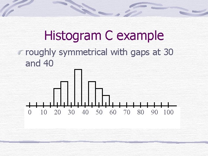
Histogram C example roughly symmetrical with gaps at 30 and 40 0 10 20 30 40 50 60 70 80 90 100

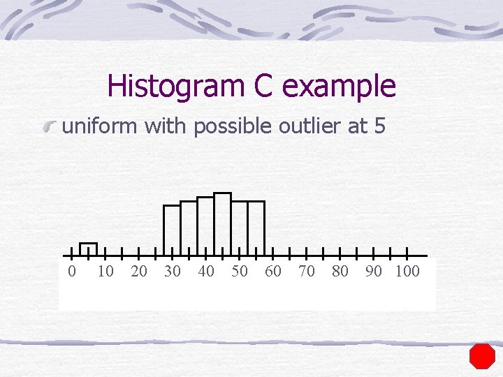
Histogram C example uniform with possible outlier at 5 0 10 20 30 40 50 60 70 80 90 100

Displaying Distributions with Graphs categorical versus quantitative categorical: bar graphs, pie charts quantitative: dotplots, histograms, stemplots, boxplots

Frequency Distributions A frequency distribution is a table that displays the categories, frequencies, relative frequencies and/or cumulative relative frequencies. The frequency for a particular category is the number of observed responses that fall into that category. The corresponding relative frequency is the fraction or proportion of observed responses in the category. The cumulative relative frequency is the fraction or proportion of observed responses in all categories so far including the current.

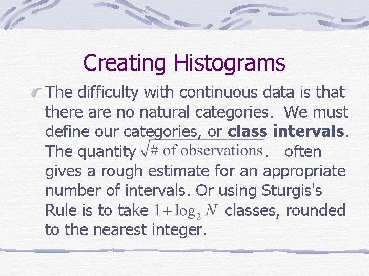
Creating Histograms The difficulty with continuous data is that there are no natural categories. We must define our categories, or class intervals. The quantity. often gives a rough estimate for an appropriate number of intervals. Or using Sturgis's Rule is to take classes, rounded to the nearest integer.

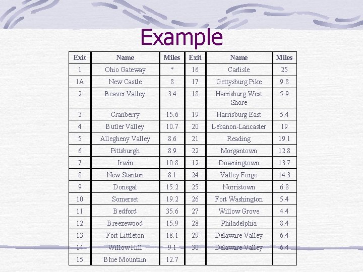
Example Exit Name Miles 1 Ohio Gateway * 16 Carlisle 25 1 A New Castle 8 17 Gettysburg Pike 9. 8 2 Beaver Valley 3. 4 18 Harrisburg West Shore 5. 9 3 Cranberry 15. 6 19 Harrisburg East 5. 4 4 Butler Valley 10. 7 20 Lebanon-Lancaster 19 5 Allegheny Valley 8. 6 21 Reading 19. 1 6 Pittsburgh 8. 9 22 Morgantown 12. 8 7 Irwin 10. 8 12 Downingtown 13. 7 8 New Stanton 8. 1 24 Valley Forge 14. 3 9 Donegal 15. 2 25 Norristown 6. 8 10 Somerset 19. 2 26 Fort Washington 5. 4 11 Bedford 35. 6 27 Willow Grove 4. 4 12 Breezewood 15. 9 28 Philadelphia 8. 4 13 Fort Littleton 18. 1 29 Delaware Valley 6. 4 14 Willow Hill 9. 1 30 Delaware Valley 6. 4 15 Blue Mountain 12. 7

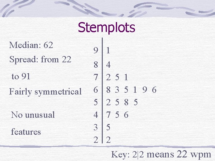
Stemplots Median: 62 Spread: from 22 to 91 Fairly symmetrical No unusual features 9 1 8 4 7 2 6 8 5 2 4 7 3 5 2 2 5 3 5 5 1 9 6 8 5 6 Key: 2|2 means 22 wpm

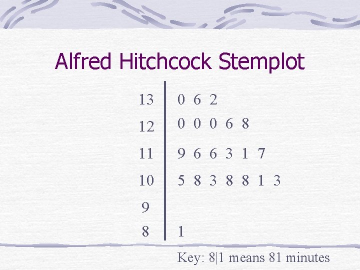
Alfred Hitchcock Stemplot 13 0 6 2 12 0 0 0 6 8 11 9 6 6 3 1 7 10 5 8 3 8 8 1 3 9 8 1 Key: 8|1 means 81 minutes

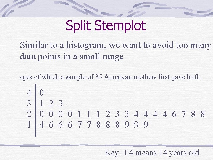
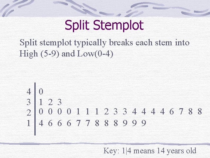
Split Stemplot Similar to a histogram, we want to avoid too many data points in a small range ages of which a sample of 35 American mothers first gave birth 4 3 2 1 0 1 2 3 0 0 1 1 1 2 3 3 4 4 6 7 8 8 4 6 6 6 7 7 8 8 8 9 9 9 Key: 1|4 means 14 years old

Split Stemplot Split stemplot typically breaks each stem into High (5 -9) and Low(0 -4) 4 3 2 1 0 1 2 3 0 0 1 1 1 2 3 3 4 4 6 7 8 8 4 6 6 6 7 7 8 8 8 9 9 9 Key: 1|4 means 14 years old

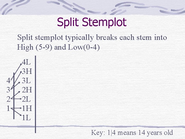
Split Stemplot Split stemplot typically breaks each stem into High (5 -9) and Low(0 -4) 4 3 2 1 4 L 3 H 3 L 2 H 2 L 1 H 1 L Key: 1|4 means 14 years old

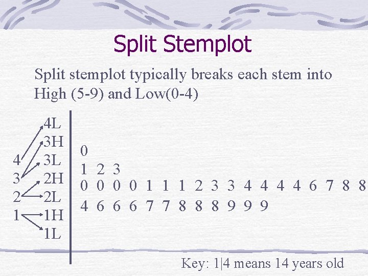
Split Stemplot Split stemplot typically breaks each stem into High (5 -9) and Low(0 -4) 4 3 2 1 4 L 3 H 3 L 2 H 2 L 1 H 1 L 0 1 2 3 0 0 1 1 1 2 3 3 4 4 6 7 8 8 4 6 6 6 7 7 8 8 8 9 9 9 Key: 1|4 means 14 years old

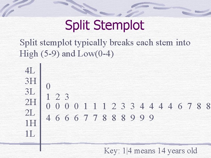
Split Stemplot Split stemplot typically breaks each stem into High (5 -9) and Low(0 -4) 4 L 3 H 3 L 2 H 2 L 1 H 1 L 0 1 2 3 0 0 1 1 1 2 3 3 4 4 6 7 8 8 4 6 6 6 7 7 8 8 8 9 9 9 Key: 1|4 means 14 years old

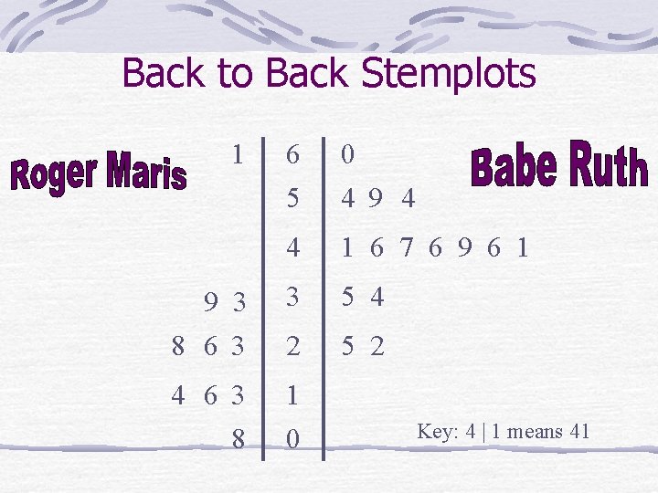
Back to Back Stemplots 1 6 0 5 4 9 4 4 1 6 7 6 9 6 1 9 3 8 6 3 3 5 4 2 5 2 4 6 3 8 1 0 Key: 4 | 1 means 41

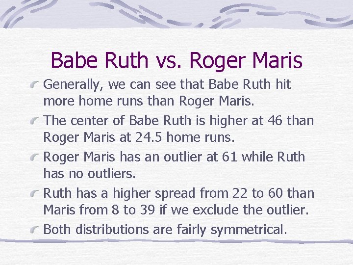
Babe Ruth vs. Roger Maris Generally, we can see that Babe Ruth hit more home runs than Roger Maris. The center of Babe Ruth is higher at 46 than Roger Maris at 24. 5 home runs. Roger Maris has an outlier at 61 while Ruth has no outliers. Ruth has a higher spread from 22 to 60 than Maris from 8 to 39 if we exclude the outlier. Both distributions are fairly symmetrical.