Exploratory Data Analysis coined by Tukey 1977 Illuminate

Exploratory Data Analysis; coined by Tukey 1977 -Illuminate underlying pattern in noisy data -Predecessor to formal analysis -May lead to different analysis than originally planned Data visualization (The first thing you do with your data!!)

Important functions of exploratory data visualization • Spot outliers • Discriminate clusters • Check distributional and other assumptions • Examine relationships • Compare mean differences • Observe a time-based process http: //seamonkey. ed. asu. edu/~alex/teaching/WBI/EDA. html
; frequency distributions Distributions of height, biomass, etc…. often used to")
Univariate data (one variable); frequency distributions Distributions of height, biomass, etc…. often used to describe populations -How are the data distributed (including summary/descriptive statistics) -Are the data normal? (required to meet assumptions of many statistical techniquesmore later) -If not normal, can they be transformed?

Histograms -Raw data hidden -Division to categories arbitrary -Excel, many programs Identify outliers Identify skew, non-normality

Stem-leaf plots -show original data -division to categories arbitrary -easier to order data first -a histogram on its side (sort of) quiz scores 20 20 21 25 29 32 36 37 38 41 44 46 50 53 58 Stem 2 3 4 5 leaves 00159 2678 146 038
 plots -calculate median, draw horizontal line -draw a box with ends at")
Box (box-whisker) plots -calculate median, draw horizontal line -draw a box with ends at the quartiles Q 1 (25%) and Q 3 (75%) -extend the "whiskers" to the farthest points that are not outliers - outliers are outside 3/2 times the interquartile range (Q 3 Q 1) -Draw a dot for every outlier Can be done for a single distribution or comparing several http: //mathworld. wolfram. com/Box-and-Whisker. Plot. html

Normal probability plots will be covered later
 data -Relationship between the 2 variables -Are there outliers? -Examined by")
Bivariate (2 variable) data -Relationship between the 2 variables -Are there outliers? -Examined by Scatterplots negative none

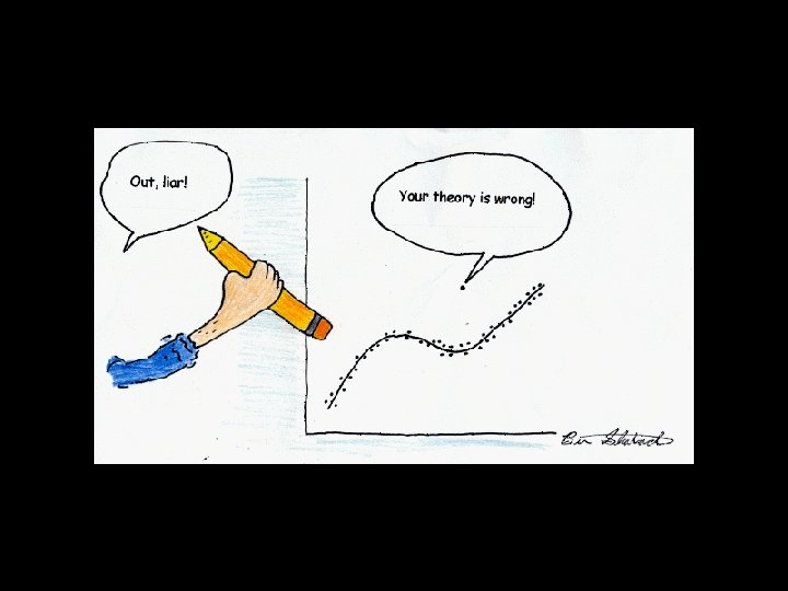
Non-linear Graphing helps you see relationships. Formal analysis guided by a priori knowledge that one variable causes change in the other (more later)

Classified Data: often result from an ecological experiment - Bar chart -Shows means and variance - “shows” treatment differences & magnitude Epilithon NPP (mg O 2/m 2/hr) 15 10 5 0 -5 -10 high light Mean one S. E. low light

List things that are wrong with this graph. 15 Epilithon NPP 10 5 0 -5 -10

Graphing Exercise Obtain a dataset, preferably your own or a colleague’s, but can be anything Choose a graphing style that best illustrates the “message” of your data Use Excel or other program to make a graph Print on an overhead to show in class
- Slides: 13