Experimental Design and Graphical Analysis of Data Rex



- Slides: 80

Experimental Design and Graphical Analysis of Data Rex P. Rice-2000; edited M. Schober 2002; questions by K. La. Fever, 2009

Independent & Dependent Variables When scientists set up experiments they often attempt to determine how a given variable (IV) affects another variable (DV). This requires the experiment to be designed in such a way that when the experimenter changes one variable (IV), the effects of this change on a second variable can be measured (DV).

Controlled Experiments If any other variable that could affect the second variable is changed, the experimenter would have no way of knowing which variable was responsible for the results. For this reason, scientists always attempt to conduct controlled experiments. This is done by choosing only one variable to manipulate in an experiment, observing its effect on a second variable, and holding all other variables in the experiment constant.

Suppose you wanted to test how changing the mass of a pendulum affects the time it takes a pendulum to swing back and forth (also known as its period). You must keep all other variables constant. You must make sure the length of the pendulum string does not change. You must make sure that the distance that the pendulum is pulled back (also known as the amplitude) does not change. The length of the pendulum and the amplitude are variables that must be held constant in order to run a controlled experiment. The only thing that you would deliberately change would be the mass of the pendulum.

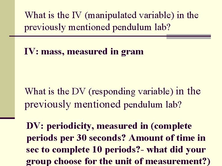
What is the IV (manipulated variable) in the previously mentioned pendulum lab? What is the DV (responding variable) in the previously mentioned pendulum lab?

What is the IV (manipulated variable) in the previously mentioned pendulum lab? IV: mass, measured in gram What is the DV (responding variable) in the previously mentioned pendulum lab? DV: periodicity, measured in (complete periods per 30 seconds? Amount of time in sec to complete 10 periods? - what did your group choose for the unit of measurement? )

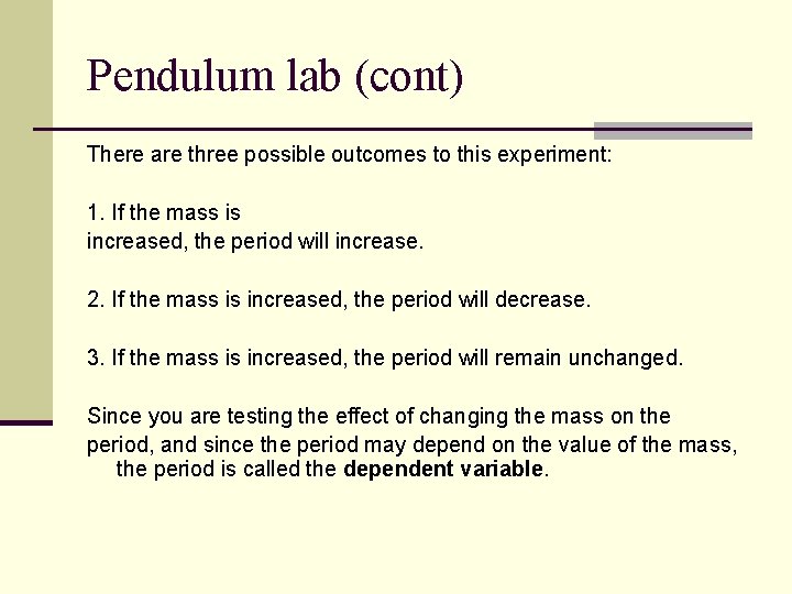
Pendulum lab (cont) There are three possible outcomes to this experiment: 1. If the mass is increased, the period will increase. 2. If the mass is increased, the period will decrease. 3. If the mass is increased, the period will remain unchanged. Since you are testing the effect of changing the mass on the period, and since the period may depend on the value of the mass, the period is called the dependent variable.

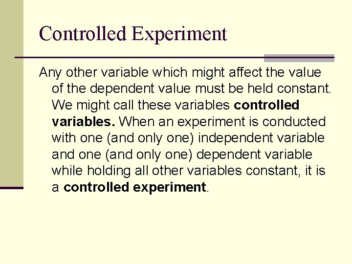
Controlled Experiment Any other variable which might affect the value of the dependent value must be held constant. We might call these variables controlled variables. When an experiment is conducted with one (and only one) independent variable and one (and only one) dependent variable while holding all other variables constant, it is a controlled experiment.

Controlled Experiment n What types of things did your group control in your pendulum lab? Mention these in your lab report…

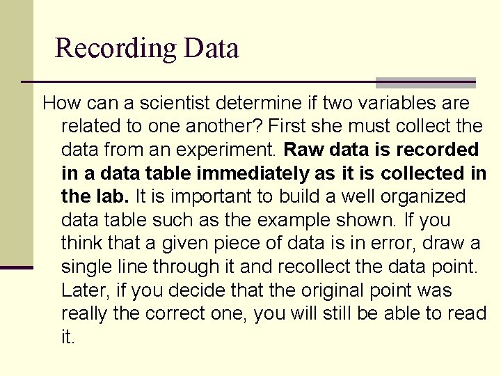
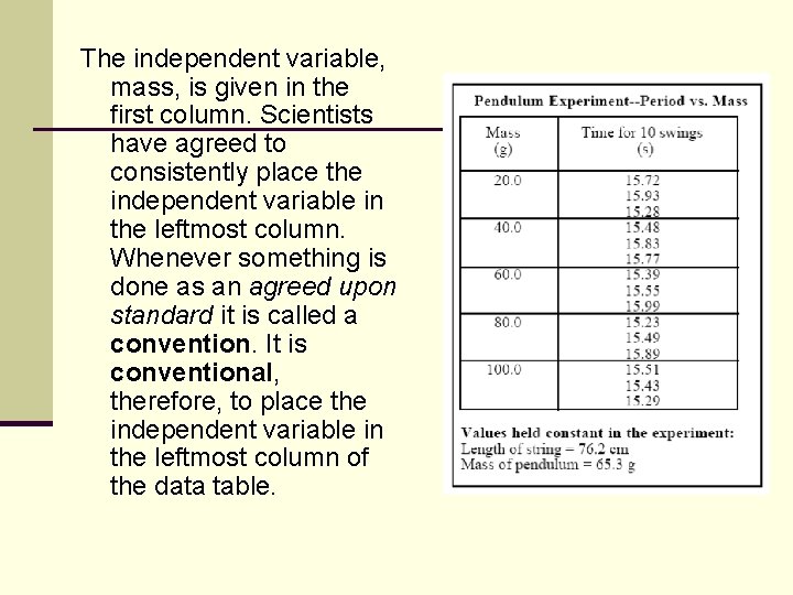
Recording Data How can a scientist determine if two variables are related to one another? First she must collect the data from an experiment. Raw data is recorded in a data table immediately as it is collected in the lab. It is important to build a well organized data table such as the example shown. If you think that a given piece of data is in error, draw a single line through it and recollect the data point. Later, if you decide that the original point was really the correct one, you will still be able to read it.

The independent variable, mass, is given in the first column. Scientists have agreed to consistently place the independent variable in the leftmost column. Whenever something is done as an agreed upon standard it is called a convention. It is conventional, therefore, to place the independent variable in the leftmost column of the data table.

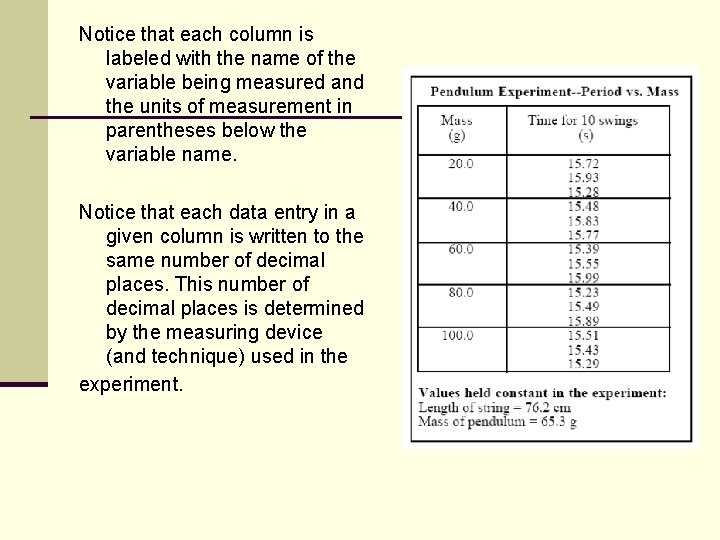
Notice that each column is labeled with the name of the variable being measured and the units of measurement in parentheses below the variable name. Notice that each data entry in a given column is written to the same number of decimal places. This number of decimal places is determined by the measuring device (and technique) used in the experiment.

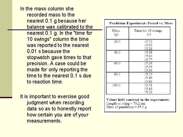
In the mass column she recorded mass to the nearest 0. 1 g because her balance was calibrated to the nearest 0. 1 g. In the "time for 10 swings" column the time was reported to the nearest 0. 01 s because the stopwatch gave times to that precision. A case could be made for only reporting the time to the nearest 0. 1 s due to reaction time. It is important to exercise good judgment when recording data so as to honestly report how certain you are of your measurements.

Create Data Table BEFORE Lab It is a good idea to construct the data table before collecting the data. Too often, students will write down data in a disorderly fashion and then try to build their data table. This defeats the purpose of a data table which is to organize and make certain that data is clear and consistent.

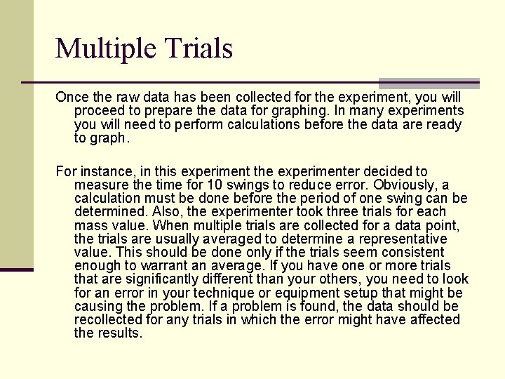
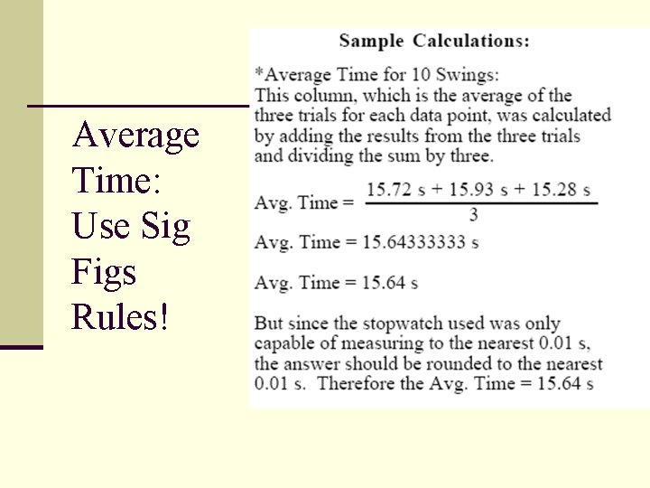
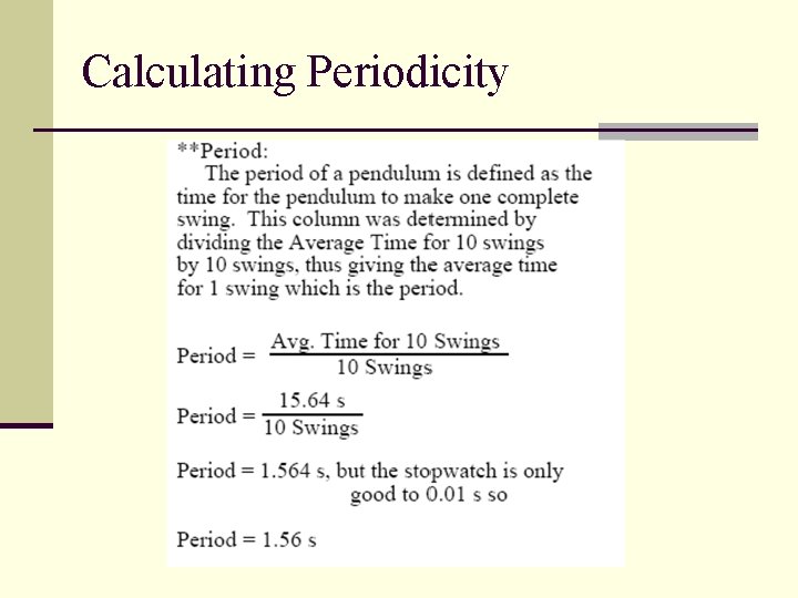
Multiple Trials Once the raw data has been collected for the experiment, you will proceed to prepare the data for graphing. In many experiments you will need to perform calculations before the data are ready to graph. For instance, in this experiment the experimenter decided to measure the time for 10 swings to reduce error. Obviously, a calculation must be done before the period of one swing can be determined. Also, the experimenter took three trials for each mass value. When multiple trials are collected for a data point, the trials are usually averaged to determine a representative value. This should be done only if the trials seem consistent enough to warrant an average. If you have one or more trials that are significantly different than your others, you need to look for an error in your technique or equipment setup that might be causing the problem. If a problem is found, the data should be recollected for any trials in which the error might have affected the results.

Average Time: Use Sig Figs Rules!

Calculating Periodicity

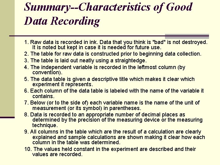
Summary--Characteristics of Good Data Recording 1. Raw data is recorded in ink. Data that you think is "bad" is not destroyed. It is noted but kept in case it is needed for future use. 2. The table for raw data is constructed prior to beginning data collection. 3. The table is laid out neatly using a straightedge. 4. The independent variable is recorded in the leftmost column (by convention). 5. The data table is given a descriptive title which makes it clear which experiment it represents. 6. Each column of the data table is labeled with the name of the variable it contains. 7. Below (or to the side of) each variable name is the name of the unit of measurement (or its symbol) in parentheses. 8. Data is recorded to an appropriate number of decimal places as determined by the precision of the measuring device or the measuring technique. 9. All columns in the table which are the result of a calculation are clearly explained and sample calculations are shown making it clear how each column in the table was determined. 10. The values held constant in the experiment are described and their values are recorded.

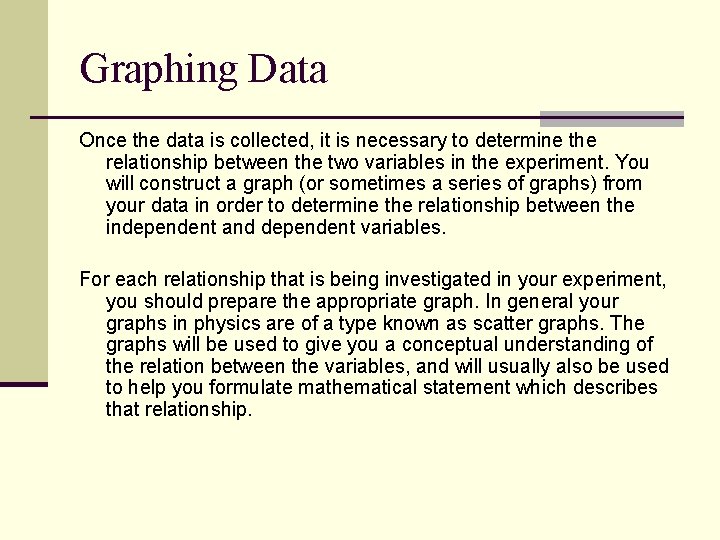
Graphing Data Once the data is collected, it is necessary to determine the relationship between the two variables in the experiment. You will construct a graph (or sometimes a series of graphs) from your data in order to determine the relationship between the independent and dependent variables. For each relationship that is being investigated in your experiment, you should prepare the appropriate graph. In general your graphs in physics are of a type known as scatter graphs. The graphs will be used to give you a conceptual understanding of the relation between the variables, and will usually also be used to help you formulate mathematical statement which describes that relationship.

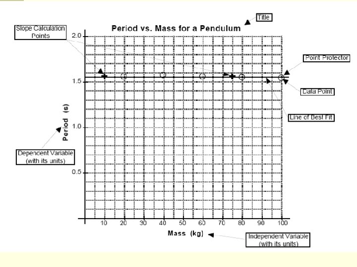
Elements of a Good Graph A title which describes the experiment. This title should be descriptive of the experiment and should indicate the relationship between the variables. It is conventional to title graphs with DEPENDENT VARIABLE vs. INDEPENDENT VARIABLE. For example, if the experiment was designed to show changing the mass of a pendulum affects its period, the mass of the pendulum is the independent variable and the period is the dependent variable. A good title might therefore be PERIOD vs. MASS FOR A PENDULUM.

Elements of a Good Graph The graph should fill the space allotted for the graph. If you have reserved a whole sheet of graph paper for the graph then it should be as large as the paper and proper scaling techniques permit.

Elements of a Good Graph The graph must be properly scaled. The scale for each axis of the graph should always begin at zero. The scale chosen on the axis must be uniform and linear. This means that each square on a given axis must represent the same amount. Obviously each axis for a graph will be scaled independently from the other since they are representing different variables. A given axis must, however, be scaled consistently.

Elements of a Good Graph Each axis should be labeled with the quantity being measured and the units of measurement. Generally, the independent variable is plotted on the horizontal (or x) axis and the dependent variable is plotted on the vertical (or y) axis.

Elements of a Good Graph Each data point should be plotted in the proper position. You should plot a point as a small dot at the position of the data point and you should circle the data point so that it will not be obscured by your line of best fit. These circles are called point protectors.

A line of best fit. This line should show the overall tendency (or trend) of your data. If the trend is linear, you should draw a straight line which shows that trend using a straight edge. If the trend is a curve, you should sketch a curve which is your best guess as to the tendency of the data. This line (whether straight or curved) does not have to go through all of the data points and it may, in some cases, not go through any of them.

Elements of a Good Graph Do not, under any circumstances, connect successive data points with a series of straight lines, dot to dot. This makes it difficult to see the overall trend of the data that you are trying to represent.

Slope of the Line of Best Fit If you are plotting the graph by hand, you will choose two points for all linear graphs from which to calculate the slope of the line of best fit. These points should not be data points unless a data point happens to fall perfectly on the line of best fit. Pick two points which are directly on your line of best fit and which are easy to read from the graph. Mark the points you have chosen with a +.

Keep the Graph Clear of Clutter! Do not do other work in the space of your graph such as the slope calculation or other parts of the mathematical analysis. The graph should be easily read and clear of all “clutter”- perform math calculations below the graph or on another sheet of paper


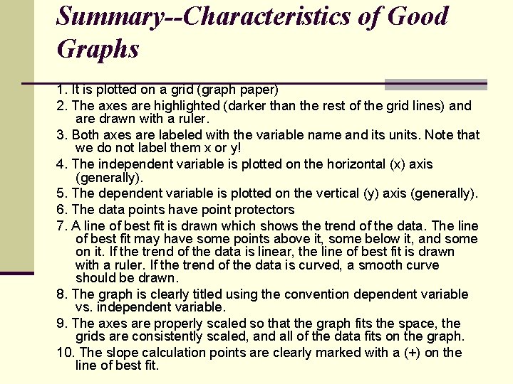
Summary--Characteristics of Good Graphs 1. It is plotted on a grid (graph paper) 2. The axes are highlighted (darker than the rest of the grid lines) and are drawn with a ruler. 3. Both axes are labeled with the variable name and its units. Note that we do not label them x or y! 4. The independent variable is plotted on the horizontal (x) axis (generally). 5. The dependent variable is plotted on the vertical (y) axis (generally). 6. The data points have point protectors 7. A line of best fit is drawn which shows the trend of the data. The line of best fit may have some points above it, some below it, and some on it. If the trend of the data is linear, the line of best fit is drawn with a ruler. If the trend of the data is curved, a smooth curve should be drawn. 8. The graph is clearly titled using the convention dependent variable vs. independent variable. 9. The axes are properly scaled so that the graph fits the space, the grids are consistently scaled, and all of the data fits on the graph. 10. The slope calculation points are clearly marked with a (+) on the line of best fit.

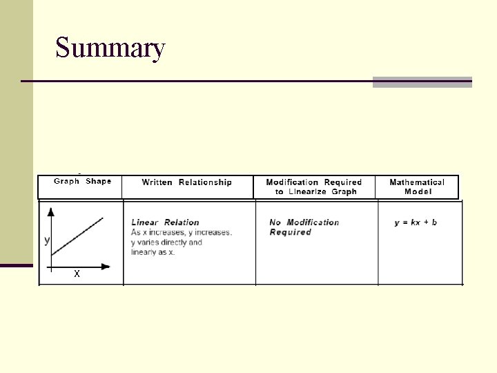
Interpreting The Graph The purpose of doing an experiment in science is to try to find out how nature behaves given certain constraints. In physics this often results in an attempt to try to find the relationship between two variables in a controlled experiment. Sometimes the trend of the data can be loosely determined by looking only at the raw data. The trend becomes more clear when one looks at the graph. In this course, most of the graphs we make will represent one of four basic relationships between the variables. These are 1) no relation 2) linear relations and 3) square relations and 4) inverse relations.

Mathematical Model To more specifically describe the relationship between the variables in an experiment, you will be expected to develop an equation. An equation which describes the behavior of a physical system (or any other system for that matter) can be called a mathematical model. The information which follows will describe each of the basic types of relationships we tend to see in physics. It also the process for arriving at a mathematical model to more fully (and simply) describe the relationship between the variables and the behaviors of physical systems.

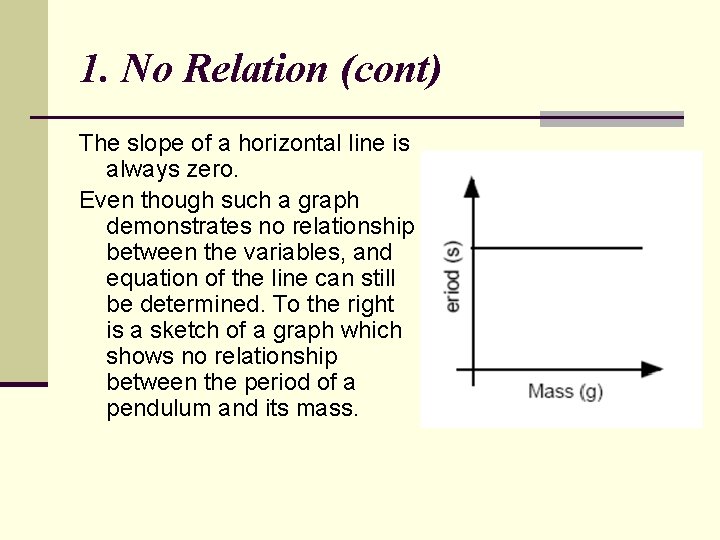
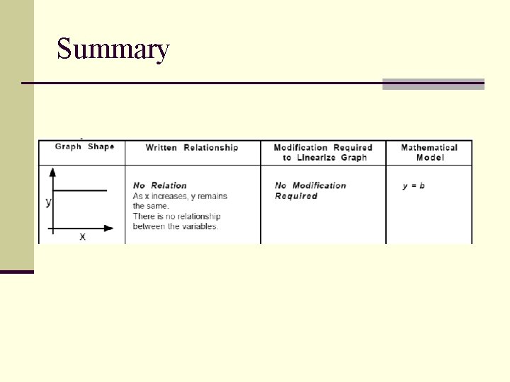
1. No Relation One possible outcome of an experiment is that changing the independent variable will have no effect on the dependent variable. When this happens we say that there is no relationship between the variables. For example, there is no relationship between the mass of a pendulum and its period when we hold the length and amplitude constant. As the independent variable increases, the dependent variable stays the same and theresulting graph is a horizontal line.

1. No Relation (cont) The slope of a horizontal line is always zero. Even though such a graph demonstrates no relationship between the variables, and equation of the line can still be determined. To the right is a sketch of a graph which shows no relationship between the period of a pendulum and its mass.

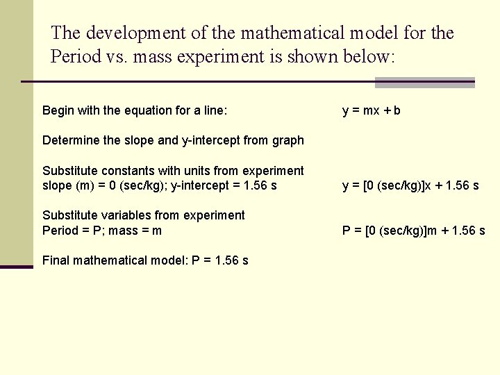
The development of the mathematical model for the Period vs. mass experiment is shown below: Begin with the equation for a line: y = mx + b Determine the slope and y-intercept from graph Substitute constants with units from experiment slope (m) = 0 (sec/kg); y-intercept = 1. 56 s y = [0 (sec/kg)]x + 1. 56 s Substitute variables from experiment Period = P; mass = m P = [0 (sec/kg)]m + 1. 56 s Final mathematical model: P = 1. 56 s

2. Linear Relations Another possible outcome of an experiment is that in which the graphs forms a straight line with a nonzero slope. We call this type of relationship a linear relation. In a linear relation, equal changes in the independent variable result in corresponding constant changes of the dependent variable.

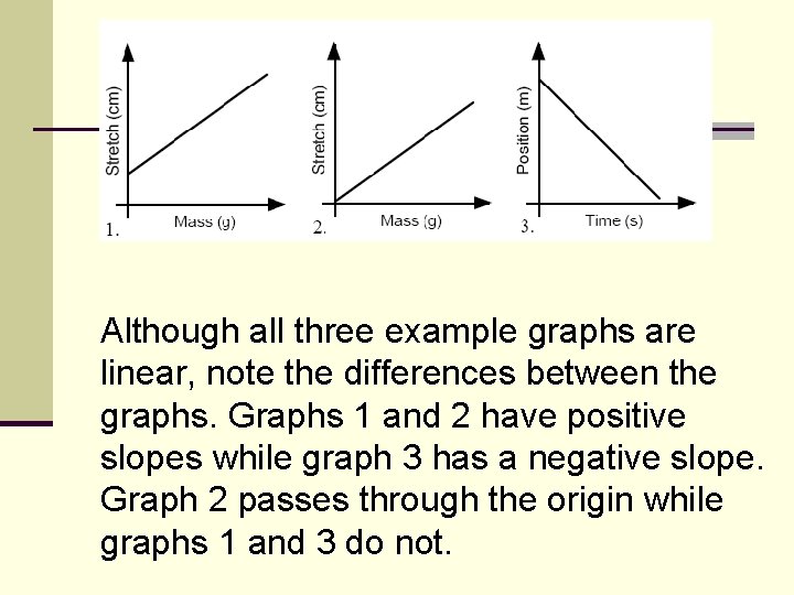
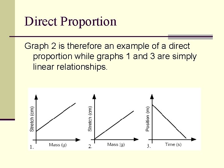
Although all three example graphs are linear, note the differences between the graphs. Graphs 1 and 2 have positive slopes while graph 3 has a negative slope. Graph 2 passes through the origin while graphs 1 and 3 do not.

Y-intercept Mathematically, the point where the graph crosses the vertical axis is called the yintercept. In the physical world, the yintercept has some physical meaning. Specifically, it is the value of the dependent variable when the independent variable is zero. Y = m(x) + b “b” is the y intercept

Direct Proportion While all three graphs are linear relationships, only one of them illustrates a proportional relationship. A direct proportion occurs when, as one variable increases by a certain factor, the other variable increases by the same factor. Graphically, therefore, a direct proportion must not only be linear but must also go through the origin of the axes. When one variable is zero, the other variable must also be zero. When one variable doubles, the other variable doubles. When one variable triples, the other variable triples, and so on.

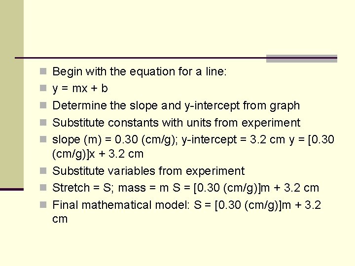
n Begin with the equation for a line: n y = mx + b n Determine the slope and y-intercept from graph n Substitute constants with units from experiment n slope (m) = 0. 30 (cm/g); y-intercept = 3. 2 cm y = [0. 30 (cm/g)]x + 3. 2 cm n Substitute variables from experiment n Stretch = S; mass = m S = [0. 30 (cm/g)]m + 3. 2 cm n Final mathematical model: S = [0. 30 (cm/g)]m + 3. 2 cm

Direct Proportion Graph 2 is therefore an example of a direct proportion while graphs 1 and 3 are simply linear relationships.

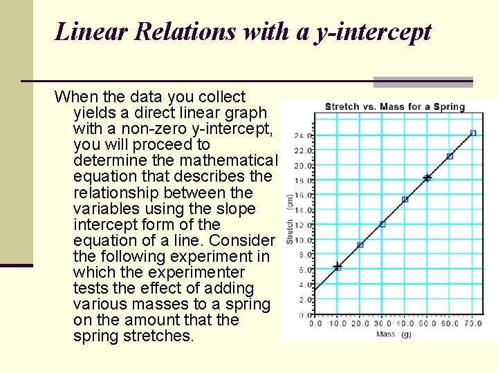
Linear Relations with a y-intercept When the data you collect yields a direct linear graph with a non-zero y-intercept, you will proceed to determine the mathematical equation that describes the relationship between the variables using the slope intercept form of the equation of a line. Consider the following experiment in which the experimenter tests the effect of adding various masses to a spring on the amount that the spring stretches.

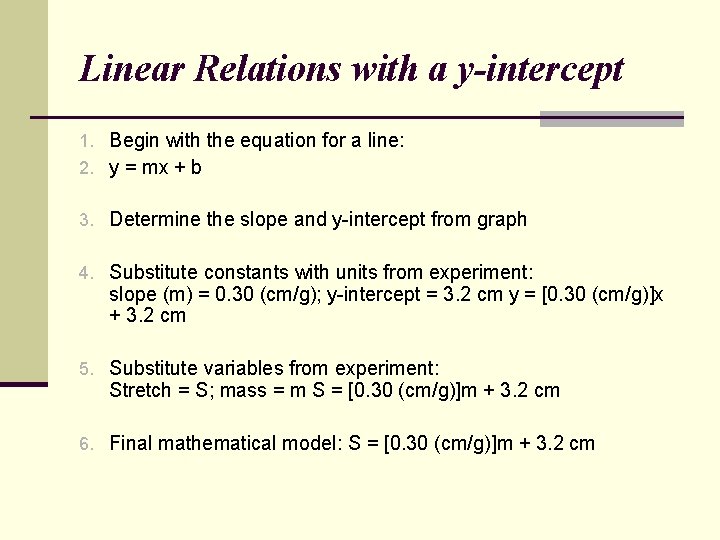
Linear Relations with a y-intercept 1. Begin with the equation for a line: 2. y = mx + b 3. Determine the slope and y-intercept from graph 4. Substitute constants with units from experiment: slope (m) = 0. 30 (cm/g); y-intercept = 3. 2 cm y = [0. 30 (cm/g)]x + 3. 2 cm 5. Substitute variables from experiment: Stretch = S; mass = m S = [0. 30 (cm/g)]m + 3. 2 cm 6. Final mathematical model: S = [0. 30 (cm/g)]m + 3. 2 cm

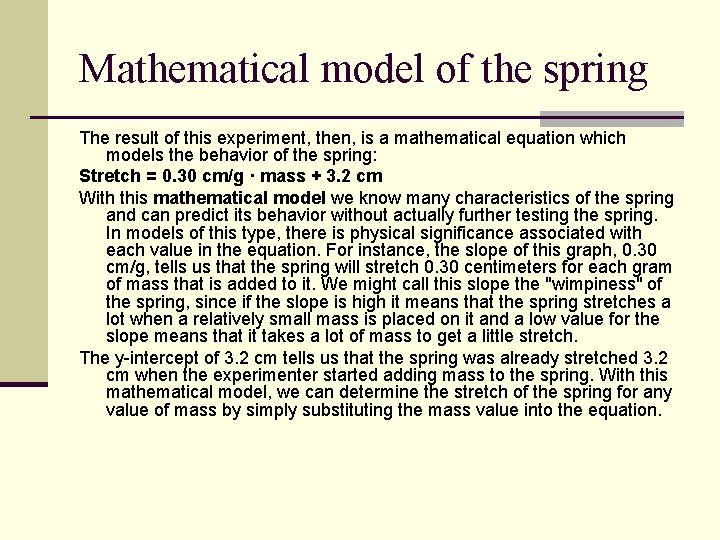
Mathematical model of the spring The result of this experiment, then, is a mathematical equation which models the behavior of the spring: Stretch = 0. 30 cm/g · mass + 3. 2 cm With this mathematical model we know many characteristics of the spring and can predict its behavior without actually further testing the spring. In models of this type, there is physical significance associated with each value in the equation. For instance, the slope of this graph, 0. 30 cm/g, tells us that the spring will stretch 0. 30 centimeters for each gram of mass that is added to it. We might call this slope the "wimpiness" of the spring, since if the slope is high it means that the spring stretches a lot when a relatively small mass is placed on it and a low value for the slope means that it takes a lot of mass to get a little stretch. The y-intercept of 3. 2 cm tells us that the spring was already stretched 3. 2 cm when the experimenter started adding mass to the spring. With this mathematical model, we can determine the stretch of the spring for any value of mass by simply substituting the mass value into the equation.

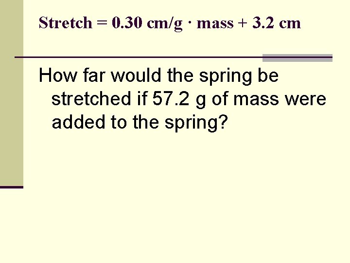
Stretch = 0. 30 cm/g · mass + 3. 2 cm How far would the spring be stretched if 57. 2 g of mass were added to the spring?

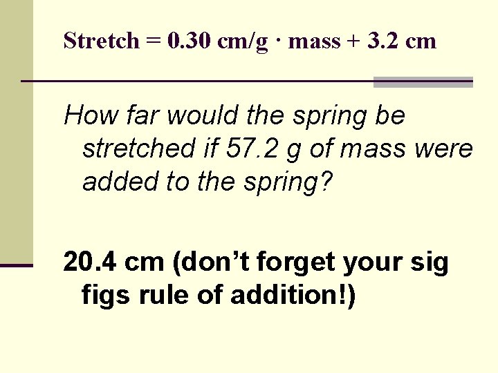
Stretch = 0. 30 cm/g · mass + 3. 2 cm How far would the spring be stretched if 57. 2 g of mass were added to the spring? 20. 4 cm (don’t forget your sig figs rule of addition!)

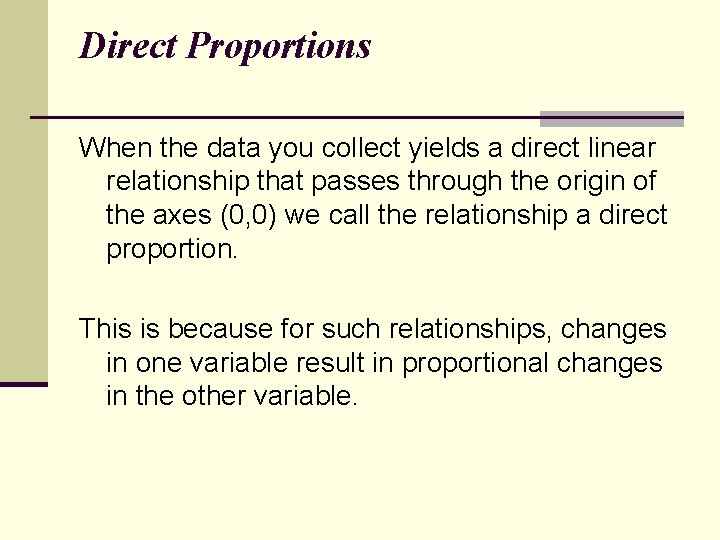
Direct Proportions When the data you collect yields a direct linear relationship that passes through the origin of the axes (0, 0) we call the relationship a direct proportion. This is because for such relationships, changes in one variable result in proportional changes in the other variable.

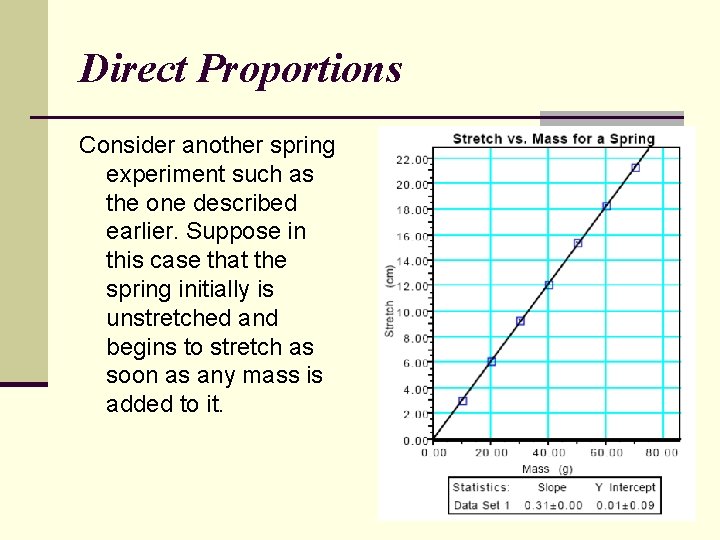
Direct Proportions Consider another spring experiment such as the one described earlier. Suppose in this case that the spring initially is unstretched and begins to stretch as soon as any mass is added to it.

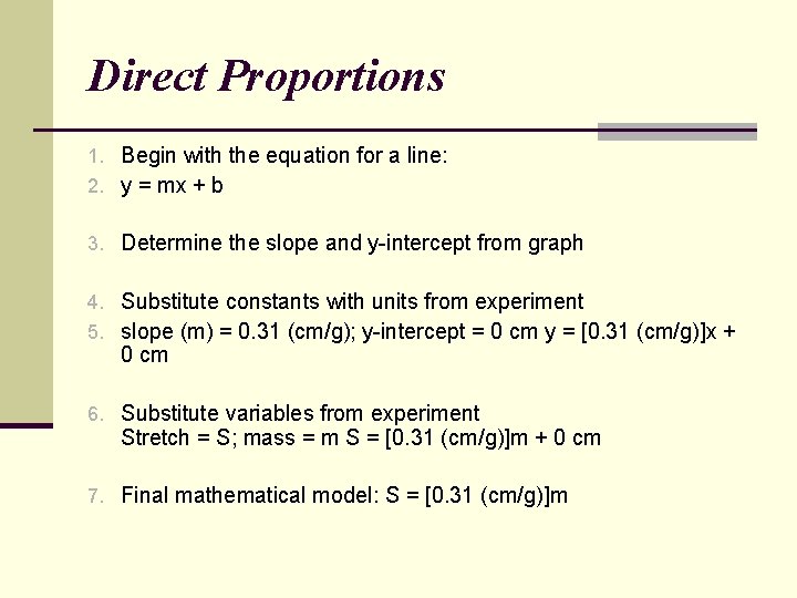
Direct Proportions 1. Begin with the equation for a line: 2. y = mx + b 3. Determine the slope and y-intercept from graph 4. Substitute constants with units from experiment 5. slope (m) = 0. 31 (cm/g); y-intercept = 0 cm y = [0. 31 (cm/g)]x + 0 cm 6. Substitute variables from experiment Stretch = S; mass = m S = [0. 31 (cm/g)]m + 0 cm 7. Final mathematical model: S = [0. 31 (cm/g)]m

Direct Proportions When you are evaluating real data, you will need to decide whether or not the graph should go through the origin. Given the limitations of the experimental process, real data will rarely yield a line that goes perfectly through the origin. In the example above, the computer calculated a y-intercept of 0. 01 cm ± 0. 09 cm. Since the uncertainty (± 0. 09 cm) in determining the y-intercept exceeds the value of the y-intercept (0. 01 cm) it is obviously reasonable to call the y-intercept zero.

Direct Proportions Other cases may not be so clear cut. The first rule of order when trying to determine whether or not a direct linear relationship is indeed a direct proportion is to ask yourself what would happen to the dependent variable if the independent variable were zero. In many cases you can reason from the physical situation being investigated whether or not the graph should logically go through the origin. Sometimes, however, it might not be so obvious. In these cases we will assume that it has some physical significance and will go about trying to determine that significance.

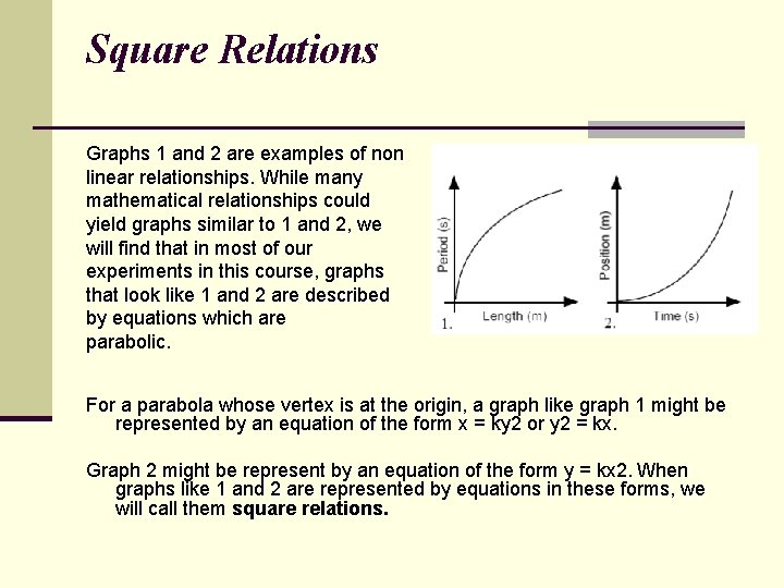
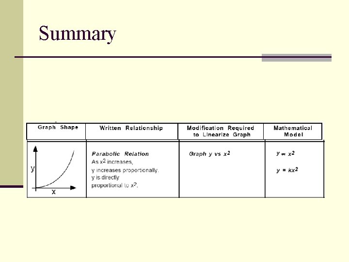
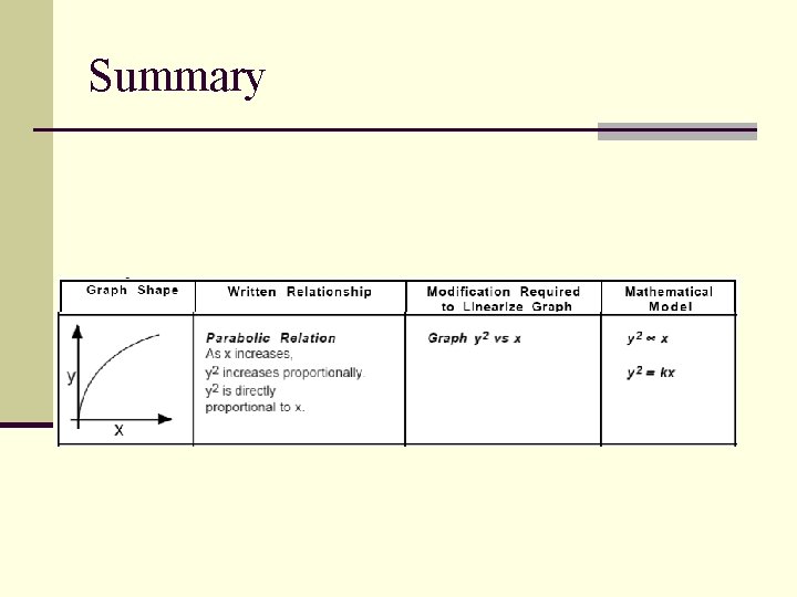
Square Relations Graphs 1 and 2 are examples of non linear relationships. While many mathematical relationships could yield graphs similar to 1 and 2, we will find that in most of our experiments in this course, graphs that look like 1 and 2 are described by equations which are parabolic. For a parabola whose vertex is at the origin, a graph like graph 1 might be represented by an equation of the form x = ky 2 or y 2 = kx. Graph 2 might be represent by an equation of the form y = kx 2. When graphs like 1 and 2 are represented by equations in these forms, we will call them square relations.

Square Relations— Top Opening Parabolas When the data you collect is non-linear and looks like it might be parabolic, you will employ a powerful technique called linearizing the graph to determine whether or not the graph is truly a parabola with its vertex at the origin.

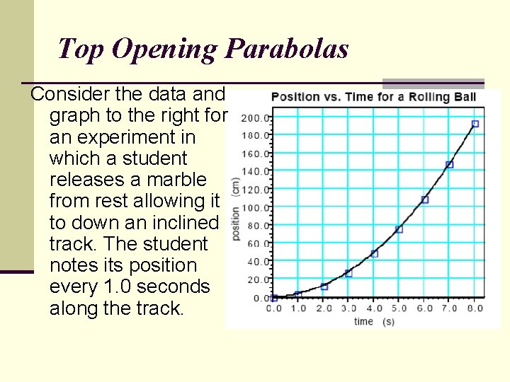
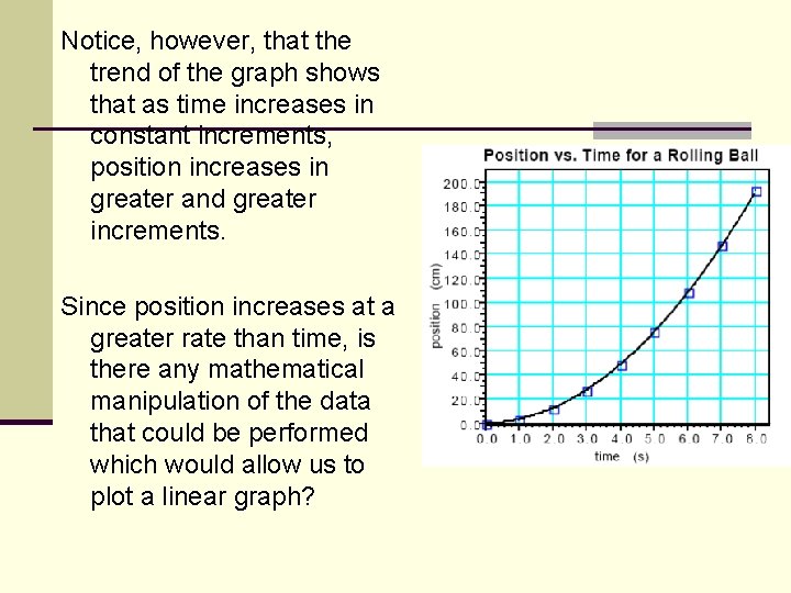
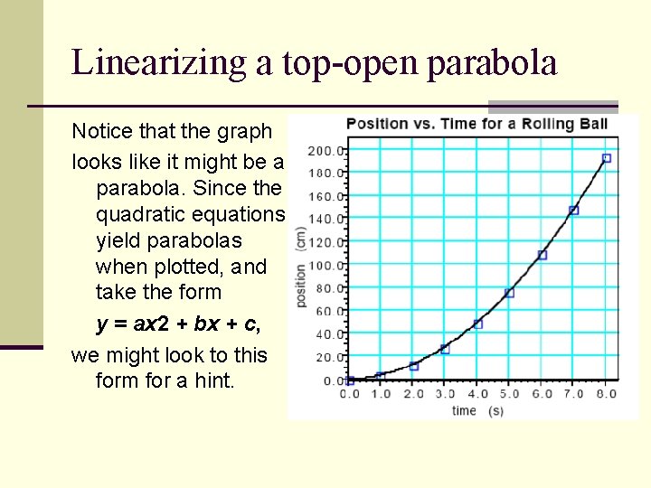
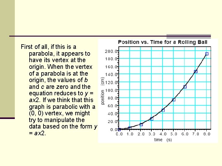
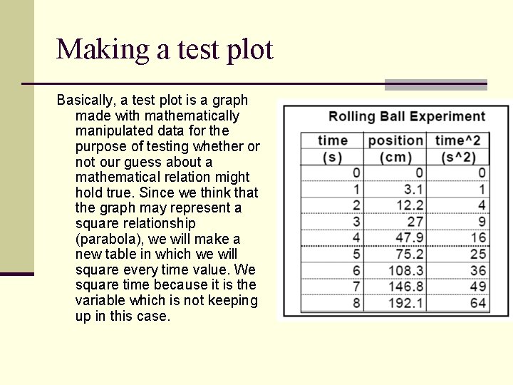
Top Opening Parabolas Consider the data and graph to the right for an experiment in which a student releases a marble from rest allowing it to down an inclined track. The student notes its position every 1. 0 seconds along the track.

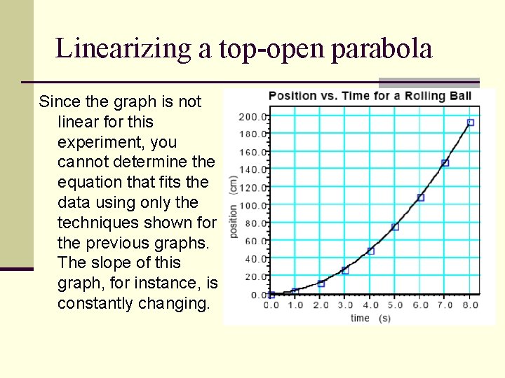
Linearizing a top-open parabola Since the graph is not linear for this experiment, you cannot determine the equation that fits the data using only the techniques shown for the previous graphs. The slope of this graph, for instance, is constantly changing.

Notice, however, that the trend of the graph shows that as time increases in constant increments, position increases in greater and greater increments. Since position increases at a greater rate than time, is there any mathematical manipulation of the data that could be performed which would allow us to plot a linear graph?

Linearizing a top-open parabola Notice that the graph looks like it might be a parabola. Since the quadratic equations yield parabolas when plotted, and take the form y = ax 2 + bx + c, we might look to this form for a hint.

First of all, if this is a parabola, it appears to have its vertex at the origin. When the vertex of a parabola is at the origin, the values of b and c are zero and the equation reduces to y = ax 2. If we think that this graph is parabolic with a (0, 0) vertex, we might try to manipulate the data based on the form y = ax 2.

Linearizing a top-open parabola Think about it. If position is increasing at a greater rate than time, isn't it possible that squaring time, which will make it increase at a greater rate, might make it keep up with position? This reasoning is the basis of creating a test plot.

Making a test plot Basically, a test plot is a graph made with mathematically manipulated data for the purpose of testing whether or not our guess about a mathematical relation might hold true. Since we think that the graph may represent a square relationship (parabola), we will make a new table in which we will square every time value. We square time because it is the variable which is not keeping up in this case.

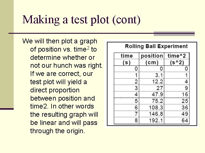
Making a test plot (cont) We will then plot a graph of position vs. time 2 to determine whether or not our hunch was right. If we are correct, our test plot will yield a direct proportion between position and time 2. In other words the resulting graph will be linear and will pass through the origin.

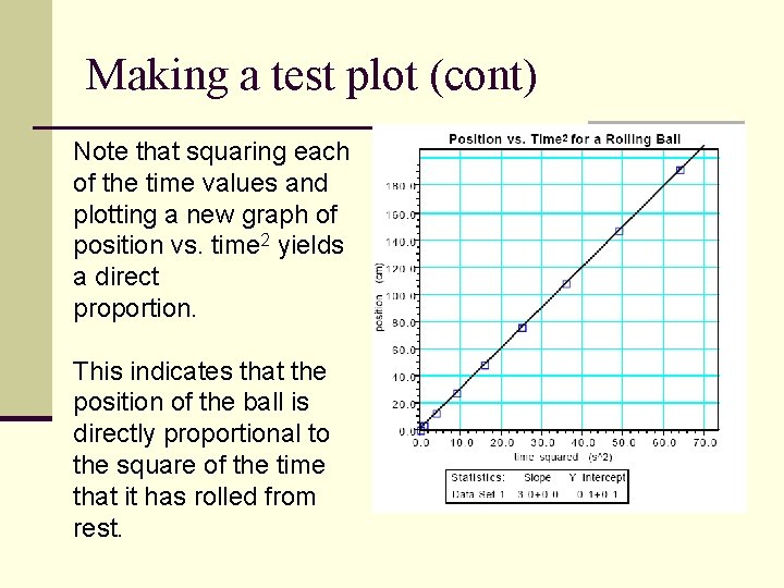
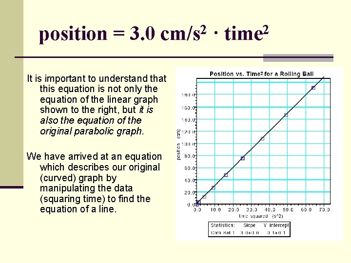
Making a test plot (cont) Note that squaring each of the time values and plotting a new graph of position vs. time 2 yields a direct proportion. This indicates that the position of the ball is directly proportional to the square of the time that it has rolled from rest.

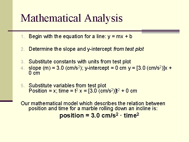
Mathematical Analysis 1. Begin with the equation for a line: y = mx + b 2. Determine the slope and y-intercept from test plot 3. Substitute constants with units from test plot 4. slope (m) = 3. 0 (cm/s 2); y-intercept = 0 cm y = [3. 0 (cm/s 2)]x + 0 cm 5. Substitute variables from test plot Position = x; time = t 2 x = [3. 0 (cm/s 2)]t 2 + 0 cm Our mathematical model which describes the relation between position and time for a marble rolling down an incline is: position = 3. 0 cm/s 2 · time 2

position = 3. 0 cm/s 2 · time 2 It is important to understand that this equation is not only the equation of the linear graph shown to the right, but it is also the equation of the original parabolic graph. We have arrived at an equation which describes our original (curved) graph by manipulating the data (squaring time) to find the equation of a line.

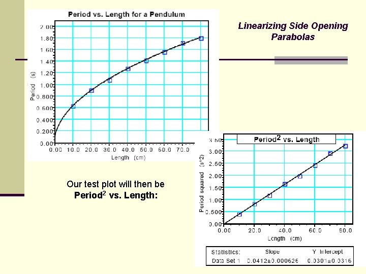
Square Relations— Side Opening Parabolas Consider an experiment in which a student investigates the effect of changing the length of a pendulum on the time required for the pendulum to make one swing (or the period). This graph could be a parabola which opens to the right. What mathematical manipulation of the data would you perform which might allow us to plot a linear graph?

Linearizing Side Opening Parabolas Since length is increasing at a greater rate than period, isn't it possible that squaring period, which will make it increase at a greater rate, might make it keep up with length?

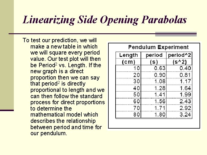
Linearizing Side Opening Parabolas To test our prediction, we will make a new table in which we will square every period value. Our test plot will then be Period 2 vs. Length. If the new graph is a direct proportion then we can say that period 2 is directly proportional to length and we can then follow the standard process for direct proportions to determine the mathematical model which describes the relationship between period and time for our pendulum.

Linearizing Side Opening Parabolas Our test plot will then be Period 2 vs. Length:

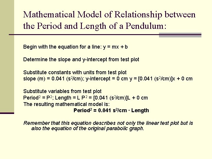
Mathematical Model of Relationship between the Period and Length of a Pendulum: Begin with the equation for a line: y = mx + b Determine the slope and y-intercept from test plot Substitute constants with units from test plot slope (m) = 0. 041 (s 2/cm); y-intercept = 0 cm y = [0. 041 (s 2/cm)]x + 0 cm Substitute variables from test plot Period 2 = P 2; Length = L P 2 = [0. 041 (s 2/cm)]L + 0 cm The resulting mathematical model is: Period 2 = 0. 041 s 2/cm · Length Remember that this equation describes not only the linear test plot but is also the equation of the original parabolic graph.

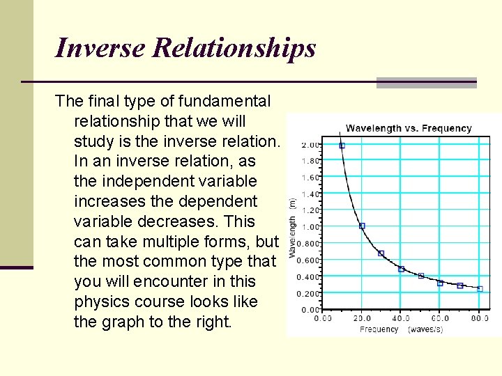
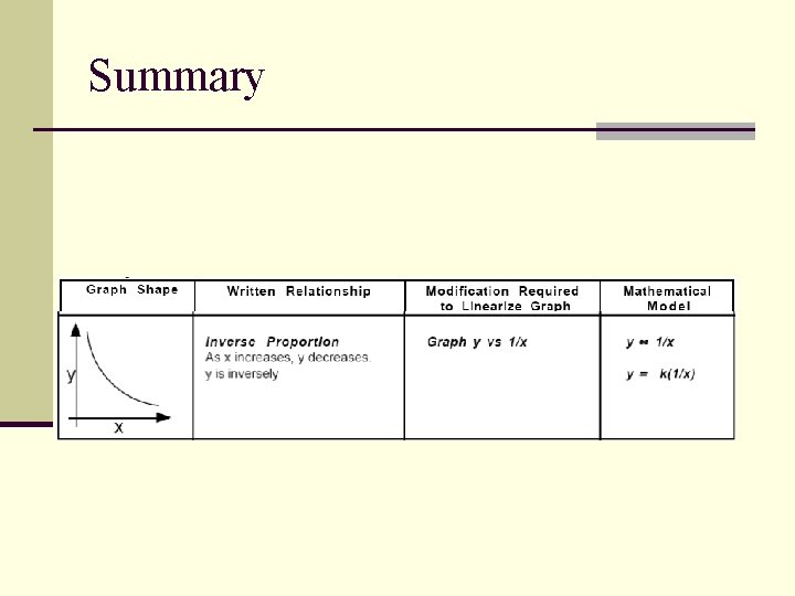
Inverse Relationships The final type of fundamental relationship that we will study is the inverse relation. In an inverse relation, as the independent variable increases the dependent variable decreases. This can take multiple forms, but the most common type that you will encounter in this physics course looks like the graph to the right.

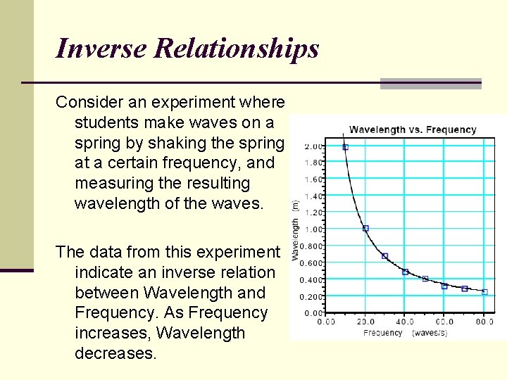
Inverse Relationships Consider an experiment where students make waves on a spring by shaking the spring at a certain frequency, and measuring the resulting wavelength of the waves. The data from this experiment indicate an inverse relation between Wavelength and Frequency. As Frequency increases, Wavelength decreases.

Linearizing Inverse Relationships What mathematical manipulation of the data might possibly linearize the graph to allow us do develop a mathematical model? The answer might be to take the reciprocal of one of the variables. This will cause the variable you have manipulated to decrease if it was increasing or to increase if it was decreasing. Remember that whatever manipulation you make of the physical quantity, you must also make of the units for that physical quantity.

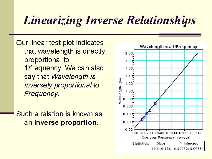
Linearizing Inverse Relationships Our linear test plot indicates that wavelength is directly proportional to 1/frequency. We can also say that Wavelength is inversely proportional to Frequency. Such a relation is known as an inverse proportion.

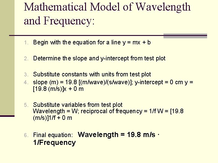
Mathematical Model of Wavelength and Frequency: 1. Begin with the equation for a line y = mx + b 2. Determine the slope and y-intercept from test plot 3. Substitute constants with units from test plot 4. slope (m) = 19. 8 [(m/wave)/(s/wave)]; y-intercept = 0 cm y = [19. 8 (m/s)]x + 0 m 5. Substitute variables from test plot Wavelength = W; reciprocal of frequency = 1/f W = [19. 8 (m/s)]1/f + 0 m 6. Final equation: 1/Frequency Wavelength = 19. 8 m/s ·

Summary

Summary

Summary

Summary

Summary

Summary