Excel Lesson 10 Using Advanced Chart Features Microsoft
- Slides: 23

Excel Lesson 10 Using Advanced Chart Features Microsoft Office 2010 Advanced Cable / Morrison

Objectives l Excel Lesson 10 l Switch rows and columns in charts. Add a data table to a chart. Add data labels to data markers. Create sparklines. l 2 Cable / Morrison l Microsoft Office 2010 Advanced

Objectives (continued) l Excel Lesson 10 l Design combination charts. Construct a gauge chart. Create a chart template. Apply a chart template. l 3 Cable / Morrison l Microsoft Office 2010 Advanced

Vocabulary l Excel Lesson 10 l chart floor chart template combination chart data labels data markers data point l 4 Cable / Morrison l l l l l data series data table gauge chart horizontal gridlines primary axis secondary axis Microsoft Office 2010 Advanced

Vocabulary (continued) l Excel Lesson 10 l sparklines vertical gridlines x-axis y-axis l 5 Cable / Morrison l Microsoft Office 2010 Advanced

Introduction Excel Lesson 10 l 6 Charts are a great solution for presenting data in Excel graphically. – – l Simple to make and format Can quickly change one type of chart to another Excel has many chart formatting features. Cable / Morrison Microsoft Office 2010 Advanced

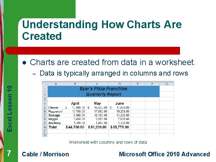
Understanding How Charts Are Created l Charts are created from data in a worksheet. Data is typically arranged in columns and rows Excel Lesson 10 – Worksheet with columns and rows of data 7 Cable / Morrison Microsoft Office 2010 Advanced

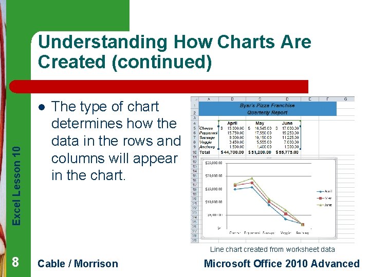
Understanding How Charts Are Created (continued) Excel Lesson 10 l The type of chart determines how the data in the rows and columns will appear in the chart. Line chart created from worksheet data 8 Cable / Morrison Microsoft Office 2010 Advanced

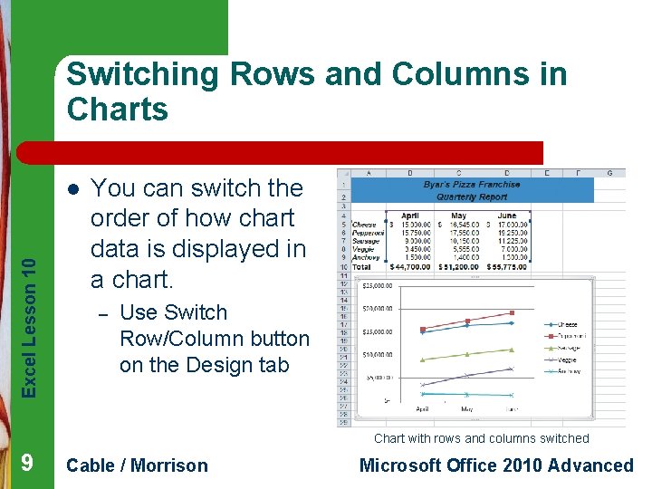
Switching Rows and Columns in Charts Excel Lesson 10 l You can switch the order of how chart data is displayed in a chart. – Use Switch Row/Column button on the Design tab Chart with rows and columns switched 9 Cable / Morrison Microsoft Office 2010 Advanced

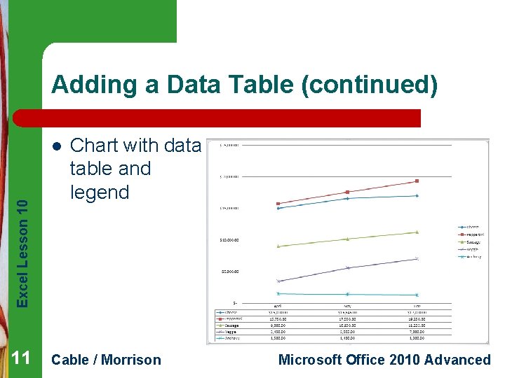
Adding a Data Table Excel Lesson 10 l A data table displays the data used to create a chart. – – l A legend is a list that shows the colors and symbols used in a chart. – 10 Appears below the chart Lets you quickly view the worksheet data while looking at the chart data series Can appear as part of the data table or separately Cable / Morrison Microsoft Office 2010 Advanced

Adding a Data Table (continued) Excel Lesson 10 l 11 Chart with data table and legend Cable / Morrison Microsoft Office 2010 Advanced

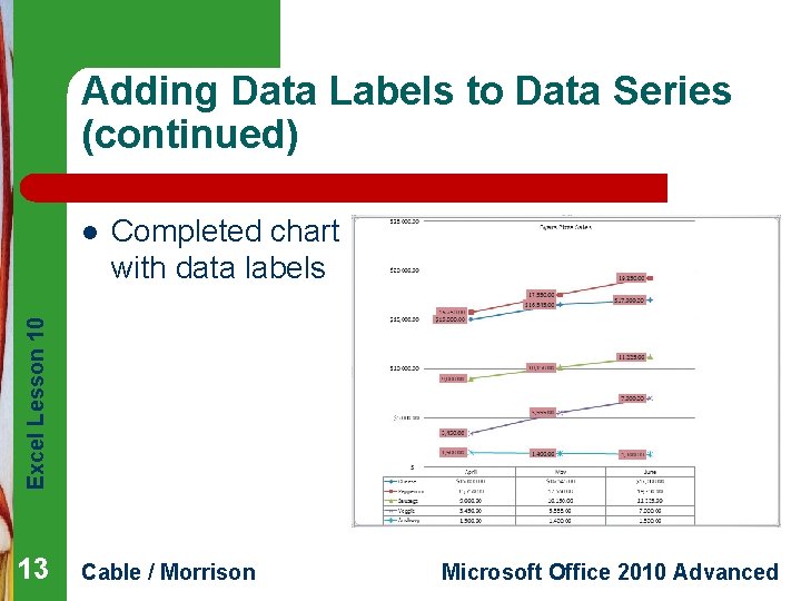
Adding Data Labels to Data Series Excel Lesson 10 l 12 l l A data label can appear as numbers or text next to each data marker in the data series. The data markers represent where the actual data would be in the chart. Each place where the line segments start or stop is a data point. – Can be displayed with a data marker Cable / Morrison Microsoft Office 2010 Advanced

Adding Data Labels to Data Series (continued) Completed chart with data labels Excel Lesson 10 l 13 Cable / Morrison Microsoft Office 2010 Advanced

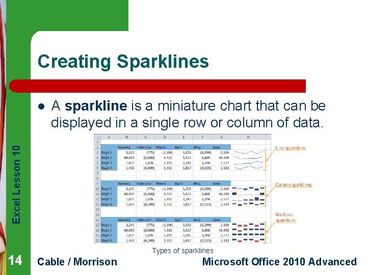
Creating Sparklines A sparkline is a miniature chart that can be displayed in a single row or column of data. Excel Lesson 10 l 14 Types of sparklines Cable / Morrison Microsoft Office 2010 Advanced

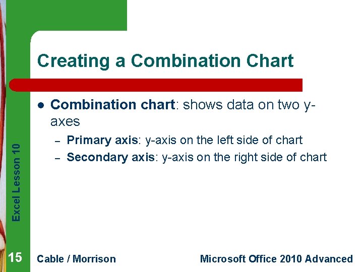
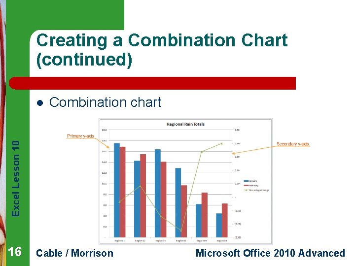
Creating a Combination Chart Excel Lesson 10 l 15 Combination chart: shows data on two yaxes – – Primary axis: y-axis on the left side of chart Secondary axis: y-axis on the right side of chart Cable / Morrison Microsoft Office 2010 Advanced

Creating a Combination Chart (continued) Combination chart Excel Lesson 10 l 16 Cable / Morrison Microsoft Office 2010 Advanced

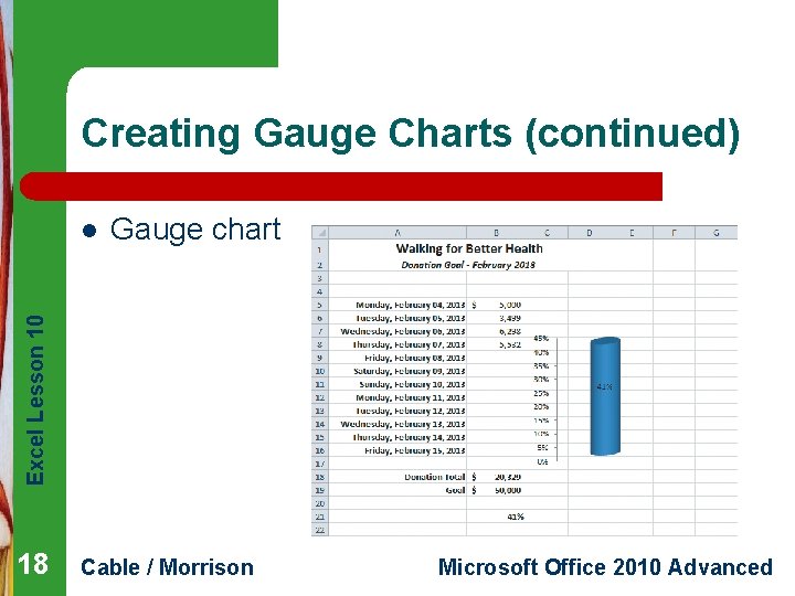
Creating Gauge Charts Excel Lesson 10 l 17 l l l A gauge chart shows the amount of progress accomplished toward a goal. Horizontal gridlines are horizontal lines within the chart. Vertical gridlines are vertical lines within the chart. Chart floor is the foundation, or base, of a 3 D chart. Cable / Morrison Microsoft Office 2010 Advanced

Creating Gauge Charts (continued) Gauge chart Excel Lesson 10 l 18 Cable / Morrison Microsoft Office 2010 Advanced

Creating Chart Templates l To create a chart template: Excel Lesson 10 – 19 – l Create and format a chart as desired Save the chart as a template Chart templates are saved in the same default location as the preformatted chart templates. Cable / Morrison Microsoft Office 2010 Advanced

Applying a Chart Template Excel Lesson 10 l 20 l After creating a chart template, you can apply it to new charts that you create. Applying a chart template to a chart will save time. – Will not need to change each chart feature individually Cable / Morrison Microsoft Office 2010 Advanced

Excel Lesson 10 Summary In this lesson, you learned: l You can switch rows and columns of data in a chart. l A data table that shows the data used to create a chart can be added to the chart. l Data labels can be added to data markers in a data series. 21 Cable / Morrison Microsoft Office 2010 Advanced

Summary (continued) Excel Lesson 10 l 22 l l A sparkline is a miniature chart that can be displayed in a single row or column of data. You can design a combination chart that has two y-axes. You can construct gauge charts that show progress towards a goal. Cable / Morrison Microsoft Office 2010 Advanced

Summary (continued) Excel Lesson 10 l 23 l A chart template can be created for a chart design that will be used repeatedly. Chart templates can be applied to charts after they are created. Cable / Morrison Microsoft Office 2010 Advanced