Excel 2016 Charts and Graphs By Martha Nelson

Excel 2016 Charts and Graphs By Martha Nelson Digital Learning Specialist

Extra Help • Type your question in the “Tell me what you want to do” area. • <right-click> on an item for help about that item https: //support. office. com/en-us/excel http: //www. gcflearnfree. org/office 2016/excel 2016
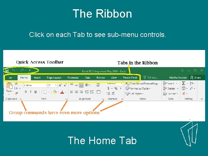
The Ribbon Click on each Tab to see sub-menu controls. The Home Tab
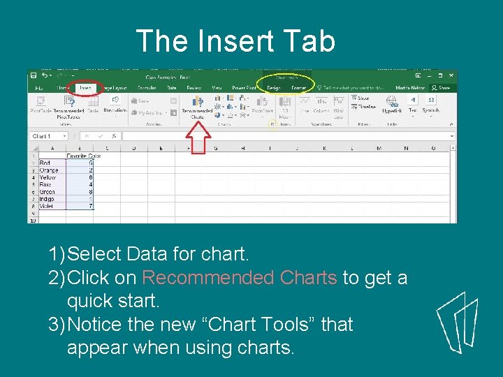
The Insert Tab 1) Select Data for chart. 2) Click on Recommended Charts to get a quick start. 3) Notice the new “Chart Tools” that appear when using charts.
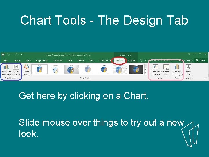
Chart Tools - The Design Tab Get here by clicking on a Chart. Slide mouse over things to try out a new look.
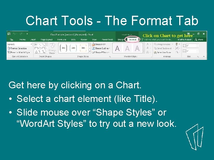
Chart Tools - The Format Tab Get here by clicking on a Chart. • Select a chart element (like Title). • Slide mouse over “Shape Styles” or “Word. Art Styles” to try out a new look.
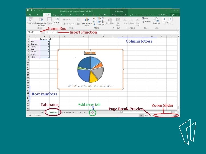

1) Get data
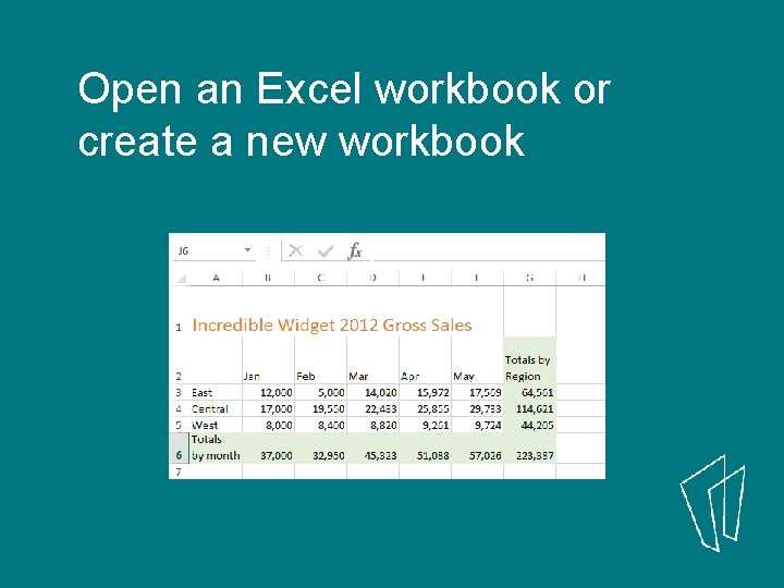
Open an Excel workbook or create a new workbook
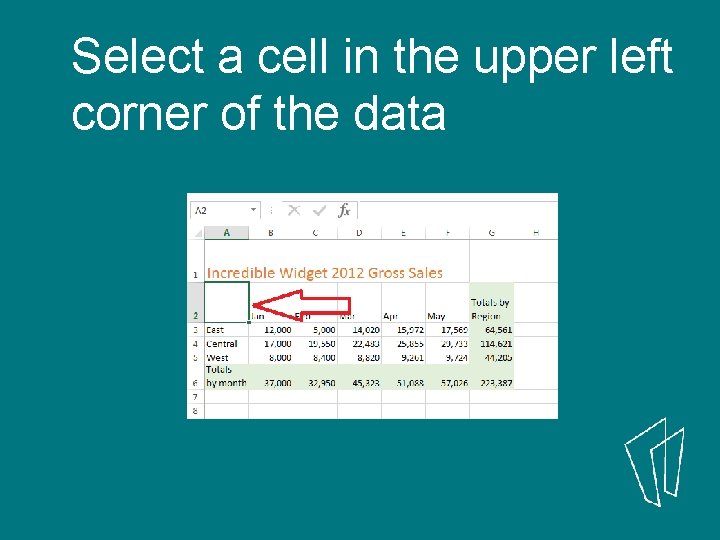
Select a cell in the upper left corner of the data
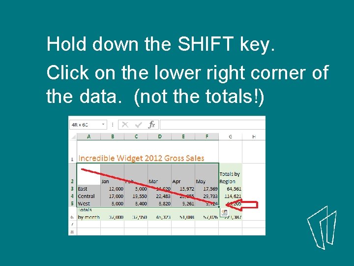
Hold down the SHIFT key. Click on the lower right corner of the data. (not the totals!)
3) Create a Chart Method #1
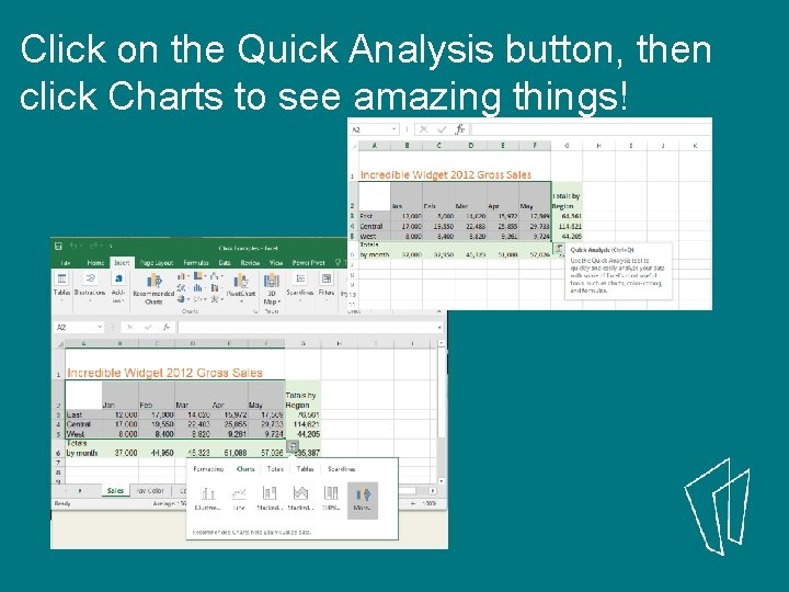
Click on the Quick Analysis button, then click Charts to see amazing things!
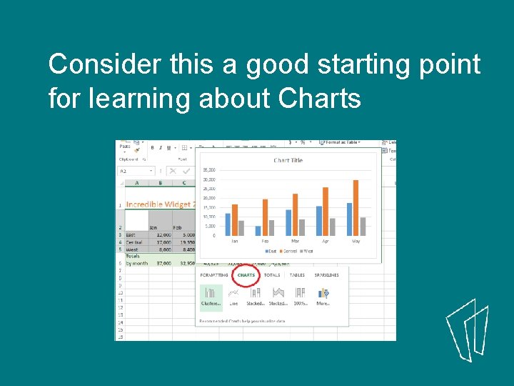
Consider this a good starting point for learning about Charts
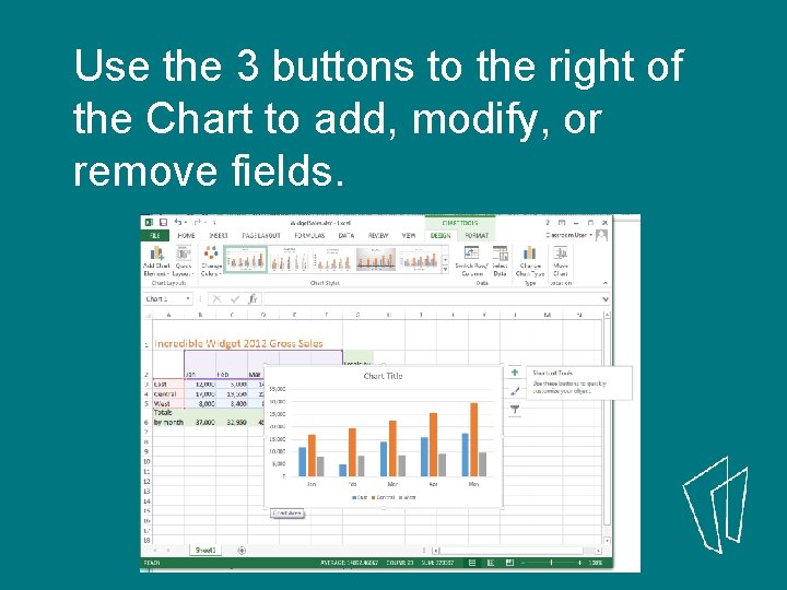
Use the 3 buttons to the right of the Chart to add, modify, or remove fields.
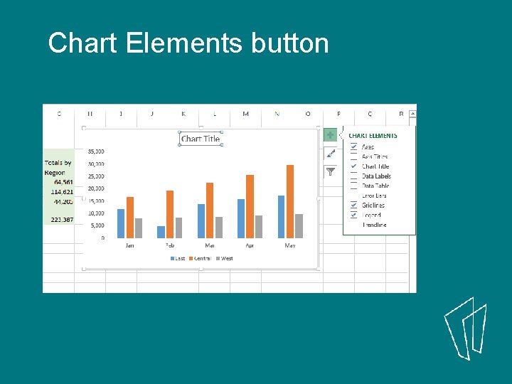
Chart Elements button
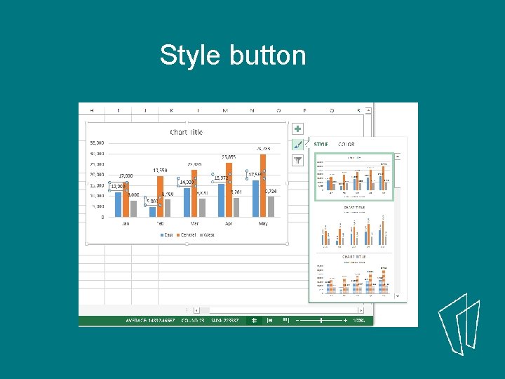
Style button
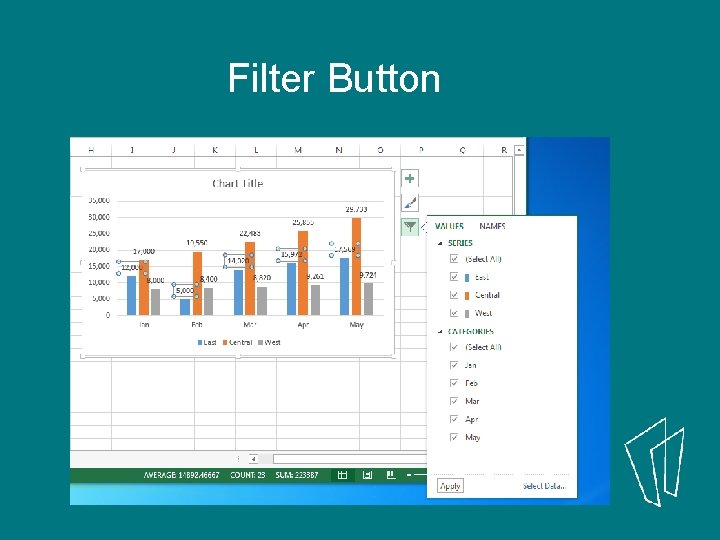
Filter Button
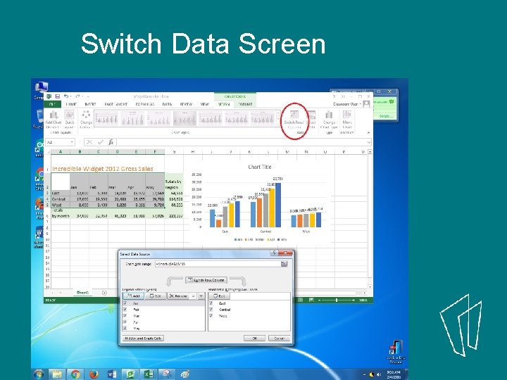
Switch Data Screen
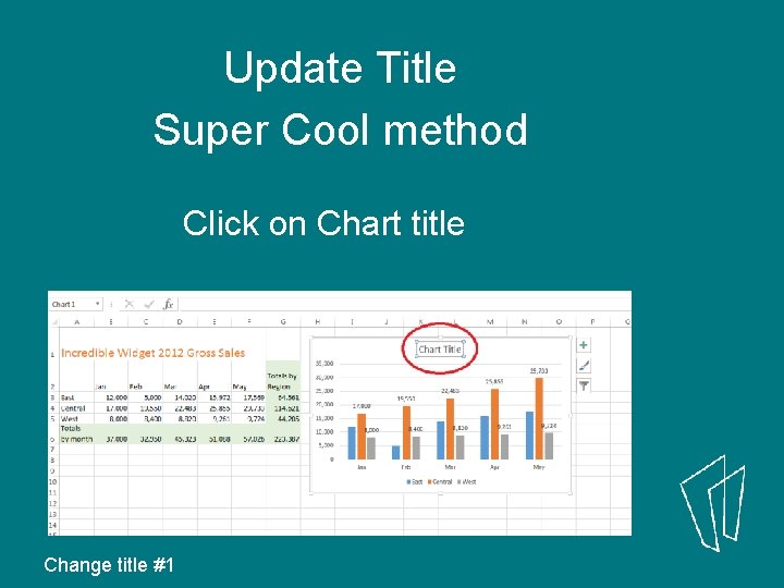
Update Title Super Cool method Click on Chart title Change title #1
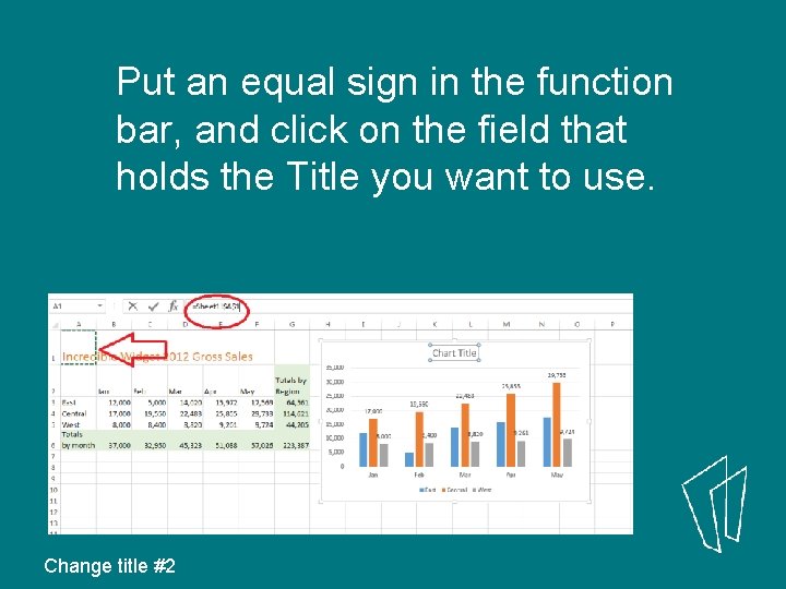
Put an equal sign in the function bar, and click on the field that holds the Title you want to use. Change title #2
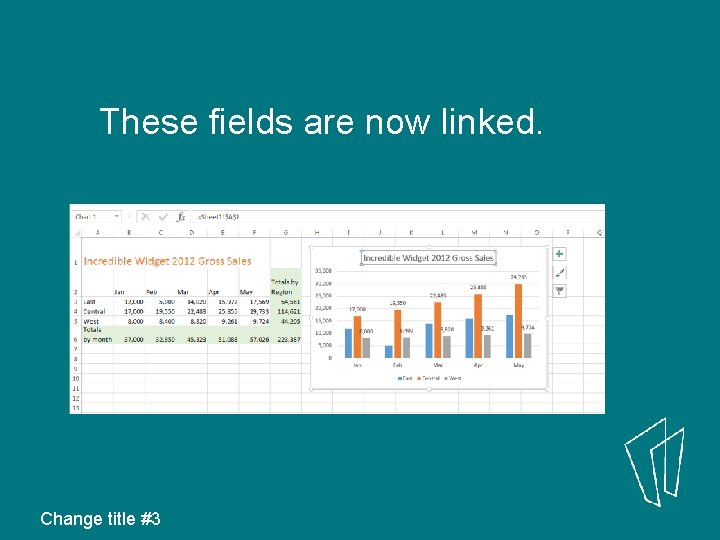
These fields are now linked. Change title #3
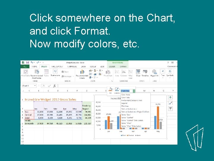
Click somewhere on the Chart, and click Format. Now modify colors, etc.
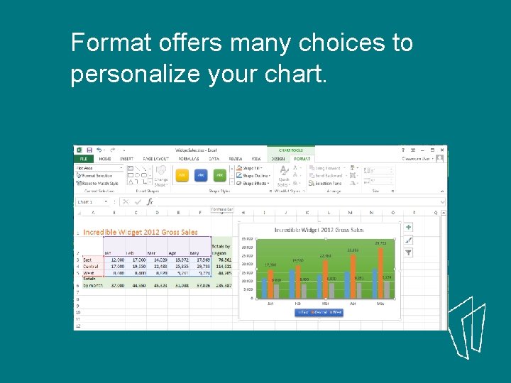
Format offers many choices to personalize your chart.
3) Create a Chart Method #2
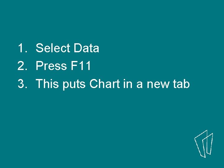
1. Select Data 2. Press F 11 3. This puts Chart in a new tab

3) Create a Chart Method #3
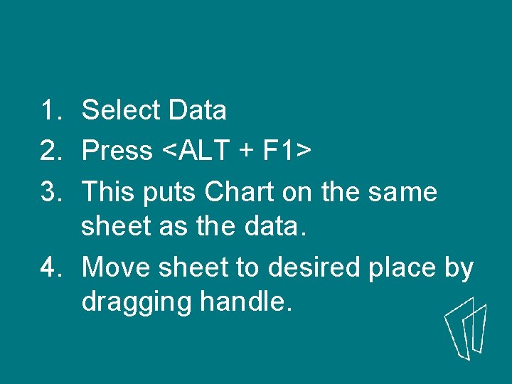
1. Select Data 2. Press <ALT + F 1> 3. This puts Chart on the same sheet as the data. 4. Move sheet to desired place by dragging handle.
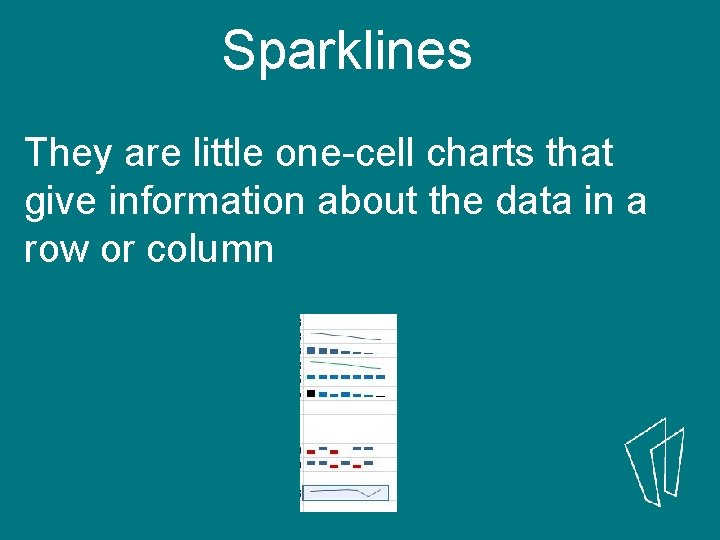
Sparklines They are little one-cell charts that give information about the data in a row or column
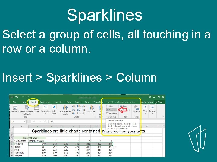
Sparklines Select a group of cells, all touching in a row or a column. Insert > Sparklines > Column
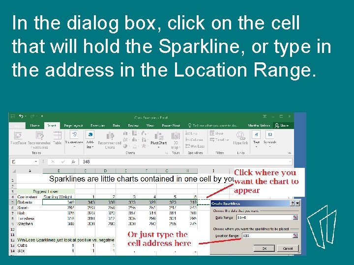
In the dialog box, click on the cell that will hold the Sparkline, or type in the address in the Location Range.
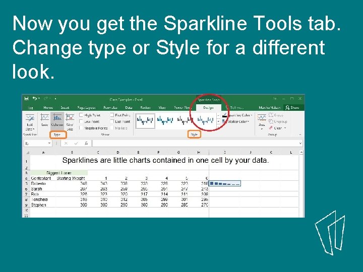
Now you get the Sparkline Tools tab. Change type or Style for a different look.
Put Charts in Word Two main choices: Can keep the chart “live”, so any change to the data will update the chart. Or, can keep a copy of the chart as a picture, unmodifiable.
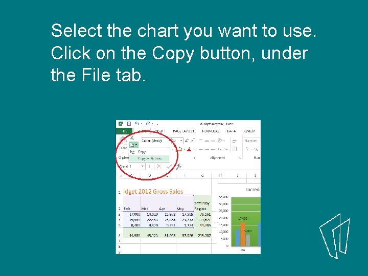
Select the chart you want to use. Click on the Copy button, under the File tab.
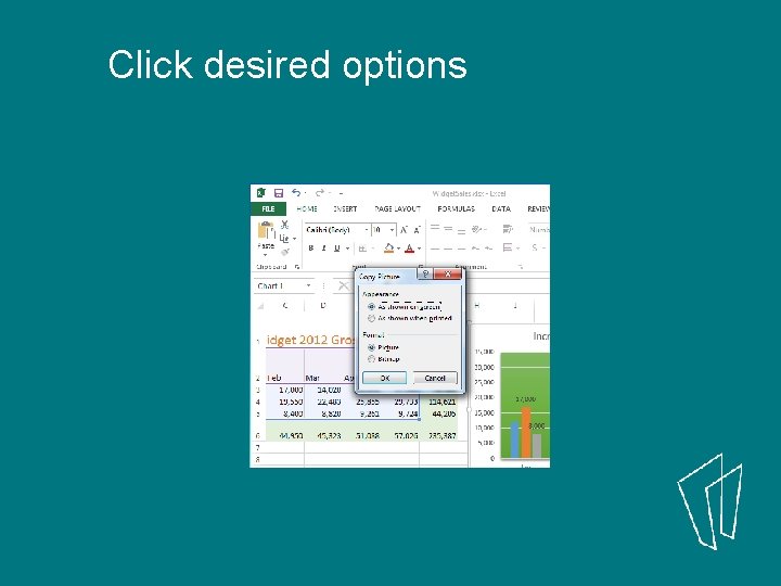
Click desired options

Make ready a Word Doc
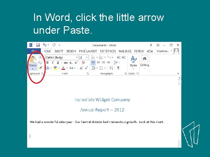
In Word, click the little arrow under Paste.

Thank You Want a copy of this presentation? Visit www. skokielibrary. info/handouts where this presentation will be available for four weeks.
- Slides: 38