Examples of Architecture Principle of Design Rhythm Balance
Examples of Architecture
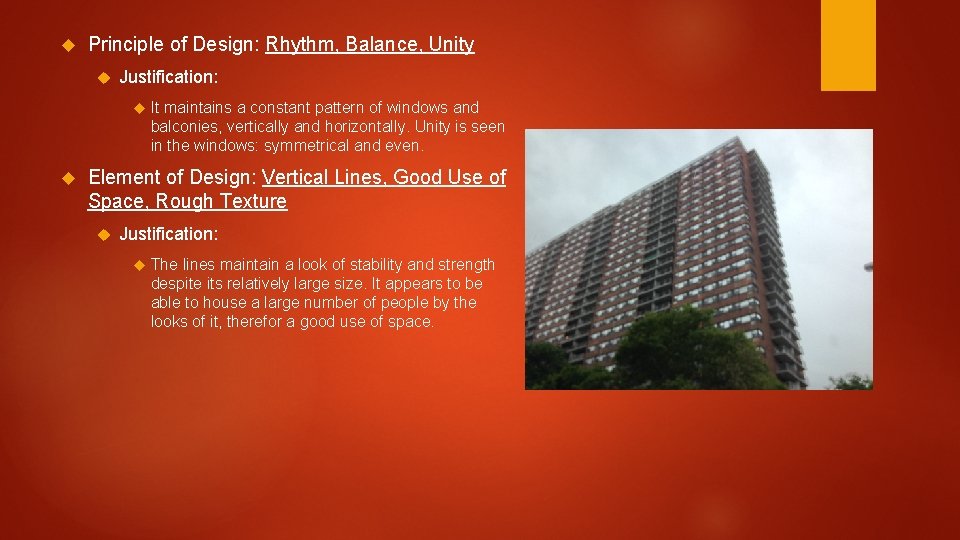
Principle of Design: Rhythm, Balance, Unity Justification: It maintains a constant pattern of windows and balconies, vertically and horizontally. Unity is seen in the windows: symmetrical and even. Element of Design: Vertical Lines, Good Use of Space, Rough Texture Justification: The lines maintain a look of stability and strength despite its relatively large size. It appears to be able to house a large number of people by the looks of it, therefor a good use of space.
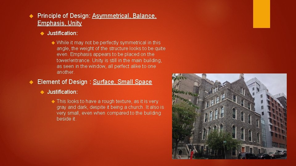
Principle of Design: Asymmetrical, Balance, Emphasis, Unity Justification: While it may not be perfectly symmetrical in this angle, the weight of the structure looks to be quite even. Emphasis appears to be placed on the tower/entrance. Unity is still in the main building, as seen in the window, all perfect alike to one another. Element of Design : Surface, Small Space Justification: This looks to have a rough texture, as it is very gray and dark, despite it being a church. It also is very small, even when compared to the building beside it.
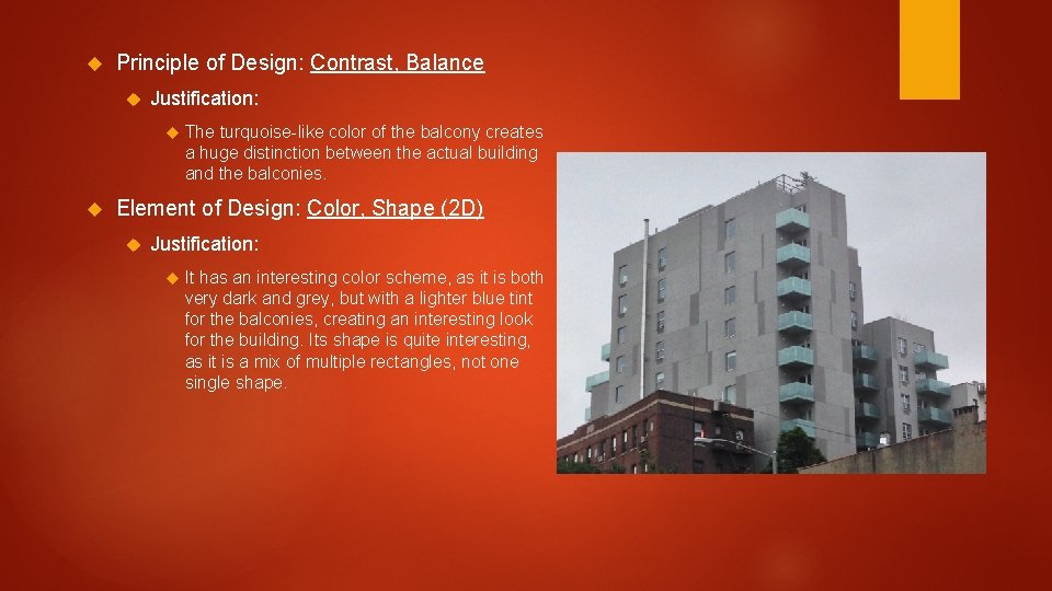
Principle of Design: Contrast, Balance Justification: The turquoise-like color of the balcony creates a huge distinction between the actual building and the balconies. Element of Design: Color, Shape (2 D) Justification: It has an interesting color scheme, as it is both very dark and grey, but with a lighter blue tint for the balconies, creating an interesting look for the building. Its shape is quite interesting, as it is a mix of multiple rectangles, not one single shape.
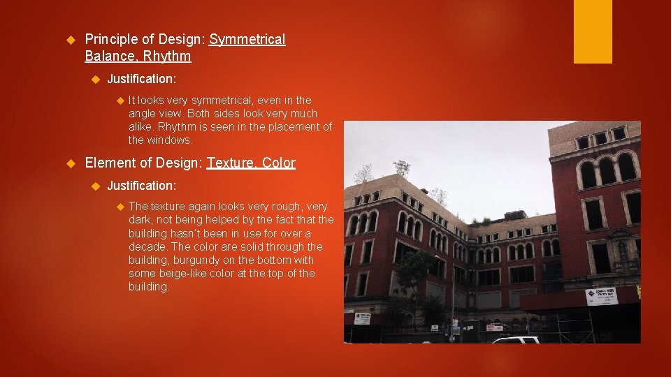
Principle of Design: Symmetrical Balance, Rhythm Justification: It looks very symmetrical, even in the angle view. Both sides look very much alike. Rhythm is seen in the placement of the windows. Element of Design: Texture, Color Justification: The texture again looks very rough, very dark, not being helped by the fact that the building hasn’t been in use for over a decade. The color are solid through the building, burgundy on the bottom with some beige-like color at the top of the building.
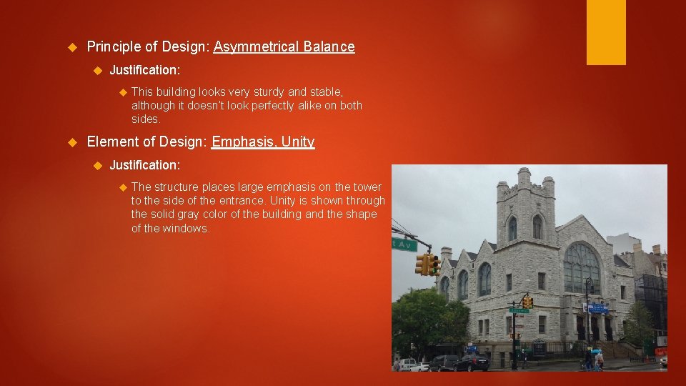
Principle of Design: Asymmetrical Balance Justification: This building looks very sturdy and stable, although it doesn’t look perfectly alike on both sides. Element of Design: Emphasis, Unity Justification: The structure places large emphasis on the tower to the side of the entrance. Unity is shown through the solid gray color of the building and the shape of the windows.

Principle of Design: Rhythm, Emphasis Justification: Although it messes up a bit from the gap between buildings, it still attempts to maintain the pattern of the roof. Emphasis appears to be placed on the design of the triangles and the white borders around certain windows Element of Design: Contrast, Texture Justification: The ivory, burgundy, and green designs on the higher levels of the building are a sharp contrast from the overall beige and bland building. The texture looks mostly rough with the exception of the white borders surrounding the windows.
Conclusion In what way do certain elements or principles identify the time period in which a structure was created? They show the artistic process of the time period, and that can vary between eras. What factors might account for an incorrect identification? Unclear factors such as the minor details on a roof, age of the paint, etc. Describe an example of a way that design principles and elements could impact the function of a building. It could prove more costly to build but could possibly accommodate more people without costing so much space to build.
- Slides: 8