Eurostat Getting the Picture Right What does right
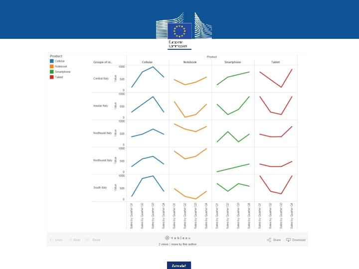

- Slides: 50

Eurostat

Getting the Picture Right What does «right» mean? 1. Conceptual? Point of view 2. Perceptual? 3. Graphic? 4. Politically? Eurostat

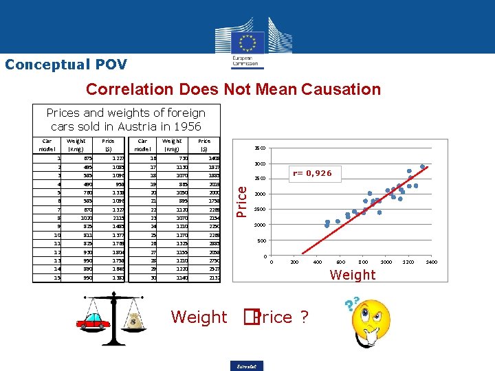
Conceptual POV Correlation Does Not Mean Causation Prices and weights of foreign cars sold in Austria in 1956 1 2 3 4 5 6 7 8 9 10 11 12 13 14 15 Weight (Kmg) 675 495 585 490 760 585 670 1020 825 811 825 930 950 890 950 Price ($) 1227 1085 1096 958 1338 1096 1327 2115 1485 1377 1769 1804 1758 1646 1381 Car Weight model (Kmg) 16 730 17 1130 18 1070 19 865 20 1050 21 895 22 1120 23 1070 24 1210 25 1270 26 1325 27 1155 28 1210 29 1220 30 1140 Price ($) 1408 1827 1885 2019 2000 1758 2269 2154 2250 2269 2885 2058 2750 2527 2132 Weight 3500 3000 r= 0, 926 2500 Price Car model 2000 1500 1000 500 0 0 200 400 600 800 Weight �Price Eurostat ? 1000 1200 1400

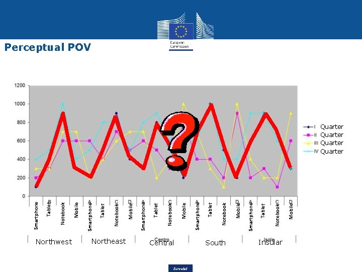
Northwest Northeast Central Eurostat South Insular Mobile Notebook Tablet Smartphone Mobile Notebook Tablet Smartphone Perceptual POV Quarter

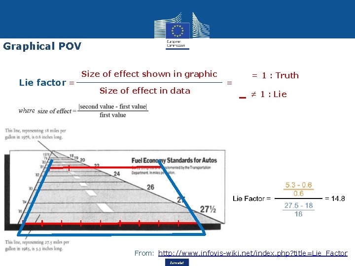
Graphical POV Lie factor = Size of effect shown in graphic Size of effect in data = = 1 : Truth ≠ 1 : Lie where From: http: //www. infovis-wiki. net/index. php? title=Lie_Factor Eurostat

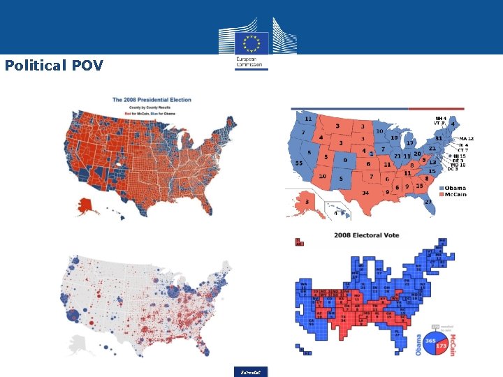
Political POV Eurostat

Outline Introduction Visual cognition process Graphic information processing Big Data visualization Storytelling Eurostat

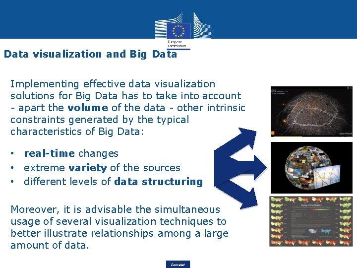
Data visualization and Big Data Implementing effective data visualization solutions for Big Data has to take into account - apart the volume of the data - other intrinsic constraints generated by the typical characteristics of Big Data: • real-time changes • extreme variety of the sources • different levels of data structuring Moreover, it is advisable the simultaneous usage of several visualization techniques to better illustrate relationships among a large amount of data. Eurostat

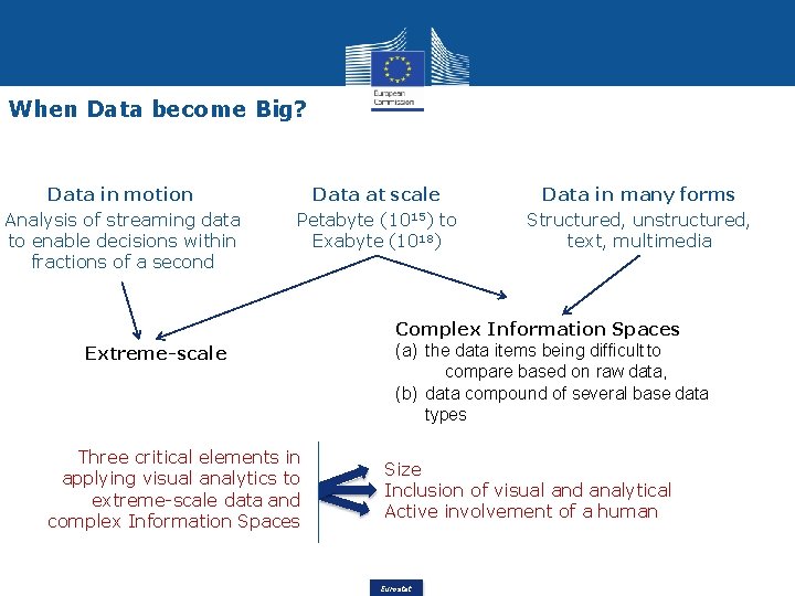
When Data become Big? Data in motion Analysis of streaming data to enable decisions within fractions of a second Data at scale Petabyte (1015) to Exabyte (1018) Extreme-scale Three critical elements in applying visual analytics to extreme-scale data and complex Information Spaces Data in many forms Structured, unstructured, text, multimedia Complex Information Spaces (a) the data items being difficult to compare based on raw data, (b) data compound of several base data types Size Inclusion of visual and analytical Active involvement of a human Eurostat

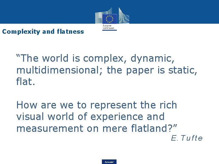
Complexity and flatness “The world is complex, dynamic, multidimensional; the paper is static, flat. How are we to represent the rich visual world of experience and measurement on mere flatland? ” E. T u f t e Eurostat

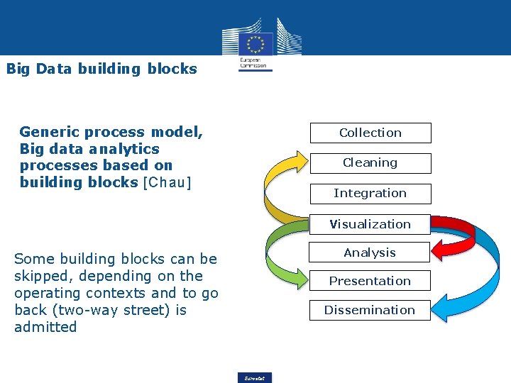
Big Data building blocks Generic process model, Big data analytics processes based on building blocks [Chau] Collection Cleaning Integration Visualization Analysis Some building blocks can be skipped, depending on the operating contexts and to go back (two-way street) is admitted Presentation Dissemination Eurostat

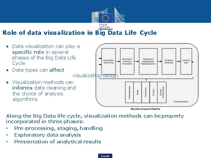
Role of data visualization in Big Data Life Cycle • Data visualization can play a specific role in several phases of the Big Data Life Cycle • Data types can affect visualization design • Visualization methods can informs data cleaning and the choice of analysis algorithms Along the Big Data life cycle, visualization methods can be properly incorporated in three phases: • Pre-processing, staging, handling • Exploratory data analysis • Presentation of analytical results Eurostat

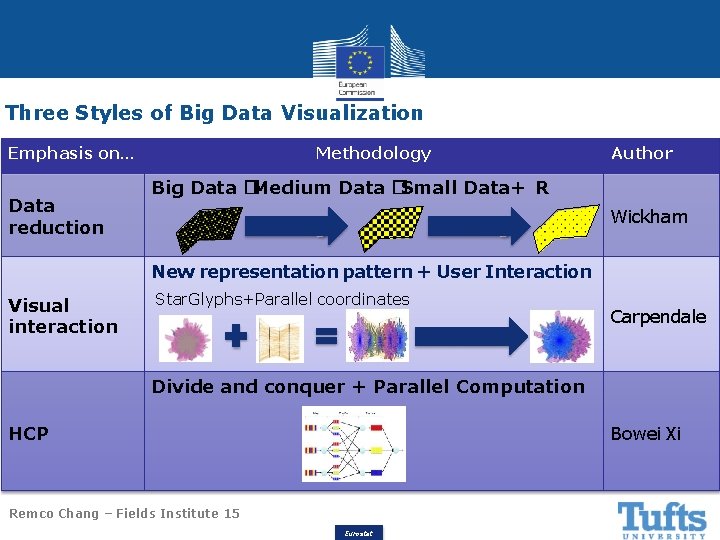
Three Styles of Big Data Visualization Emphasis on… Data reduction Methodology Author Big Data �Medium Data �Small Data+ R Filtering Wickham New representation pattern + User Interaction Visual interaction Star. Glyphs+Parallel coordinates Interaction Carpendale Divide and conquer + Parallel Computation HCP Bowei Xi Remco Chang – Fields Institute 15 Eurostat

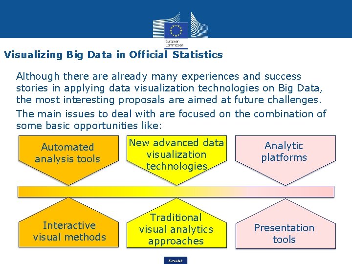
Visualizing Big Data in Official Statistics Although there already many experiences and success stories in applying data visualization technologies on Big Data, the most interesting proposals are aimed at future challenges. The main issues to deal with are focused on the combination of some basic opportunities like: Automated analysis tools New advanced data visualization technologies Analytic platforms Interactive visual methods Traditional visual analytics approaches Presentation tools Eurostat

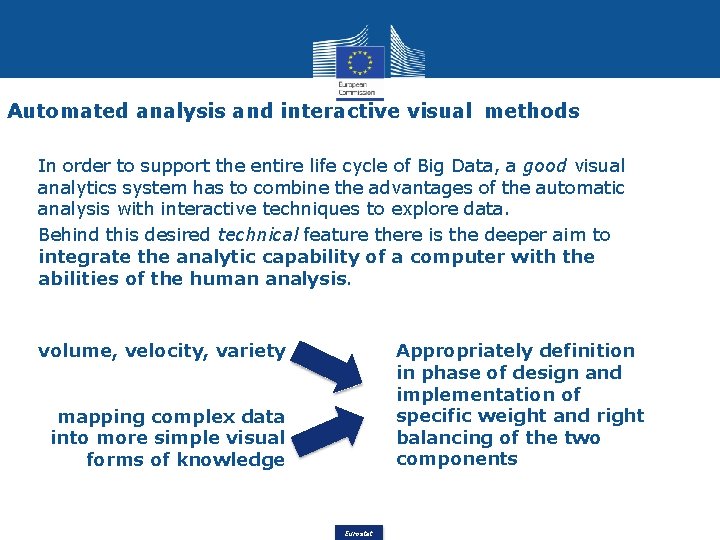
Automated analysis and interactive visual methods In order to support the entire life cycle of Big Data, a good visual analytics system has to combine the advantages of the automatic analysis with interactive techniques to explore data. Behind this desired technical feature there is the deeper aim to integrate the analytic capability of a computer with the abilities of the human analysis. volume, velocity, variety Appropriately definition in phase of design and implementation of specific weight and right balancing of the two components mapping complex data into more simple visual forms of knowledge Eurostat

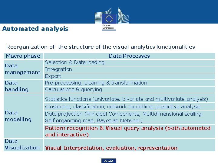
Automated analysis Reorganization of the structure of the visual analytics functionalities Macro phase Data Processes Selection & Data loading Data Integration management Export Data Pre-processing, cleaning & transformation handling Calculations & querying Statistics functions (univariate, bivariate and multivariate analysis) Clustering, classification, network modelling, predictive analysis Data modelling Data projection (Principal Components, Multidimensional scaling, Self organizing map, Bayesian Network) Pattern recognition & Visual query analysis (both automated and interactive) Data Visualization Visual Interpretation, evaluation, representation Eurostat

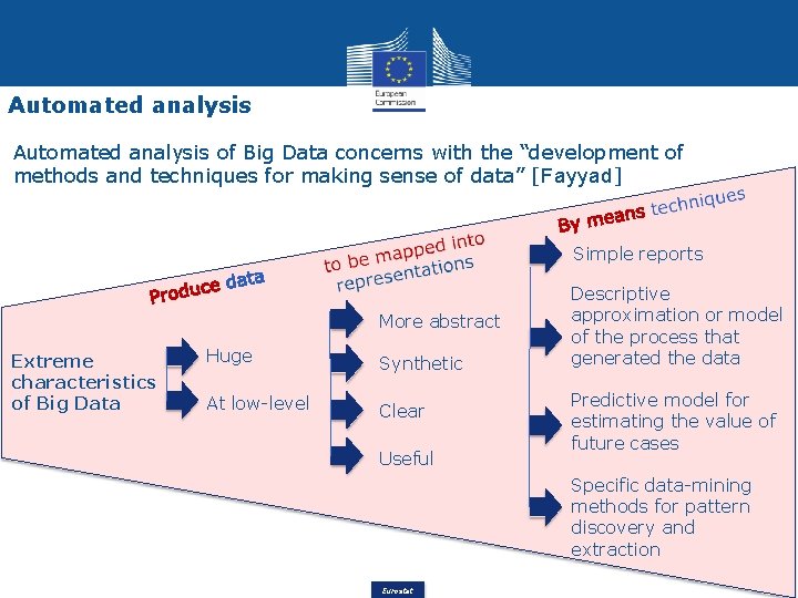
Automated analysis of Big Data concerns with the “development of methods and techniques for making sense of data” [Fayyad] Simple reports More abstract Extreme characteristics of Big Data Huge Synthetic At low-level Clear Useful Descriptive approximation or model of the process that generated the data Predictive model for estimating the value of future cases Specific data-mining methods for pattern discovery and extraction Eurostat

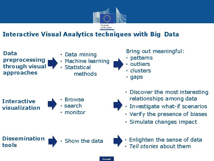
Interactive Visual Analytics techniques with Big Data • Data mining • Machine learning • Statistical methods Bring out meaningful: • patterns • outliers • clusters • gaps Interactive visualization • Browse • search • monitor • Discover the most interesting relationships among data • Investigate what-if scenarios • Verify the presence of biases • Simulate changes impact Dissemination tools • Show the data • Enlighten the sense of data • Tell stories about them Data preprocessing through visual approaches Eurostat

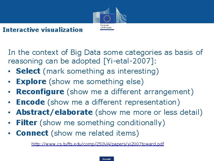
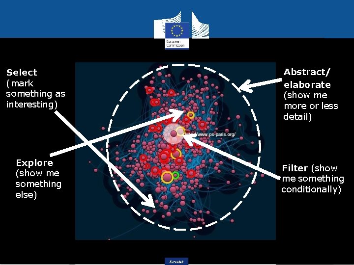
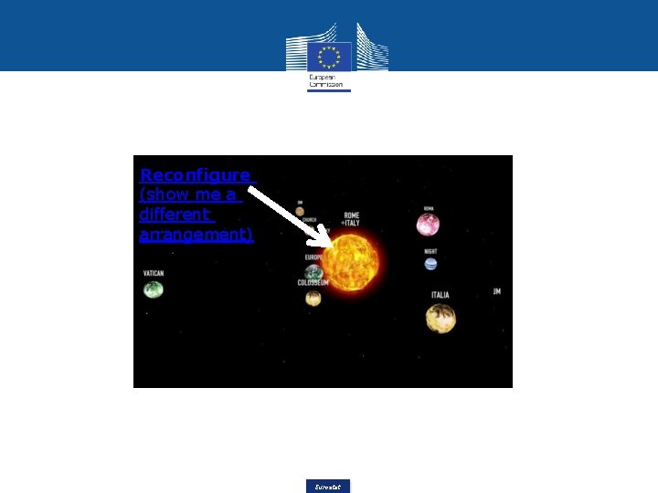
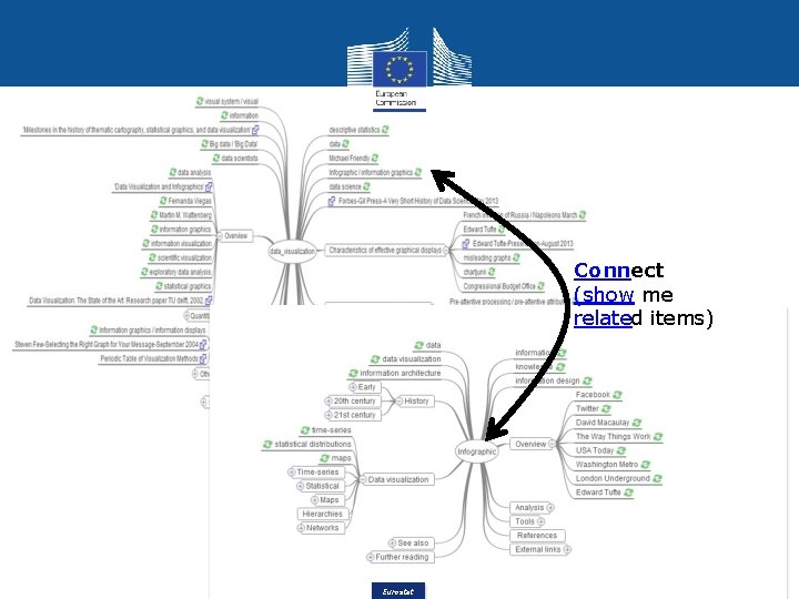
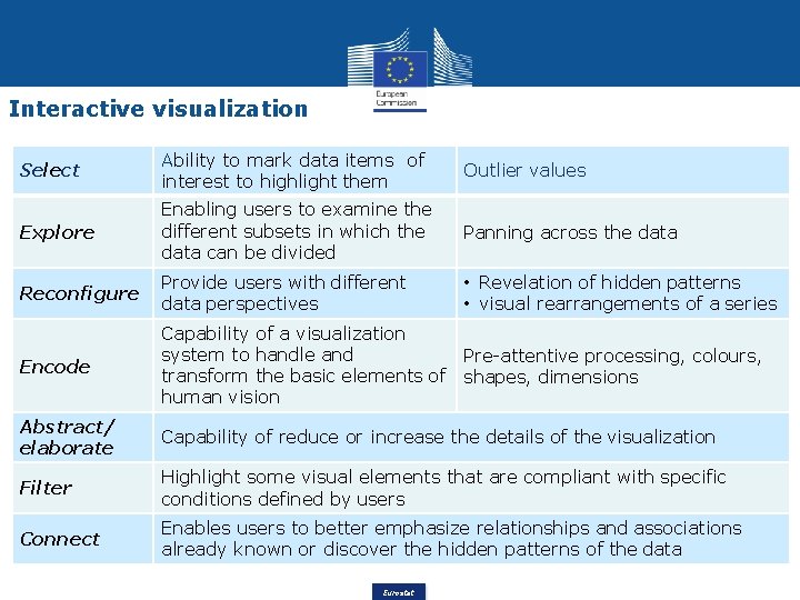
Interactive visualization In the context of Big Data some categories as basis of reasoning can be adopted [Yi-etal-2007]: • Select (mark something as interesting) • Explore (show me something else) • Reconfigure (show me a different arrangement) • Encode (show me a different representation) • Abstract/elaborate (show me more or less detail) • Filter (show me something conditionally) • Connect (show me related items) http: //www. cs. tufts. edu/comp/250 VA/papers/yi 2007 toward. pdf Eurostat

Abstract/ elaborate (show me more or less detail) Select (mark something as interesting) Explore (show me something else) Filter (show me something conditionally) Eurostat

Reconfigure (show me a different arrangement) Eurostat

Connect (show me related items) Eurostat

Interactive visualization Select Ability to mark data items of interest to highlight them Outlier values Explore Enabling users to examine the different subsets in which the data can be divided Panning across the data Reconfigure Provide users with different data perspectives • Revelation of hidden patterns • visual rearrangements of a series Encode Capability of a visualization system to handle and transform the basic elements of human vision Pre-attentive processing, colours, shapes, dimensions Abstract/ elaborate Capability of reduce or increase the details of the visualization Filter Highlight some visual elements that are compliant with specific conditions defined by users Connect Enables users to better emphasize relationships and associations already known or discover the hidden patterns of the data Eurostat

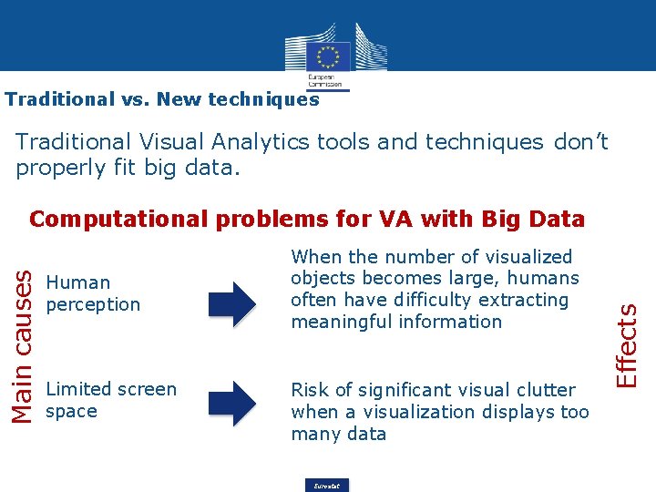
Traditional vs. New techniques Traditional Visual Analytics tools and techniques don’t properly fit big data. Human perception Limited screen space When the number of visualized objects becomes large, humans often have difficulty extracting meaningful information Risk of significant visual clutter when a visualization displays too many data Eurostat Effects Main causes Computational problems for VA with Big Data

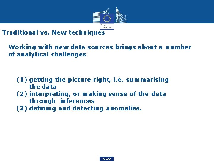
Traditional vs. New techniques Working with new data sources brings about a number of analytical challenges (1) getting the picture right, i. e. summarising the data (2) interpreting, or making sense of the data through inferences (3) defining and detecting anomalies. Eurostat

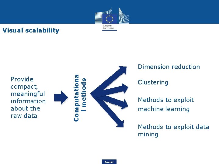
Visual scalability Provide compact, meaningful information about the raw data Computationa l methods Dimension reduction Clustering Methods to exploit machine learning Methods to exploit data mining Eurostat

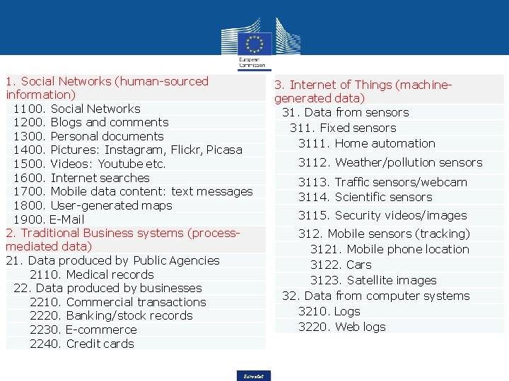
1. Social Networks (human-sourced information) 1100. Social Networks 1200. Blogs and comments 1300. Personal documents 1400. Pictures: Instagram, Flickr, Picasa 1500. Videos: Youtube etc. 1600. Internet searches 1700. Mobile data content: text messages 1800. User-generated maps 1900. E-Mail 2. Traditional Business systems (processmediated data) 21. Data produced by Public Agencies 2110. Medical records 22. Data produced by businesses 2210. Commercial transactions 2220. Banking/stock records 2230. E-commerce 2240. Credit cards Eurostat 3. Internet of Things (machinegenerated data) 31. Data from sensors 311. Fixed sensors 3111. Home automation 3112. Weather/pollution sensors 3113. Traffic sensors/webcam 3114. Scientific sensors 3115. Security videos/images 312. Mobile sensors (tracking) 3121. Mobile phone location 3122. Cars 3123. Satellite images 32. Data from computer systems 3210. Logs 3220. Web logs

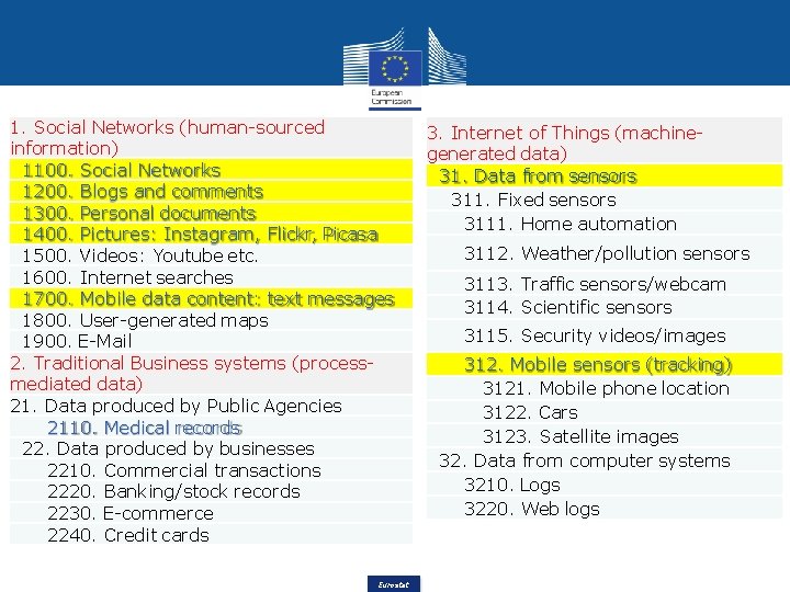
1. Social Networks (human-sourced information) 1100. Social Networks 1200. Blogs and comments 1300. Personal documents 1400. Pictures: Instagram, Flickr, Picasa 1500. Videos: Youtube etc. 1600. Internet searches 1700. Mobile data content: text messages 1800. User-generated maps 1900. E-Mail 2. Traditional Business systems (processmediated data) 21. Data produced by Public Agencies 2110. Medical records 22. Data produced by businesses 2210. Commercial transactions 2220. Banking/stock records 2230. E-commerce 2240. Credit cards Eurostat 3. Internet of Things (machinegenerated data) 31. Data from sensors 311. Fixed sensors 3111. Home automation 3112. Weather/pollution sensors 3113. Traffic sensors/webcam 3114. Scientific sensors 3115. Security videos/images 312. Mobile sensors (tracking) 3121. Mobile phone location 3122. Cars 3123. Satellite images 32. Data from computer systems 3210. Logs 3220. Web logs

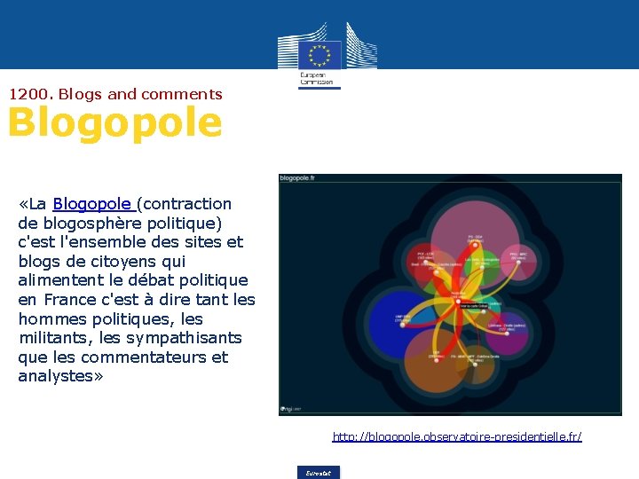
1200. Blogs and comments Blogopole «La Blogopole (contraction de blogosphère politique) c'est l'ensemble des sites et blogs de citoyens qui alimentent le débat politique en France c'est à dire tant les hommes politiques, les militants, les sympathisants que les commentateurs et analystes» http: //blogopole. observatoire-presidentielle. fr/ Eurostat

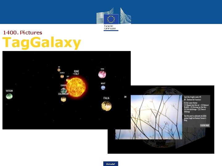
1400. Pictures Tag. Galaxy Eurostat

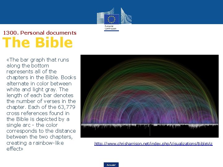
1300. Personal documents The Bible «The bar graph that runs along the bottom represents all of the chapters in the Bible. Books alternate in color between white and light gray. The length of each bar denotes the number of verses in the chapter. Each of the 63, 779 cross references found in the Bible is depicted by a single arc - the color corresponds to the distance between the two chapters, creating a rainbow-like effect» http: //www. chrisharrison. net/index. php/Visualizations/Bible. Viz Eurostat

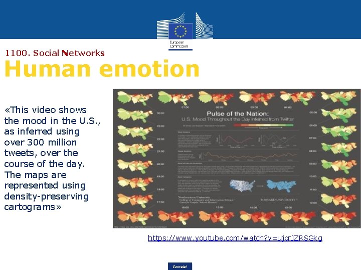
1100. Social Networks Human emotion «This video shows the mood in the U. S. , as inferred using over 300 million tweets, over the course of the day. The maps are represented using density-preserving cartograms» https: //www. youtube. com/watch? v=ujcr. JZRSGkg Eurostat

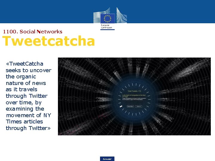
1100. Social Networks Tweetcatcha «Tweet. Catcha seeks to uncover the organic nature of news as it travels through Twitter over time, by examining the movement of NY Times articles through Twitter» Eurostat

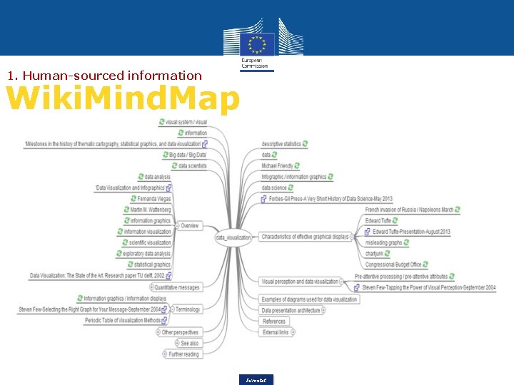
1. Human-sourced information Wiki. Mind. Map Eurostat

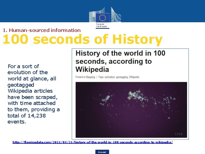
1. Human-sourced information 100 seconds of History For a sort of evolution of the world at glance, all geotagged Wikipedia articles have been scraped, with time attached to them, providing a total of 14, 238 events. http: //flowingdata. com/2011/03/21/history-of-the-world-in-100 -seconds-according-to-wikipedia/ Eurostat

2110. Medical records Human disease network «The diseasome website is a disease/disorder relationships explorer and a sample of an innovative map-oriented scientific work. Built by a team of researchers and engineers, it uses the Human Disease Network dataset and allows intuitive knowledge discovery by mapping its complexity» Eurostat

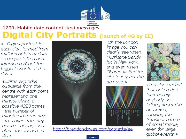
1700. Mobile data content: text messages Digital City Portraits «In the London image you can clearly see when Hurricane Sandy hit in New york, and even when Obama visited the city to inspect the damage. » «…Digital portrait for each city, formed from millions of bits of data as people talked and interacted about the biggest events of the day. » «…time explodes outwards from the centre with each point representing one minute giving a possible 4320 points –the number of minutes in three days –to cover the day before, during and after the launch of 4 G. » (launch of 4 G by EE) http: //brendandawes. com/projects/ee Eurostat «It's also evident that only a day later hardly anybody was talking about the hurricane, showing the transient nature of social media, even for large global events. »

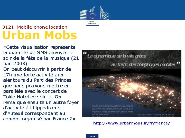
3121. Mobile phone location Urban Mobs «Cette visualisation représente la quantité de SMS envoyés le soir de la fête de la musique (21 juin 2008). On peut découvrir à partir de 17 h une forte activité aux alentours du Parc des Princes que nous pouvons mettre en parallèle avec le concert de Tokio Hotel ce soir là. On remarque ensuite un autre foyer d'activité à l'hippodrome d'Auteuil correspondant au concert organisé par France 2» http: //www. urbanmobs. fr/fr/france/ Eurostat

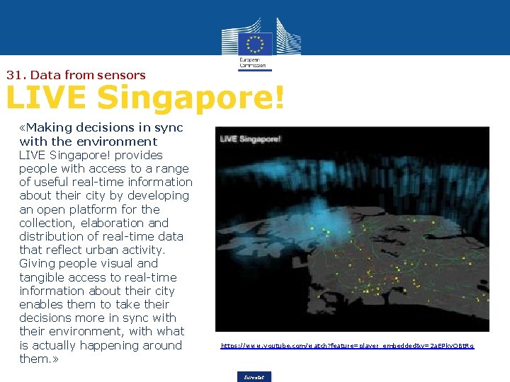
31. Data from sensors LIVE Singapore! «Making decisions in sync with the environment LIVE Singapore! provides people with access to a range of useful real-time information about their city by developing an open platform for the collection, elaboration and distribution of real-time data that reflect urban activity. Giving people visual and tangible access to real-time information about their city enables them to take their decisions more in sync with their environment, with what is actually happening around them. » https: //www. youtube. com/watch? feature=player_embedded&v=2 a. EPky. OBt. Ro Eurostat

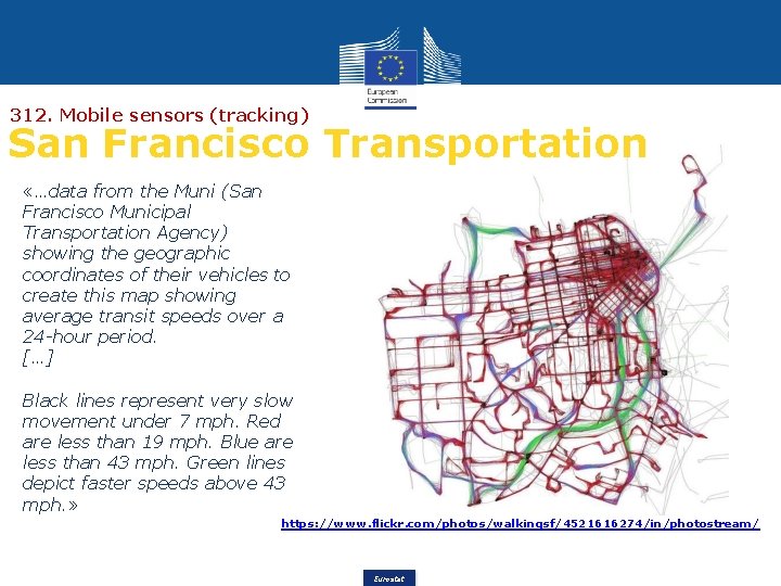
312. Mobile sensors (tracking) San Francisco Transportation «…data from the Muni (San Francisco Municipal Transportation Agency) showing the geographic coordinates of their vehicles to create this map showing average transit speeds over a 24 -hour period. […] Black lines represent very slow movement under 7 mph. Red are less than 19 mph. Blue are less than 43 mph. Green lines depict faster speeds above 43 mph. » https: //www. flickr. com/photos/walkingsf/4521616274/in/photostream/ Eurostat

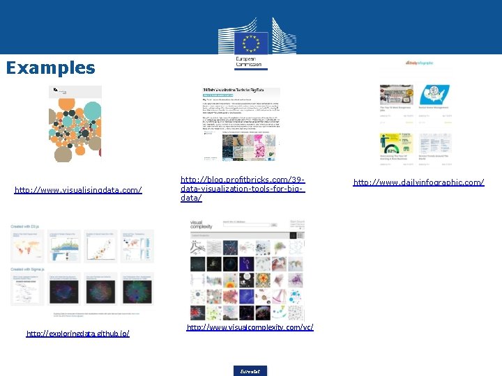
Examples http: //www. visualisingdata. com/ http: //exploringdata. github. io/ http: //blog. profitbricks. com/39 data-visualization-tools-for-bigdata/ http: //www. visualcomplexity. com/vc/ Eurostat http: //www. dailyinfographic. com/

Outline Introduction Visual cognition process Graphic information processing Big Data visualization Storytelling Eurostat

Hints about Storytelling “Narrative or recital of an event, or a series of events whether real or fictitious” New International Webster’s Comprehensive Dictionary (2013 edition) “Programme to make the results of official statistics accessible and understandable to people and – in fulfilment of an information mandate – to make "evidence based decision making" possible. ” Armin Grossenbacher, Federal Statistical Office, Storytelling revisited, 2010 Eurostat

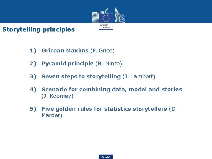
Storytelling principles 1) Gricean Maxims (P. Grice) 2) Pyramid principle (B. Minto) 3) Seven steps to storytelling (J. Lambert) 4) Scenario for combining data, model and stories (J. Koomey) 5) Five golden rules for statistics storytellers (D. Marder) Eurostat

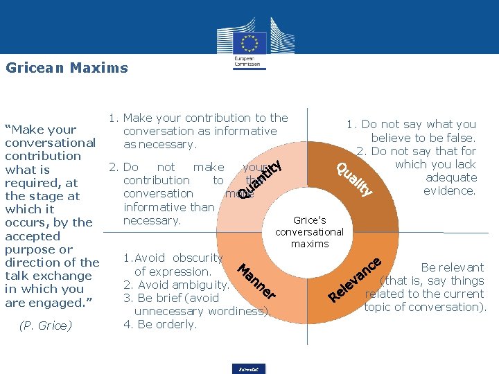
Gricean Maxims 1. Make your contribution to the conversation as informative as necessary. 1. Do not say what you “Make your believe to be false. conversational 2. Do not say that for contribution which you lack 2. Do not make your what is adequate contribution to the required, at evidence. conversation more the stage at informative than which it Grice’s necessary. occurs, by the conversational accepted maxims purpose or 1. Avoid obscurity direction of the Be relevant of expression. talk exchange (that is, say things 2. Avoid ambigu ity. in which you related to the current 3. Be brief (avoid are engaged. ” topic of conversation). unnecessary wordiness). 4. Be orderly. (P. Grice) Eurostat

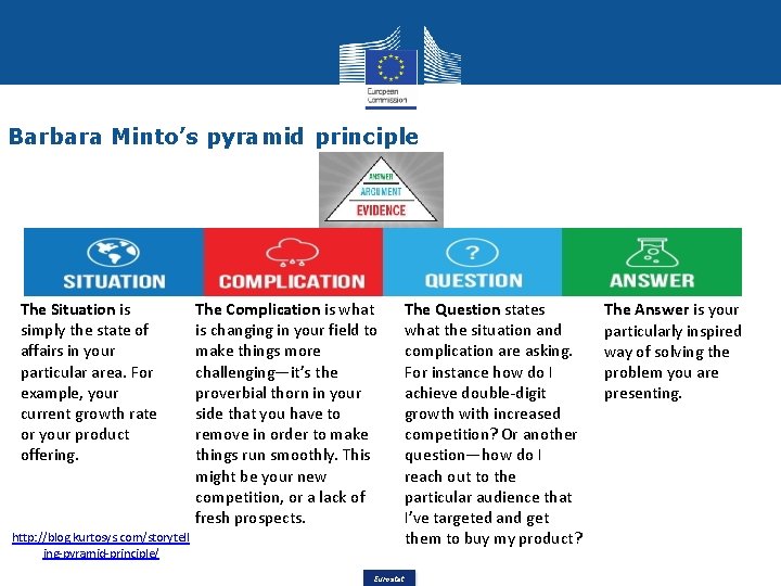
Barbara Minto’s pyramid principle The Situation is simply the state of affairs in your particular area. For example, your current growth rate or your product offering. http: //blog. kurtosys. com/storytell ing-pyramid-principle/ The Complication is what is changing in your field to make things more challenging—it’s the proverbial thorn in your side that you have to remove in order to make things run smoothly. This might be your new competition, or a lack of fresh prospects. The Question states what the situation and complication are asking. For instance how do I achieve double-digit growth with increased competition? Or another question—how do I reach out to the particular audience that I’ve targeted and get them to buy my product? Eurostat The Answer is your particularly inspired way of solving the problem you are presenting.

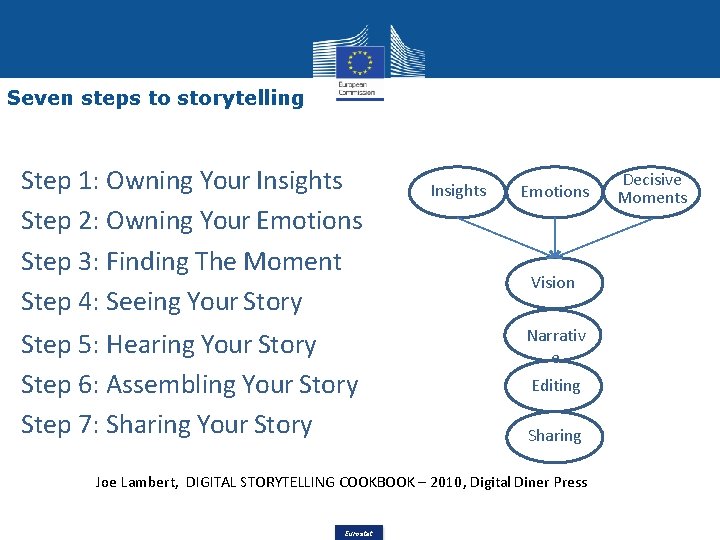
Seven steps to storytelling Step 1: Owning Your Insights Step 2: Owning Your Emotions Step 3: Finding The Moment Step 4: Seeing Your Story Step 5: Hearing Your Story Step 6: Assembling Your Story Step 7: Sharing Your Story Insights Emotions Vision Narrativ e Editing Sharing Joe Lambert, DIGITAL STORYTELLING COOKBOOK – 2010, Digital Diner Press Eurostat Decisive Moments

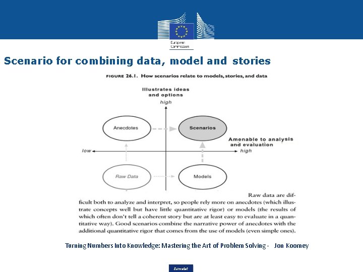
Scenario for combining data, model and stories Turning Numbers Into Knowledge: Mastering the Art of Problem Solving - Jon Koomey Eurostat

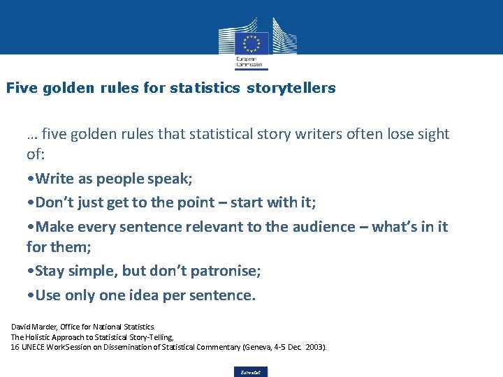
Five golden rules for statistics storytellers … five golden rules that statistical story writers often lose sight of: • Write as people speak; • Don’t just get to the point – start with it; • Make every sentence relevant to the audience – what’s in it for them; • Stay simple, but don’t patronise; • Use only one idea per sentence. David Marder, Office for National Statistics. The Holistic Approach to Statistical Story-Telling, 16 UNECE Work Session on Dissemination of Statistical Commentary (Geneva, 4 -5 Dec. 2003). Eurostat

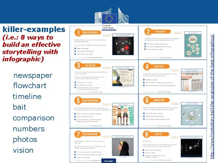
killer-examples http: //www. howtostory. be/killer-examples-of-the-best-infographics/ (i. e. : 8 ways to build an effective storytelling with infographic) newspaper flowchart timeline bait comparison numbers photos vision Eurostat