Ethics in Data Visualization A Visualizing the Future


- Slides: 36

Ethics in Data Visualization A Visualizing the Future Module

Intro Question What has made a problematic chart for you in the past? When you have seen a problematic chart, what has been the problem? What are some past problems you’ve seen in charts? When has a chart made you question its validity? [if you can’t think of anything problematic…] How did you learn about a problematic design technique? tinyurl. com/0521 vizandtell

Learning Objectives ● List the five steps in the data visualization creation process: select topic, problem, or question; acquire data; clean data; analyze data; create the visualization ● Understand how decisions in the steps up to data visualization can affect the final visualization ● Identify common sources of bias in the data visualization process ● Practice ethics-centered data visualization design

Defining ethics “a set of moral principles, especially ones relating to or affirming a specified group, field, or form of conduct. ” (OED)

Data Is Not Neutral

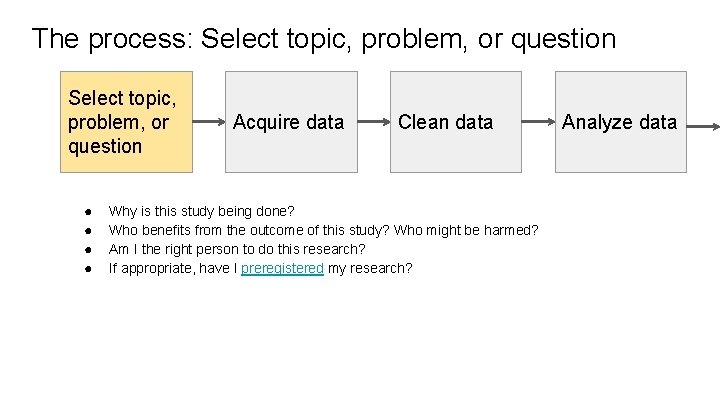
The process: Select topic, problem, or question ● ● Acquire data Clean data Why is this study being done? Who benefits from the outcome of this study? Who might be harmed? Am I the right person to do this research? If appropriate, have I preregistered my research? Analyze data

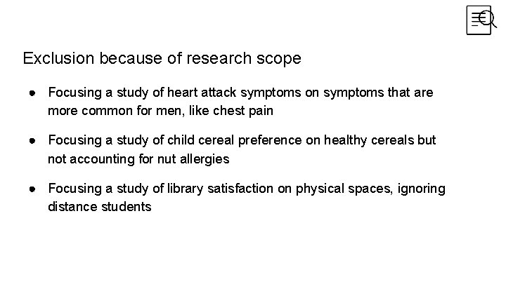
Exclusion because of research scope ● Focusing a study of heart attack symptoms on symptoms that are more common for men, like chest pain ● Focusing a study of child cereal preference on healthy cereals but not accounting for nut allergies ● Focusing a study of library satisfaction on physical spaces, ignoring distance students

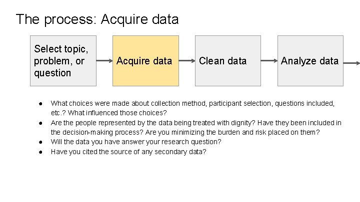
The process: Acquire data Select topic, problem, or question ● ● Acquire data Clean data Analyze data What choices were made about collection method, participant selection, questions included, etc. ? What influenced those choices? Are the people represented by the data being treated with dignity? Have they been included in the decision-making process? Are you minimizing the burden and risk placed on them? Will the data you have answer your research question? Have you cited the source of any secondary data?

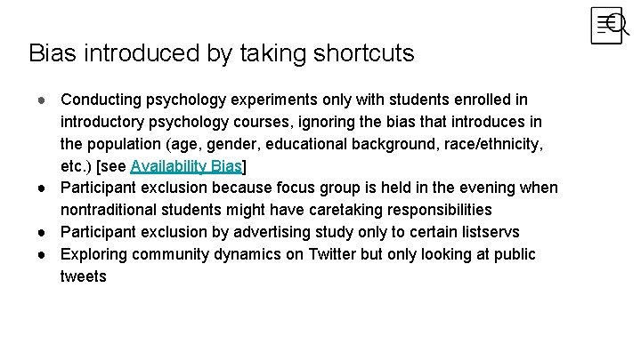
Bias introduced by taking shortcuts ● Conducting psychology experiments only with students enrolled in introductory psychology courses, ignoring the bias that introduces in the population (age, gender, educational background, race/ethnicity, etc. ) [see Availability Bias] ● Participant exclusion because focus group is held in the evening when nontraditional students might have caretaking responsibilities ● Participant exclusion by advertising study only to certain listservs ● Exploring community dynamics on Twitter but only looking at public tweets

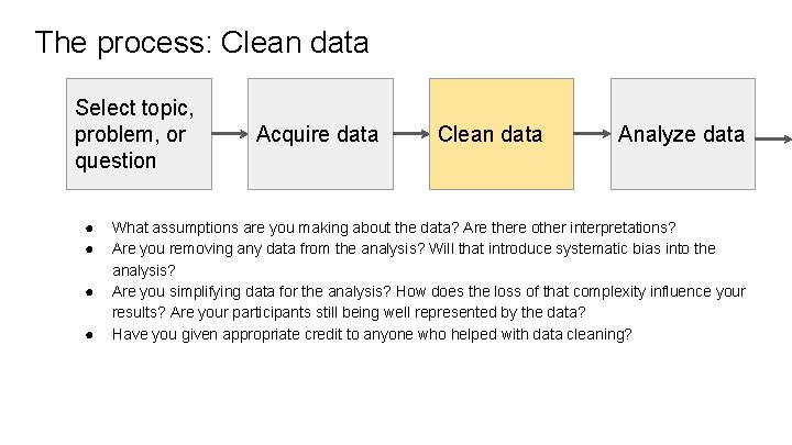
The process: Clean data Select topic, problem, or question ● ● Acquire data Clean data Analyze data What assumptions are you making about the data? Are there other interpretations? Are you removing any data from the analysis? Will that introduce systematic bias into the analysis? Are you simplifying data for the analysis? How does the loss of that complexity influence your results? Are your participants still being well represented by the data? Have you given appropriate credit to anyone who helped with data cleaning?

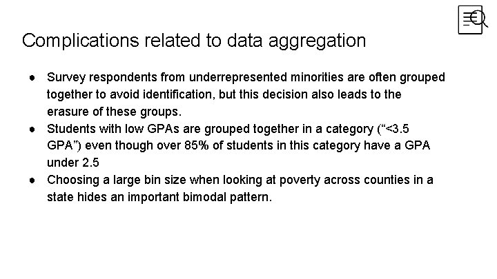
Complications related to data aggregation ● Survey respondents from underrepresented minorities are often grouped together to avoid identification, but this decision also leads to the erasure of these groups. ● Students with low GPAs are grouped together in a category (“<3. 5 GPA”) even though over 85% of students in this category have a GPA under 2. 5 ● Choosing a large bin size when looking at poverty across counties in a state hides an important bimodal pattern.

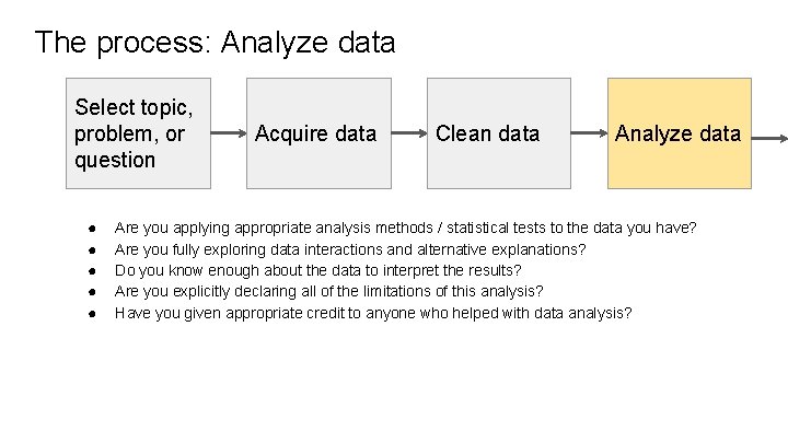
The process: Analyze data Select topic, problem, or question ● ● ● Acquire data Clean data Analyze data Are you applying appropriate analysis methods / statistical tests to the data you have? Are you fully exploring data interactions and alternative explanations? Do you know enough about the data to interpret the results? Are you explicitly declaring all of the limitations of this analysis? Have you given appropriate credit to anyone who helped with data analysis?

Bias introduced by assumptions ● Misunderstanding a hashtag that is meant to indicate sarcasm and, thus, coding a series of tweets as having positive sentiment instead of negative ● Ignoring gender because it wasn’t expected to be an issue, only later to realize that there was an issue with sexual harassment in the survey population ● Seeing an anomalous 50% drop in counts as a data collection problem, when really there was a global pandemic that year

Accounting for these decisions in our final visualization ● Create the visualization ● ● ● Ask these questions of collaborators or yourself if you’ve been completing all the steps in the process. Show the process Give credit Fill in personal knowledge gaps by consulting literature, subject experts, and, if human-subject data is involved, work put out by members of the community being visualized

Ethical decisions when visualizing data ● Create the visualization ● ● ● What are we selecting and emphasizing? How can we show these decisions? (Ozeran, 2019) How are the aesthetics affecting the tone of the visualization? (Ozeran, 2019) “What values are you espousing in your visualization? Do they support or conflict with other values? ” (Cogley, 2020) Are you naturalizing or challenging a broader worldview? (Naerland, 2020)

Know Your Audience ● Both intended and unintended ● Conscious of historical context and what may come after (datapractices. org) ○ People can feel recognized, misrecognized, and unrecognized in data visualization (Naerland, 2020) ● Work towards increasing benefit and preventing harm (datapractices. org) ● What gaps might our audience have and what narrative needs to be added? (Cogley, 2018 a) ● Does the visualization empower the audience? (D’Ignazio & Klein, 2016)

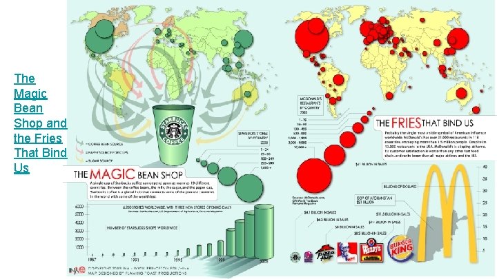
The Fries that Bind Us and The Magic Bean Shop

The Magic Bean Shop and the Fries That Bind Us

Reflection (small group) What is one strategy you will (or already do) use to center ethics in the data visualization process?

Mapping Census (ACS) Data Activity Based on Hepworth & Church, 2018

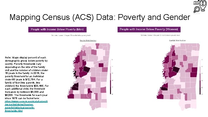
Mapping Census (ACS) Data: Poverty and Gender Note: Maps display percent of each demographic group below poverty by county. Poverty thresholds vary depending on the size of the family unit and the number of children under 18 years in the family. In 2018, the poverty threshold for an individual under 65 years is $12, 784. For a family of four (two parents, two children) the threshold is $25, 465. For each additional child, the threshold increases by between $3, 000 and $5, 000. The thresholds for each year since 1978 can be found here: https: //www. census. gov/data/tables/ti me-series/demo/incomepoverty/historical-povertythresholds. html

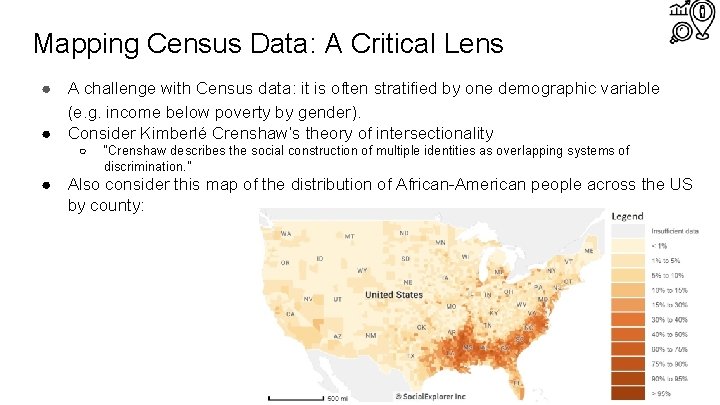
Mapping Census Data: A Critical Lens ● A challenge with Census data: it is often stratified by one demographic variable (e. g. income below poverty by gender). ● Consider Kimberlé Crenshaw’s theory of intersectionality ○ “Crenshaw describes the social construction of multiple identities as overlapping systems of discrimination. ” ● Also consider this map of the distribution of African-American people across the US by county:

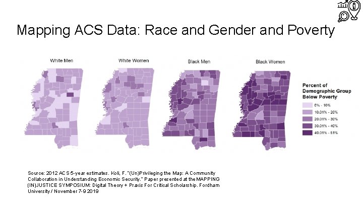
Challenging Assumptions ● Did we know enough about the history of Mississippi to be able to interpret the relationship between poverty and gender? ● Should the map creator(s) have investigated the intersection of race and gender as it relates to poverty in Mississippi? ● Examining positionality: Who is benefitting from this work? ● “Mapping inequality is not impactful in and of itself. Must continuously ask ourselves: are our practices creating the knowledge by which communities can build power? ” (Koli 2019)

Mapping ACS Data: Race and Gender and Poverty Source: 2012 ACS 5 -year estimates. Koli, F. “(Un)Privileging the Map: A Community Collaboration in Understanding Economic Security. ” Paper presented at the MAPPING (IN)JUSTICE SYMPOSIUM: Digital Theory + Praxis For Critical Scholarship. Fordham University / November 7 -9 2019

Redesigning Economist Charts Group Activity

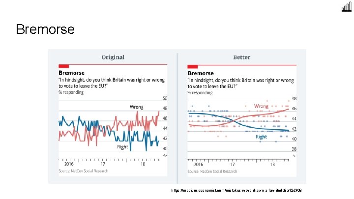
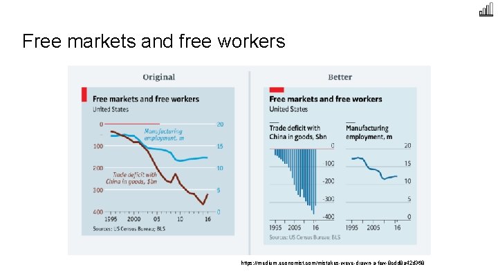
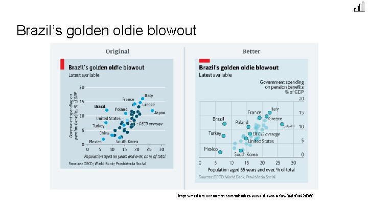
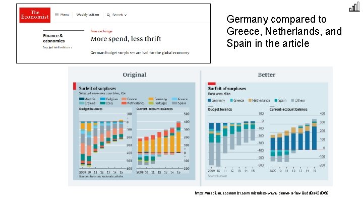
Redesigning Economist Charts Group Activity Instructions ● Split class into groups of 2 -4 people ● Each group will receive a chart ● Answer the following questions about the chart: ○ ○ ○ What message is the chart trying to get across? What is misleading about this chart or preventing the message from getting across? With the above questions in mind, how would you redesign the chart? Sketch out or use your preferred visualization software to redesign the chart. ● Share redesigns and discuss.

What were the solutions from The Economist?

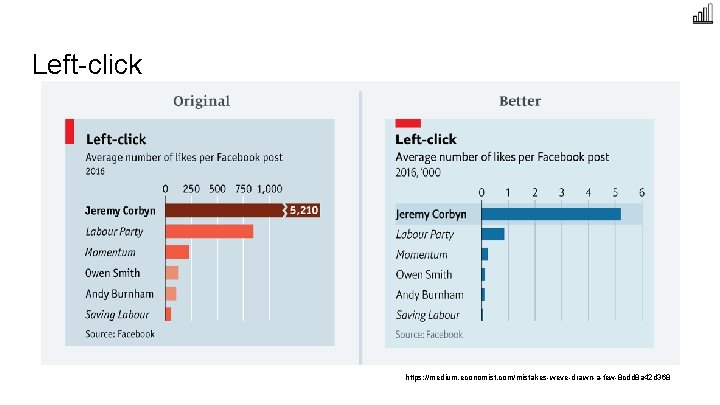
Left-click https: //medium. economist. com/mistakes-weve-drawn-a-few-8 cdd 8 a 42 d 368

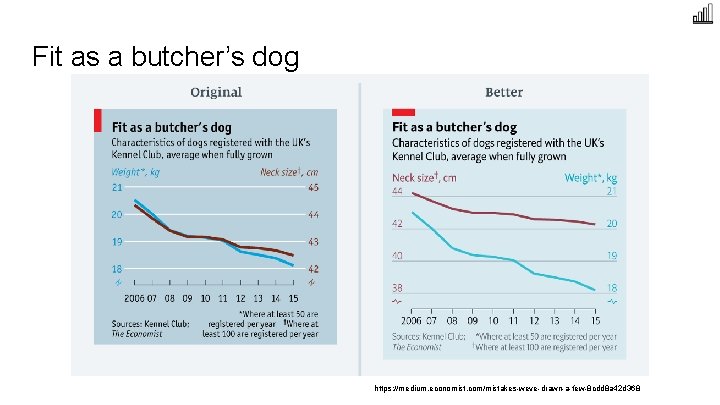
Fit as a butcher’s dog https: //medium. economist. com/mistakes-weve-drawn-a-few-8 cdd 8 a 42 d 368

Bremorse https: //medium. economist. com/mistakes-weve-drawn-a-few-8 cdd 8 a 42 d 368

Free markets and free workers https: //medium. economist. com/mistakes-weve-drawn-a-few-8 cdd 8 a 42 d 368

Brazil’s golden oldie blowout https: //medium. economist. com/mistakes-weve-drawn-a-few-8 cdd 8 a 42 d 368

Germany compared to Greece, Netherlands, and Spain in the article https: //medium. economist. com/mistakes-weve-drawn-a-few-8 cdd 8 a 42 d 368

References ● ● ● ● Barrowman, N. (2018). Why data is never raw. New Atlantis 56: 129 -135. Cogley, B. (2018, October 29). From headlines to headway - Tableau conference data ethics presentation. Tableau. Fit. Retrieved from: https: //www. tableaufit. com/from-headlines-to-headway-tableau-conference-data-ethics-presentation/ Cogley, B. (2018, November 28). The quantified life and data ethics: Thinking beyond privacy. Tableau. Fit. Retrieved from: https: //www. tableaufit. com/the-quantified-life-and-data-ethics-thinking-beyond-privacy/ Cogley, B. (2019, September 5). How we collect data matters. Tableau. Fit. Retrieved from: https: //www. tableaufit. com/how-wecollect-data-matters/ Cogley, B. (2020, March 30). The ethics of visualizing during a pandemic. Tableau. Fit. Retrieved from: https: //www. tableaufit. com/the-ethics-of-visualizing-during-a-pandemic/ D’Ignazio, C. , & Klein, L. F. (2016). Feminist data visualization. In Workshop on Visualization for The Digital Humanities (VIS 4 DH), Baltimore. IEEE. Retrieved from: http: //vis 4 dh. dbvis. de/papers/2016/Feminist Data Visualization. pdf Datapractices. org Drucker, J. (2011). Humanities approaches to graphical display. Digital Humanities Quarterly 5(1). Retrieved from: http: //www. digitalhumanities. org/dhq/vol/5/1/000091. html Hall, P. (2008). Critical Visualization. In Design and the Elastic Mind, edited by Paola Antonelli. 122 -131. New York: Museum of Modern Art. Hepworth, K. , & Church, C. (2018). Racism in the machine: Visualization ethics in digital humanities projects. Digital Humanities Quarterly 12(4). Retrieved from: http: //www. digitalhumanities. org/dhq/vol/12/4/000408. html Naerland, T. U. (2020). The political significance of data visualization: Four key perspectives. In Data Visualization in Society, ed. M. Engebretsen & H. Kennedy. Amsterdam: Amsterdam University Press. doi: 10. 5117/9789463722902_ch 04 Ozeran, M. (2019). Ethics of data visualization. Position statement for Visualizing the Future Symposium. Quinn, M. J. (2013). Ethics for the Information Age. Upper Saddle River, NJ: Pearson.

Icons ● ● ● case study by Tomas Knopp from the Noun Project demographic by Nithinan Tatah from the Noun Project chart by Setyo Ari Wibowo from the Noun Project

Questions?