EQ How do we construct dot plots and

")


- Slides: 19
EQ: How do we construct dot plots and histograms? How are they used to compare data? Standard: MCC 9‐ 12. S. ID. 1 Represent data with plots on the real number line (dot plots, histograms, and box plots).
What is a dot plot? • A dot plot (sometimes called a line plot) is a graph that uses a number line to show the frequency of data. • It helps to get a clearer understanding of a small number of observations.
Dot Plots Outlier a data point whose value is significantly greater than or less than other values Cluster an isolated group of points Gap Mode a large space between data points data value(s) that occur most often. Slide 10. 1‐ 3
Dot Plot • Step 1 The first step is to take these data values and put them in order from least to greatest. • Step 2 Create a number line that is equally spaced and contains all the data. • Step 3 Put dots above the numbers to show the data for the variable.
Dot Plots • Suppose the 30 students in Abel’s class received the following test scores: Slide 10. 1‐ 5
Dot Plots • A dot plot for the class scores consists of a horizontal number line on which each score is denoted by a dot, or an x, above the corresponding number‐line value. The number of x’s above each score indicates how many times each score occurred. Slide 10. 1‐ 6
Dot plots Two students scored 72. Four students scored 82. The score 52 is an outlier A gap occurs between scores 88 and 97. Scores 97 and 98 form a cluster Slide 10. 1‐ 7
Let’s Do an Example Together… • We’ll use the data from the temperatures every day for the month of August. There are 31 days in August, and here are the temperatures for that month: August 76 82 83 90 93 85 78 75 71 71 72 69 70 75 77 83 85 82 80 81 77 76 78 74 72 73 77 77 76 77 72
~Step One~ • There are 31 days in August, and here are the temperatures for that month: August 76 82 83 90 93 85 78 75 71 71 72 69 70 75 77 83 85 82 80 81 77 76 78 74 72 73 77 77 76 77 72 • The first step is to take these data values and put them in order from least to greatest. ‐ Example: 69 70 71 71 72 72 72 73 74 75 75 76 76 76 77 77 77 78 78 80 81 82 82 83 83 85 85 90 93
~Step Two~ • Create a number line that is equally spaced and contains all the data. • A good scale to use for this problem is a number line that increases in increments of 5.
~Step Three~ • Put dots above the numbers to show the data for the variable. ‐Example: The first data point is 69 degrees Fahrenheit, so a dot is placed above the number line at 69. Continue until all the data for the daily August temperatures has been recorded.
~Final Product~ • You have just completed your own line plot! Here's what it should look like: • Can you figure out the mode? What about the coolest temperature in August and the warmest temperature?
~Final Touches~ • You have just created a line plot, but there are still two details needed to complete it. They are a title and a key. Title You need to choose a title that will explain what your line plot is about. A good title for this plot might be "Temperatures for August. " Key You also need to have a key for your line plot. This tell anyone who looks at your plot what each data point represents. For your plot, a good example might be: 76 = 76 degrees Fahrenheit.
Histogram • Histogram is a bar graph that shows the frequency of data within equal intervals. • There is no space in between the bars.
The table below shows the number of hours students watch TV in one week Make a histogram of all the data. Number of hours of TV 1 II 6 III 2 IIII 7 IIII - IIII 3 IIII - IIII 8 III 4 IIII - I 9 IIII 5 IIII - III
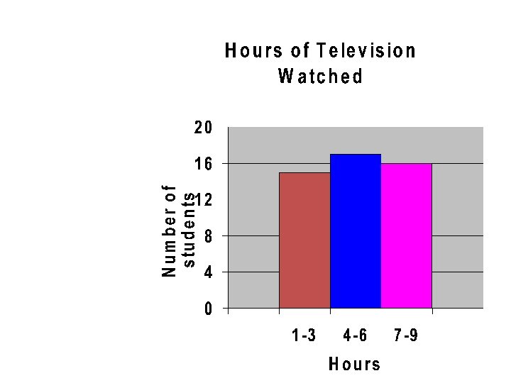
Step 1 1 2 3 4 5 • Make a frequency table of the data. Be sure to use equal intervals Number of hours of TV II 6 IIII 7 IIII - IIII 8 IIII - I 9 IIII - III Number of Frequency hours of TV 1 -3 4 -6 7 -9 15 17 16
Step 2 • Choose an appropriate scale and interval for the vertical axis. The greatest value on the scale should be at least as great as the greatest frequency. Number of Frequency hours of TV 1 -3 4 -6 7 -9 15 17 16
Step 3 • Draw a bar for each interval. The height of the bar is the frequency for that interval. Bars must touch but not overlap. • Label the axes and give the graph title Number of hours of TV 1 -3 4 -6 7 -9 Frequency 15 17 16