Engineering Applications of Statistics will be known to

Engineering Applications of Statistics (will be known to us eventually as we go through our syllabus) 1. 2. 3. 4. 5. 6. Statistical Process Control Quality Assessment Model Building and Predicting Communicating with and Acting on Experimental Results Assessing Design Reliability Experimental Design
VARIABLE AND DATA Variable ¡ A characteristic of a population or sample that is of interest to us. l Example ¡ In case of Hudson Auto a variable is the average cost of parts used in engine tune ups. l
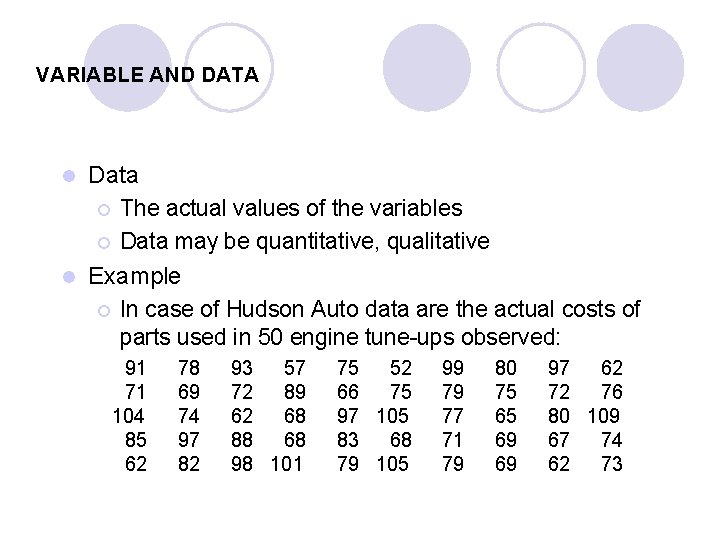
VARIABLE AND DATA Data ¡ The actual values of the variables ¡ Data may be quantitative, qualitative l Example ¡ In case of Hudson Auto data are the actual costs of parts used in 50 engine tune ups observed: l 91 71 104 85 62 78 69 74 97 82 93 57 72 89 62 68 88 68 98 101 75 52 66 75 97 105 83 68 79 105 99 79 77 71 79 80 75 65 69 69 97 62 72 76 80 109 67 74 62 73
QUANTITATIVE DATA Quantitative data may have a ratio scale ¡ Data possessing a natural zero point and organized into measures for which differences are meaningful. ¡ Examples: Money, income, sales, profits, losses, heights of NBA players l Quantitative data may also have an interval scale ¡ The distance between numbers is a known, constant size, but the zero value is arbitrary. ¡ Examples: Temperature on the Fahrenheit scale. l
Types of Quantitative Data A) Nominal data: They are numbers that represent arbitrary data. Example: An engineering school, might use numbers to denote undergraduate majors. 1 For electrical engineering 2 For civil engineering and so on.
Types of Quantitative Data B) Ordinal data convey ranking in terms of importance, strength, or severity. Example: a value of 3 corresponds to gentle breeze A value of 6 corresponds to a strong breeze A value of 9 signifies a strong gale The change in force between a gentle and a strong sea breeze is not equal to that between a strong gale and a strong breeze, as the numbers themselves would misleadingly indicate.
Types of Quantitative Data C) Interval data allow only addition and subtraction. Example: Temperature for which scales are arbitrarily chosen. A 100 degree Fahrenheit day is not twice as hot as 50 degree day since 100 degree/ 50 degree is not a meaningful ratio.
Types of Quantitative Data D) Ratio Data include times and many physical measurements of size, weight, or strength. The arithmetic operations of addition, subtraction, division, and multiplication are all valid with ratio data. Most statistical investigations involve arithmetic operations, which limits them to interval or ratio data. Example: income, sales, profits.
QUALITATIVE DATA l Qualitative data has a nominal scale ¡ Data that can only be classified into categories and cannot be arranged in an ordering scheme. ¡ Examples: eye color, gender, marital status, religious affiliation, etc. ¡ Examples: Suppose that the responses to the marital status question is recorded as follows: Single 1 Divorced 3 Married 2 Widowed 4
85: 222: Chapter 2 Describing, Displaying, and Exploring Statistical Data Assuming you have collected a data set of your interest The questions are: l. How can you make sense out of it? l. How can you organize and summarize the data set to make it more comprehensible and meaningful?
Graphical techniques for Describing Quantitative Data The Frequency Distribution l The most popular and traditional graphical method for describing quantitative data is the frequency histogram – often called a frequency distribution.
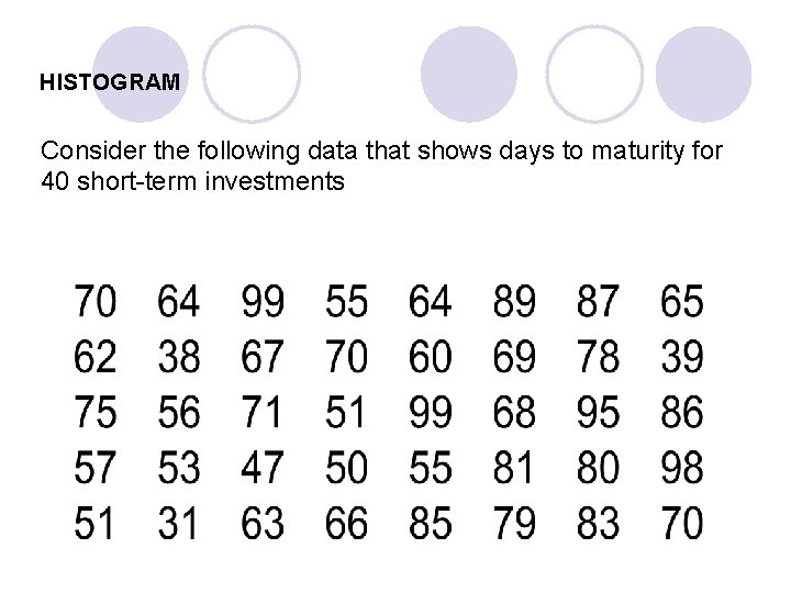
HISTOGRAM Consider the following data that shows days to maturity for 40 short term investments
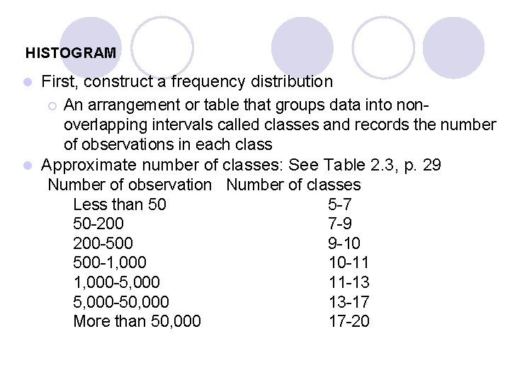
HISTOGRAM First, construct a frequency distribution ¡ An arrangement or table that groups data into non overlapping intervals called classes and records the number of observations in each class l Approximate number of classes: See Table 2. 3, p. 29 Number of observation Number of classes Less than 50 5 7 50 200 7 9 200 500 9 10 500 1, 000 10 11 1, 000 5, 000 11 13 5, 000 50, 000 13 17 More than 50, 000 17 20 l
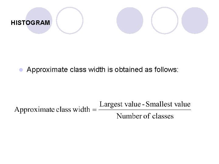
HISTOGRAM l Approximate class width is obtained as follows:
HISTOGRAM Classes and counts for the days to maturity data
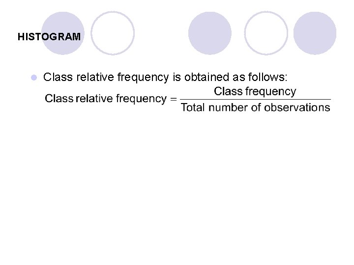
HISTOGRAM l Class relative frequency is obtained as follows:


HISTOGRAM
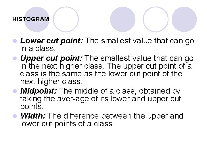
HISTOGRAM Lower cut point: The smallest value that can go in a class. l Upper cut point: The smallest value that can go in the next higher class. The upper cut point of a class is the same as the lower cut point of the next higher class. l Midpoint: The middle of a class, obtained by taking the aver age of its lower and upper cut points. l Width: The difference between the upper and lower cut points of a class. l
HISTOGRAM
RELATIVE FREQUENCY HISTOGRAM Relative frequency distribution for the days to maturity data

FREQUENCY POLYGON l. A frequency polygon is a graph that displays the data by using lines that connect points plotted for frequencies at the midpoint of classes. l The frequencies represent the heights of the midpoints.

STEM-AND-LEAF DISPLAY Here the raw data are arranged tabularly by locating each observation on a ‘tree’ This is done by separating the values into a stem digit and a leaf digit. l The main advantage is that it provides the essential features of the histogram; it can be seen easily by rotating the plot 90 degrees l The disadvantage is that the stem and leaf plot becomes cumbersome if the number of observations is large l
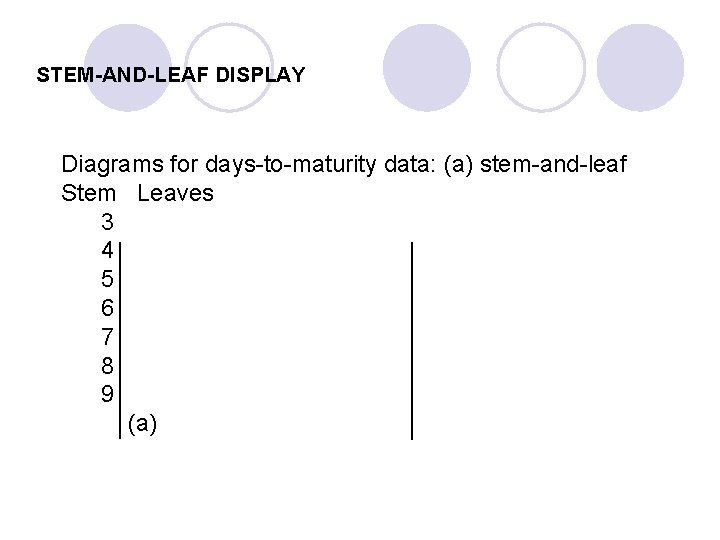
STEM-AND-LEAF DISPLAY Diagrams for days to maturity data: (a) stem and leaf Stem Leaves 3 4 5 6 7 8 9 (a)
- Slides: 26