Elle Magazine Front cover analysis Layout The selllines
- Slides: 6

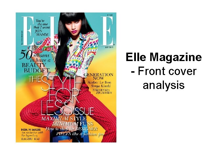
Elle Magazine - Front cover analysis

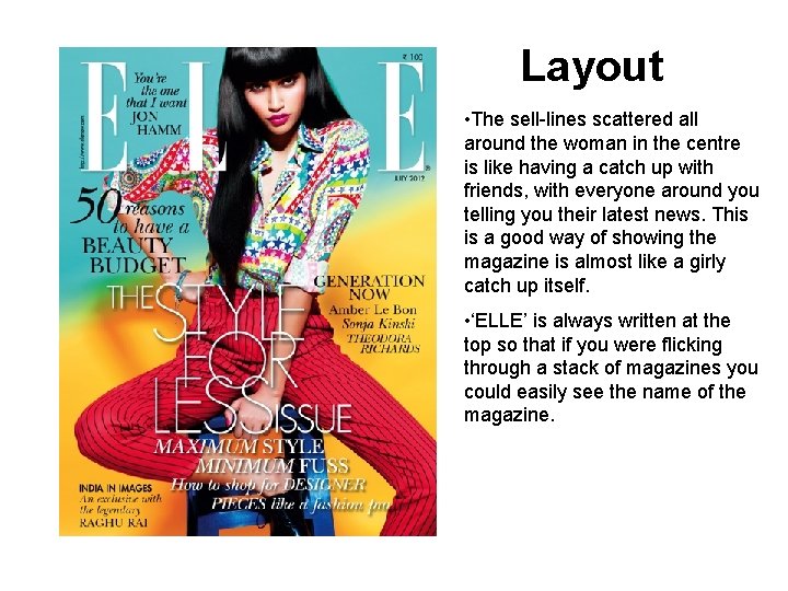
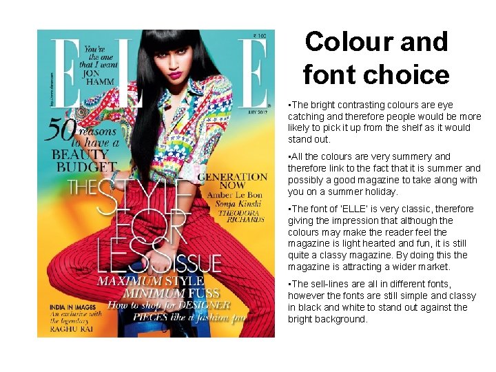
Layout • The sell-lines scattered all around the woman in the centre is like having a catch up with friends, with everyone around you telling you their latest news. This is a good way of showing the magazine is almost like a girly catch up itself. • ‘ELLE’ is always written at the top so that if you were flicking through a stack of magazines you could easily see the name of the magazine.

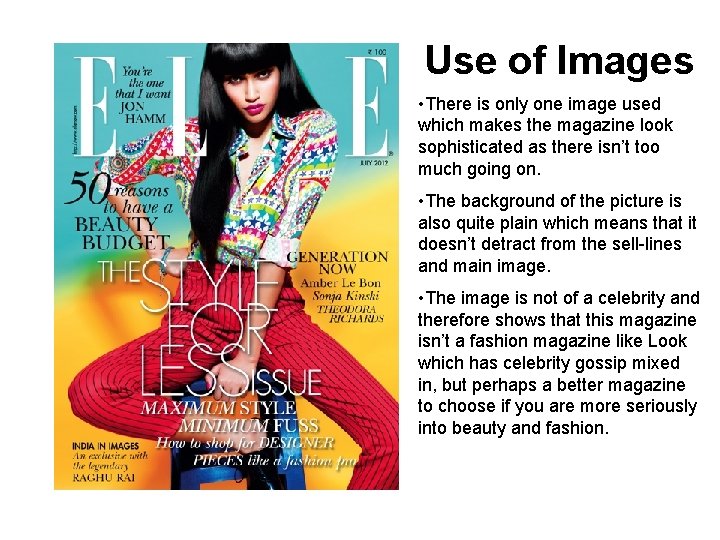
Use of Images • There is only one image used which makes the magazine look sophisticated as there isn’t too much going on. • The background of the picture is also quite plain which means that it doesn’t detract from the sell-lines and main image. • The image is not of a celebrity and therefore shows that this magazine isn’t a fashion magazine like Look which has celebrity gossip mixed in, but perhaps a better magazine to choose if you are more seriously into beauty and fashion.

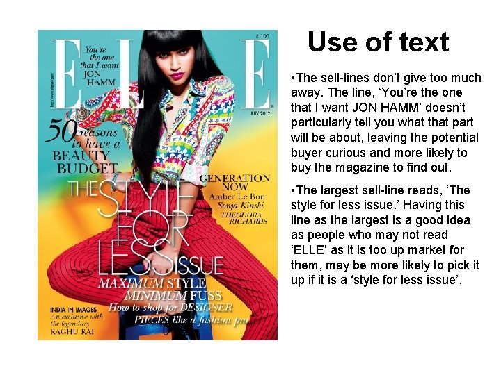
Use of text • The sell-lines don’t give too much away. The line, ‘You’re the one that I want JON HAMM’ doesn’t particularly tell you what that part will be about, leaving the potential buyer curious and more likely to buy the magazine to find out. • The largest sell-line reads, ‘The style for less issue. ’ Having this line as the largest is a good idea as people who may not read ‘ELLE’ as it is too up market for them, may be more likely to pick it up if it is a ‘style for less issue’.

Colour and font choice • The bright contrasting colours are eye catching and therefore people would be more likely to pick it up from the shelf as it would stand out. • All the colours are very summery and therefore link to the fact that it is summer and possibly a good magazine to take along with you on a summer holiday. • The font of ‘ELLE’ is very classic, therefore giving the impression that although the colours may make the reader feel the magazine is light hearted and fun, it is still quite a classy magazine. By doing this the magazine is attracting a wider market. • The sell-lines are all in different fonts, however the fonts are still simple and classy in black and white to stand out against the bright background.

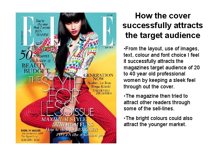
How the cover successfully attracts the target audience • From the layout, use of images, text, colour and font choice I feel it successfully attracts the magazines target audience of 20 to 40 year old professional women by keeping a sleek feel through out the cover. • The magazine then tried to attract other readers through some of the sell-lines. • The bright colours could also attract the younger market.