Elements and Principals of Design Unit 1 Drawing


 use of colour is where the")

- Slides: 38
Elements and Principals of Design Unit 1: Drawing
Elements of Design • Art works are composed of the basic elements of design: – Dot - Tone – Line - Value – Shape - Space – Form - Colour – Texture The elements of design are the visual features of a work of art.
Dot • • • The dot is the simplest, most basic mark which can be made. It has no direction or dimensions. When dots are placed together, our eyes and brain see them as a group which may make up a recognizable image. Stippling is a very controlled drawing technique
Dot
Line • • • A line is the most important element in art which can express direction. There are many variables involving line, including "size, shape, position, direction, number, interval and density". Lines can represent physical forms and can
Line
Lines and Doodles • • • A doodle is a spontaneous drawing that you create without a lot of thought. Often people doodle when their mind is on something else. Drawing doodles is like playing where you can freely move your pencil across paper without
Lines and Doodles • • Some doodles are like scribbles, designs, places or people. Doodles can be silly, weird, funny, or serious.
Texture • • • Texture refers to the visual look or feel of a surface. It is, or implies, a 3 -dimensional feature. Texture can, for example, be rough, smooth, soft, or hard, or can appear to be warm or cold.
Texture
Texture
Tone/Value • • Tone and value deal with the level of lightness or darkness in a colour or shade. Contrast refers to the range of colours or the amount of difference between lights and darks (or black and white). Sometimes there's a lot of contrast used in an image; sometimes there's very little.
Tone/Value
Shape • • • Shapes are flat, 2 -dimensional areas enclosed by lines or areas defined as a result of a collection of lines. Shapes have width and height. They can be organic or geometric. Shapes may also be implied by the placement of other shapes.
Shape
Form • Forms are 3 -dimensional or can have the appearance of being 3 -dimensional. The object will have height, width and depth. • Forms can also be organic or geometric. • They may also be implied.
Forms
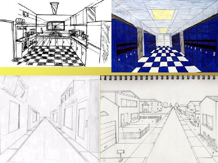
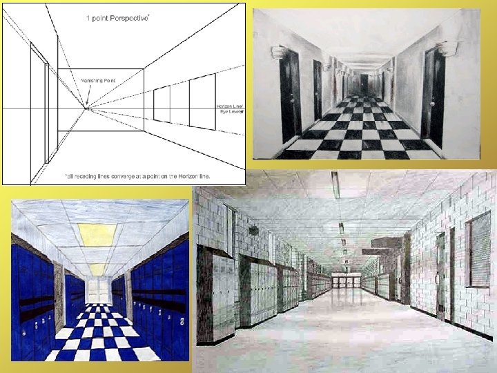
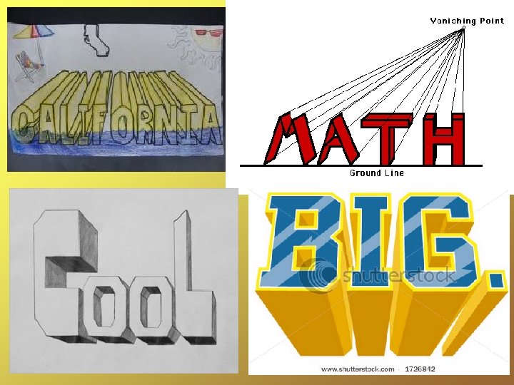
Space • Artists can represent 3 -dimensional space on a 2 dimensional, flat picture plane in a number of ways: – – – overlapping objects increasing the amount of detail visible in the foreground varying the size/scale of like objects so that 'closer' ones appear to be larger
Space
Space • • Infinite space would be the space around us when we're in an open outdoor area; the space goes on and on. Limited space occurs when we have a controlling influence on the amount of space around us, such as the ceiling, floor and four walls of a room.
Space
Colour • • • Artists use colour to express emotion, moods and feelings and to give detail to objects in their work. Colour can also direct a viewer's attention. Some colours (bolder, deeper) appear to stand out, while others (lighter) appear to recede. A colour's hue is it's name.
Colour • • Some groups of colours work together very well and are considered harmonious. (Examples: Warm, Cool, and Neutral colour families). Others do not and are in contrast to one another. (Example: Complementary colours which are complete oppisites).
Colour
Subtractive Theory of Colour • • Unless an artist is working on a computer screen or with light sources, they are using materials which may contain coloured pigments, such as paint or ink. Subtractive Theory of Colour deals with light waves of energy in the visible spectrum are absorbed or reflected by surfaces. If you have three primary colours (red, blue and yellow)
Subtractive Theory of Colour
Subtractive Theory of Colour • Value refers to the lightness or darkness of a colour. Colours can be made darker or lighter by adding black or white. • Tints are lighter values. • Shades are darker values.
Subtractive Theory of Colour
Elements of Design • • Objective (or representational) use of colour is where the artist tries to show the real colours of the things they are painting. Subjective (or non-representational) use of colour is where the artist changes the colours of the objects as we know them to make a statement, express a mood, shock the viewer.
Elements of Design