Elementary Statistics Thirteenth Edition Chapter 2 Summarizing and
- Slides: 23

Elementary Statistics Thirteenth Edition Chapter 2 Summarizing and Graphing Data Copyright © 2018, 2014, 2012 Pearson Education, Inc. All Rights Reserved

Summarizing and Graphing Data 2 -1 Frequency Distributions for Organizing and Summarizing Data 2 -2 Histograms 2 -3 Graphs that Enlighten and Graphs that Deceive 2 -4 Scatterplots, Correlation, and Regression Copyright © 2018, 2014, 2012 Pearson Education, Inc. All Rights Reserved

Key Concept When working with large data sets, a frequency distribution (or frequency table) is often helpful in organizing and summarizing data. A frequency distribution helps us to understand the nature of the distribution of a data set. Copyright © 2018, 2014, 2012 Pearson Education, Inc. All Rights Reserved

Frequency Distribution • Frequency Distribution (or Frequency Table) – Shows how data are partitioned among several categories (or classes) by listing the categories along with the number (frequency) of data values in each of them. Copyright © 2018, 2014, 2012 Pearson Education, Inc. All Rights Reserved

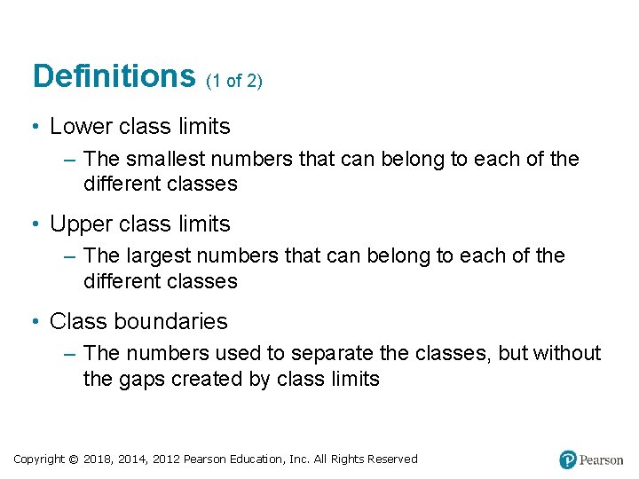
Definitions (1 of 2) • Lower class limits – The smallest numbers that can belong to each of the different classes • Upper class limits – The largest numbers that can belong to each of the different classes • Class boundaries – The numbers used to separate the classes, but without the gaps created by class limits Copyright © 2018, 2014, 2012 Pearson Education, Inc. All Rights Reserved

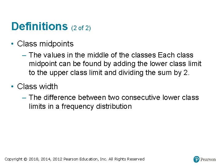
Definitions (2 of 2) • Class midpoints – The values in the middle of the classes Each class midpoint can be found by adding the lower class limit to the upper class limit and dividing the sum by 2. • Class width – The difference between two consecutive lower class limits in a frequency distribution Copyright © 2018, 2014, 2012 Pearson Education, Inc. All Rights Reserved

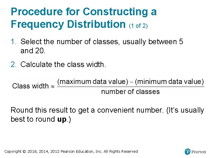
Procedure for Constructing a Frequency Distribution (1 of 2) 1. Select the number of classes, usually between 5 and 20. 2. Calculate the class width. Round this result to get a convenient number. (It’s usually best to round up. ) Copyright © 2018, 2014, 2012 Pearson Education, Inc. All Rights Reserved

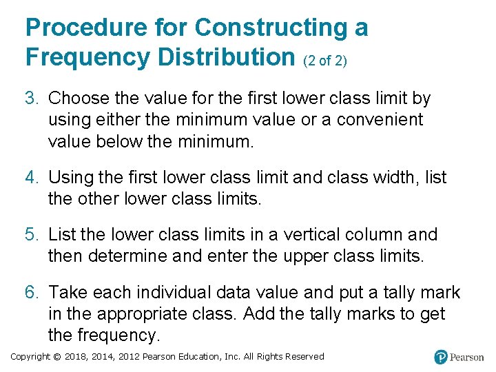
Procedure for Constructing a Frequency Distribution (2 of 2) 3. Choose the value for the first lower class limit by using either the minimum value or a convenient value below the minimum. 4. Using the first lower class limit and class width, list the other lower class limits. 5. List the lower class limits in a vertical column and then determine and enter the upper class limits. 6. Take each individual data value and put a tally mark in the appropriate class. Add the tally marks to get the frequency. Copyright © 2018, 2014, 2012 Pearson Education, Inc. All Rights Reserved

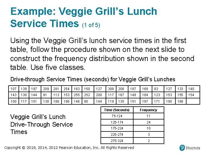
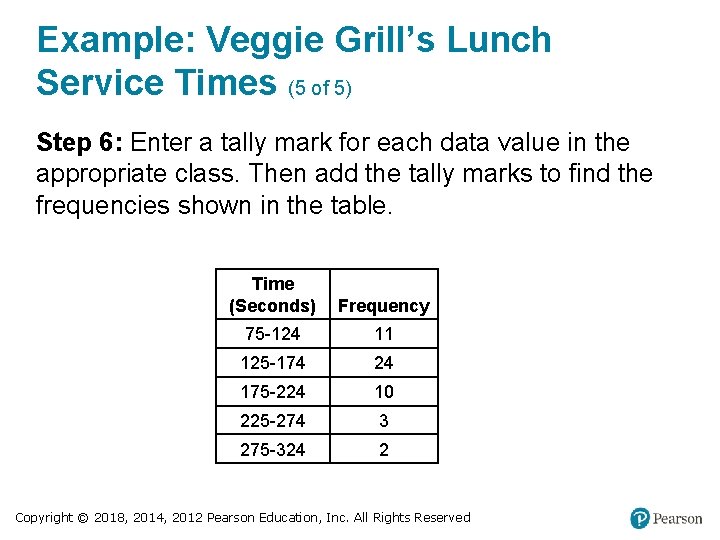
Example: Veggie Grill’s Lunch Service Times (1 of 5) Using the Veggie Grill’s lunch service times in the first table, follow the procedure shown on the next slide to construct the frequency distribution shown in the second table. Use five classes. Drive-through Service Times (seconds) for Veggie Grill’s Lunches 107 139 197 209 281 254 163 150 127 308 206 187 169 83 127 133 140 143 130 144 91 113 153 255 252 200 117 167 148 184 123 155 154 100 117 101 138 186 196 146 90 144 119 135 151 197 171 190 169 Blank Veggie Grill’s Lunch Drive-Through Service Times Time (Seconds) Frequency 75 -124 11 125 -174 24 175 -224 10 225 -274 3 275 -324 2 Copyright © 2018, 2014, 2012 Pearson Education, Inc. All Rights Reserved

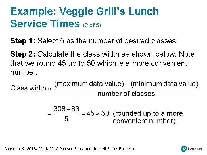
Example: Veggie Grill’s Lunch Service Times (2 of 5) Step 1: Select 5 as the number of desired classes. Step 2: Calculate the class width as shown below. Note that we round 45 up to 50, which is a more convenient number. Copyright © 2018, 2014, 2012 Pearson Education, Inc. All Rights Reserved

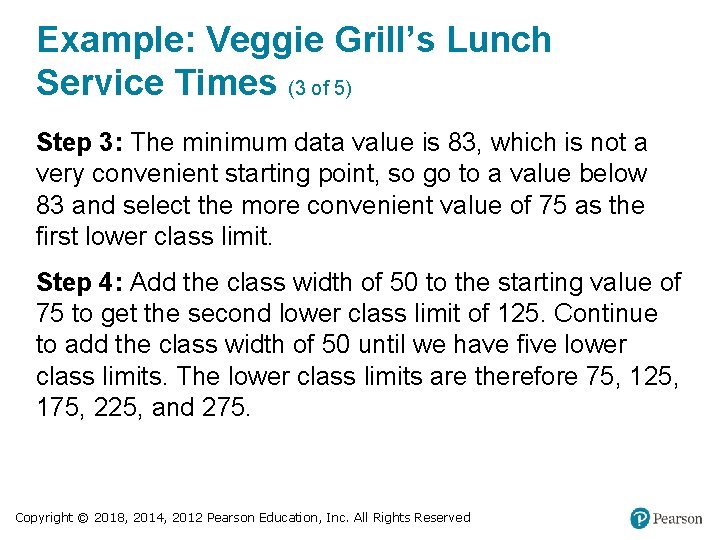
Example: Veggie Grill’s Lunch Service Times (3 of 5) Step 3: The minimum data value is 83, which is not a very convenient starting point, so go to a value below 83 and select the more convenient value of 75 as the first lower class limit. Step 4: Add the class width of 50 to the starting value of 75 to get the second lower class limit of 125. Continue to add the class width of 50 until we have five lower class limits. The lower class limits are therefore 75, 125, 175, 225, and 275. Copyright © 2018, 2014, 2012 Pearson Education, Inc. All Rights Reserved

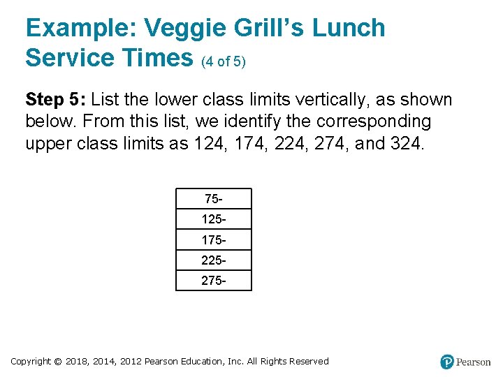
Example: Veggie Grill’s Lunch Service Times (4 of 5) Step 5: List the lower class limits vertically, as shown below. From this list, we identify the corresponding upper class limits as 124, 174, 224, 274, and 324. 75125175225275 - Copyright © 2018, 2014, 2012 Pearson Education, Inc. All Rights Reserved

Example: Veggie Grill’s Lunch Service Times (5 of 5) Step 6: Enter a tally mark for each data value in the appropriate class. Then add the tally marks to find the frequencies shown in the table. Time (Seconds) Frequency 75 -124 11 125 -174 24 175 -224 10 225 -274 3 275 -324 2 Copyright © 2018, 2014, 2012 Pearson Education, Inc. All Rights Reserved

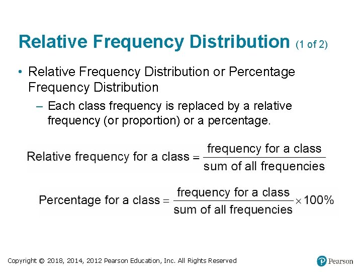
Relative Frequency Distribution (1 of 2) • Relative Frequency Distribution or Percentage Frequency Distribution – Each class frequency is replaced by a relative frequency (or proportion) or a percentage. Copyright © 2018, 2014, 2012 Pearson Education, Inc. All Rights Reserved

Relative Frequency Distribution (2 of 2) • Relative Frequency Distribution or Percentage Frequency Distribution – Each class frequency is replaced by a relative frequency (or proportion) or a percentage. The sum of the percentages in a relative frequency distribution must be very close to 100% (with a little wiggle room for rounding errors). Copyright © 2018, 2014, 2012 Pearson Education, Inc. All Rights Reserved

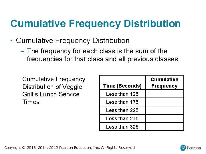
Cumulative Frequency Distribution • Cumulative Frequency Distribution – The frequency for each class is the sum of the frequencies for that class and all previous classes. Cumulative Frequency Distribution of Veggie Grill’s Lunch Service Times Time (Seconds) Less than 125 Less than 175 Less than 225 Less than 275 Less than 325 Copyright © 2018, 2014, 2012 Pearson Education, Inc. All Rights Reserved Cumulative Frequency

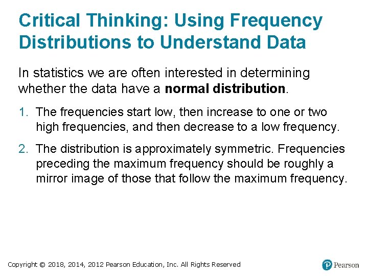
Critical Thinking: Using Frequency Distributions to Understand Data In statistics we are often interested in determining whether the data have a normal distribution. 1. The frequencies start low, then increase to one or two high frequencies, and then decrease to a low frequency. 2. The distribution is approximately symmetric. Frequencies preceding the maximum frequency should be roughly a mirror image of those that follow the maximum frequency. Copyright © 2018, 2014, 2012 Pearson Education, Inc. All Rights Reserved

Gaps • The presence of gaps can show that the data are from two or more different populations. • However, the converse is not true, because data from different populations do not necessarily result in gaps. Copyright © 2018, 2014, 2012 Pearson Education, Inc. All Rights Reserved

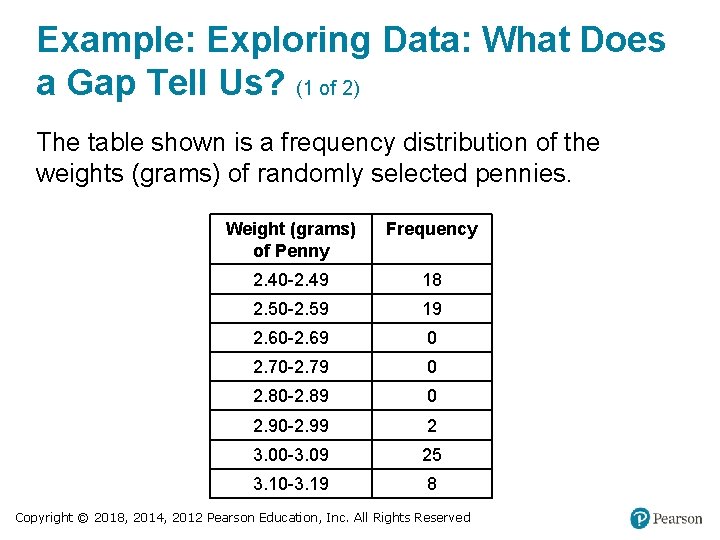
Example: Exploring Data: What Does a Gap Tell Us? (1 of 2) The table shown is a frequency distribution of the weights (grams) of randomly selected pennies. Weight (grams) of Penny Frequency 2. 40 -2. 49 18 2. 50 -2. 59 19 2. 60 -2. 69 0 2. 70 -2. 79 0 2. 80 -2. 89 0 2. 90 -2. 99 2 3. 00 -3. 09 25 3. 10 -3. 19 8 Copyright © 2018, 2014, 2012 Pearson Education, Inc. All Rights Reserved

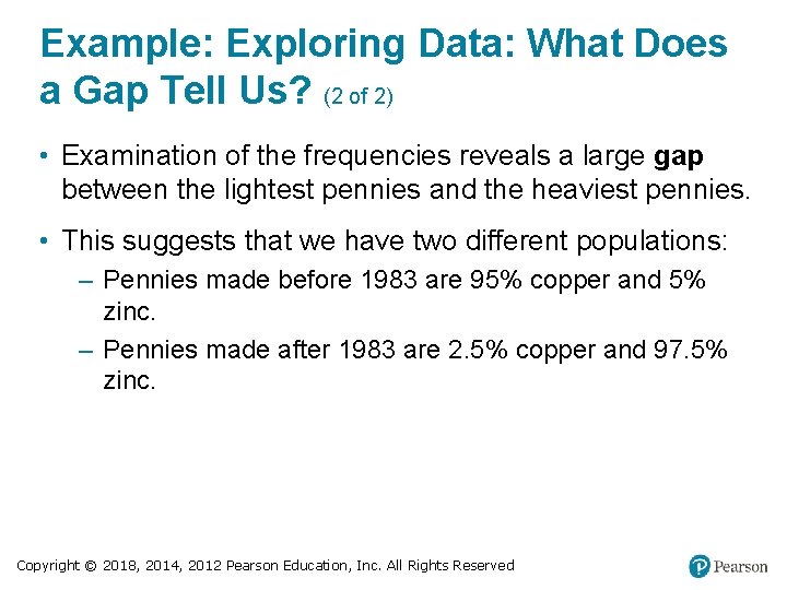
Example: Exploring Data: What Does a Gap Tell Us? (2 of 2) • Examination of the frequencies reveals a large gap between the lightest pennies and the heaviest pennies. • This suggests that we have two different populations: – Pennies made before 1983 are 95% copper and 5% zinc. – Pennies made after 1983 are 2. 5% copper and 97. 5% zinc. Copyright © 2018, 2014, 2012 Pearson Education, Inc. All Rights Reserved

Comparisons Combining two or more relative frequency distributions in one table makes comparisons of data much easier. Copyright © 2018, 2014, 2012 Pearson Education, Inc. All Rights Reserved

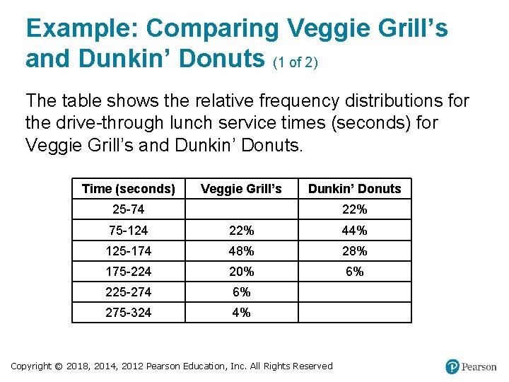
Example: Comparing Veggie Grill’s and Dunkin’ Donuts (1 of 2) The table shows the relative frequency distributions for the drive-through lunch service times (seconds) for Veggie Grill’s and Dunkin’ Donuts. Time (seconds) Veggie Grill’s Dunkin’ Donuts 25 -74 Blank 22% 75 -124 22% 44% 125 -174 48% 28% 175 -224 20% 6% 225 -274 6% Blank 275 -324 4% Blank Copyright © 2018, 2014, 2012 Pearson Education, Inc. All Rights Reserved

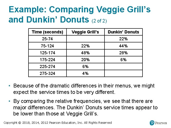
Example: Comparing Veggie Grill’s and Dunkin’ Donuts (2 of 2) Time (seconds) Veggie Grill’s Dunkin’ Donuts 25 -74 Blank 22% 75 -124 22% 44% 125 -174 48% 28% 175 -224 20% 6% 225 -274 6% Blank 275 -324 4% Blank • Because of the dramatic differences in their menus, we might expect the service times to be very different. • By comparing the relative frequencies, we see that there are major differences. The Dunkin’ Donuts service times appear to be lower than those at Veggie Grill’s. Copyright © 2018, 2014, 2012 Pearson Education, Inc. All Rights Reserved