Elementary Statistics Thirteenth Edition Chapter 2 Summarizing and
- Slides: 28

Elementary Statistics Thirteenth Edition Chapter 2 Summarizing and Graphing Data Copyright © 2018, 2014, 2012 Pearson Education, Inc. All Rights Reserved

Summarizing and Graphing Data 2 -1 Frequency Distributions for Organizing and Summarizing Data 2 -2 Histograms 2 -3 Graphs that Enlighten and Graphs that Deceive 2 -4 Scatterplots, Correlation, and Regression Copyright © 2018, 2014, 2012 Pearson Education, Inc. All Rights Reserved

Key Concept Introduce other common graphs that foster understanding of data. Discuss some graphs that are deceptive because they create impressions about data that are somehow misleading or wrong. Technology now provides us with powerful tools for generating a wide variety of graphs. Copyright © 2018, 2014, 2012 Pearson Education, Inc. All Rights Reserved

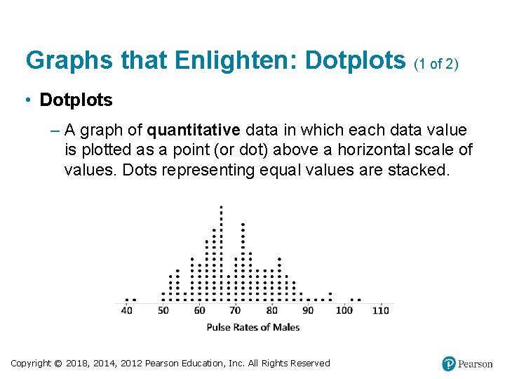
Graphs that Enlighten: Dotplots (1 of 2) • Dotplots – A graph of quantitative data in which each data value is plotted as a point (or dot) above a horizontal scale of values. Dots representing equal values are stacked. Copyright © 2018, 2014, 2012 Pearson Education, Inc. All Rights Reserved

Graphs that Enlighten: Dotplots (2 of 2) • Dotplots – Features of a Dotplot § Displays the shape of distribution of data. § It is usually possible to recreate the original list of data values. Copyright © 2018, 2014, 2012 Pearson Education, Inc. All Rights Reserved

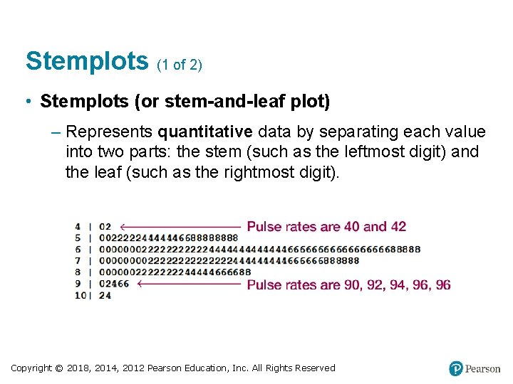
Stemplots (1 of 2) • Stemplots (or stem-and-leaf plot) – Represents quantitative data by separating each value into two parts: the stem (such as the leftmost digit) and the leaf (such as the rightmost digit). Copyright © 2018, 2014, 2012 Pearson Education, Inc. All Rights Reserved

Stemplots (2 of 2) • Stemplots (or stem-and-leaf plot) – Features of a Stemplot § Shows the shape of the distribution of the data. § Retains the original data values. § The sample data are sorted (arranged in order). Copyright © 2018, 2014, 2012 Pearson Education, Inc. All Rights Reserved

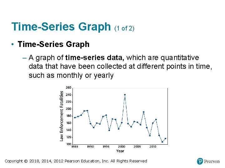
Time-Series Graph (1 of 2) • Time-Series Graph – A graph of time-series data, which are quantitative data that have been collected at different points in time, such as monthly or yearly Copyright © 2018, 2014, 2012 Pearson Education, Inc. All Rights Reserved

Time-Series Graph (2 of 2) • Time-Series Graph – Feature of a Time-Series Graph § Reveals information about trends over time. Copyright © 2018, 2014, 2012 Pearson Education, Inc. All Rights Reserved

Bar Graph (1 of 2) • Bar Graphs – A graph of bars of equal width to show frequencies of categorical (or qualitative) data. The bars may or may not be separated by small gaps. Copyright © 2018, 2014, 2012 Pearson Education, Inc. All Rights Reserved

Bar Graph (2 of 2) • Bar Graphs – Feature of a Bar Graph § Shows the relative distribution of categorical data so that it is easier to compare the different categories. Copyright © 2018, 2014, 2012 Pearson Education, Inc. All Rights Reserved

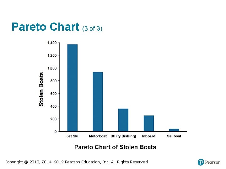
Pareto Chart (1 of 3) • Pareto Charts – A Pareto chart is a bar graph for categorical data, with the added stipulation that the bars are arranged in descending order according to frequencies, so the bars decrease in height from left to right. Copyright © 2018, 2014, 2012 Pearson Education, Inc. All Rights Reserved

Pareto Chart (2 of 3) • Pareto Charts – Features of a Pareto Chart § Shows the relative distribution of categorical data so that it is easier to compare the different categories. § Draws attention to the more important categories. Copyright © 2018, 2014, 2012 Pearson Education, Inc. All Rights Reserved

Pareto Chart (3 of 3) Copyright © 2018, 2014, 2012 Pearson Education, Inc. All Rights Reserved

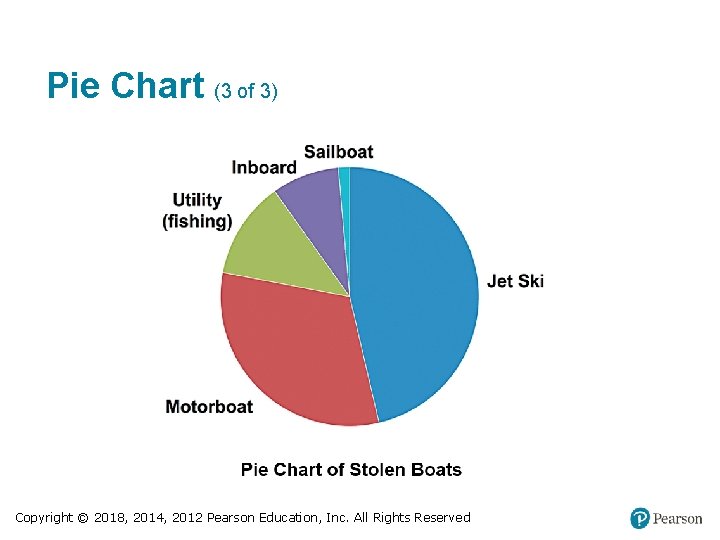
Pie Chart (1 of 3) • Pie Charts – A very common graph that depicts categorical data as slices of a circle, in which the size of each slice is proportional to the frequency count for the category Copyright © 2018, 2014, 2012 Pearson Education, Inc. All Rights Reserved

Pie Chart (2 of 3) • Pie Charts – Feature of a Pie Chart § Shows the distribution of categorical data in a commonly used format. Copyright © 2018, 2014, 2012 Pearson Education, Inc. All Rights Reserved

Pie Chart (3 of 3) Copyright © 2018, 2014, 2012 Pearson Education, Inc. All Rights Reserved

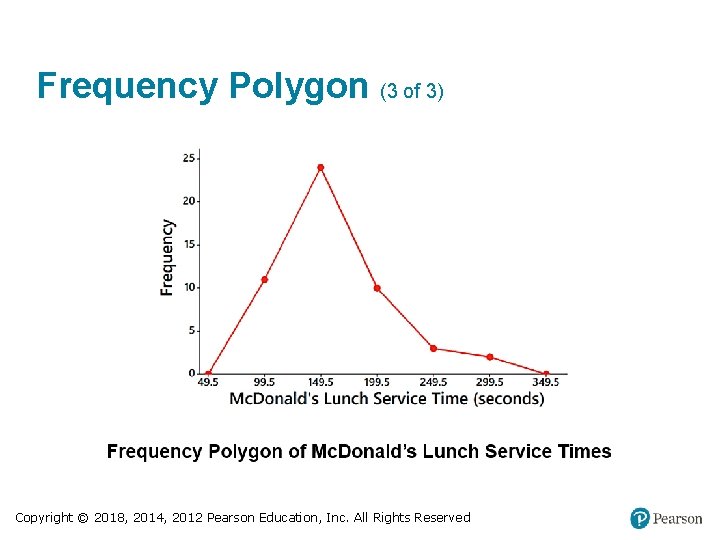
Frequency Polygon (1 of 3) • Frequency Polygon – A graph using line segments connected to points located directly above class midpoint values – A frequency polygon is very similar to a histogram, but a frequency polygon uses line segments instead of bars. Copyright © 2018, 2014, 2012 Pearson Education, Inc. All Rights Reserved

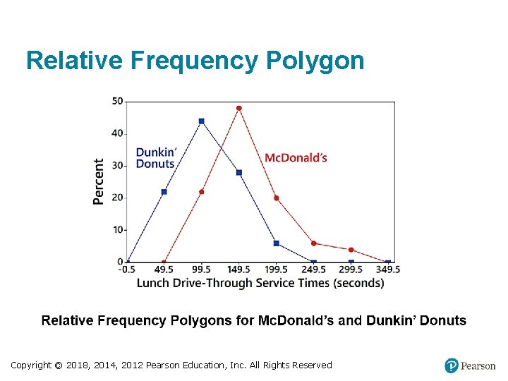
Frequency Polygon (2 of 3) • Frequency Polygon – A variation of the basic frequency polygon is the relative frequency polygon, which uses relative frequencies (proportions or percentages) for the vertical scale. Copyright © 2018, 2014, 2012 Pearson Education, Inc. All Rights Reserved

Frequency Polygon (3 of 3) Copyright © 2018, 2014, 2012 Pearson Education, Inc. All Rights Reserved

Relative Frequency Polygon Copyright © 2018, 2014, 2012 Pearson Education, Inc. All Rights Reserved

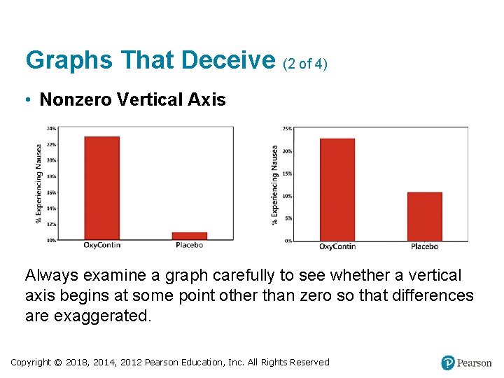
Graphs That Deceive (1 of 4) • Nonzero Vertical Axis – A common deceptive graph involves using a vertical scale that starts at some value greater than zero to exaggerate differences between groups. Copyright © 2018, 2014, 2012 Pearson Education, Inc. All Rights Reserved

Graphs That Deceive (2 of 4) • Nonzero Vertical Axis Always examine a graph carefully to see whether a vertical axis begins at some point other than zero so that differences are exaggerated. Copyright © 2018, 2014, 2012 Pearson Education, Inc. All Rights Reserved

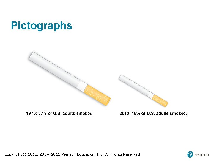
Graphs That Deceive (3 of 4) • Pictographs – Drawings of objects, called pictographs, are often misleading. Data that are one-dimensional in nature (such as budget amounts) are often depicted with two -dimensional objects (such as dollar bills) or threedimensional objects (such as stacks of coins, homes, or barrels). Copyright © 2018, 2014, 2012 Pearson Education, Inc. All Rights Reserved

Graphs That Deceive (4 of 4) • Pictographs – By using pictographs, artists can create false impressions that grossly distort differences by using these simple principles of basic geometry: § When you double each side of a square, its area doesn’t merely double; it increases by a factor of four. § When you double each side of a cube, its volume doesn’t merely double; it increases by a factor of eight. Copyright © 2018, 2014, 2012 Pearson Education, Inc. All Rights Reserved

Pictographs Copyright © 2018, 2014, 2012 Pearson Education, Inc. All Rights Reserved

Concluding Thoughts (1 of 2) In addition to the graphs we have discussed in this section, there are many other useful graphs - some of which have not yet been created. The world needs more people who can create original graphs that enlighten us about the nature of data. Copyright © 2018, 2014, 2012 Pearson Education, Inc. All Rights Reserved

Concluding Thoughts (2 of 2) In The Visual Display of Quantitative Information, Edward Tufte offers these principles: • For small data sets of 20 values or fewer, use a table instead of a graph. • A graph of data should make us focus on the true nature of the data, not on other elements, such as eye-catching but distracting design features. • Do not distort data; construct a graph to reveal the true nature of the data. • Almost all of the ink in a graph should be used for the data, not for other design elements. Copyright © 2018, 2014, 2012 Pearson Education, Inc. All Rights Reserved