ELEMENTARY STATISTICS 3 E William Navidi and Barry
ELEMENTARY STATISTICS 3 E William Navidi and Barry Monk ©Mc. Graw-Hill Education. All rights reserved. Authorized only for instructor use in the classroom. No reproduction or further distribution permitted without the prior written consent of Mc. Graw-Hill Education.
Graphical Summaries for Qualitative Data Section 2. 1 ©Mc. Graw-Hill Education.
Objectives 1. Construct frequency distributions for qualitative data 2. Construct bar graphs 3. Construct pie charts ©Mc. Graw-Hill Education.
Objective 1 Construct frequency distributions for qualitative data ©Mc. Graw-Hill Education.
Frequency Distribution The frequency of a category is the number of times it occurs in the data set. A frequency distribution is a table that presents the frequency for each category. ©Mc. Graw-Hill Education.
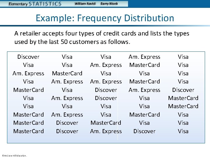
Example: Frequency Distribution A retailer accepts four types of credit cards and lists the types used by the last 50 customers as follows. Discover Visa Am. Express Visa Master. Card Master. Card ©Mc. Graw-Hill Education. Visa Master. Card Am. Express Visa Am. Express Discover Visa Master. Card Am. Express Master. Card Visa Master. Card Am. Express Visa Master. Card Visa Discover Visa Discover Master. Card Visa
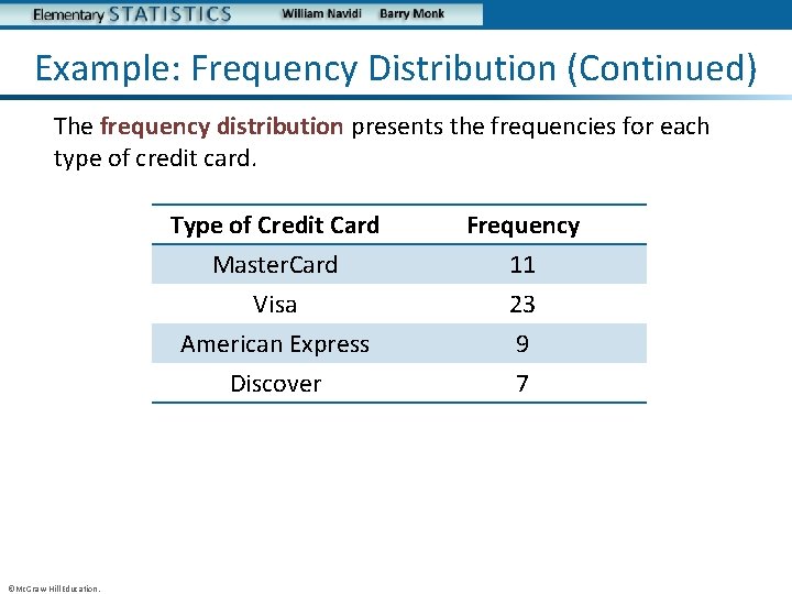
Example: Frequency Distribution (Continued) The frequency distribution presents the frequencies for each type of credit card. ©Mc. Graw-Hill Education. Type of Credit Card Master. Card Visa American Express Frequency 11 23 9 Discover 7
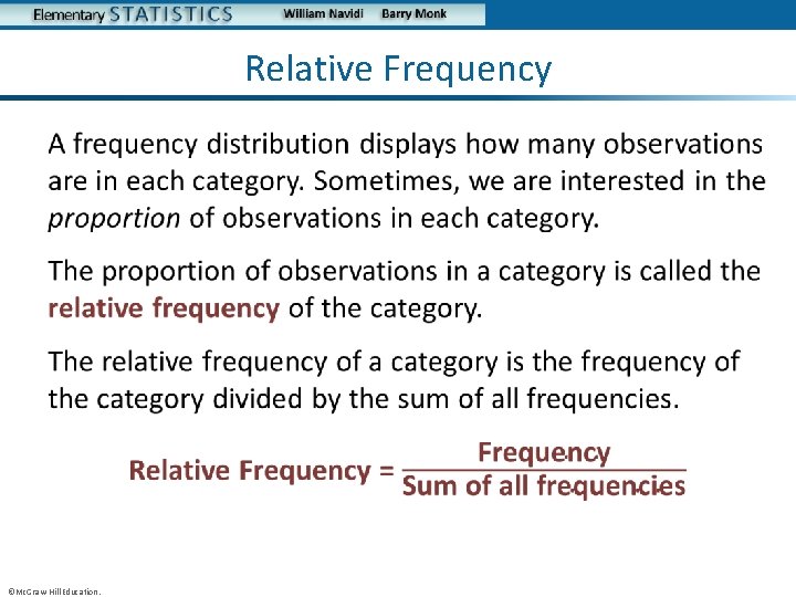
Relative Frequency • ©Mc. Graw-Hill Education.
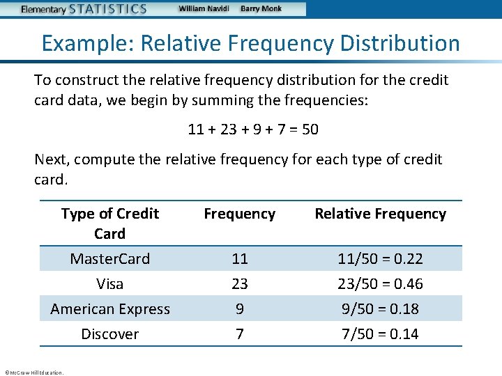
Example: Relative Frequency Distribution To construct the relative frequency distribution for the credit card data, we begin by summing the frequencies: 11 + 23 + 9 + 7 = 50 Next, compute the relative frequency for each type of credit card. Type of Credit Card Frequency Relative Frequency Master. Card Visa American Express Discover 11 23 9 7 11/50 = 0. 22 23/50 = 0. 46 9/50 = 0. 18 7/50 = 0. 14 ©Mc. Graw-Hill Education.
Objective 2 Construct bar graphs ©Mc. Graw-Hill Education.
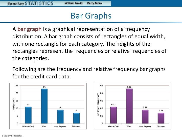
Bar Graphs A bar graph is a graphical representation of a frequency distribution. A bar graph consists of rectangles of equal width, with one rectangle for each category. The heights of the rectangles represent the frequencies or relative frequencies of the categories. Following are the frequency and relative frequency bar graphs for the credit card data. ©Mc. Graw-Hill Education.
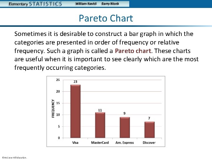
Pareto Chart Sometimes it is desirable to construct a bar graph in which the categories are presented in order of frequency or relative frequency. Such a graph is called a Pareto chart. These charts are useful when it is important to see clearly which are the most frequently occurring categories. ©Mc. Graw-Hill Education.
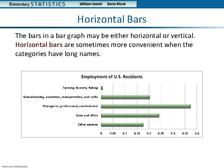
Horizontal Bars The bars in a bar graph may be either horizontal or vertical. Horizontal bars are sometimes more convenient when the categories have long names. ©Mc. Graw-Hill Education.
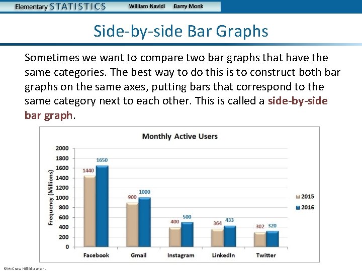
Side-by-side Bar Graphs Sometimes we want to compare two bar graphs that have the same categories. The best way to do this is to construct both bar graphs on the same axes, putting bars that correspond to the same category next to each other. This is called a side-by-side bar graph. ©Mc. Graw-Hill Education.

Objective 3 Construct pie charts ©Mc. Graw-Hill Education.
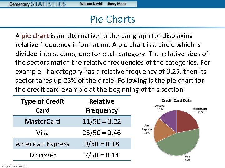
Pie Charts A pie chart is an alternative to the bar graph for displaying relative frequency information. A pie chart is a circle which is divided into sectors, one for each category. The relative sizes of the sectors match the relative frequencies of the categories. For example, if a category has a relative frequency of 0. 25, then its sector takes up 25% of the circle. Following is the pie chart for the credit card example at the beginning of this section. Type of Credit Card Relative Frequency Master. Card Visa American Express Discover 11/50 = 0. 22 23/50 = 0. 46 9/50 = 0. 18 7/50 = 0. 14 ©Mc. Graw-Hill Education.
You Should Know. . . • How to construct a frequency and relative frequency distribution • How to construct and interpret bar graphs including: – Pareto charts – Bar graphs with horizontal bars – Side-by-side bar graphs • How to construct and interpret pie charts ©Mc. Graw-Hill Education.
Frequency Distributions and Their Graphs Section 2. 2 ©Mc. Graw-Hill Education.
Objectives 1. Construct frequency distributions for quantitative data 2. Construct histograms 3. Determine the shape of a distribution from a histogram 4. Construct frequency polygons and ogives ©Mc. Graw-Hill Education.

Objective 1 Construct frequency distributions for quantitative data ©Mc. Graw-Hill Education.
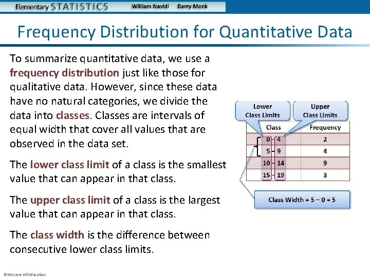
Frequency Distribution for Quantitative Data To summarize quantitative data, we use a frequency distribution just like those for qualitative data. However, since these data have no natural categories, we divide the data into classes. Classes are intervals of equal width that cover all values that are observed in the data set. The lower class limit of a class is the smallest value that can appear in that class. The upper class limit of a class is the largest value that can appear in that class. The class width is the difference between consecutive lower class limits. ©Mc. Graw-Hill Education.
Guidelines for Choosing Classes There are many ways to construct a frequency distribution, and they will differ depending on the classes chosen. Following are guidelines for choosing the classes. • Every observation must fall into one of the classes. • The classes must not overlap. • The classes must be of equal width. • There must be no gaps between classes. Even if there are no observations in a class, it must be included in the frequency distribution. ©Mc. Graw-Hill Education.
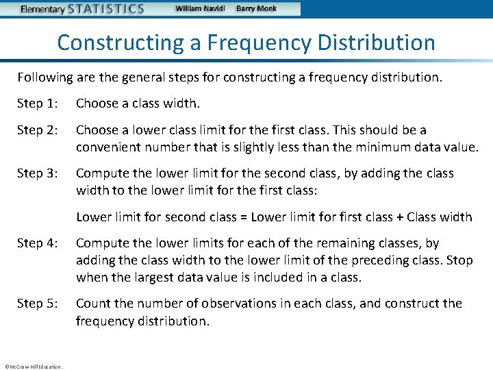
Constructing a Frequency Distribution Following are the general steps for constructing a frequency distribution. Step 1: Choose a class width. Step 2: Choose a lower class limit for the first class. This should be a convenient number that is slightly less than the minimum data value. Step 3: Compute the lower limit for the second class, by adding the class width to the lower limit for the first class: Lower limit for second class = Lower limit for first class + Class width Step 4: Compute the lower limits for each of the remaining classes, by adding the class width to the lower limit of the preceding class. Stop when the largest data value is included in a class. Step 5: Count the number of observations in each class, and construct the frequency distribution. ©Mc. Graw-Hill Education.
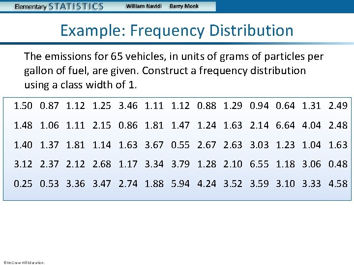
Example: Frequency Distribution The emissions for 65 vehicles, in units of grams of particles per gallon of fuel, are given. Construct a frequency distribution using a class width of 1. 1. 50 0. 87 1. 12 1. 25 3. 46 1. 11 1. 12 0. 88 1. 29 0. 94 0. 64 1. 31 2. 49 1. 48 1. 06 1. 11 2. 15 0. 86 1. 81 1. 47 1. 24 1. 63 2. 14 6. 64 4. 04 2. 48 1. 40 1. 37 1. 81 1. 14 1. 63 3. 67 0. 55 2. 67 2. 63 3. 03 1. 23 1. 04 1. 63 3. 12 2. 37 2. 12 2. 68 1. 17 3. 34 3. 79 1. 28 2. 10 6. 55 1. 18 3. 06 0. 48 0. 25 0. 53 3. 36 3. 47 2. 74 1. 88 5. 94 4. 24 3. 52 3. 59 3. 10 3. 33 4. 58 ©Mc. Graw-Hill Education.
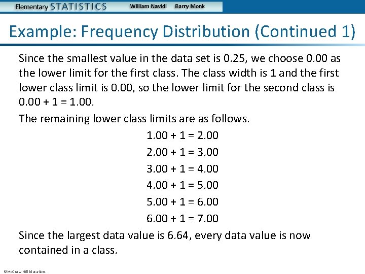
Example: Frequency Distribution (Continued 1) Since the smallest value in the data set is 0. 25, we choose 0. 00 as the lower limit for the first class. The class width is 1 and the first lower class limit is 0. 00, so the lower limit for the second class is 0. 00 + 1 = 1. 00. The remaining lower class limits are as follows. 1. 00 + 1 = 2. 00 + 1 = 3. 00 + 1 = 4. 00 + 1 = 5. 00 + 1 = 6. 00 + 1 = 7. 00 Since the largest data value is 6. 64, every data value is now contained in a class. ©Mc. Graw-Hill Education.
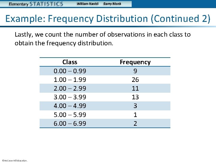
Example: Frequency Distribution (Continued 2) Lastly, we count the number of observations in each class to obtain the frequency distribution. Class 0. 00 – 0. 99 1. 00 – 1. 99 2. 00 – 2. 99 3. 00 – 3. 99 4. 00 – 4. 99 5. 00 – 5. 99 6. 00 – 6. 99 ©Mc. Graw-Hill Education. Frequency 9 26 11 13 3 1 2
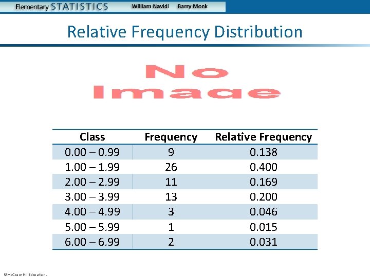
Relative Frequency Distribution • Class 0. 00 – 0. 99 1. 00 – 1. 99 2. 00 – 2. 99 3. 00 – 3. 99 4. 00 – 4. 99 5. 00 – 5. 99 6. 00 – 6. 99 ©Mc. Graw-Hill Education. Frequency 9 26 11 13 3 1 2 Relative Frequency 0. 138 0. 400 0. 169 0. 200 0. 046 0. 015 0. 031

Objective 2 Construct histograms ©Mc. Graw-Hill Education.
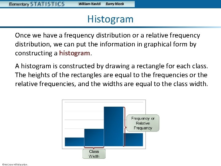
Histogram Once we have a frequency distribution or a relative frequency distribution, we can put the information in graphical form by constructing a histogram. A histogram is constructed by drawing a rectangle for each class. The heights of the rectangles are equal to the frequencies or the relative frequencies, and the widths are equal to the class width. ©Mc. Graw-Hill Education.
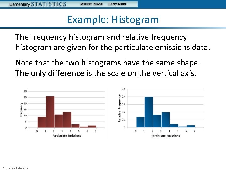
Example: Histogram The frequency histogram and relative frequency histogram are given for the particulate emissions data. Note that the two histograms have the same shape. The only difference is the scale on the vertical axis. ©Mc. Graw-Hill Education.
Choosing the Number of Classes There are no hard and fast rules for choosing the number of classes. In general, it is good to have more classes rather than fewer, but it is also good to have reasonably large frequencies in some of the classes. There are two principles that can guide the choice. • Too few classes produce a histogram lacking in detail. • Too many classes produce a histogram with too much detail, so that the main features of the data are obscured. ©Mc. Graw-Hill Education.
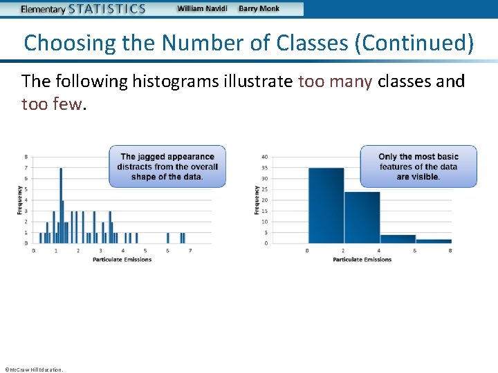
Choosing the Number of Classes (Continued) The following histograms illustrate too many classes and too few. ©Mc. Graw-Hill Education.
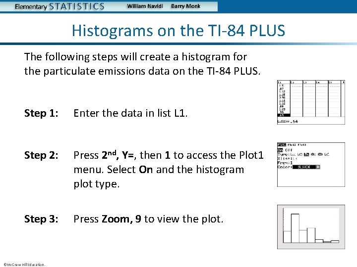
Histograms on the TI-84 PLUS The following steps will create a histogram for the particulate emissions data on the TI-84 PLUS. Step 1: Enter the data in list L 1. Step 2: Press 2 nd, Y=, then 1 to access the Plot 1 menu. Select On and the histogram plot type. Step 3: Press Zoom, 9 to view the plot. ©Mc. Graw-Hill Education.
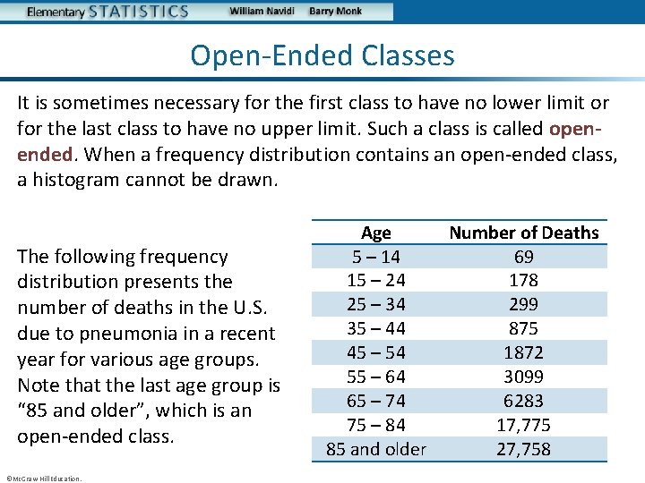
Open-Ended Classes It is sometimes necessary for the first class to have no lower limit or for the last class to have no upper limit. Such a class is called openended. When a frequency distribution contains an open-ended class, a histogram cannot be drawn. The following frequency distribution presents the number of deaths in the U. S. due to pneumonia in a recent year for various age groups. Note that the last age group is “ 85 and older”, which is an open-ended class. ©Mc. Graw-Hill Education. Age 5 – 14 15 – 24 25 – 34 35 – 44 45 – 54 55 – 64 65 – 74 75 – 84 85 and older Number of Deaths 69 178 299 875 1872 3099 6283 17, 775 27, 758
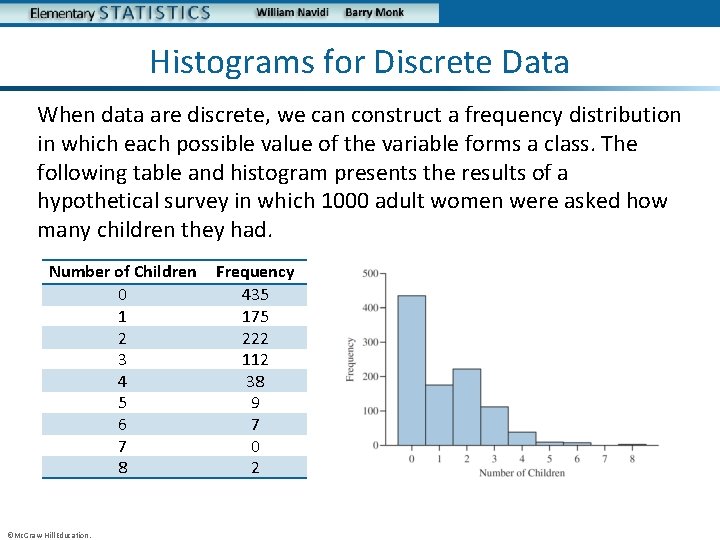
Histograms for Discrete Data When data are discrete, we can construct a frequency distribution in which each possible value of the variable forms a class. The following table and histogram presents the results of a hypothetical survey in which 1000 adult women were asked how many children they had. Number of Children 0 1 2 3 4 5 6 7 8 ©Mc. Graw-Hill Education. Frequency 435 175 222 112 38 9 7 0 2

Objective 3 Determine the shape of a distribution from a histogram ©Mc. Graw-Hill Education.
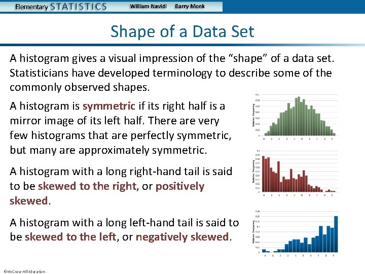
Shape of a Data Set A histogram gives a visual impression of the “shape” of a data set. Statisticians have developed terminology to describe some of the commonly observed shapes. A histogram is symmetric if its right half is a mirror image of its left half. There are very few histograms that are perfectly symmetric, but many are approximately symmetric. A histogram with a long right-hand tail is said to be skewed to the right, or positively skewed. A histogram with a long left-hand tail is said to be skewed to the left, or negatively skewed. ©Mc. Graw-Hill Education.
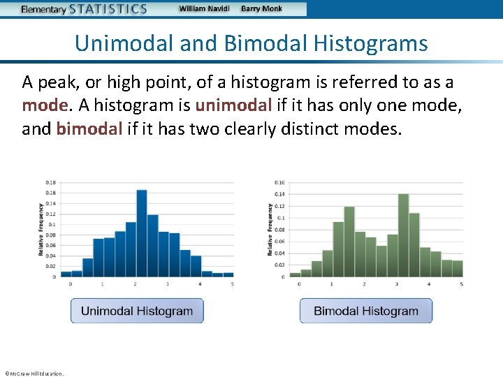
Unimodal and Bimodal Histograms A peak, or high point, of a histogram is referred to as a mode. A histogram is unimodal if it has only one mode, and bimodal if it has two clearly distinct modes. ©Mc. Graw-Hill Education.
Objective 4 Construct frequency polygons and ogives ©Mc. Graw-Hill Education.
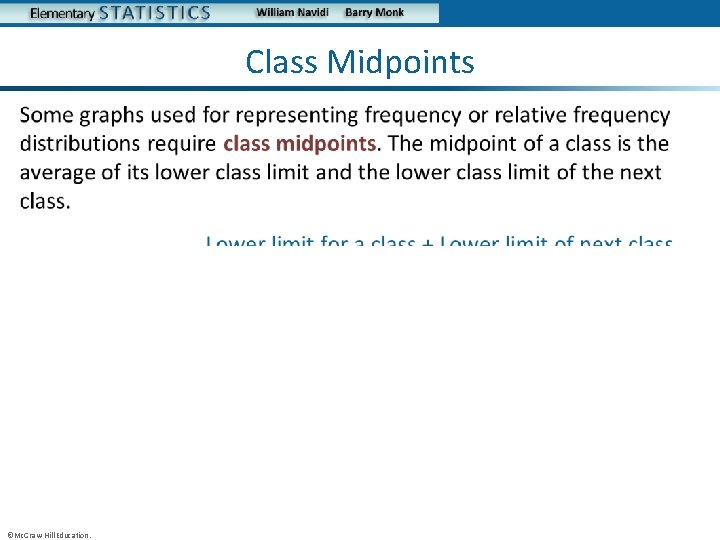
Class Midpoints • ©Mc. Graw-Hill Education.
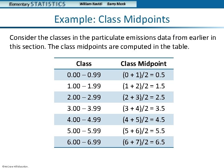
Example: Class Midpoints Consider the classes in the particulate emissions data from earlier in this section. The class midpoints are computed in the table. ©Mc. Graw-Hill Education. Class 0. 00 – 0. 99 1. 00 – 1. 99 2. 00 – 2. 99 Class Midpoint (0 + 1)/2 = 0. 5 (1 + 2)/2 = 1. 5 (2 + 3)/2 = 2. 5 3. 00 – 3. 99 4. 00 – 4. 99 5. 00 – 5. 99 6. 00 – 6. 99 (3 + 4)/2 = 3. 5 (4 + 5)/2 = 4. 5 (5 + 6)/2 = 5. 5 (6 + 7)/2 = 6. 5
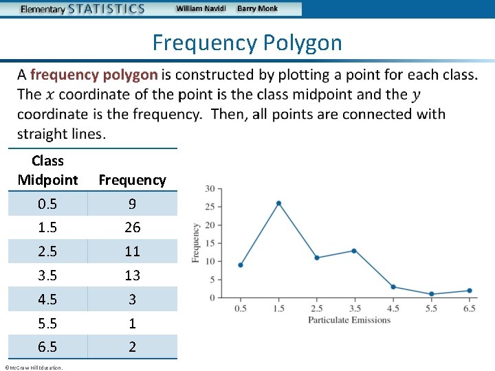
Frequency Polygon • Class Midpoint Frequency 0. 5 9 1. 5 26 2. 5 11 3. 5 13 4. 5 3 5. 5 1 6. 5 2 ©Mc. Graw-Hill Education.
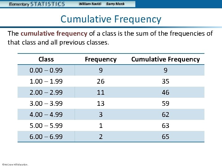
Cumulative Frequency The cumulative frequency of a class is the sum of the frequencies of that class and all previous classes. ©Mc. Graw-Hill Education. Class 0. 00 – 0. 99 1. 00 – 1. 99 2. 00 – 2. 99 Frequency 9 26 11 Cumulative Frequency 9 35 46 3. 00 – 3. 99 4. 00 – 4. 99 5. 00 – 5. 99 6. 00 – 6. 99 13 3 1 2 59 62 63 65
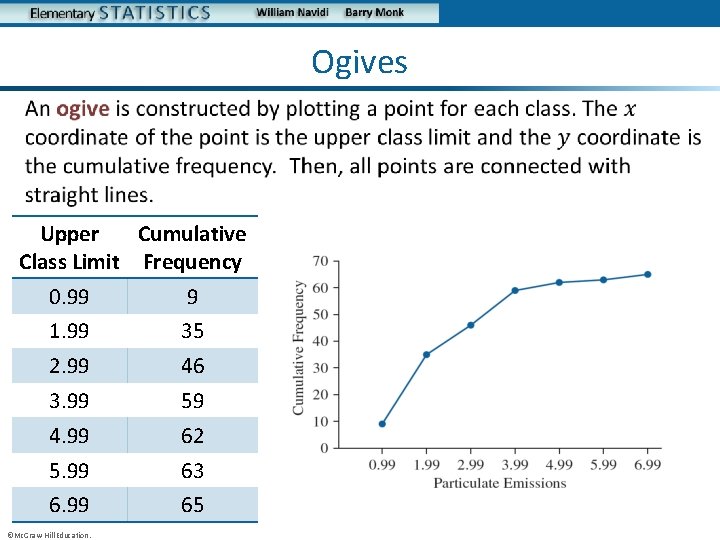
Ogives • Upper Cumulative Class Limit Frequency 0. 99 9 1. 99 35 2. 99 46 3. 99 59 4. 99 62 5. 99 63 6. 99 65 ©Mc. Graw-Hill Education.
You Should Know. . . • How to construct a frequency and relative frequency distribution for quantitative data • How to construct and interpret histograms • The guiding principles for choosing the number of classes in a histogram • How to construct a histogram on the TI-84 PLUS calculator • Some possible shapes of a data set including: – – – Symmetric Skewed to the right (positively skewed) Skewed to the left (negatively skewed) Unimodal Bimodal • How to construct frequency polygons and ogives ©Mc. Graw-Hill Education.
More Graphs for Quantitative Data Section 2. 3 ©Mc. Graw-Hill Education.
Objectives 1. Construct stem-and-leaf plots 2. Construct dotplots 3. Construct time-series plots ©Mc. Graw-Hill Education.
Objective 1 Construct stem-and-leaf plots ©Mc. Graw-Hill Education.
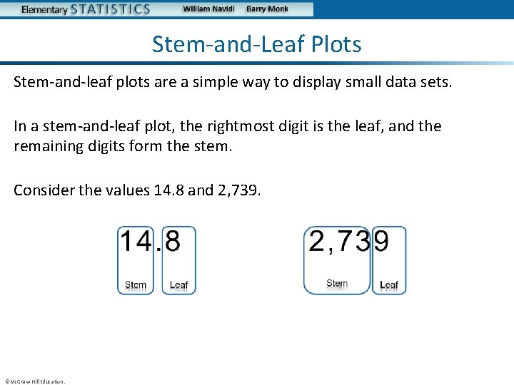
Stem-and-Leaf Plots Stem-and-leaf plots are a simple way to display small data sets. In a stem-and-leaf plot, the rightmost digit is the leaf, and the remaining digits form the stem. Consider the values 14. 8 and 2, 739. ©Mc. Graw-Hill Education.
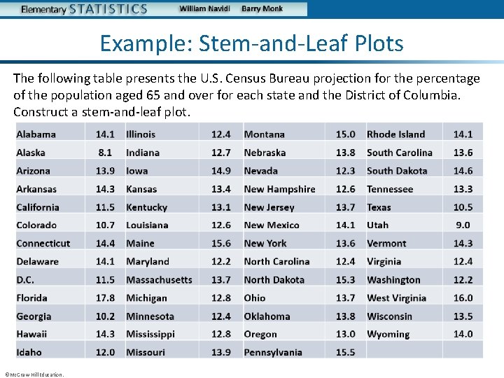
Example: Stem-and-Leaf Plots The following table presents the U. S. Census Bureau projection for the percentage of the population aged 65 and over for each state and the District of Columbia. Construct a stem-and-leaf plot. ©Mc. Graw-Hill Education.
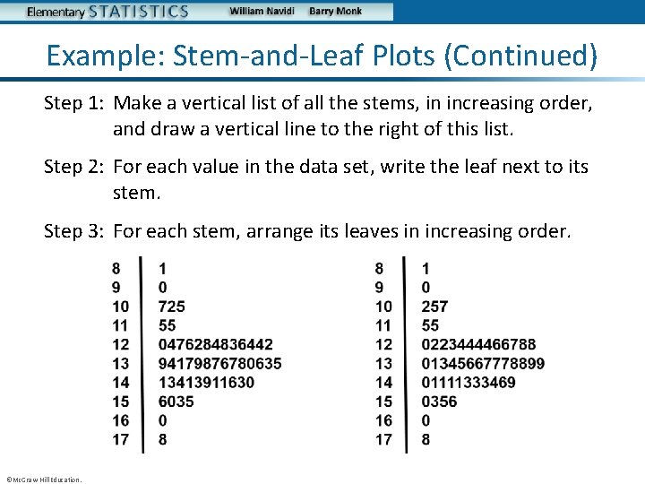
Example: Stem-and-Leaf Plots (Continued) Step 1: Make a vertical list of all the stems, in increasing order, and draw a vertical line to the right of this list. Step 2: For each value in the data set, write the leaf next to its stem. Step 3: For each stem, arrange its leaves in increasing order. ©Mc. Graw-Hill Education.
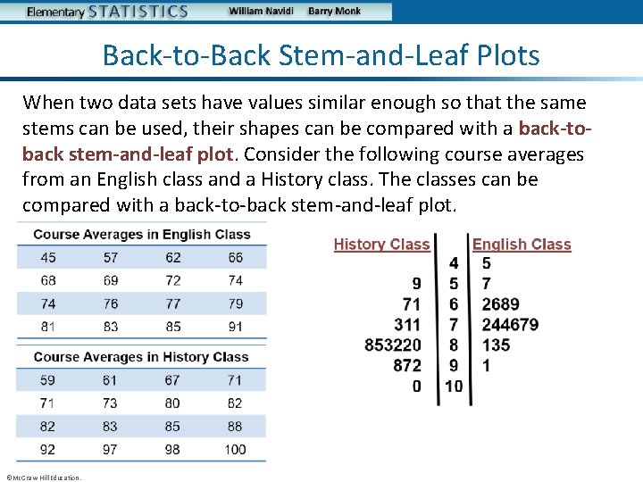
Back-to-Back Stem-and-Leaf Plots When two data sets have values similar enough so that the same stems can be used, their shapes can be compared with a back-toback stem-and-leaf plot. Consider the following course averages from an English class and a History class. The classes can be compared with a back-to-back stem-and-leaf plot. ©Mc. Graw-Hill Education.
Objective 2 Construct dotplots ©Mc. Graw-Hill Education.
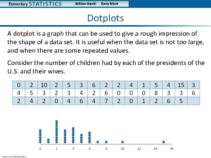
Dotplots A dotplot is a graph that can be used to give a rough impression of the shape of a data set. It is useful when the data set is not too large, and when there are some repeated values. Consider the number of children had by each of the presidents of the U. S. and their wives. ©Mc. Graw-Hill Education.
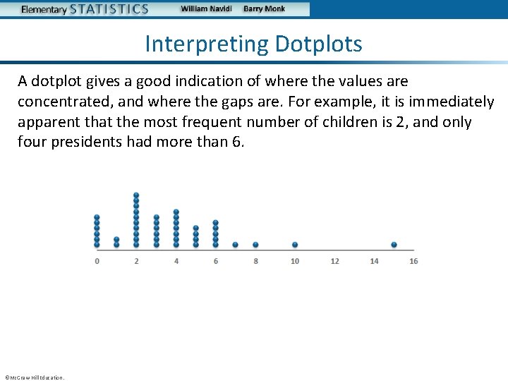
Interpreting Dotplots A dotplot gives a good indication of where the values are concentrated, and where the gaps are. For example, it is immediately apparent that the most frequent number of children is 2, and only four presidents had more than 6. ©Mc. Graw-Hill Education.
Objective 3 Construct time-series plots ©Mc. Graw-Hill Education.
Time-Series Plot A time-series plot may be used when the data consist of values of a variable measured at different points in time. In a time-series plot, the horizontal axis represents time, and the vertical axis represents the value of the variable we are measuring. ©Mc. Graw-Hill Education.
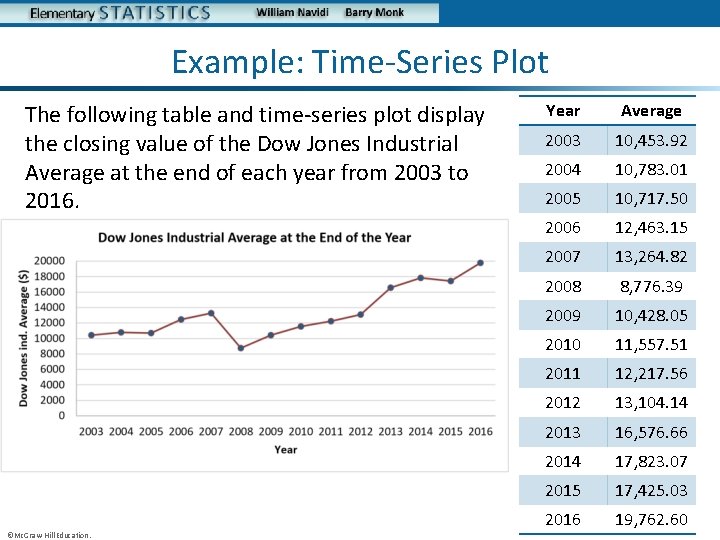
Example: Time-Series Plot The following table and time-series plot display the closing value of the Dow Jones Industrial Average at the end of each year from 2003 to 2016. ©Mc. Graw-Hill Education. Year Average 2003 10, 453. 92 2004 10, 783. 01 2005 10, 717. 50 2006 12, 463. 15 2007 13, 264. 82 2008 8, 776. 39 2009 10, 428. 05 2010 11, 557. 51 2011 12, 217. 56 2012 13, 104. 14 2013 16, 576. 66 2014 17, 823. 07 2015 17, 425. 03 2016 19, 762. 60
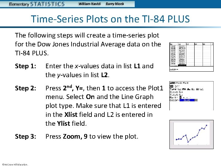
Time-Series Plots on the TI-84 PLUS The following steps will create a time-series plot for the Dow Jones Industrial Average data on the TI-84 PLUS. Step 1: Enter the x-values data in list L 1 and the y-values in list L 2. Step 2: Press 2 nd, Y=, then 1 to access the Plot 1 menu. Select On and the Line Graph plot type. Make sure that L 1 is entered in the Xlist field and L 2 is entered in the Ylist field. Step 3: Press Zoom, 9 to view the plot. ©Mc. Graw-Hill Education.
You Should Know. . . • How to construct and interpret: – Stem-and-leaf plots – Dotplots – Time-series plots ©Mc. Graw-Hill Education.
Graphs Can Be Misleading Section 2. 4 ©Mc. Graw-Hill Education.
Objectives 1. Understand how improper positioning of the vertical scale can be misleading 2. Understand the area principle for constructing statistical graphs 3. Understand how three-dimensional graphs can be misleading ©Mc. Graw-Hill Education.
Graphical Misrepresentation Statistical graphs, when properly used, are powerful forms of communication. Unfortunately, when graphs are improperly used, they can misrepresent the data and lead people to draw incorrect conclusions. We discuss here three of the most common forms of misrepresentation. • Incorrect position of the vertical scale • Incorrect sizing of graphical images • Misleading perspective for three-dimensional diagrams. ©Mc. Graw-Hill Education.

Objective 1 Understand how improper positioning of the vertical scale can be misleading ©Mc. Graw-Hill Education.
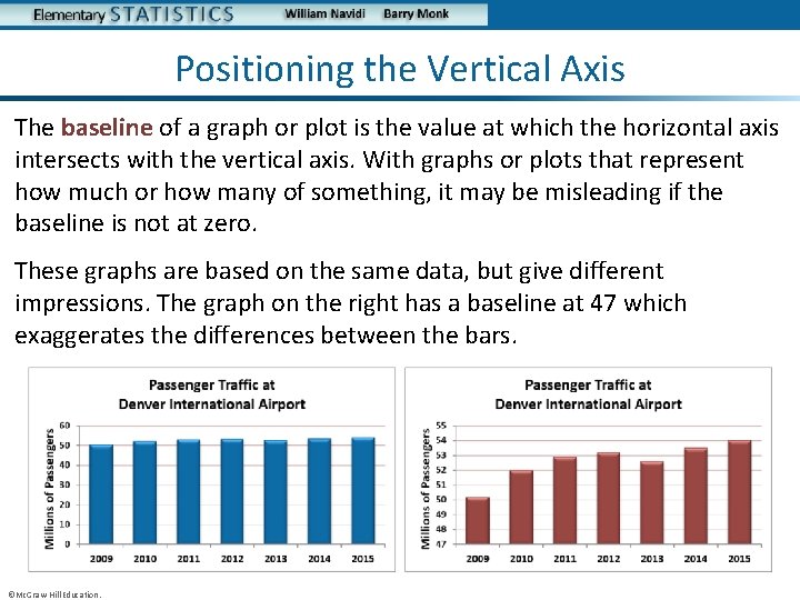
Positioning the Vertical Axis The baseline of a graph or plot is the value at which the horizontal axis intersects with the vertical axis. With graphs or plots that represent how much or how many of something, it may be misleading if the baseline is not at zero. These graphs are based on the same data, but give different impressions. The graph on the right has a baseline at 47 which exaggerates the differences between the bars. ©Mc. Graw-Hill Education.
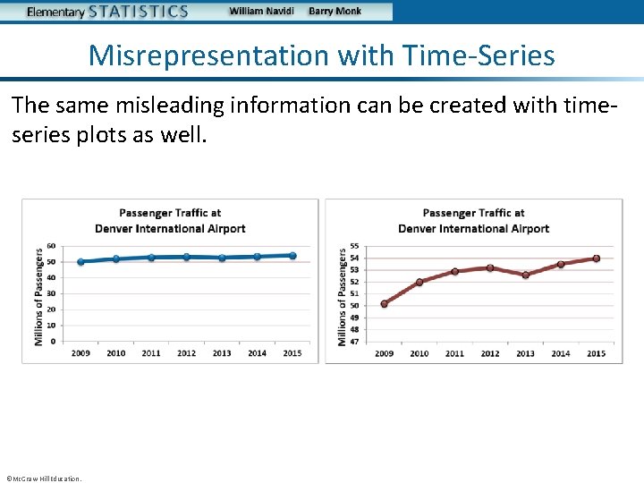
Misrepresentation with Time-Series The same misleading information can be created with timeseries plots as well. ©Mc. Graw-Hill Education.
Objective 2 Understand the area principle for constructing statistical graphs ©Mc. Graw-Hill Education.
The Area Principle We often use images to compare amounts. Larger images correspond to greater amounts. To use images properly in this way, we must follow a rule known as The Area Principle When amounts are compared by constructing an image for each amount, the areas of the images must be proportional to the amounts. For example, if one amount is twice as much as another, its image should have twice as much area as the other image. ©Mc. Graw-Hill Education.
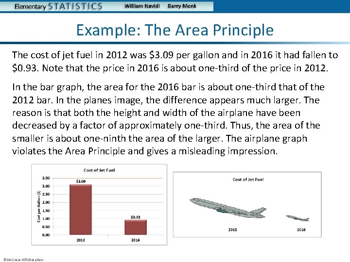
Example: The Area Principle The cost of jet fuel in 2012 was $3. 09 per gallon and in 2016 it had fallen to $0. 93. Note that the price in 2016 is about one-third of the price in 2012. In the bar graph, the area for the 2016 bar is about one-third that of the 2012 bar. In the planes image, the difference appears much larger. The reason is that both the height and width of the airplane have been decreased by a factor of approximately one-third. Thus, the area of the smaller is about one-ninth the area of the larger. The airplane graph violates the Area Principle and gives a misleading impression. ©Mc. Graw-Hill Education.

Objective 3 Understand how three-dimensional graphs can be misleading ©Mc. Graw-Hill Education.
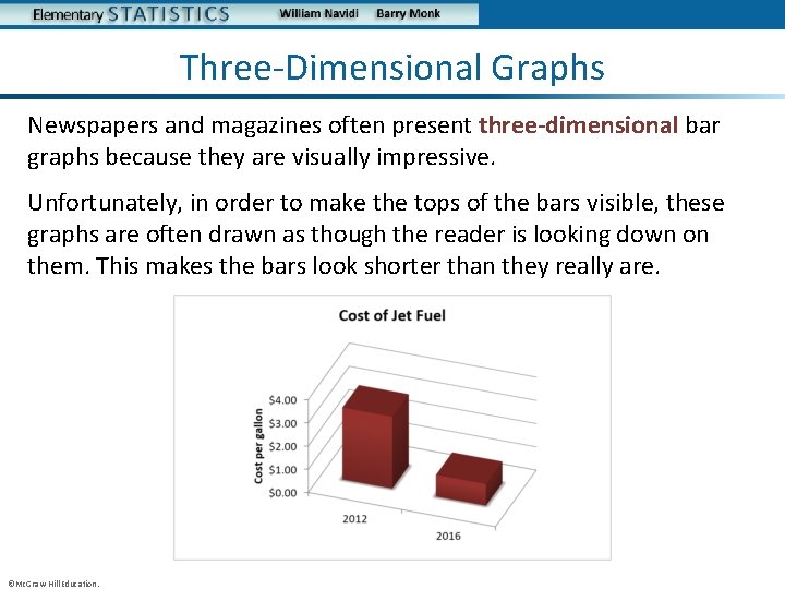
Three-Dimensional Graphs Newspapers and magazines often present three-dimensional bar graphs because they are visually impressive. Unfortunately, in order to make the tops of the bars visible, these graphs are often drawn as though the reader is looking down on them. This makes the bars look shorter than they really are. ©Mc. Graw-Hill Education.
You Should Know. . . • The common ways that graphs can be misleading including: – Incorrect positioning of the vertical axis – Incorrect sizing of graphical images by not following the Area Principle – How three-dimensional graphs can distort the perspective ©Mc. Graw-Hill Education.
- Slides: 72