Elearning Principles Interface Design principles Graphic Design Learning
 • Learning principles (Clark & Mayer)")


 2 - Texture & 3 D")
")
 Picture Five")
 Picture Five")


 do in human body? A. B. C. D. They carry")


 viewers assume that elements close to each other are related")


- Slides: 71
E-learning Principles • Interface Design principles (Graphic Design) • Learning principles (Clark & Mayer) • Engagement principle (Michael Allen)
User Interface Design
Process of interface design 1 - Elements first, Interface design later gathering or producing the visuals elements (pictures & texts) Based on your goals & objectives and students’ needs and level
2 - Pattern matters, choose the overall “look” or the general design of your presentation. Decide how the viewer’s eye will flow across your display
3 - Arrangement not random arrange the items within the pattern.
Grab attention 1 - Uniqueness (Size, Color, Shape) 2 - Texture & 3 D effect 3 - Interaction
Uniqueness (Color)
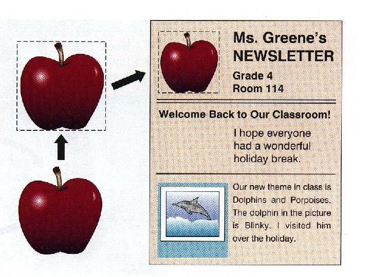
Uniqueness (Shape) Picture Five
Uniqueness (size) Picture Five
Texture & 3 D
Two dimensional Download Upload Next Previous Search Browse Buy Now Buy Later
Three dimensional
3 -interaction, viewers can be asked to respond to visual displays
This is a circle Complete the Circle
What do (red cells) do in human body? A. B. C. D. They carry impulses around the body to deliver messages. They increase the surface area for absorbing water. They contain chloroplasts for photosynthesis. They carry oxygen around the body to all the cells.
A. B. C. D. E. F. Carries impulses around the body to deliver messages. They swim to fertilize the egg. To trap dust particles and germs in the air passages. They increase the surface area for absorbing water. They contain chloroplasts for photosynthesis. They carry oxygen around the body to all the cells.
overall look The major factors that affect the overall look are 1. alignment of elements, 2. shape, 3. balance, 4. style, 5. color scheme, 6. and color appeal.
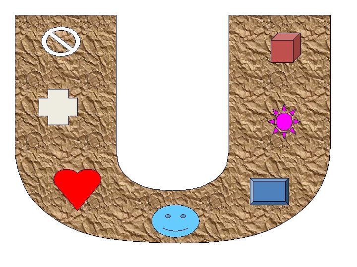
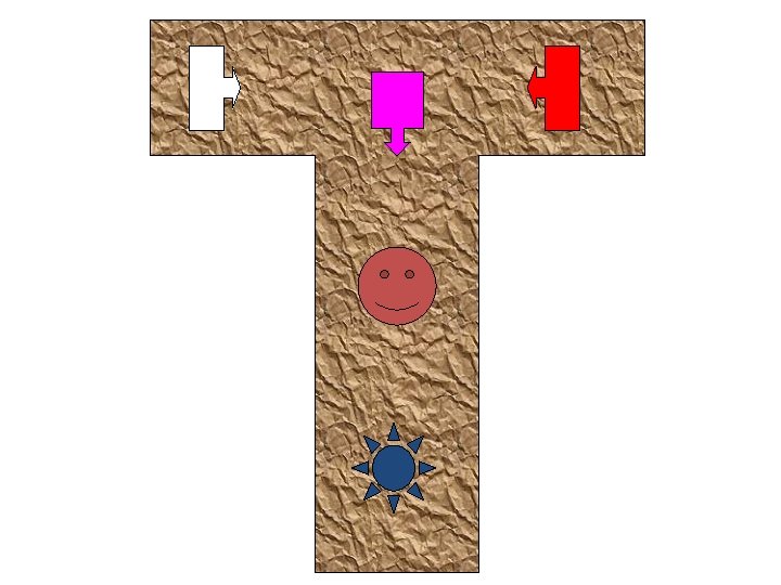
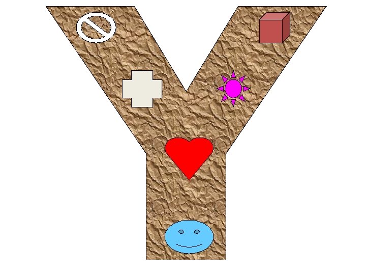
Creative Arrangement Shapes Another way to arrange the visual and verbal elements is to put them into a shape that is already familiar to the viewer (e. g. , circle, triangle, rectangle, the letters Z, L, T, and U)
Balance
Balance? on each side of an axis, either horizontally or vertically or both. The weight of the elements in a display should equally distributed In som e c asy ase s in or de r m ica ay to ca l o use tch r in th for e e ma yes l b yo ala u nce. mm etr e o c n s t a l a nd b m it te i id se . o Av cau ring be Jar be
Style Your choice of lettering and type of pictures should be consistent with each other and with the preferences of the audience Students, artists, religious groups,
Using Colors • Color should be used sparingly in your applications and, if you do use it, you must also use a secondary indicator. • Some of your users may be color blind and if you are using color to highlight something on a screen, then you need to do something else to make it stand out if you want these people to notice it.
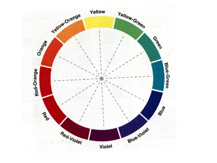
Color Psychology Blue, green, and violet are considered cool colors Whereas red and orange are considered warm colors.
Warm colors are associated with action, dynamic, and warm feeling And cool colors are associated with contemplative, thoughtful, cool feeling Also warm colors appear to approach the viewer while cool colors tend to recede. Children seem to prefer warm colors (particularly, red, pink, yellow, and orange, brighter colors and combinations of intense colors)
Teacher Education • Pre Service • In Service • Post Service
Arrangement Rules
Arrangement Rules 1 - Proximity 2. Directionals, 3 - Figure and ground, 4 - Consistency
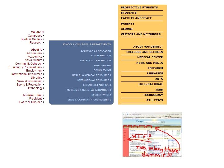
1 - proximity (spacing) viewers assume that elements close to each other are related
Group things effectively. Items that are logically connected should be grouped together on the screen to communicate they are connected, whereas items that have nothing to do with each other should be separated. You can use white space between collections of items to group them and/or you can put boxes around them to accomplish the same thing.
Example
Directionals • You can use arrows to direct the viewer’s attention
3 - figure and ground important elements, especially wording, should stand out in good contrast to the background.
Contrast • Reading blue text on a white background is easy. • But reading blue text on a red background is difficult.
Russia launches enhanced rocket in test March 21, 2000 Web posted at: 10: 12 AM EST (1512 GMT) MOSCOW (AP) -- Russia successfully launched a rocket designed to put payloads higher into orbit in a rehearsal for the launch of a group of research satellites this summer, space officials said Tuesday. A Soyuz booster equipped with a Fregat accelerator unit placed a mock-up Cluster II satellite into orbit after blasting off from the Baikonur cosmodrome in Kazakhstan on Monday night.
Russia launches enhanced rocket in test March 21, 2000 Web posted at: 10: 12 AM EST (1512 GMT) MOSCOW (AP) -- Russia successfully launched a rocket designed to put payloads higher into orbit in a rehearsal for the launch of a group of research satellites this summer, space officials said Tuesday. A Soyuz booster equipped with a Fregat accelerator unit placed a mock-up Cluster II satellite into orbit after blasting off from the Baikonur cosmodrome in Kazakhstan on Monday night.
Russia launches enhanced rocket in test March 21, 2000 Web posted at: 10: 12 AM EST (1512 GMT) MOSCOW (AP) -- Russia successfully launched a rocket designed to put payloads higher into orbit in a rehearsal for the launch of a group of research satellites this summer, space officials said Tuesday. A Soyuz booster equipped with a Fregat accelerator unit placed a mock-up Cluster II satellite into orbit after blasting off from the Baikonur cosmodrome in Kazakhstan on Monday night.
Russia launches enhanced rocket in test March 21, 2000 Web posted at: 10: 12 AM EST (1512 GMT) MOSCOW (AP) -- Russia successfully launched a rocket designed to put payloads higher into orbit in a rehearsal for the launch of a group of research satellites this summer, space officials said Tuesday. A Soyuz booster equipped with a Fregat accelerator unit placed a mock-up Cluster II satellite into orbit after blasting off from the Baikonur cosmodrome in Kazakhstan on Monday night.
4 - Consistency? every time the arrangement breaks the rules, viewers have to expend mental energy deciding whether this is a deliberate exception or whether they need to revise the rule Consistency in your user interface enables your users to build an accurate mental model of the way it works, and accurate mental models lead to lower training and support costs.
Consistency Titles, Notes, Links, Exercises, Icons,
Consistency If you can double-click on items in one list and have something happen, then you should be able to double-click on items in any other list and have the same sort of thing happen. Put your buttons in consistent places on all your windows, use the same wording in labels and messages, and use a consistent color scheme throughout.
Title Text Text Text Text Text Text Text Text
Text Text Text Text Text Text Text Text Title
Navigation bar arrangement • In Western societies, people read left to right and top to bottom. Because people are used to this, should you design screens that are also organized left to right and top to bottom when designing a user interface for people from this culture
Keep the Bar - Hold the line When you are developing the user interface for your system you will discover that your stakeholders often have some unusual ideas as to how the user interface should be developed. You should definitely listen to these ideas but you also need to make your stakeholders aware of your corporate UI standards and the need to conform to them.
Facilitate Navigation If it is difficult to get from one screen to another, then your users will quickly become frustrated and give up
Expect your users to make mistakes.
Provide feedback
Justify data appropriately For columns of data, common practice is to right-justify integers, decimal align floatingpoint numbers, and to left-justify strings Text High Low Medium Low High Numbers 1. 5 2. 5 3. 4 4. 35 7. 235
Intuitive Design • If your users don’t know how to use your software, they should be able to determine how to use it by making educated guesses. • Even when the guesses are wrong, your system should provide reasonable results from which your users can readily understand ideally learn.
Simplicity • Don’t create busy user interfaces • the overall density of the screen should not exceed 40 percent
Enable keyboard shortcuts
Offer personalization options
Design feedback messages carefully • color code the different types of messages
Use tabbed navigation • If you make the menu look like tabs on folders, almost everyone will be able to figure out what it is and how it works. This is because the visual metaphor is strong and clear.
Short sign-up forms • removing all optional elements
Watch your words • “You have input the wrong information” OR • “An account number should be eight digits in length. ”
Non-Standard Style
Using Generic Labels • Use descriptive labels