EFFECTIVE VISUALS USING GRAPHS TABLES CHARTS AND ILLUSTRATIONS
EFFECTIVE VISUALS USING GRAPHS, TABLES, CHARTS, AND ILLUSTRATIONS IN TECHNICAL REPORTS
VISUALS � Capture and hold people’s attention � Help illustrate textual information and data � Simplify complicated textual descriptions � Help the reader understand complicated systems, processes, data, and mechanisms.
TYPES OF VISUALS Visuals are referred to as either TABLES or FIGURES. � TABLES contain detailed data/information formatted in rows and columns for visual comparison. � FIGURES can take many forms and include � Graphs � Charts � Illustrations
When to use each � Tables show the most amount of detail but require study. Use a table when detail is needed; refer to the details in the text, and if necessary, move the table to an appendix. � Figures such as graphs and charts illustrate trends or contrast more dramatically but lose the detail. Make the point with the graph, but back it up in the text.
Principles of Effective Visuals � Simple Design: make visuals clear, easy to understand; don’t overcomplicate them. � Not“decoration”: visuals perform a useful function, they don’t just decorate your document � Clarification: visuals illustrate and supplement written ideas; they do not “replace” textual information
5 RULES for including visuals: 1. Number and caption every visual sequentially � Tables and Figures are numbered separately � Captions should be brief, accurate, and informative/descriptive 2. Discuss each visual in the body text, referring to the caption number. 3. Never omit, distort, or manipulate information to deceive or mislead 4. Cite the sources of visuals you did not create yourself 5. Clearly label all elements of a visual (legends, axes, scale, direction, etc. ) and provide a “key”
Additional Considerations � Place the visual as soon as possible after the in-text reference to that visual (on the same page if at all possible) � Table captions must be placed ABOVE the table; figure captions can be placed above or below (but be consistent) � Point of view should match that of the reader performing illustrated procedure � Present all visuals in an appealing manner � Don’t crowd them by the text or squeeze in between other visuals � Use white space to enhance readability � Avoid spelling mistakes, poor grammar, inconsistent formatting, in labels, key, title or accompanying text � Use computer applications critically; simple is good.
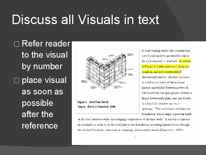
Discuss all Visuals in text � Refer reader to the visual by number � place visual as soon as possible after the reference
TABLES � Portray detailed statistical and other information for comparison horizontally � Consist of horizontal rows and vertical columns � Leftmost column holds the row headings and is called the STUB (not used in all tables) � Top row holds the column headings and is called the BOXHEAD; specify unit measurements in boxhead rather than in each cell. Centre and bold the boxhead text. All tables must include a boxhead row. � Align columns according to the material in the cells: left align text, right align numbers, left align combinations � Explain key points of the table; refer to tables in nearby text, and explain the significance. Data does not “speak for itself” – you must disuss its significance.
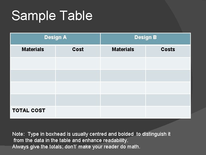
Sample Table Design A Materials Design B Cost Materials Costs TOTAL COST Note: Type in boxhead is usually centred and bolded to distinguish it from the data in the table and enhance readability. Always give the totals; don’t’ make your reader do math.
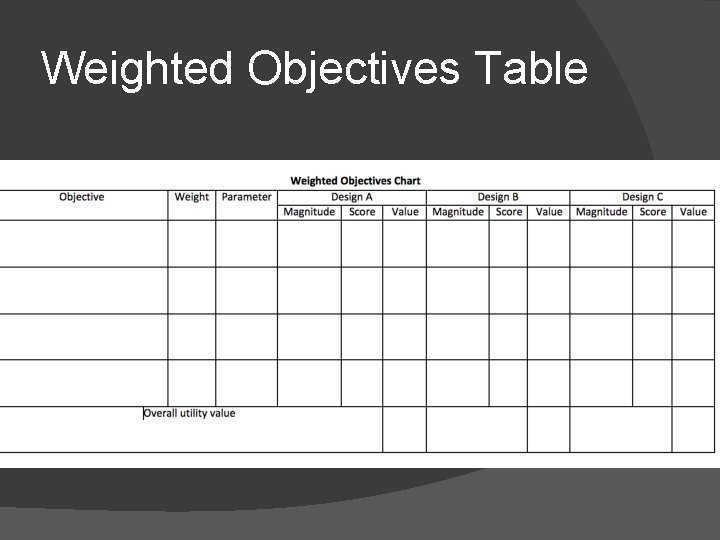
Weighted Objectives Table
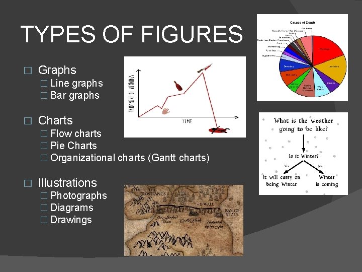
TYPES OF FIGURES � Graphs � Line graphs � Bar graphs � Charts � Flow charts � Pie Charts � Organizational charts (Gantt charts) � Illustrations � Photographs � Diagrams � Drawings
GRAPHS � Line Graphs and Bar Graphs � Display statistical trends, changes, and comparisons � Line Graphs � Portray change over time � Plot points along horizontal and vertical axes � Join points by means of straight line � Horizontal axis identifies the categories of information � Vertical axis identifies incremental values that are being compared � Additional lines can be added for comparison
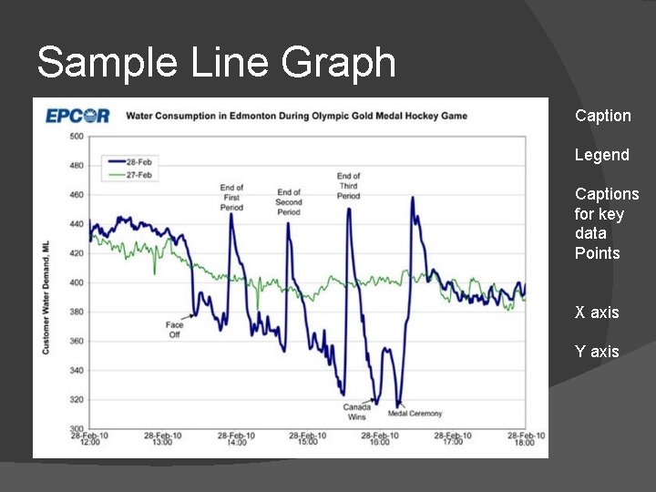
Sample Line Graph Caption Legend Captions for key data Points X axis Y axis
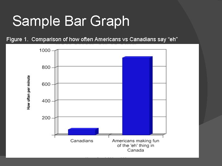
Sample Bar Graph Figure 1. Comparison of how often Americans vs Canadians say “eh”
Bar Graphs �Consist of horizontal and vertical axes that depict dependent and independent variables �Which axis depicts which variable is determined by whether bars are horizontal or vertical �Horizontal bar graphs are useful for accommodating many bars and have room for labels if titles are lengthy
CHARTS � Portray quantitative, cause-and-effect, and other relationships among parts of a unified whole � Can depict �Steps in a production process �Chain of command in an organization �Sequential or hierarchical interactions
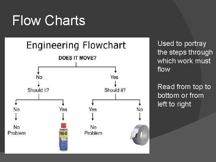
Flow Charts Used to portray the steps through which work must flow Read from top to bottom or from left to right
Organizational Charts � Portray chains of command within organizations �Most powerful positions placed at the top �Least powerful positions placed at the bottom � Portray relationships between elements (can be non-hierarchical) � Gantt Charts – project management tool showing when all tasks are to be done in a project over a period of time
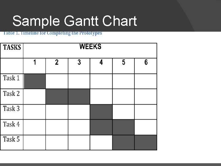
Sample Gantt Chart
Pie Chart Pie Or Circle Charts – depict relationships among parts within statistical wholes �Often used to show the percentage distribution of budget or resources �Should have at least 3, but ideally no more than 7, segments resembling slices of pie and constituting a percentage �Each slice labeled, showing percentage of the total
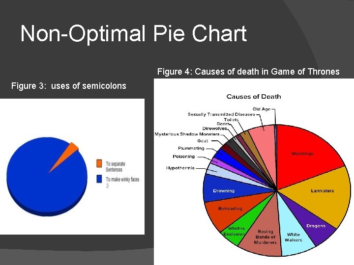
Non-Optimal Pie Chart Figure 4: Causes of death in Game of Thrones Figure 3: uses of semicolons
ILLUSTRATIONS Illustrations such as photographs and diagrams help the reader to understand what you explain in your text. Some documents that NEED illustrations include � Instructions � Need to show the components of the objects involved, and the orientations between the objects and the tools � Technical background reports � Need to use diagrams and drawings, photographic evidence, conceptual drawings with maps, etc.
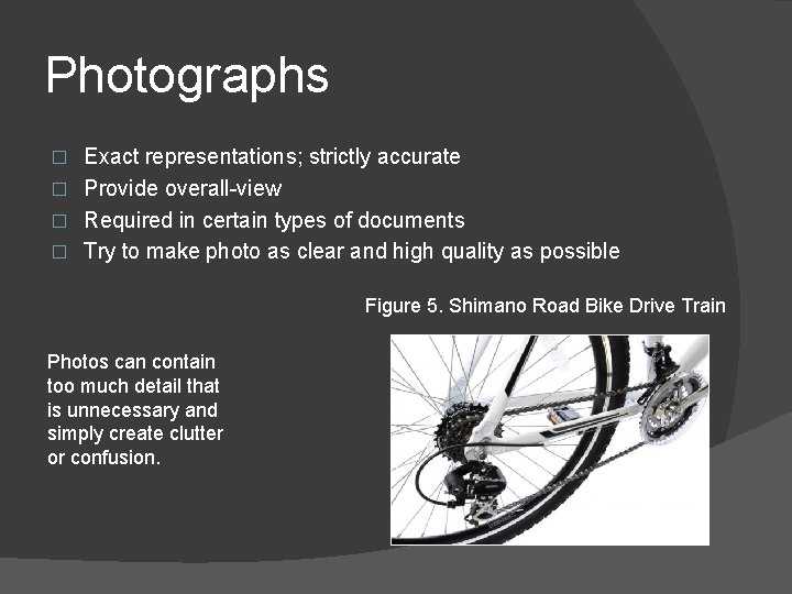
Photographs Exact representations; strictly accurate � Provide overall-view � Required in certain types of documents � Try to make photo as clear and high quality as possible � Figure 5. Shimano Road Bike Drive Train Photos can contain too much detail that is unnecessary and simply create clutter or confusion.
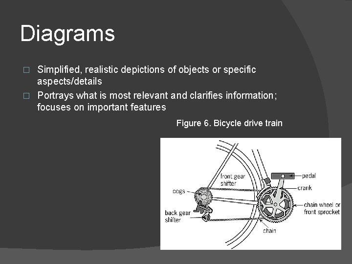
Diagrams Simplified, realistic depictions of objects or specific aspects/details � Portrays what is most relevant and clarifies information; focuses on important features � Figure 6. Bicycle drive train
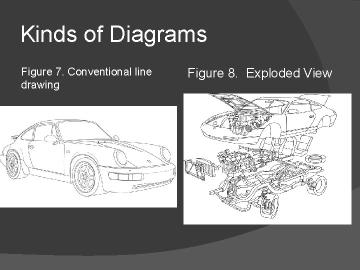
Kinds of Diagrams Figure 7. Conventional line drawing Figure 8. Exploded View
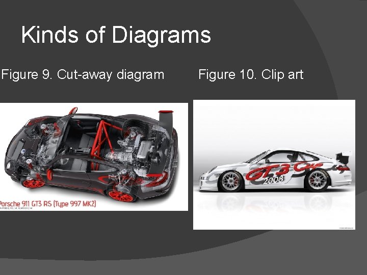
Kinds of Diagrams Figure 9. Cut-away diagram Figure 10. Clip art
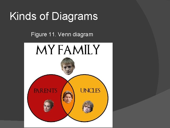
Kinds of Diagrams Figure 11. Venn diagram
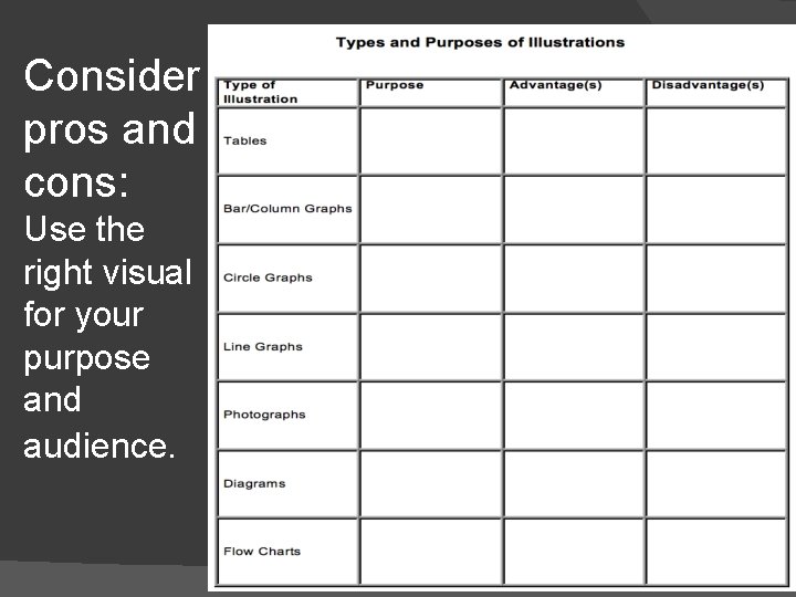
Consider pros and cons: Use the right visual for your purpose and audience.
- Slides: 29