Effective Data Presentation Presented to Fernwood Avenue Middle

- Slides: 51

Effective Data Presentation Presented to: Fernwood Avenue Middle School By: Ferne Friedman-Berg, Ph. D. Kenneth Allendoerfer, Ph. D. Date: December 21, 2011 Federal Aviation Administration

Introduction • Good and bad data displays are a lot like good and bad writing • Good graphical displays of data communicate ideas with: – Clarity – Precision – Efficiency • Bad graphical displays: – Distort or obscure the data – Make it harder to understand or compare – Don’t effectively communicate the “take home” message of the graph. Effective Data Presentation December 21, 2011 Federal Aviation Administration 2

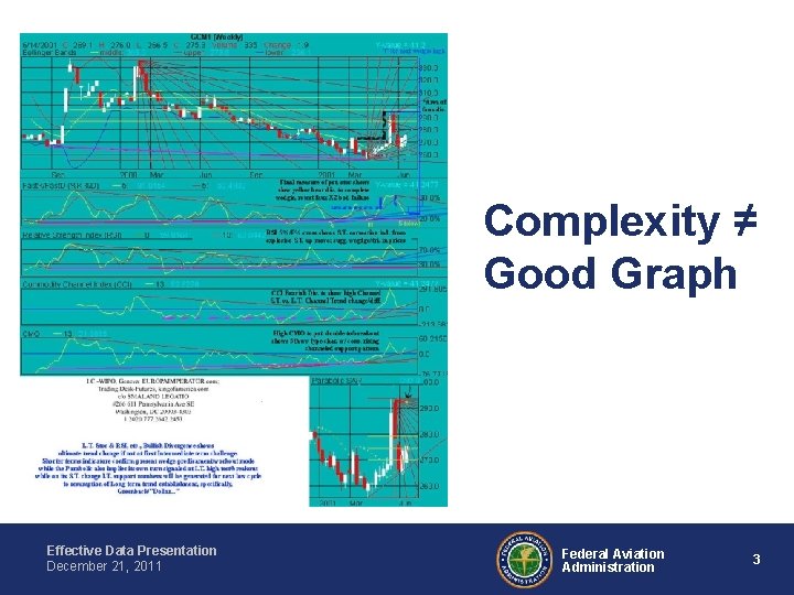
Complexity ≠ Good Graph Effective Data Presentation December 21, 2011 Federal Aviation Administration 3

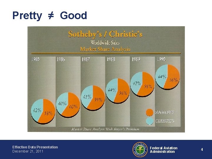
Pretty ≠ Good Effective Data Presentation December 21, 2011 Federal Aviation Administration 4

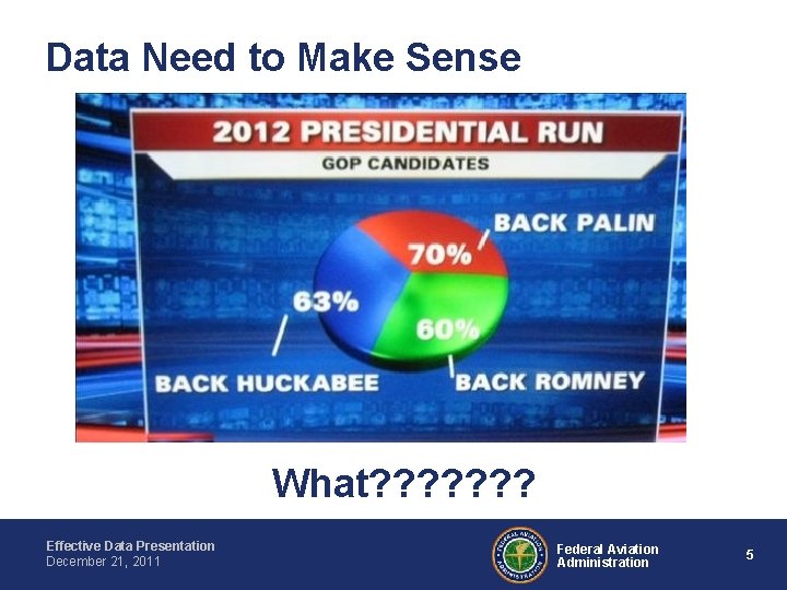
Data Need to Make Sense What? ? ? ? Effective Data Presentation December 21, 2011 Federal Aviation Administration 5

Bad Graphs: The Fundamentals • Three fundamental elements of bad graphical displays – Data Ambiguity – Data Distortion – Data Distraction Effective Data Presentation December 21, 2011 Federal Aviation Administration 6

Recognizing Bad Graphs • Graphs give an immediate visual image • Why might a graph be bad: – bad because of errors – technically correct but misleading. • It is important to recognize bad or misleading graphs in order to keep from getting the wrong impression. Effective Data Presentation December 21, 2011 Federal Aviation Administration 7

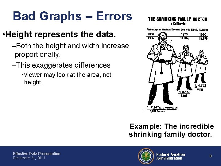
Bad Graphs – Errors • Height represents the data. –Both the height and width increase proportionally. –This exaggerates differences • viewer may look at the area, not height. Example: The incredible shrinking family doctor. Effective Data Presentation December 21, 2011 Federal Aviation Administration 8

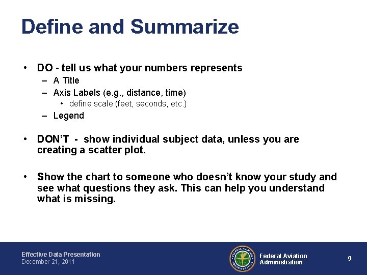
Define and Summarize • DO - tell us what your numbers represents – A Title – Axis Labels (e. g. , distance, time) • define scale (feet, seconds, etc. ) – Legend • DON’T - show individual subject data, unless you are creating a scatter plot. • Show the chart to someone who doesn’t know your study and see what questions they ask. This can help you understand what is missing. Effective Data Presentation December 21, 2011 Federal Aviation Administration 9

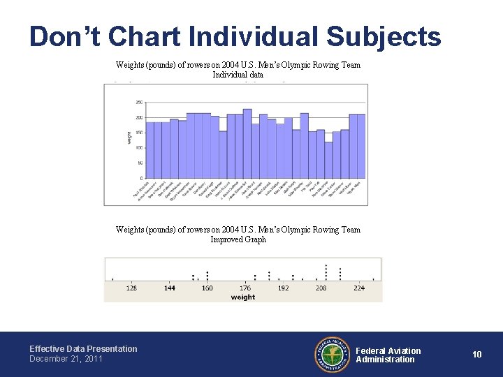
Don’t Chart Individual Subjects Weights (pounds) of rowers on 2004 U. S. Men’s Olympic Rowing Team Individual data Weights (pounds) of rowers on 2004 U. S. Men’s Olympic Rowing Team Improved Graph Effective Data Presentation December 21, 2011 Federal Aviation Administration 10

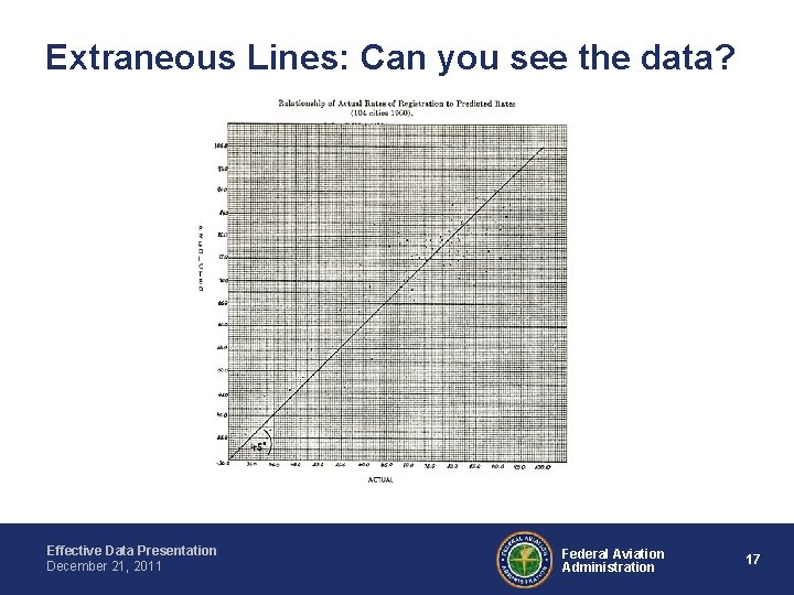
Some DO’s & DON’TS of Good Graphing • • DO - Maximize the ratio of data to ink. DON’T - use extraneous lines DON’T – use 3 -D DON’T - rotate the perspective. Effective Data Presentation December 21, 2011 Federal Aviation Administration 11

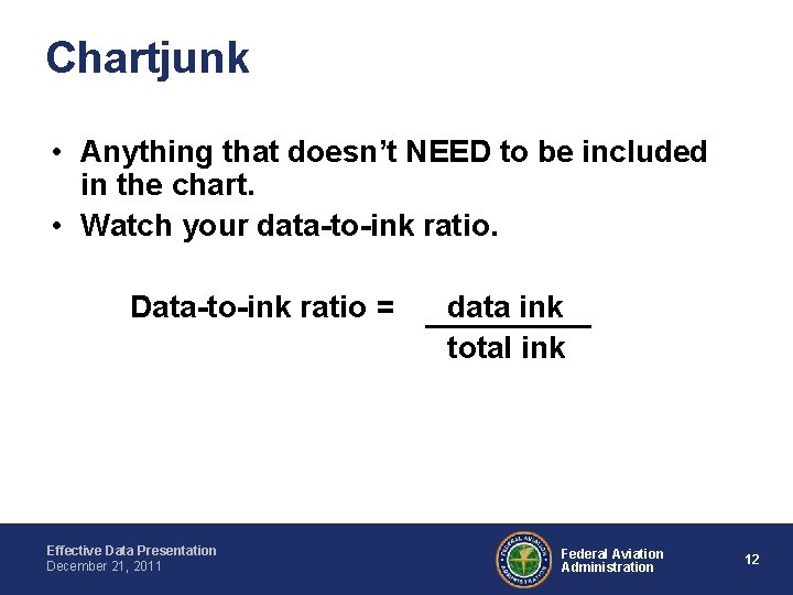
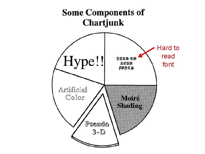
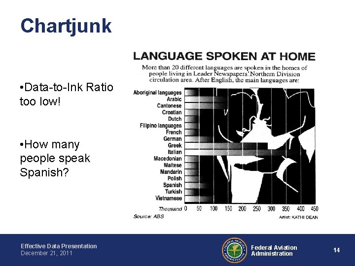
Chartjunk • Anything that doesn’t NEED to be included in the chart. • Watch your data-to-ink ratio. Data-to-ink ratio = Effective Data Presentation December 21, 2011 data ink total ink Federal Aviation Administration 12

Hard to read font

Chartjunk • Data-to-Ink Ratio too low! • How many people speak Spanish? Effective Data Presentation December 21, 2011 Federal Aviation Administration 14

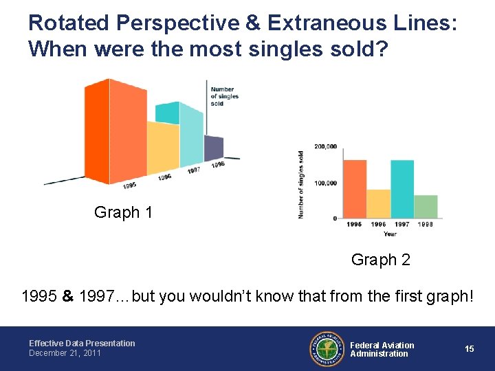
Rotated Perspective & Extraneous Lines: When were the most singles sold? Graph 1 Graph 2 1995 & 1997…but you wouldn’t know that from the first graph! Effective Data Presentation December 21, 2011 Federal Aviation Administration 15

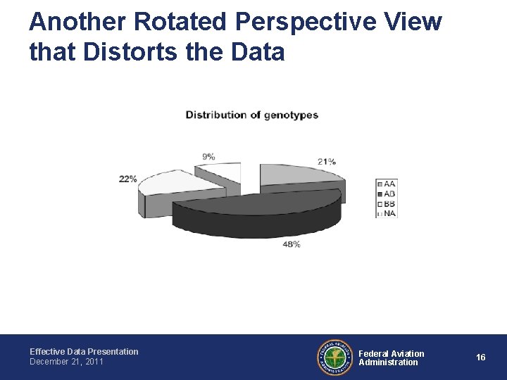
Another Rotated Perspective View that Distorts the Data Effective Data Presentation December 21, 2011 Federal Aviation Administration 16

Extraneous Lines: Can you see the data? Effective Data Presentation December 21, 2011 Federal Aviation Administration 17

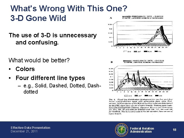
What's Wrong With This One? 3 -D Gone Wild The use of 3 -D is unnecessary and confusing. What would be better? • Colors • Four different line types – e. g. , Solid, Dashed, Dotted, Dashdotted Effective Data Presentation December 21, 2011 Federal Aviation Administration 18

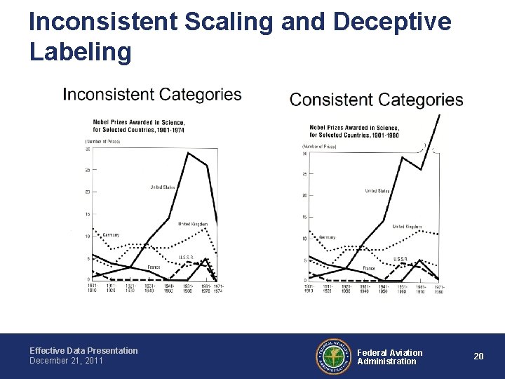
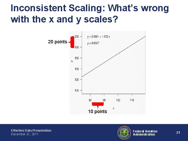
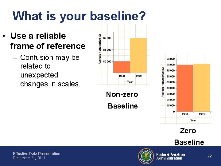
More DO’s & DON’TS of Good Graphing • DON’T use inconsistent scaling – This makes differences look bigger than they actually are • DON’T use inaccurate labeling – This can mislead the reader • DON’T use a non-zero axis – It can be misleading if axis starts at a value other than zero. Effective Data Presentation December 21, 2011 Federal Aviation Administration 19

Inconsistent Scaling and Deceptive Labeling Effective Data Presentation December 21, 2011 Federal Aviation Administration 20

Inconsistent Scaling: What’s wrong with the x and y scales? 20 points 10 points Effective Data Presentation December 21, 2011 Federal Aviation Administration 21

What is your baseline? • Use a reliable frame of reference – Confusion may be related to unexpected changes in scales. Non-zero Baseline Zero Baseline Effective Data Presentation December 21, 2011 Federal Aviation Administration 22

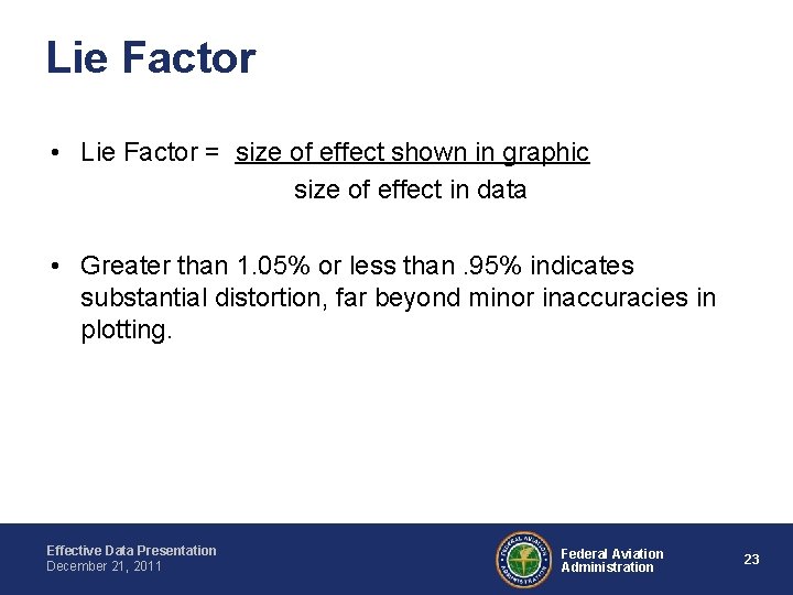
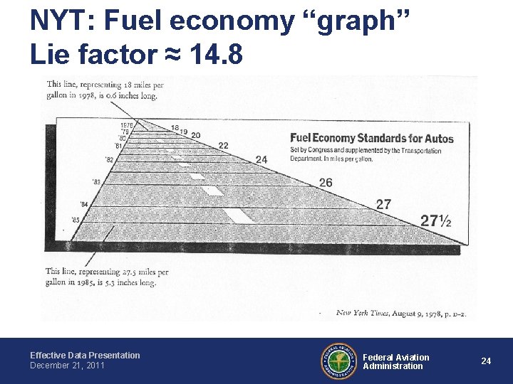
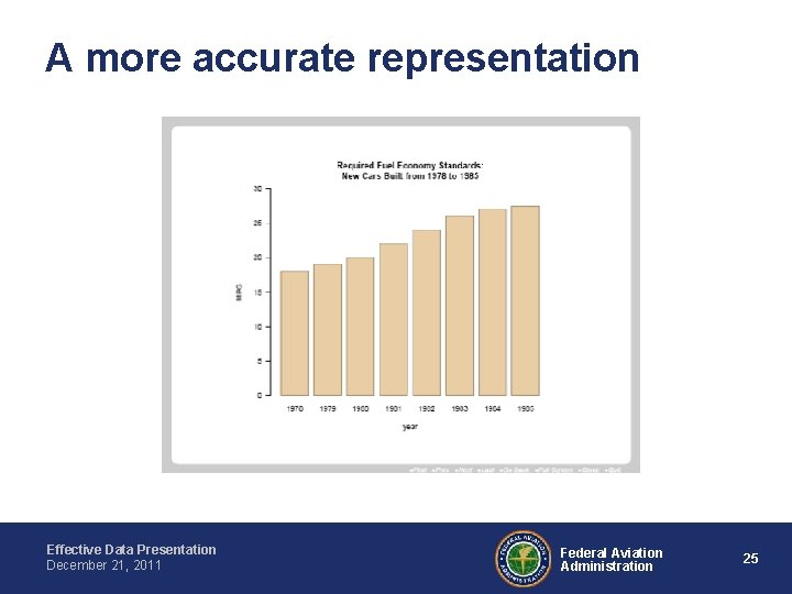
Lie Factor • Lie Factor = size of effect shown in graphic size of effect in data • Greater than 1. 05% or less than. 95% indicates substantial distortion, far beyond minor inaccuracies in plotting. Effective Data Presentation December 21, 2011 Federal Aviation Administration 23

NYT: Fuel economy “graph” Lie factor ≈ 14. 8 Effective Data Presentation December 21, 2011 Federal Aviation Administration 24

A more accurate representation Effective Data Presentation December 21, 2011 Federal Aviation Administration 25

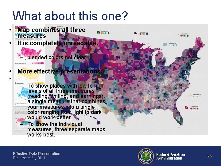
What about this one? • Map combines all three measures • It is completely unreadable. – blended colors not clear • More effective presentations: • – To show places with low to high levels of all three measures (reading, writing, and earnings), a single measure that combines your measures into a single color ranging from light to dark would work better. – To show the individual measures, three separate maps works best. Effective Data Presentation December 21, 2011 Federal Aviation Administration 26

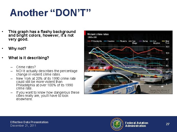
Another “DON’T” • This graph has a flashy background and bright colors, however, it’s not very good. • Why not? • What is it describing? – Crime rates? – NO! It actually describes the percentage change in violent crime rates. – New York at 20% of its 1990 crime rate could still be more violent than Philadelphia at over 100% of its 1990 crime rate. – If you want to know how dangerous these cities really are, you’ll have to look elsewhere. Effective Data Presentation December 21, 2011 Federal Aviation Administration 27

Statistics for Science Fairs • What difference is meaningful? • When is it scientifically valid to say that two numbers are different? – Is an 80 on a test different than an 81? • How much would you pay for a new teaching method for a gain of one point? – If you are trying to say two numbers are different you might want statistics to back up what you say. Effective Data Presentation December 21, 2011 Federal Aviation Administration 28

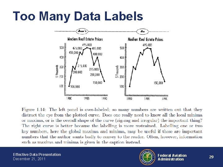
Too Many Data Labels Effective Data Presentation December 21, 2011 Federal Aviation Administration 29

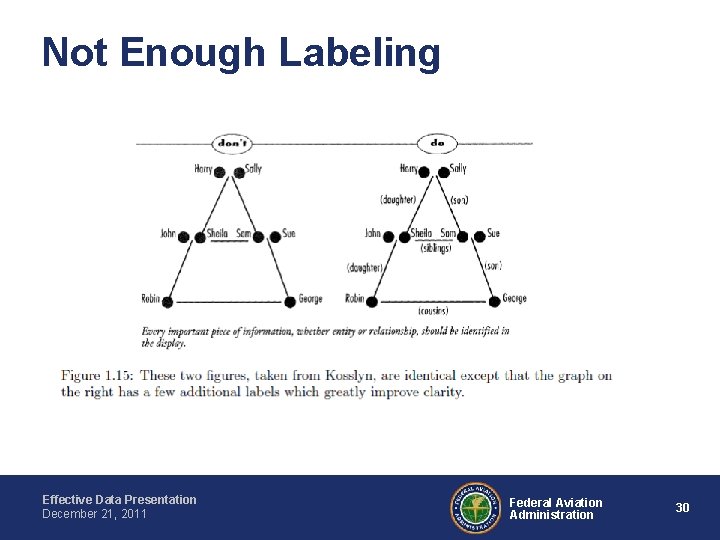
Not Enough Labeling Effective Data Presentation December 21, 2011 Federal Aviation Administration 30

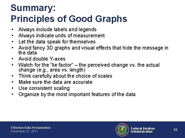
Summary: Principles of Good Graphs • • • Always include labels and legends Always indicate units of measurement Let the data speak for themselves Avoid fancy 3 D graphs and visual effects that hide the message in the data Avoid double Y-axes Watch for the “lie factor” – the perceived change vs. the actual change (e. g. , area vs. length) Think carefully about the choice of scales Make sure the data are accurate Use consistent scaling Organize by the most important features of the data Effective Data Presentation December 21, 2011 Federal Aviation Administration 31

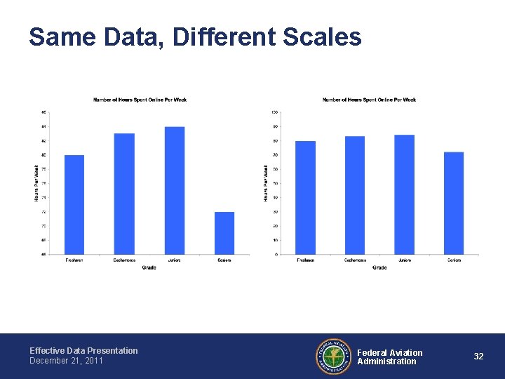
Same Data, Different Scales Effective Data Presentation December 21, 2011 Federal Aviation Administration 32

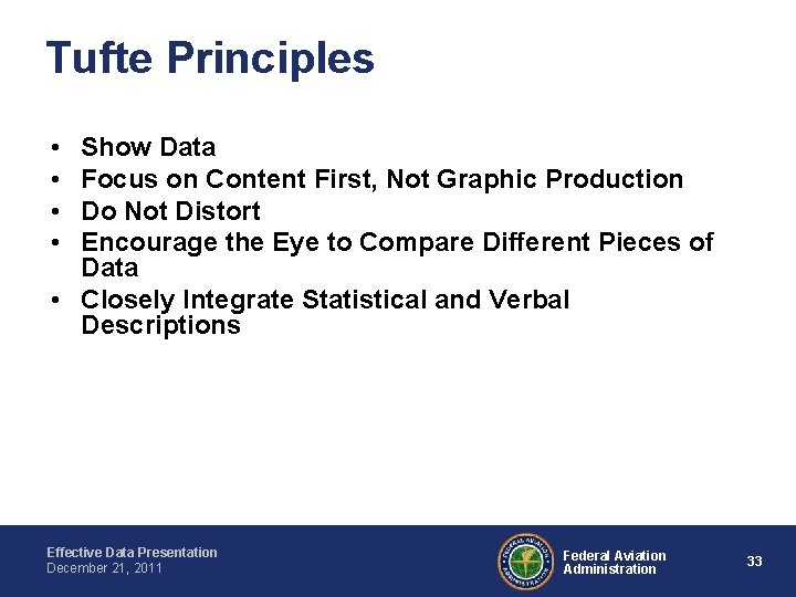
Tufte Principles • • Show Data Focus on Content First, Not Graphic Production Do Not Distort Encourage the Eye to Compare Different Pieces of Data • Closely Integrate Statistical and Verbal Descriptions Effective Data Presentation December 21, 2011 Federal Aviation Administration 33

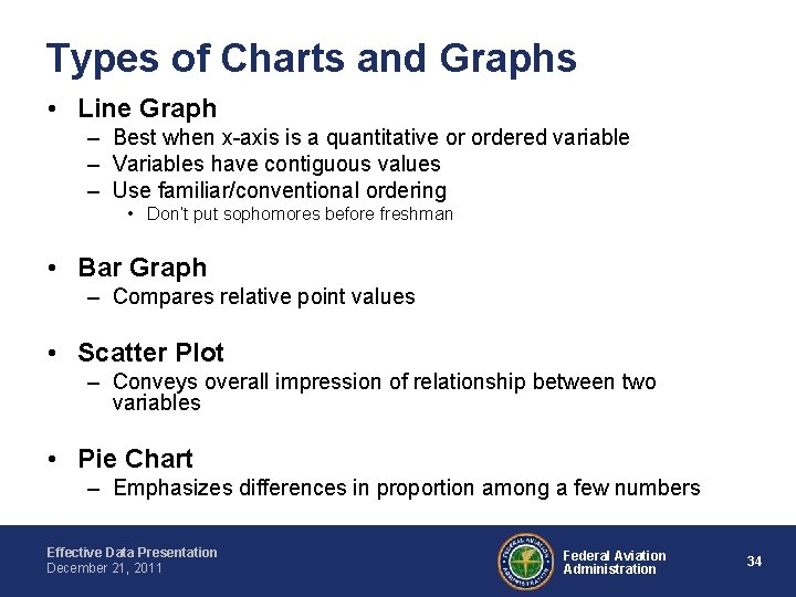
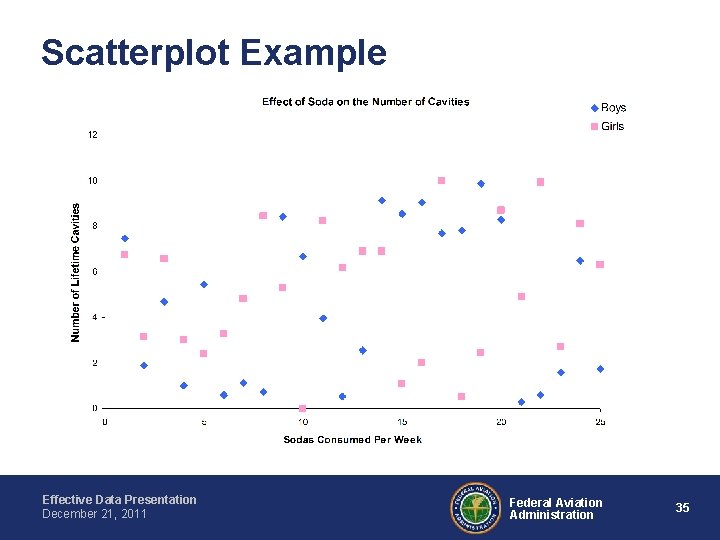
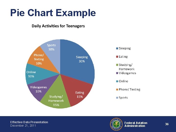
Types of Charts and Graphs • Line Graph – Best when x-axis is a quantitative or ordered variable – Variables have contiguous values – Use familiar/conventional ordering • Don’t put sophomores before freshman • Bar Graph – Compares relative point values • Scatter Plot – Conveys overall impression of relationship between two variables • Pie Chart – Emphasizes differences in proportion among a few numbers Effective Data Presentation December 21, 2011 Federal Aviation Administration 34

Scatterplot Example Effective Data Presentation December 21, 2011 Federal Aviation Administration 35

Pie Chart Example Effective Data Presentation December 21, 2011 Federal Aviation Administration 36

Bar charts • Best for comparing different things during the same time period • Neither the bars nor the axis should be interrupted • Axis should usually include zero (some exceptions) • Again - avoid 3 -D effects, can be misleading Effective Data Presentation December 21, 2011 Federal Aviation Administration 37

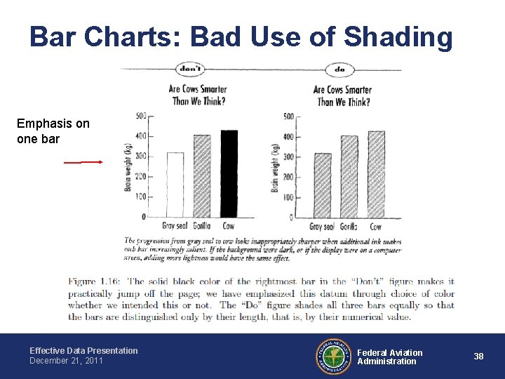
Bar Charts: Bad Use of Shading Emphasis on one bar Effective Data Presentation December 21, 2011 Federal Aviation Administration 38

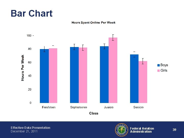
Bar Chart Effective Data Presentation December 21, 2011 Federal Aviation Administration 39

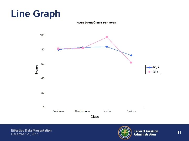
Line graphs • Best for showing change over time • Can indicate trends • Use a different color and symbol for each line • Avoid too many lines Effective Data Presentation December 21, 2011 Federal Aviation Administration 40

Line Graph Effective Data Presentation December 21, 2011 Federal Aviation Administration 41

Figure 1: Percent of elders in intergenerational families Too many lines! Use color wisely!

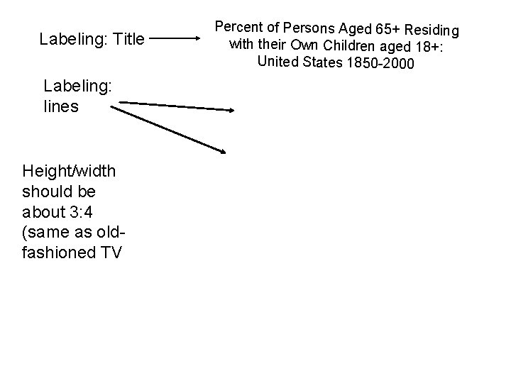
Labeling: Title Labeling: lines Height/width should be about 3: 4 (same as oldfashioned TV Percent of Persons Aged 65+ Residing with their Own Children aged 18+: United States 1850 -2000

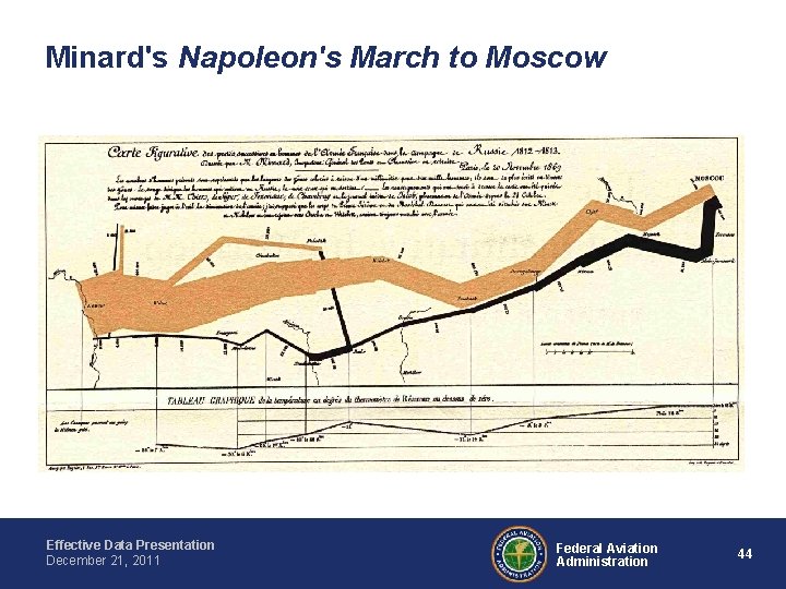
Minard's Napoleon's March to Moscow Effective Data Presentation December 21, 2011 Federal Aviation Administration 44

Contact Information Dr. Ferne Friedman-Berg, Ph. D. ferne. friedman-berg@faa. gov Dr. Kenneth Allendoerfer, Ph. D. kenneth. allendoerfer@faa. gov Engineering Research Psychologists FAA Aviation Research Division Human Factors Branch, ANG-E 25 William J. Hughes Technical Center, Bldg. 28. Atlantic City International Airport, NJ 08405. Fax: (609) 485 -6218 http: //hf. tc. faa. gov/ Effective Data Presentation December 21, 2011 Federal Aviation Administration 45

Supplementary Material Effective Data Presentation December 21, 2011 Federal Aviation Administration 46

References • • http: //lilt. ilstu. edu/gmklass/pos 138/datadisplay/badchart. htm http: //pol. illinoisstate. edu/jpda/ http: //www. smashingmagazine. com/2010/05/10/imagine-a-pie-chart-stomping-on-aninfographic-forever/ http: //www. siggraph. org/publications/newsletter/v 33 n 3/contributions/davis. html http: //www. datavis. ca/gallery/index. php Boyd, J. P. , Scientific Visualization and Information Architecture Course: Chapter 1. Downloaded from http: //www-personal. umich. edu/~jpboyd/sciviz_1_graphbadly. pdf Huff, D. , (1991). How to Lie with Statistics. Tufte, E. , (1983). The Visual Display of Quantitative Information. Effective Data Presentation December 21, 2011 Federal Aviation Administration 47

References Online Practice • BBC online practice http: //www. bbc. co. uk/schools/gcsebitesize/maths/data/repres entingdata 2 rev 5. shtml • Glencoe online tools http: //www. glencoe. com/sec/math/studytools/cgibin/msg. Quiz. php 4? isbn=0 -02 -833052 -8&chapter=4&lesson=8 • Excel Activities: http: //www. northcanton. sparcc. org/~technology/excel/files/mi sleading_graphs. html Effective Data Presentation December 21, 2011 Federal Aviation Administration 48

On-Line Charting Tools (some are free) http: //coding. smashingmagazine. com/2007/10/ 18/charts-and-graphs-modern-solutions/ Effective Data Presentation December 21, 2011 Federal Aviation Administration 49

On-Line Statistics Resources and Applets • http: //www. socr. ucla. edu/ • http: //www. ats. ucla. edu/stat/mult_pkg/whats tat/default. htm Effective Data Presentation December 21, 2011 Federal Aviation Administration 50

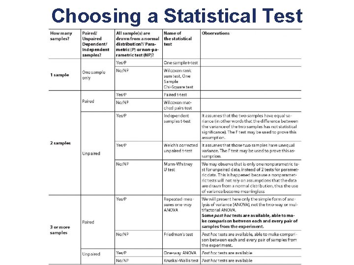
Choosing a Statistical Test Effective Data Presentation December 21, 2011 Federal Aviation Administration 51