Effective Charts Some Best Practices Effective Charts Making

Effective Charts Some Best Practices

Effective Charts Making a chart is easy Making an Effective chart is challenging Requires critical thinking

Chart Purpose make numbers more understandable useful for summarizing numbers and their interrelationships can help you spot trends and patterns

Tips for Effective Charts Less is More – keep it simple Charts need to be self explanatory Choose a clear title that focuses on the interpretation of the data - meaning and conclusions should be made clear Provide complete information – company name? time frame?

Tips for Effective Charts Format large numbers without decimal places Never use 3 D – causes distortion Do not include too much data in one chart Don't clutter things up - grid lines, background patterns, excessive tick marks If being printed in black and white or photocopied – use solid black, empty, cross-hatching, stripes, etc. - don't use colors or grays use color in charts for presentations, avoid green/red (color blind)

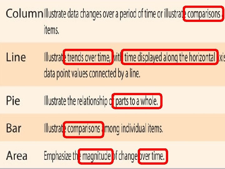
Column & Bar Charts used to compare numbers are represented by the height of column or length of bar charts are sideways column charts 6

Effective Column and Bar Charts If possible, delete legend Don’t chart very different things in one chart Don’t chart compared items and their total in same chart Consider sorting data before charting Indicate units – are the numbers $s? cases? Items?

Line Charts used to show trends over time emphasizes the rate of change Area Charts look like colored-in line charts used to show the rate of change emphasize the magnitude of the change

Effective Line and Area Charts typically there is time line across delete legend – label at each line

Pie Charts used to show parts that make up a whole “…percentage of…” “…market share…” shows only one data series <=6 slices for clarity can show exploded slices 10

Effective Pie Charts Pies are generally considered least useful type of chart – almost always a different chart type would be clearer Select slice names and data for only one series of data Put labels at or near slices NOT in legend Usually, no more than 6 slices per pie Never 3 D the pie – slices in back look deceptively smaller


More Effective Chart Resources/Ideas

What is the Purpose of a Chart? http: //data. bls. gov/timeseries/LNS 14000000

http: //data. bls. gov/timeseries/LNS 14000000

Excel Chart Doctor http: //www. processtrends. com/toc _chart_doctor. htm Avoid Legends harder for the reader to interpret the chart must move eye back and forth between the series and the legend replace with data labels for each series to make it easier

Enlightening data presentation is a skill that you can learn, but only if you first recognize the need and then give it the attention it deserves. The Information Cannot Speak for Itself http: //intelligententerprise. informationweek. com/channels/information_man agement/show. Article. jhtml? article. ID=22102226&pgno=3
 t n le a v i u q tons of oil e must")
(toe) t n le a v i u q tons of oil e must look back and forth between pies to assess important trend information hidden in charts: • 3 countries have decreasing shares • 3 countries have increasing share • China and Other EMEs have fastest rate of increase • FSU has greatest rate of decrease • US and Europe are decreasing • Other OECD countries had slight increase improved version: • each region labeled • 1991 and 2006 data values • increasing black lines • decreasing gray lines

Excel Chart Doctor http: //www. processtrends. c om/toc_chart_doctor. htm column charts are a poor choice for showing trends especially of several clustered series selecting the right chart type is one of the most important steps in making an effective chart

Excel Chapter 2 Chart Improvement

Improove Charts Do this in groups of 3 Turn in one per group Make sure all last names are in file name

Excel Chapter 2 Chart Improvement
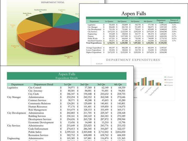

More Descriptive Title Remove 3 D

What would make this chart better?
- Slides: 27