DTP elements and Principles Higher Graphics Miss Airlie


- Slides: 12

DTP elements and Principles Higher Graphics Miss Airlie

§ What you should know: Line Shape Colour Elements Size § What’s New? Texture Value Mass Weight

Line Elements Used to separate a layout, connesct parts of a layout, or add emphasis/dominance to a part of a layout Shape What you know Organise a layout, create movement, add emphasis or dominance, symbolise different meanings Colour Creates unity/depth, creates a mood, contracting/harmonising, advancing/receding Size Adds dominance or emphasis to a layout,

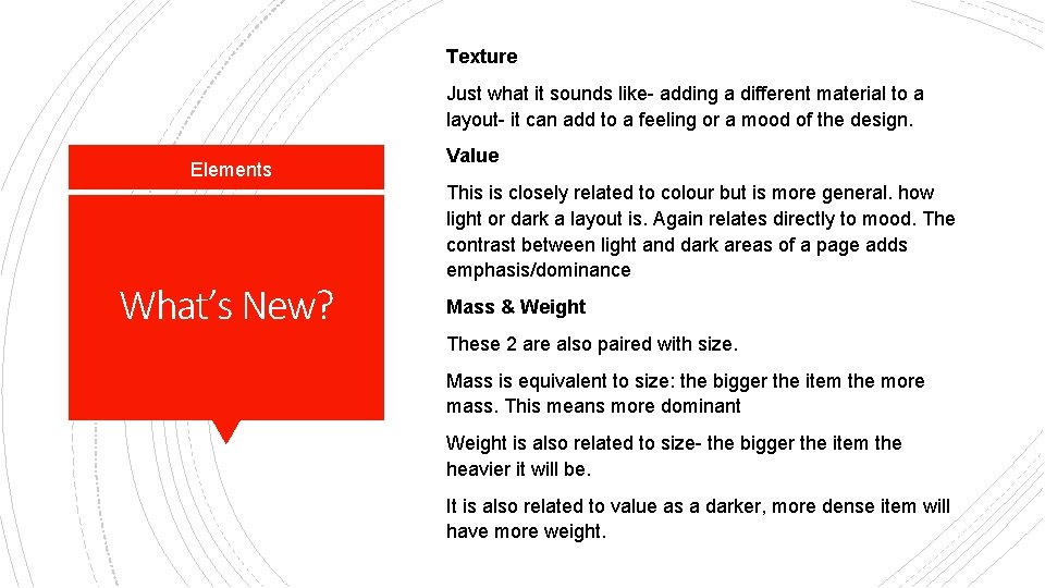
Texture Just what it sounds like- adding a different material to a layout- it can add to a feeling or a mood of the design. Elements What’s New? Value This is closely related to colour but is more general. how light or dark a layout is. Again relates directly to mood. The contrast between light and dark areas of a page adds emphasis/dominance Mass & Weight These 2 are also paired with size. Mass is equivalent to size: the bigger the item the more mass. This means more dominant Weight is also related to size- the bigger the item the heavier it will be. It is also related to value as a darker, more dense item will have more weight.

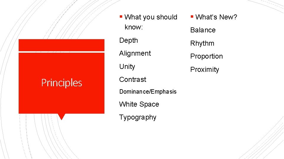
§ What you should know: Principles § What’s New? Balance Depth Rhythm Alignment Proportion Unity Proximity Contrast Dominance/Emphasis White Space Typography

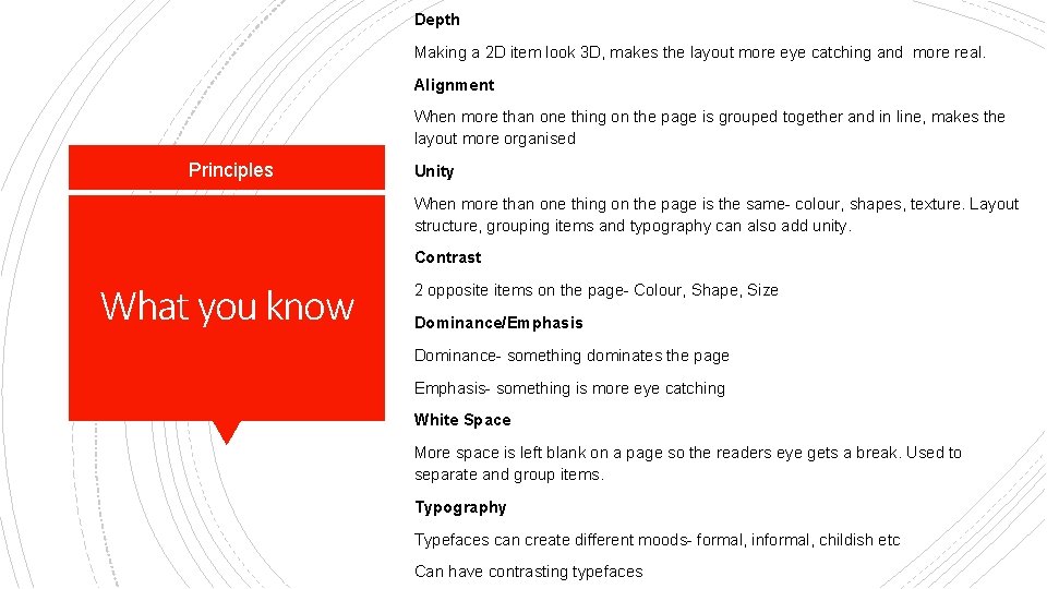
Depth Making a 2 D item look 3 D, makes the layout more eye catching and more real. Alignment When more than one thing on the page is grouped together and in line, makes the layout more organised Principles Unity When more than one thing on the page is the same- colour, shapes, texture. Layout structure, grouping items and typography can also add unity. Contrast What you know 2 opposite items on the page- Colour, Shape, Size Dominance/Emphasis Dominance- something dominates the page Emphasis- something is more eye catching White Space More space is left blank on a page so the readers eye gets a break. Used to separate and group items. Typography Typefaces can create different moods- formal, informal, childish etc Can have contrasting typefaces

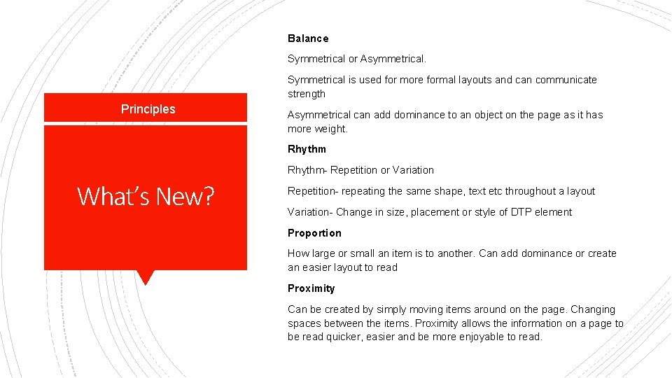
Balance Symmetrical or Asymmetrical. Symmetrical is used for more formal layouts and can communicate strength Principles Asymmetrical can add dominance to an object on the page as it has more weight. Rhythm- Repetition or Variation What’s New? Repetition- repeating the same shape, text etc throughout a layout Variation- Change in size, placement or style of DTP element Proportion How large or small an item is to another. Can add dominance or create an easier layout to read Proximity Can be created by simply moving items around on the page. Changing spaces between the items. Proximity allows the information on a page to be read quicker, easier and be more enjoyable to read.

SQA Questions


