Drawing from Observation Color Pencil Art 1 Set
Drawing from Observation Color Pencil Art 1
Set Up *Sit so you can see, facing the still life. (nobody blocking you, no turning) *Make sure the objects fill your paper (75%) *Start with a light outline (placeholder shapes) then refine the drawing by adding in 3 D shapes and organic shapes and leave shading/value for the end. Swing light, loose lines at first, and gradually create tighter, more defined lines as the drawing develops. *I like to pick an object in the middle of the arrangement and put that in the middle of my paper, then work out from there.
Creating Depth Making the jump from 3 D to 2 D- higher on the page also means further back in space Foreground- The place where objects are closest to you Middleground- The place between the foreground and background Background- The place where objects are furthest away from you Depicting overlap will help you show depth (What is in front? What is behind that? )
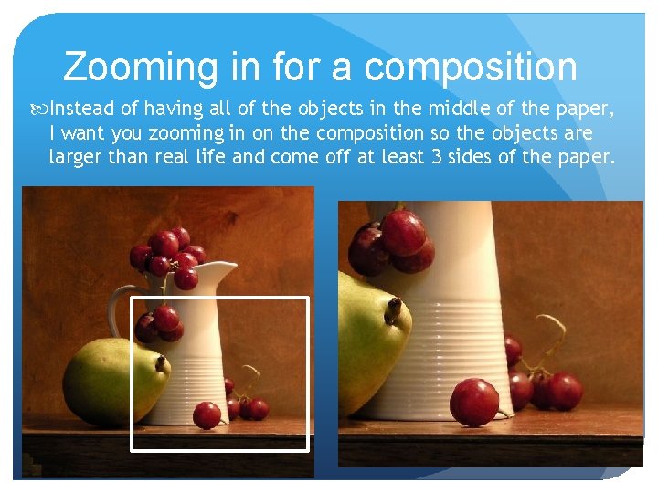
Zooming in for a composition Instead of having all of the objects in the middle of the paper, I want you zooming in on the composition so the objects are larger than real life and come off at least 3 sides of the paper.
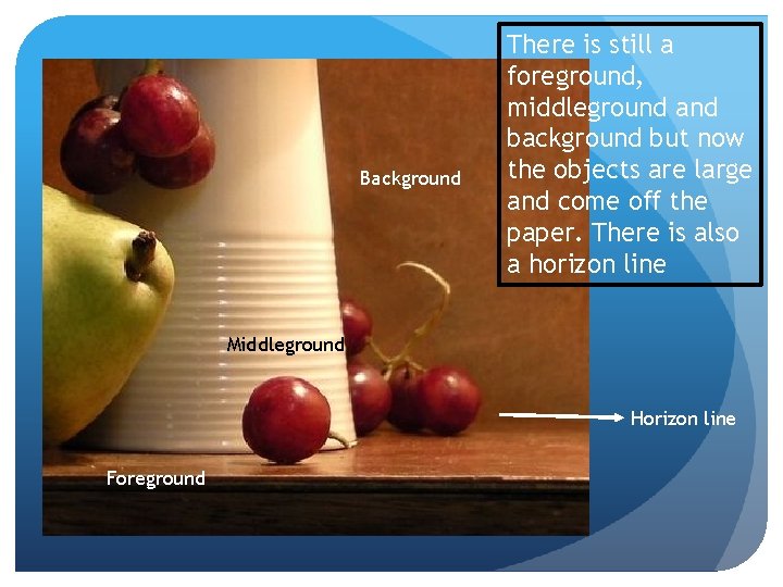
Background There is still a foreground, middleground and background but now the objects are large and come off the paper. There is also a horizon line Middleground Horizon line Foreground
General Procedure: Blocking Out Your Drawing • Block out “placeholder shapes. ” Compare heights/widths and line up forms. Lightly block in background and surface. • Refine, filling in placeholder shapes with more developed 3 D forms. Look at where edges and angles run into one another. Darken lines a little. • Fix edges and angles, and get the outlines as accurate as possible. Also look for any extreme shadow shapes that you see. • Think of your drawing growing gradually as a whole (general specific). Do not finish one part entirely and then move to the next. Work little by little, in layers.
Other things to consider… No “floating” still life (ground the objects by drawing foam-core board) No “magic carpets” (draw the table’s edges/sides and the background; think of two planes coming together) Resolve the background Look from the exact same position if you come back at a later time to work on your drawing
Adding value/color and texture Blending colors to create new colors and depth to the drawing is encouraged. Always add the lightest color first. If you add the darker color, you won’t see the lighter color You can switch back and forth (adding yellow, then orange, then yellow) so the colors truly become a whole new color. So when you look at an object and it’s a darker orange, maybe adding some brown to the darker area will allow you to change values on the object. With bright highlights, add white or yellow to the color
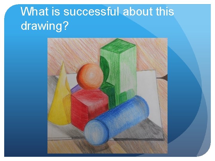
What is successful about this drawing?
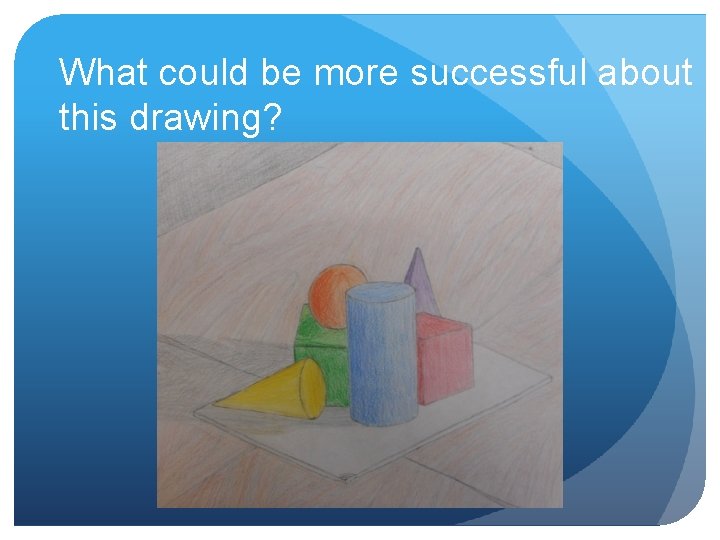
What could be more successful about this drawing?
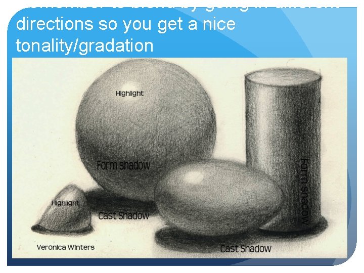
Remember to blend by going in different directions so you get a nice tonality/gradation
General Procedure: Shading Your Drawing There will be tone on almost all of your paper. Even light values have a little shading to them. I like to block my lightest tones in first with medium pressure. Then, I will layer with my next darkest tone, and, finally with my darkest tones as a third layer. Remember to shade in the direction of the objects’ surfaces to show form and volume. For flat sides, bring the shadow right up to the edges of the sides. For rounded sides, use curved marks, and have the shadow fade gradually. You might find it helpful to draw in your cast shadow shapes and fill them in with a strong dark value. Don’t forget to have tone in the background and on the surface that the objects sit on.
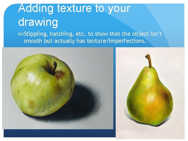
Adding texture to your drawing Stippling, hatching, etc. to show that the object isn’t smooth but actually has texture/imperfections.
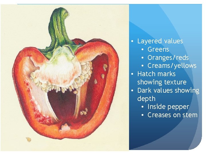
• Layered values • Greens • Oranges/reds • Creams/yellows • Hatch marks showing texture • Dark values showing depth • Inside pepper • Creases on stem
The background Option 1: Gradient value You can choose one color and do a gradient from dark to light Think about how the background interacts with the shapes in the composition. You wouldn’t want a dark background behind a dark object. How you apply the colored pencil doesn’t technically have to be smooth. You can do hatch marks, swirls, etc. to bring interest and texture to the composition
The background Option 2: Realistic You can draw a more realistic background Observe what you see-maybe it’s the person across from you, maybe it’s a window or shelving The background does not have to be hyper realistic but we should know what we’re looking at The colors of the background should be muted so the objects in the foreground pop forward
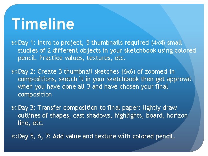
Timeline Day 1: Intro to project, 5 thumbnails required (4 x 4) small studies of 2 different objects in your sketchbook using colored pencil. Practice values, textures, etc. Day 2: Create 3 thumbnail sketches (6 x 6) of zoomed-in compositions, sketch it in your sketchbook then get approval when you have done all 3 and have chosen your final composition Day 3: Transfer composition to final paper: lightly draw outlines of shapes, cast shadows, highlights, board, horizon line, etc. Day 5, 6, 7: Add value and texture with colored pencil.

Due Date Information This project needs to be handed in with a completed rubric (front and back) on December 11 for 2 A and December 8 for 3 B. If I see that the entire class needs extra time, it will be given. However, extra time is given ONLY if I see the entire class working consistently. Every day the project is turned in late, it’s 5 points off. After 2 weeks, the project is a 0. If a project is turned in without a name on it and/or the project isn’t turned in with a completed rubric, it’s 10 points off.
- Slides: 18