DOUBLE PAGE SPREAD Magazine Requirements Written Article Research
DOUBLE PAGE SPREAD Magazine Requirements
Written Article > Research: Written articles in Indie magazines usually consist of new album releases, tour dates and venues, or just laughing and joking around with the interviewer. They are usually not boring, depending on who is in the article, and usually use slang to make it seem like they are friendly with the interviewer. > Planning: I don’t want my magazine’s written article to be lengthy and boring so I want to engage my readers and get my interviewees to discuss something relevant and interesting to my target audience age. > Production: I will write up my article by hand to roughly draft it and then type it up on In. Design when I have got Steve or Frankie to check through it.
Spelling and Grammar > Research: All magazines feature immaculate spelling and grammar. This is because it looks much more professional than scrappy grammar and poor spelling. Some occasionally feature colloquial language if they are trying to appeal to their target audience but it is used sparingly so that it does not make the magazine seem too informal and trying too hard. > Planning: To ensure that my magazine has correct grammar and good spelling, I will be writing the double page spread article in rough on a piece of paper and thoroughly checking the spelling and grammar. I will then get either a classmate or Steve/Frankie to check the article again. This should take me one lesson to write it up and a further lesson for any corrections to be made. > Production: Once my magazine article has been checked through, I will be typing the article up onto In. Design very carefully to ensure I don’t make any further mistakes when typing. This shouldn’t take me very long at all; at most an hour will be required to type it up fully.
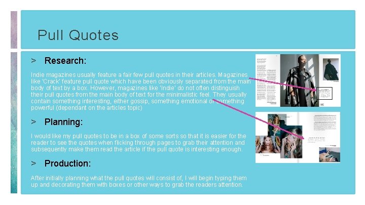
Pull Quotes > Research: Indie magazines usually feature a fair few pull quotes in their articles. Magazines like ‘Crack’ feature pull quote which have been obviously separated from the main body of text by a box. However, magazines like ‘Indie’ do not often distinguish their pull quotes from the main body of text for the minimalistic feel. They usually contain something interesting, either gossip, something emotional or something powerful (dependant on the articles topic) > Planning: I would like my pull quotes to be in a box of some sorts so that it is easier for the reader to see the quotes when flicking through pages to grab their attention and subsequently make them read the article if the pull quote is interesting enough. > Production: After initially planning what the pull quotes will consist of, I will begin typing them up and decorating them with boxes or other ways to grab the readers attention.
Title > Research: The title of the double page spread is more often than not in large bold text that is easy to read and will attract the attention of the audience. > Planning: I will have to plan the title and the text it will be written in as I want to attract audiences with a fun or interesting title. This should not take long since I only have to scour Da. Font. com for suitable fonts, but coming up with the idea on what to label the title will take a bit longer. > Production: This will be produced on In. Design on the Mac’s rather than the PC’s as I am not able to download fonts on the PC’s and the whole editing process is faster and easier on the Mac’s.

Standfirst > Research: Nearly all magazines feature a standfirst to introduce the reader to the article. They are usually in bold or capitals to attract the readers attention so that they are more likely to read the article. They are also used to summarise the main points of the article so this allows the reader to skip reading the entire article if they don’t need to, in a rush or not fully interested in the subject at hand. > Planning: I will need to plan the contents of my standfirst and how I will write it in an effective and engaging manner. This will require around one lesson (so one hour) to complete to make sure it is good. > Production: The production of this standfirst will be completed on In. Design after the initial planning on paper. I will be using the font, font size and style outlined on my blog for this.
Page Numbers > Research: Many Indie magazines feature page numbers but some do not. This probably links into the simple and minimalist approach that many Indie magazines abide by so it really just depends on the magazine. Some feature Roman Numerals as their page numbers while others feature just normal numbers. > Planning: There isn’t much planning that can be carried out for this section of the magazine. I would definitely like there to be page numbers as it helps for ease of access around the magazines pages and justifies the need for a contents page. I would also like the page numbers to be in normal number form and not Roman Numerals as I do not like this idea. > Production: I will produce the page numbers at the bottom right hand corner of the page on In. Design when I write up the main article.

Credits > Research: Credits are given to the photographer or editor of the images usually underneath the image or at the bottom of the page. > Planning: My credits will be at the bottom of the image so that people can clearly see them and not overlook them like they would if they were situated at the bottom of the page or on the last page of the magazine. > Production: These will be added at the end of the whole production of the magazine on In. Design as they are not the most important part of the magazine and won’t take long to include them.
Use of In. Design > Research: Adobe In. Design is a desktop publishing software application produced by Adobe Systems. It can be used to create works such as posters, flyers, brochures, magazines, newspapers, and books. Therefore it is a suitable programme to use for the production of my magazine. It is also widely used by professionals. > Planning: In. Design has been planned to be used from the very beginning of the plan for this magazine. This is because it is an easy software to use that helps creates effective and unique magazines. The whole magazine is to be published on In. Design after editing on Photoshop. I can further edit the magazine on In. Design but it will be solely used for inserting text and creating the double page spread. > Production: All of the magazine will be produced on In. Design because it is easy to use and allows me to create a good quality magazine that is pleasing to look at.
- Slides: 9