Double Page Spread Analysis Colour Scheme For this

Double Page Spread Analysis

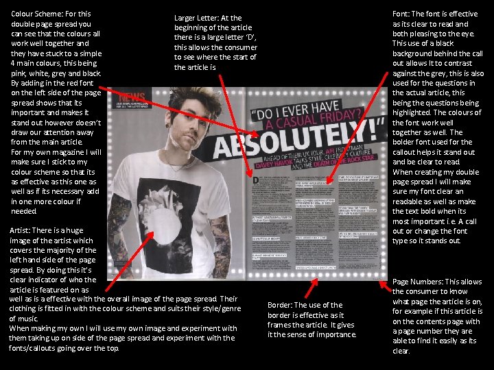
Colour Scheme: For this double page spread you can see that the colours all work well together and they have stuck to a simple 4 main colours, this being pink, white, grey and black. By adding in the red font on the left side of the page spread shows that its important and makes it stand out however doesn’t draw our attention away from the main article. For my own magazine I will make sure I stick to my colour scheme so that its as effective as this one as well as if its necessary add in one more colour if needed. Font: The font is effective as its clear to read and both pleasing to the eye. This use of a black background behind the call out allows It to contrast against the grey, this is also used for the questions in the actual article, this being the questions being highlighted. The colours of the font work well together as well. The bolder font used for the callout helps it stand out and be clear to read. When creating my double page spread I will make sure my font clear an readable as well as make the text bold when its most important i. e. A call out or change the font type so it stands out. Larger Letter: At the beginning of the article there is a large letter ‘D’, this allows the consumer to see where the start of the article is. Artist: There is a huge image of the artist which covers the majority of the left hand side of the page spread. By doing this it’s clear indicator of who the article is featured on as well as is a effective with the overall image of the page spread. Their clothing is fitted in with the colour scheme and suits their style/genre of music. When making my own I will use my own image and experiment with them taking up on side of the page spread and experiment with the fonts/callouts going over the top. Border: The use of the border is effective as it frames the article. It gives it the sense of importance. Page Numbers: This allows the consumer to know what page the article is on, for example if this article is on the contents page with a page number they are able to find it easily as its clear.

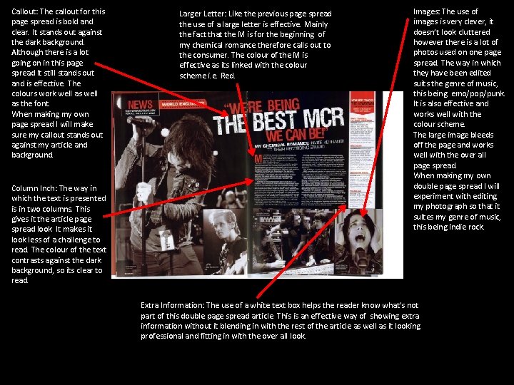
Callout: The callout for this page spread is bold and clear. It stands out against the dark background. Although there is a lot going on in this page spread it still stands out and is effective. The colours work well as the font. When making my own page spread I will make sure my callout stands out against my article and background. Column Inch: The way in which the text is presented is in two columns. This gives it the article page spread look. It makes it look less of a challenge to read. The colour of the text contrasts against the dark background, so its clear to read. Larger Letter: Like the previous page spread the use of a large letter is effective. Mainly the fact that the M is for the beginning of my chemical romance therefore calls out to the consumer. The colour of the M is effective as its linked with the colour scheme i. e. Red. Images: The use of images is very clever, it doesn’t look cluttered however there is a lot of photos used on one page spread. The way in which they have been edited suits the genre of music, this being emo/pop/punk. It is also effective and works well with the colour scheme. The large image bleeds off the page and works well with the over all page spread. When making my own double page spread I will experiment with editing my photograph so that it suites my genre of music, this being indie rock. Extra Information: The use of a white text box helps the reader know what's not part of this double page spread article. This is an effective way of showing extra information without it blending in with the rest of the article as well as it looking professional and fitting in with the over all look.
- Slides: 3