DOUBLE PAGE SPREAD Aimee Williams Double Page Spread

DOUBLE PAGE SPREAD Aimee Williams

Double Page Spread

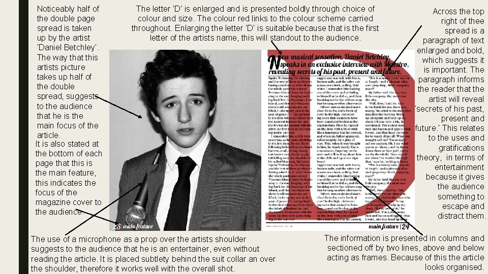
Noticeably half of the double page spread is taken up by the artist ‘Daniel Betchley’. The way that this artists picture takes up half of the double spread, suggests to the audience that he is the main focus of the article. It is also stated at the bottom of each page that this is the main feature, this indicates the focus of the magazine cover to the audience. The letter ‘D’ is enlarged and is presented boldly through choice of colour and size. The colour red links to the colour scheme carried throughout. Enlarging the letter ‘D’ is suitable because that is the first letter of the artists name, this will standout to the audience. The use of a microphone as a prop over the artists shoulder suggests to the audience that he is an entertainer, even without reading the article. It is placed subtlety behind the suit collar an over the shoulder, therefore it works well with the overall shot. Across the top right of thee spread is a paragraph of text enlarged and bold, which suggests it is important. The paragraph informs the reader that the artist will reveal ‘secrets of his past, present and future. ’ This relates to the uses and gratifications theory, in terms of entertainment because it gives the audience something to escape and distract them. The information is presented in columns and sectioned off by two lines, above and below acting as frames. Because of this the article looks organised.

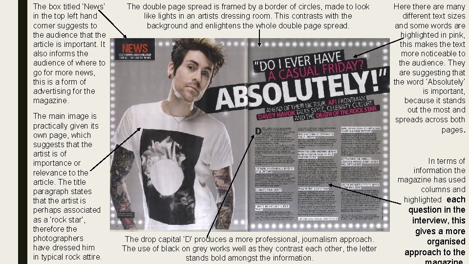
The box titled ‘News’ in the top left hand corner suggests to the audience that the article is important. It also informs the audience of where to go for more news, this is a form of advertising for the magazine. The main image is practically given its own page, which suggests that the artist is of importance or relevance to the article. The title paragraph states that the artist is perhaps associated as a ‘rock star’, therefore the photographers have dressed him in typical rock attire. The double page spread is framed by a border of circles, made to look like lights in an artists dressing room. This contrasts with the background and enlightens the whole double page spread. Here there are many different text sizes and some words are highlighted in pink, this makes the text more noticeable to the audience. They are suggesting that the word ‘Absolutely’ is important, because it stands out the most and spreads across both pages. In terms of information the magazine has used columns and highlighted each The drop capital ‘D’ produces a more professional, journalism approach. The use of black on grey works well as they contrast each other, the letter stands bold amongst the information. question in the interview, this gives a more organised approach to the
- Slides: 4