Dot Plot Dot Plot A dot plot can


- Slides: 26
Dot Plot
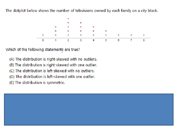
Dot Plot A dot plot can make some observations easier, especially gaps and outliers. It gives an overall sense of the data’s center, spread, and shape. It is like a number line, but you don’t have to start at zero.
• Center. Graphically, the center of a data is the point where about half of the observations are on either side. • Spread. The spread of a data refers to the variability of the data. If the observations cover a wide range, the spread is larger. If the observations are clustered around a single value, the spread is smaller. • Shape. The shape of a distribution is described by symmetry, skewness, number of peaks, etc. http: //stattrek. com/statistics/charts/compare-data-sets. aspx? Tutorial=AP
Youtube: https: //www. youtube. com/watch? v=_zur. DAF 1 Fw 4 Dot Plot
Frequency Table A frequency table is a list of categories that classifies the number of occurrences in each category.
Two-Way Frequency Table A two-ways frequency table displays the distribution for two categorical variables. Junior Senior TOTAL 10 5 15 Disagree 7 4 11 TOTAL 9 26 Agree 17
Categorical Data What Do You Call Carbonated Drinks? STATE California New York Georgia Main “Pop” 4566 3433 455 584 “Soda” 968 493 456 3924 “Coke” 323 1385 5038 453 Other 446 44 445 4523
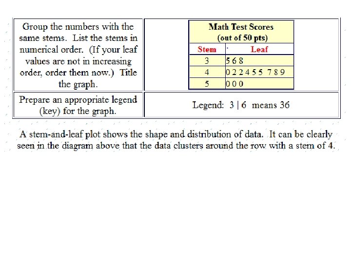
Stem-and-Leaf Plots • A stem-and-leaf plot is a graph that organizes the leading digits of data as stems. The remaining digits becomes leaves. • Stem and Leaf Plots can be used to analyze data and display data all at the same time. The advantage of having a steam-and-leaf plot is being able to see the original data points.
In a stem-and-leaf each data value is split into a “stem” and a “leaf”. The “leaf” is usually the last digit of the number and other digits to the left of the “leaf” form the “stem”. Example: the number 123 stem is 12 and leaf is 3
Steps http: //regentsprep. org/regents/math/stemleaf. htm
Stem-and Leaf Plots DATA: 12, 13, 21, 27, 33, 34, 35, 37, 40, 41 KEY: 1|2 = 12
Stem-and Leaf Plots DATA: 23. 3, 24. 1, 24. 8, 25. 0, 25. 3, 25. 6, 25. 9, 26. 3, 27. 1
homework • Stem and leaf #14 -31
Histogram
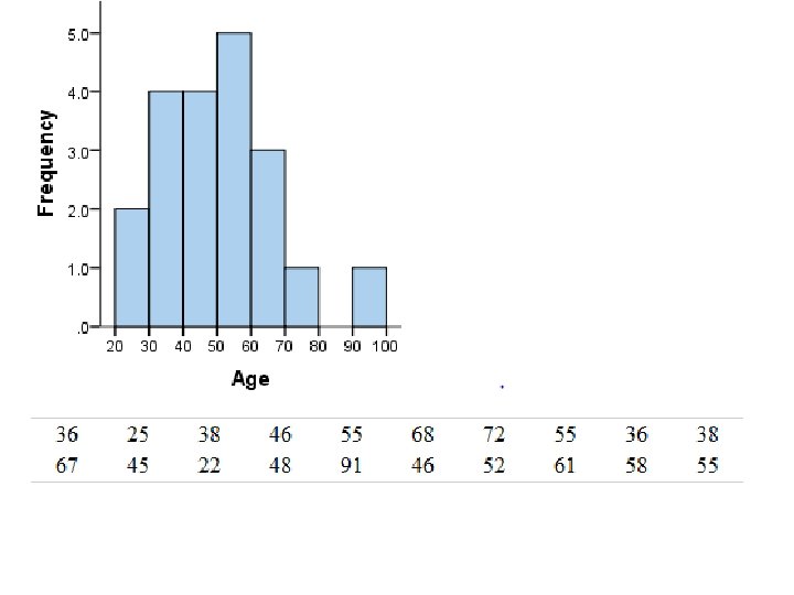
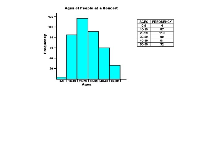
Histogram A histogram is a type of graph that uses vertical bars to display continuous data. This allows the inspection of the data for its underlying distribution (e. g. , normal distribution), outliers, skewness, etc.
Histogram
Histogram
What makes a good histogram? • Title • Label the x and y-axis • Have a correct scale: – the x-axis = the data values – The y-axis = the frequency values (how often the data may appear) • All of the bins are touching each other
There is no single “correct” bin width for a histogram. The width of a histogram’s bins can affect how well it shows the center, spread, shape, and outliers of the corresponding data.
How to create a histogram •
Example Teachers’ ages: 21, 22, 23, 32, 34, 45, 48, 49, 49, 51, 52, 54, 58, Class will be 4 https: //www. youtube. com/watch? v=rh. Cq 0 Xcvg_E