Displaying Quantitative Data Descriptive Statistics 1 Methods of


- Slides: 33

Displaying Quantitative Data Descriptive Statistics 1

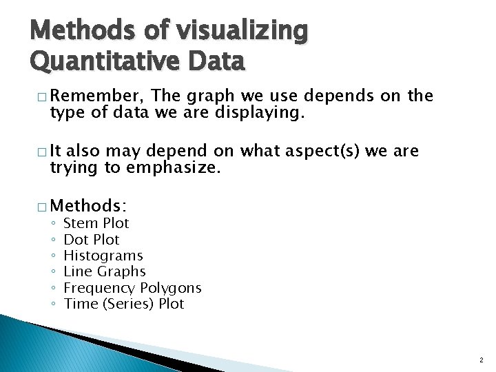
Methods of visualizing Quantitative Data � Remember, The graph we use depends on the type of data we are displaying. � It also may depend on what aspect(s) we are trying to emphasize. � Methods: ◦ ◦ ◦ Stem Plot Dot Plot Histograms Line Graphs Frequency Polygons Time (Series) Plot 2

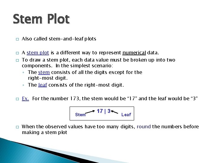
Stem Plot � � Also called stem-and-leaf plots A stem plot is a different way to represent numerical data. To draw a stem plot, each data value must be broken up into two components. In the simplest scenario: ◦ The stem consists of all the digits except for the right-most digit. ◦ The leaf consists of the right-most digit. Ex. For the number 173, the stem would be “ 17” and the leaf would be “ 3” Stem � 17 | 3 Leaf When the observed values have too many digits, round the numbers before making a stem plot

High Temps Stem Plot � Consider a Stemplot of the high temperature recorded in each of the 50 states

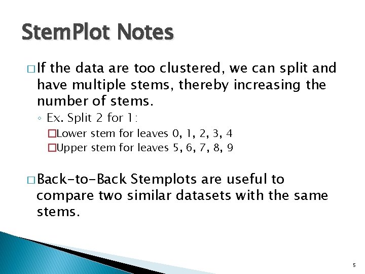
Stem. Plot Notes � If the data are too clustered, we can split and have multiple stems, thereby increasing the number of stems. ◦ Ex. Split 2 for 1: �Lower stem for leaves 0, 1, 2, 3, 4 �Upper stem for leaves 5, 6, 7, 8, 9 � Back-to-Back Stemplots are useful to compare two similar datasets with the same stems. 5

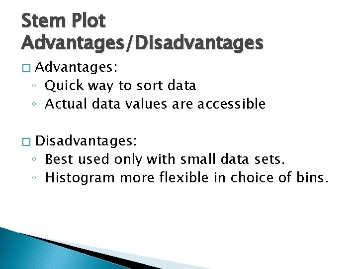
Stem Plot Advantages/Disadvantages � � Advantages: ◦ Quick way to sort data ◦ Actual data values are accessible Disadvantages: ◦ Best used only with small data sets. ◦ Histogram more flexible in choice of bins.

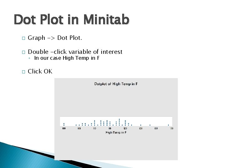
Dot Plot � Record data values on a number line with a dot above the number line for each data value observed. � We can get a sense of frequency by seeing how high the dots stack up.

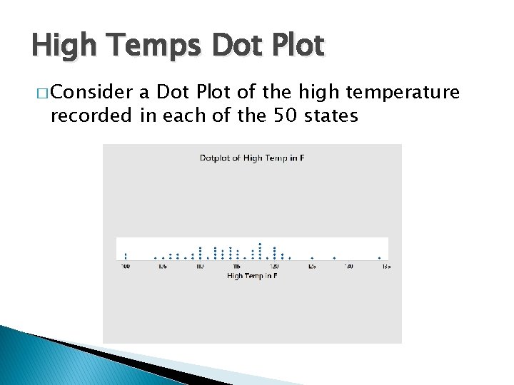
High Temps Dot Plot � Consider a Dot Plot of the high temperature recorded in each of the 50 states

Dot Plot Advantages/Disadvantages � Advantages ◦ Shows individual data points ◦ Helps investigate the shape of the distribution ◦ Can see points that stand out � Disadvantages ◦ Not as common as histograms and other graphs ◦ Not great for data with too many individual values

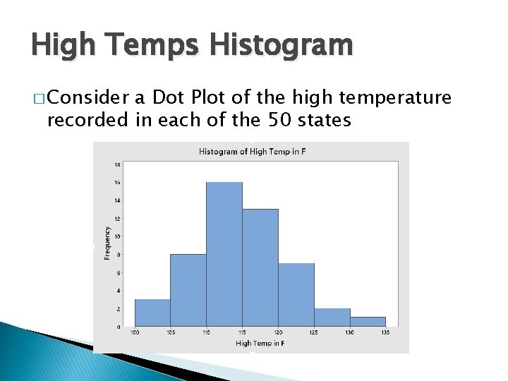
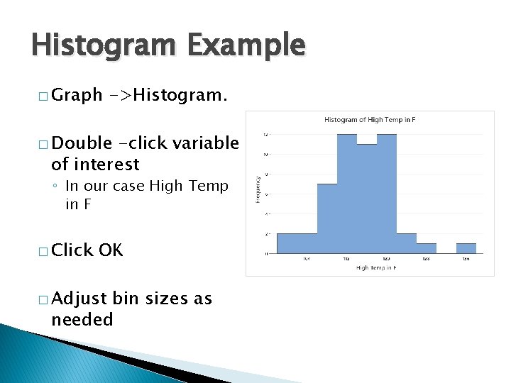
Histograms � � � We group data into intervals, called bins (or classes) where the width of the interval equals the bin width. Essentially a 2 -D frequency table. We create rectangles (or bars) above each bin. These bars have the following properties: ◦ Consecutive bars touch ◦ The first value in each bin is recorded on the horizontal axis (called the lower class limit) ◦ The height of each rectangle corresponds to the count (or proportion) of the number of values in that bin.

High Temps Histogram � Consider a Dot Plot of the high temperature recorded in each of the 50 states

Histogram Advantages/Disadvantages � Advantages ◦ Good for large data sets ◦ Helps focus on the general shape of the data � Disadvantages ◦ Individual data values are not visible (lost) ◦ Distribution shape affected by change in bin width

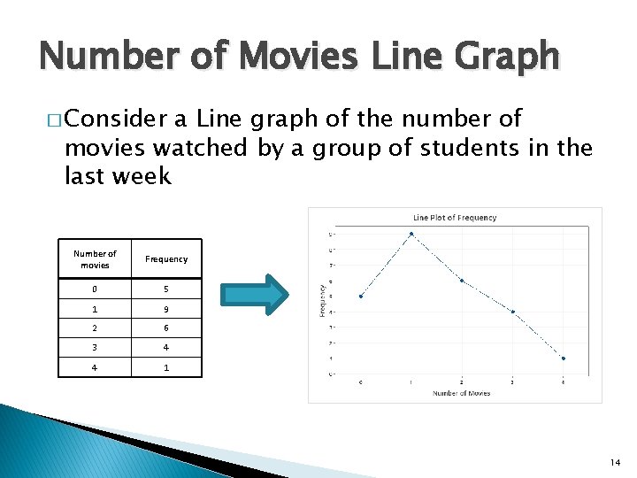
Line Graphs � Uses discrete (or ordinal) data in frequency table format �A line graph shows: ◦ Data values the x-axis ◦ Frequencies on the y-axis. ◦ The frequency points are connected using line segments. 13

Number of Movies Line Graph � Consider a Line graph of the number of movies watched by a group of students in the last week Number of movies Frequency 0 5 1 9 2 6 3 4 4 1 14

Line Graphs Advantages/Disadvantages � Advantages ◦ Shows trends in grouped Data � Disadvantages ◦ Must have data grouped by frequencies ◦ Does not work well for continuous data

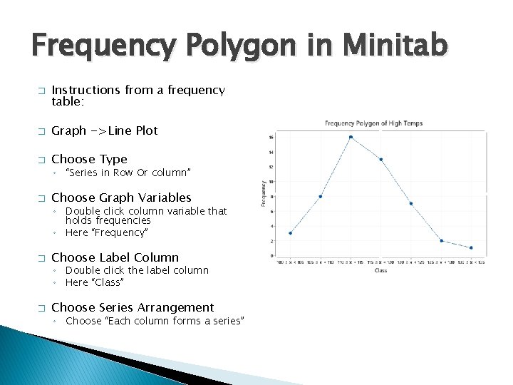
Frequency Polygons � Continuous format. �A data must be in frequency table line graph shows: ◦ Bins or classes on the x-axis ◦ Frequencies on the y-axis. ◦ The frequency points are connected using line segments. � Combines graphs. idea of a histogram with line 16

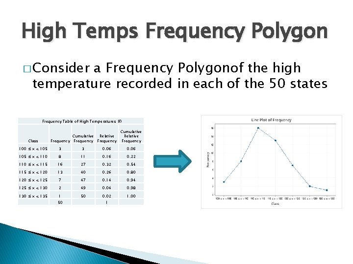
High Temps Frequency Polygon a Frequency Polygonof the high temperature recorded in each of the 50 states � Consider Frequency Table of High Temperatures (F) Class Cumulative Relative Frequency Cumulative Relative Frequency 100 ≤ x < 105 3 3 0. 06 105 ≤ x < 110 8 11 0. 16 0. 22 110 ≤ x < 115 16 27 0. 32 0. 54 115 ≤ x < 120 13 40 0. 26 0. 80 120 ≤ x < 125 7 47 0. 14 0. 94 125 ≤ x < 130 2 49 0. 04 0. 98 130 ≤ x < 135 1 50 0. 02 1. 00 50 1

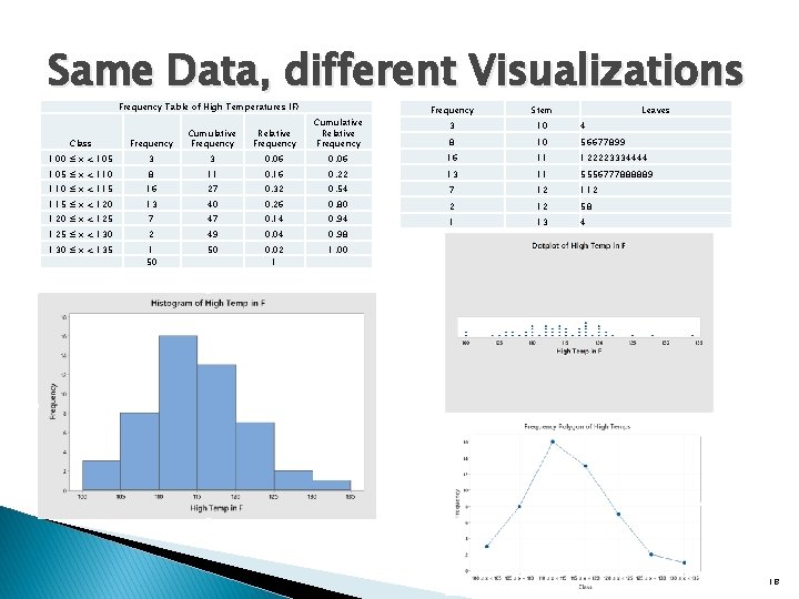
Same Data, different Visualizations Frequency Table of High Temperatures (F) Cumulative Frequency Relative Frequency Cumulative Relative Frequency Stem Leaves 3 10 4 8 10 56677899 Class Frequency 100 ≤ x < 105 3 3 0. 06 16 11 122223334444 105 ≤ x < 110 8 11 0. 16 0. 22 13 11 5556777888889 110 ≤ x < 115 16 27 0. 32 0. 54 7 12 115 ≤ x < 120 13 40 0. 26 0. 80 120 ≤ x < 125 7 47 0. 14 0. 94 2 12 58 125 ≤ x < 130 2 49 0. 04 0. 98 1 13 4 130 ≤ x < 135 1 50 50 0. 02 1 1. 00 18

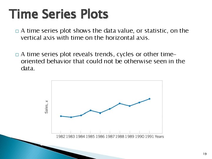
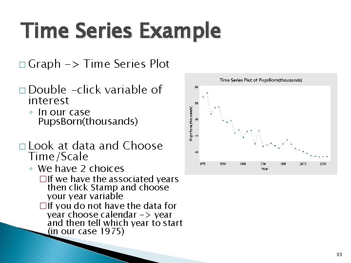
Time Series Plots � � A time series plot shows the data value, or statistic, on the vertical axis with time on the horizontal axis. A time series plot reveals trends, cycles or other timeoriented behavior that could not be otherwise seen in the data. 19

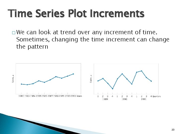
Time Series Plot Increments � We can look at trend over any increment of time. Sometimes, changing the time increment can change the pattern 20

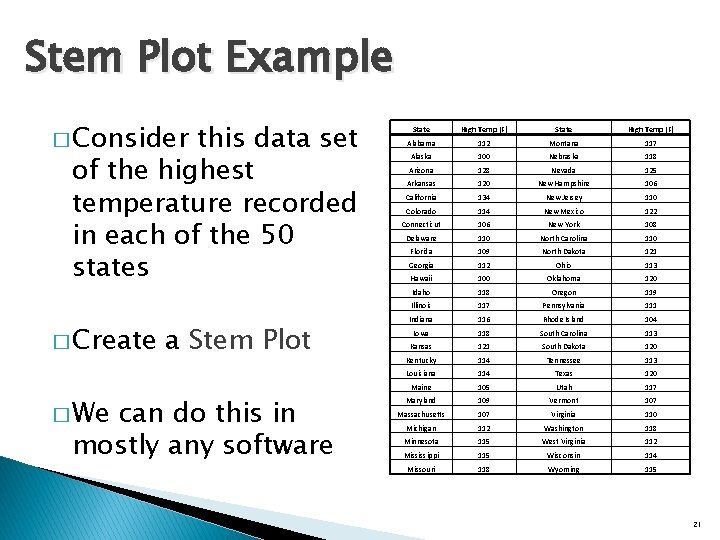
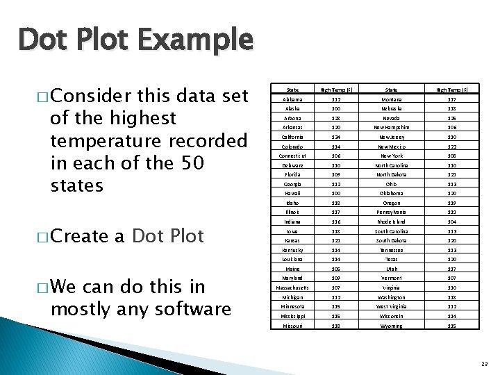
Stem Plot Example � Consider this data set of the highest temperature recorded in each of the 50 states � Create � We a Stem Plot can do this in mostly any software State High Temp (F) Alabama 112 Montana 117 Alaska 100 Nebraska 118 Arizona 128 Nevada 125 Arkansas 120 New Hampshire 106 California 134 New Jersey 110 Colorado 114 New Mexico 122 Connecticut 106 New York 108 Delaware 110 North Carolina 110 Florida 109 North Dakota 121 Georgia 112 Ohio 113 Hawaii 100 Oklahoma 120 Idaho 118 Oregon 119 Illinois 117 Pennsylvania 111 Indiana 116 Rhode Island 104 Iowa 118 South Carolina 113 Kansas 121 South Dakota 120 Kentucky 114 Tennessee 113 Louisiana 114 Texas 120 Maine 105 Utah 117 Maryland 109 Vermont 107 Massachusetts 107 Virginia 110 Michigan 112 Washington 118 Minnesota 115 West Virginia 112 Mississippi 115 Wisconsin 114 Missouri 118 Wyoming 115 21

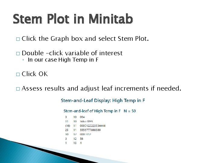
Stem Plot in Minitab � Click the Graph box and select Stem Plot. � Double -click variable of interest � Click OK � Assess results and adjust leaf increments if needed. ◦ In our case High Temp in F

Dot Plot Example � Consider this data set of the highest temperature recorded in each of the 50 states � Create � We a Dot Plot can do this in mostly any software State High Temp (F) Alabama 112 Montana 117 Alaska 100 Nebraska 118 Arizona 128 Nevada 125 Arkansas 120 New Hampshire 106 California 134 New Jersey 110 Colorado 114 New Mexico 122 Connecticut 106 New York 108 Delaware 110 North Carolina 110 Florida 109 North Dakota 121 Georgia 112 Ohio 113 Hawaii 100 Oklahoma 120 Idaho 118 Oregon 119 Illinois 117 Pennsylvania 111 Indiana 116 Rhode Island 104 Iowa 118 South Carolina 113 Kansas 121 South Dakota 120 Kentucky 114 Tennessee 113 Louisiana 114 Texas 120 Maine 105 Utah 117 Maryland 109 Vermont 107 Massachusetts 107 Virginia 110 Michigan 112 Washington 118 Minnesota 115 West Virginia 112 Mississippi 115 Wisconsin 114 Missouri 118 Wyoming 115 23

Dot Plot in Minitab � Graph -> Dot Plot. � Double -click variable of interest ◦ In our case High Temp in F � Click OK

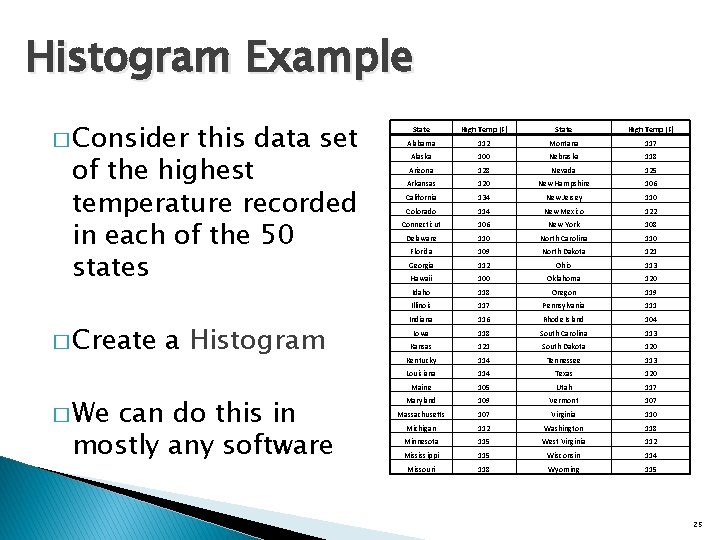
Histogram Example � Consider this data set of the highest temperature recorded in each of the 50 states � Create � We a Histogram can do this in mostly any software State High Temp (F) Alabama 112 Montana 117 Alaska 100 Nebraska 118 Arizona 128 Nevada 125 Arkansas 120 New Hampshire 106 California 134 New Jersey 110 Colorado 114 New Mexico 122 Connecticut 106 New York 108 Delaware 110 North Carolina 110 Florida 109 North Dakota 121 Georgia 112 Ohio 113 Hawaii 100 Oklahoma 120 Idaho 118 Oregon 119 Illinois 117 Pennsylvania 111 Indiana 116 Rhode Island 104 Iowa 118 South Carolina 113 Kansas 121 South Dakota 120 Kentucky 114 Tennessee 113 Louisiana 114 Texas 120 Maine 105 Utah 117 Maryland 109 Vermont 107 Massachusetts 107 Virginia 110 Michigan 112 Washington 118 Minnesota 115 West Virginia 112 Mississippi 115 Wisconsin 114 Missouri 118 Wyoming 115 25

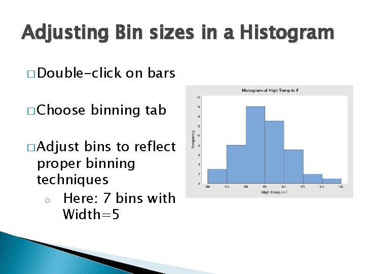
Histogram Example � Graph ->Histogram. � Double -click variable of interest ◦ In our case High Temp in F � Click OK � Adjust bin sizes as needed

Adjusting Bin sizes in a Histogram � Double-click � Choose � Adjust on bars binning tab bins to reflect proper binning techniques o Here: 7 bins with Width=5

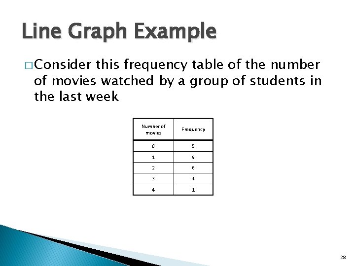
Line Graph Example � Consider this frequency table of the number of movies watched by a group of students in the last week Number of movies Frequency 0 5 1 9 2 6 3 4 4 1 28

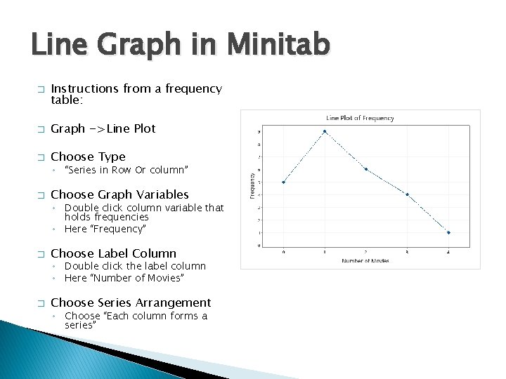
Line Graph in Minitab � Instructions from a frequency table: � Graph ->Line Plot � Choose Type ◦ “Series in Row Or column” � Choose Graph Variables ◦ Double click column variable that holds frequencies ◦ Here “Frequency” � Choose Label Column ◦ Double click the label column ◦ Here “Number of Movies” � Choose Series Arrangement ◦ Choose “Each column forms a series”

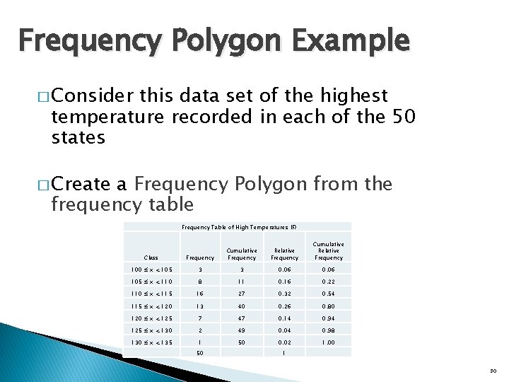
Frequency Polygon Example � Consider this data set of the highest temperature recorded in each of the 50 states � Create a Frequency Polygon from the frequency table Frequency Table of High Temperatures (F) Relative Frequency Cumulative Relative Frequency Class Frequency Cumulative Frequency 100 ≤ x < 105 3 3 0. 06 105 ≤ x < 110 8 11 0. 16 0. 22 110 ≤ x < 115 16 27 0. 32 0. 54 115 ≤ x < 120 13 40 0. 26 0. 80 120 ≤ x < 125 7 47 0. 14 0. 94 125 ≤ x < 130 2 49 0. 04 0. 98 130 ≤ x < 135 1 50 0. 02 1. 00 50 1 30

Frequency Polygon in Minitab � Instructions from a frequency table: � Graph ->Line Plot � Choose Type ◦ “Series in Row Or column” � Choose Graph Variables ◦ Double click column variable that holds frequencies ◦ Here “Frequency” � Choose Label Column ◦ Double click the label column ◦ Here “Class” � Choose Series Arrangement ◦ Choose “Each column forms a series”

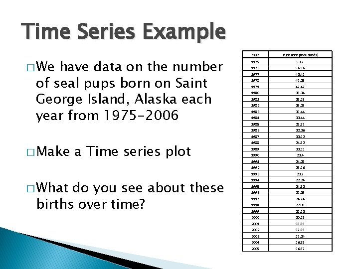
Time Series Example � We have data on the number of seal pups born on Saint George Island, Alaska each year from 1975 -2006 � Make � What a Time series plot do you see about these births over time? Year Pups. Born(thousands) 1975 53. 7 1976 56. 16 1977 43. 41 1978 47. 25 1979 47. 47 1980 39. 34 1981 38. 15 1982 39. 29 1983 31. 44 1984 33. 44 1985 28. 87 1986 32. 36 1987 33. 12 1988 24. 82 1989 33. 11 1990 23. 4 1991 24. 28 1992 25. 16 1993 23. 7 1994 22. 24 1995 24. 82 1996 27. 39 1997 24. 74 1998 22. 09 1999 21. 13 2000 20. 18 2001 18. 89 2002 17. 59 2003 17. 24 2004 16. 88 2005 16. 97

Time Series Example � Graph -> Time Series Plot � Double interest -click variable of ◦ In our case Pups. Born(thousands) � Look at data and Choose Time/Scale ◦ We have 2 choices �If we have the associated years then click Stamp and choose your year variable �If you do not have the data for year choose calendar -> year and then tell which year to start (in our case 1975) 33