Displaying Data in Graphs and charts Challenger Disaster


 l Showing the data (choosing the data) l Showing")


 • 4 variables • 6")


 l How Not to Use Power.")


- Slides: 30
Displaying Data in Graphs and charts
Challenger Disaster
Report of the Presidential Commission on the Space Shuttle Challenger Accident, 1986 (vol 1, p. 145)
How to Display Data (Badly) l Showing the data (choosing the data) l Showing data accurately l Showing data clearly H Wainer(1984). “How to display data badly. ” American Statistician 38(2): 137 -147. http: //www. jstor. org/view/00031305/di 020581/02 p 0048 x/0
Showing Data
Showing data l Edward Tufte l Data Density Index l Chart Junk l It does not make sense to use graphs to display very small amounts of data. l The human brain is quite capable of grasping up to three values.
Showing Data
Showing Data l Graphs are only as good as the data they display. l No amount of creativity can produce a good graph from dubious data.
Showing Data
Showing Data Accurately l Graphs should not provide a distorted picture of the values they portray. l Distortion can be either deliberate or accidental. l Common l Use Distortions of 3 dimensional “effects” l Use of linear scaling when using area or volume to represent values.
3 dimensional effects
No 3 D Effect
Linear Distortion Fact: 1973 dollar : $0. 44 1958 dollar: $1 Dimensions 1958 dollar is less than twice the height and width of the 1973 dollar Area: 1958 dollar has 3 x the area
No Distortion
Hiding Information
Not so hidden
Showing Data Clearly l Graphs should be no more complex than the data which they portray l Unnecessary complexity can be introduced by chartjunk l irrelevant l color decoration
Showing Data Clearly Age Structure of College Enrolment (19721976) • 4 variables • 6 colors • Weird perspective • SPLIT AXIS American Education Magazine.
Showing Data Clearly
Tips for “Good” Graphs, Tables and Charts l Tell the truth – don’t distort the data l If the data is very simple, just use text l Simplify If the “story” is simple, keep it simple. l If the “story” is complex, make it look simpler l “Keep it Simple” (for presentations) l
A complex graph is sometimes the best way to tell a story
The Cognitive Style of Power. Point (Edward Tufte) l How Not to Use Power. Point l Bullet Points are bad l Style no substitute for content l 40 words = 8 seconds of silent reading = very little actual content
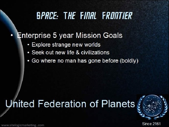
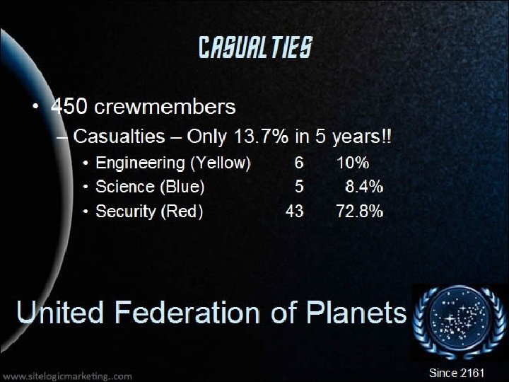
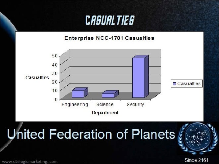
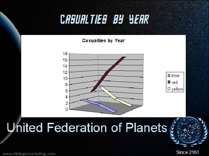
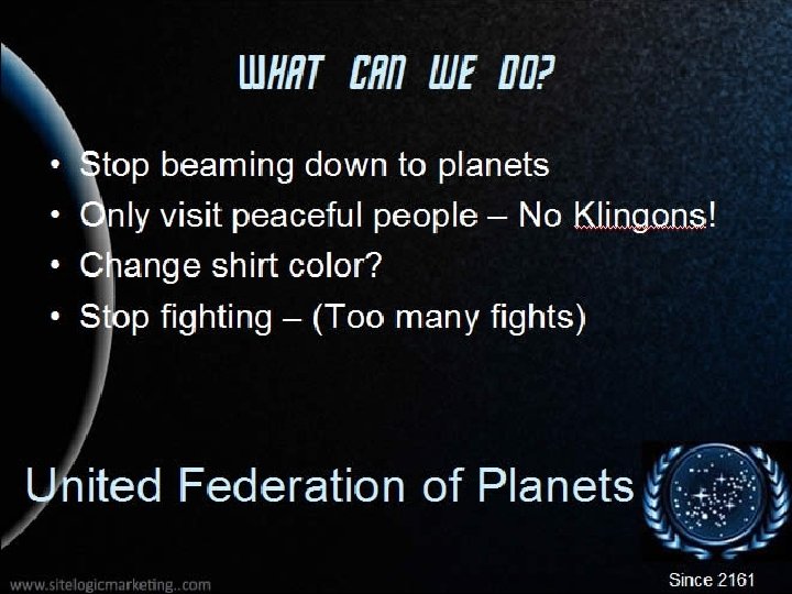
Analytics According to Captain Kirk l Power. Point does not provide enough detail for analysis l One needs to look at all of the data to do a proper analysis
Clarification Simple