Displaying Categorical Data Frequency tables the Area Principle
Displaying Categorical Data Frequency tables, the Area Principle and Bar Graphs
Draw Pictures! The Three Rules of Data Analysis • The three rules of data analysis won’t be difficult to remember: 1. Make a picture—things may be revealed that are not obvious in the raw data. These will be things to think about. 2. Make a picture—important features of and patterns in the data will show up. You may also see things that you did not expect. 3. Make a picture—the best way to tell others about your data is with a well-chosen picture.
Frequency Tables The picture we will concentrate on in this lesson is a bar graph. To create a bar graph, first we must understand how to read a frequency table. Frequency Tables that show many or how often (frequent) something happens.
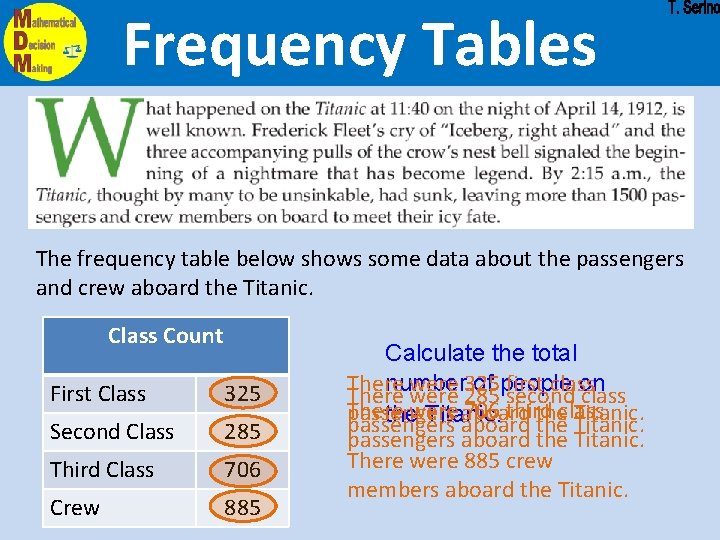
Frequency Tables The frequency table below shows some data about the passengers and crew aboard the Titanic. Class Count First Class 325 Second Class 285 Third Class 706 Crew 885 Calculate the total There were 325 first class number of people There were 285 second on class There 706 third passengers aboard theclass Titanic. thewere Titanic. passengers aboard the Titanic. There were 885 crew members aboard the Titanic.
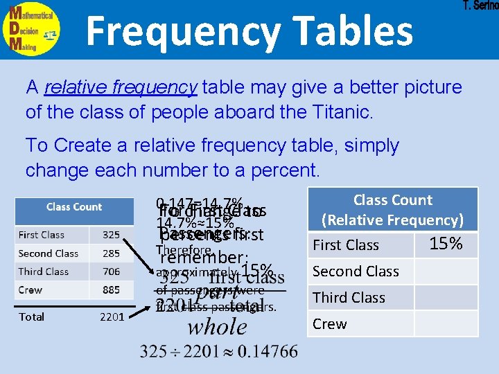
Frequency Tables A relative frequency table may give a better picture of the class of people aboard the Titanic. To Create a relative frequency table, simply change each number to a percent. 0. 147=14. 7% For First Class To change to 14. 7%≈15% Passengers: percents first Therefore, remember: approximately 15% Total 2201 of passengers were first class passengers. Class Count (Relative Frequency) First Class Second Class Third Class Crew 15%
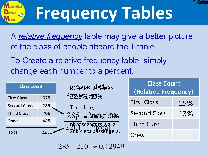
Frequency Tables A relative frequency table may give a better picture of the class of people aboard the Titanic. To Create a relative frequency table, simply change each number to a percent. For Second Class 0. 129=12. 9% Passengers: 12. 9%≈13% Therefore, Total 2201 approximately 13% of passengers were 2 nd class passengers. Class Count (Relative Frequency) First Class Second Class Third Class Crew 15% 13%
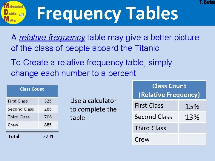
Frequency Tables A relative frequency table may give a better picture of the class of people aboard the Titanic. To Create a relative frequency table, simply change each number to a percent. Use a calculator to complete the table. Class Count (Relative Frequency) First Class Second Class Third Class Total 2201 Crew 15% 13%

Area Principle The Area Principle Good data displays observe the area principle. Area Principle: The area occupied by a part of the graph should correspond to the magnitude of the value it represents This is an example of a BAD display!
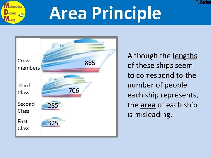
Area Principle 885 706 285 325 Although the lengths of these ships seem to correspond to the number of people each ship represents, the area of each ship is misleading.
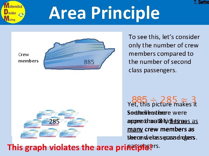
Area Principle Crew members 885 To see this, let’s consider only the number of crew members compared to the number of second class passengers. 885 ÷ 285 ≈ 3 Yet, this picture makes it Second Class 285 This graph violates the area seem likewere there were So there more than 8 times as as approximately 3 times many crew members as second classsecond passengers. there were class passengers. principle!
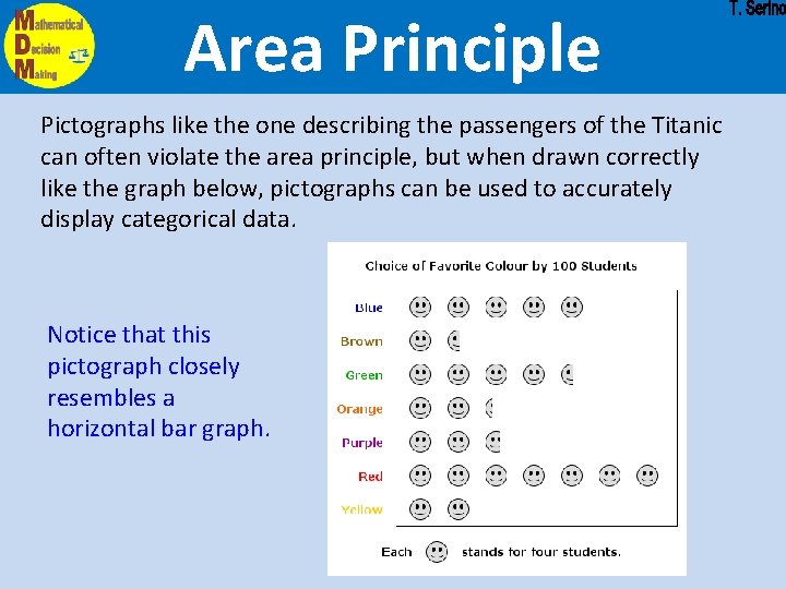
Area Principle Pictographs like the one describing the passengers of the Titanic can often violate the area principle, but when drawn correctly like the graph below, pictographs can be used to accurately display categorical data. Notice that this pictograph closely resembles a horizontal bar graph.
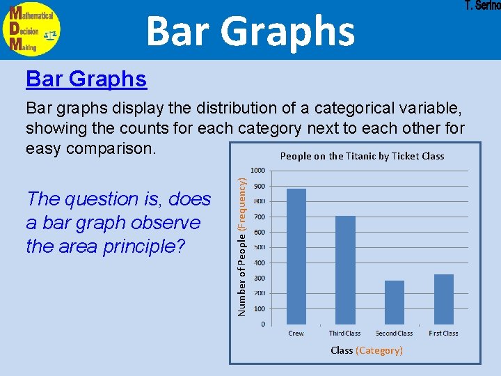
Bar Graphs The question is, does a bar graph observe the area principle? Number of People (Frequency) Bar graphs display the distribution of a categorical variable, showing the counts for each category next to each other for easy comparison. People on the Titanic by Ticket Class (Category)
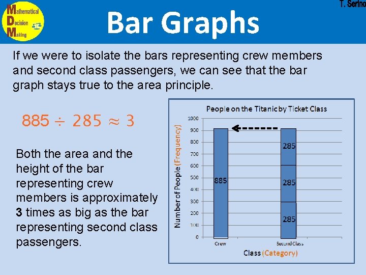
Bar Graphs If we were to isolate the bars representing crew members and second class passengers, we can see that the bar graph stays true to the area principle. 885 ÷ 285 ≈ 3 Both the area and the height of the bar representing crew members is approximately 3 times as big as the bar representing second class passengers. 885 285
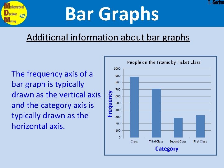
Bar Graphs Additional information about bar graphs The frequency axis of a bar graph is typically drawn as the vertical axis and the category axis is typically drawn as the horizontal axis. Frequency People on the Titanic by Ticket Class Category
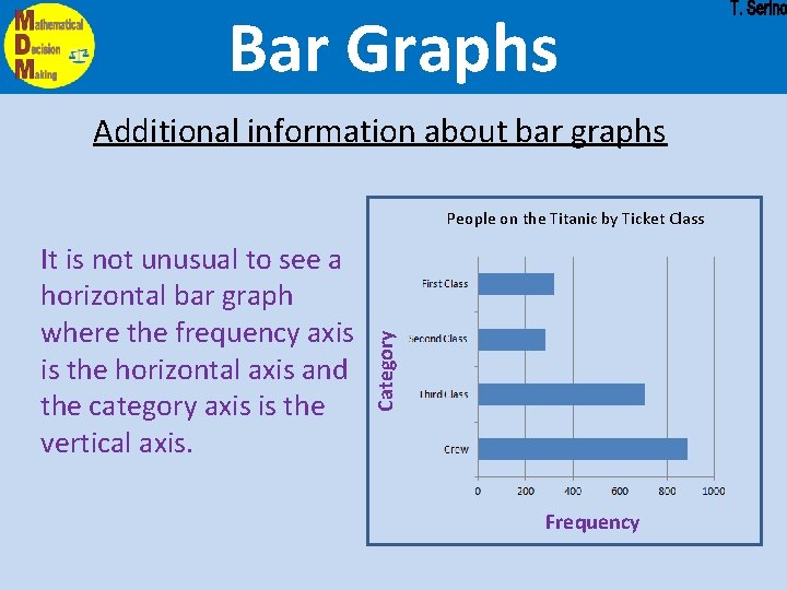
Bar Graphs Additional information about bar graphs It is not unusual to see a horizontal bar graph where the frequency axis is the horizontal axis and the category axis is the vertical axis. Category People on the Titanic by Ticket Class Frequency
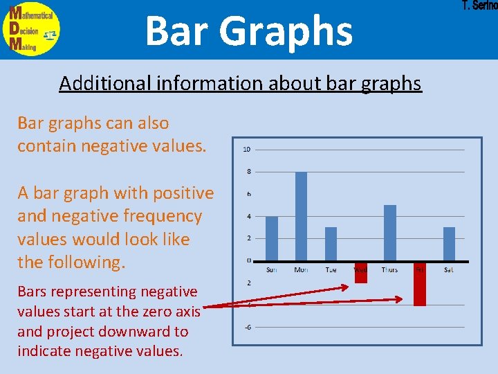
Bar Graphs Additional information about bar graphs Bar graphs can also contain negative values. A bar graph with positive and negative frequency values would look like the following. Bars representing negative values start at the zero axis and project downward to indicate negative values.
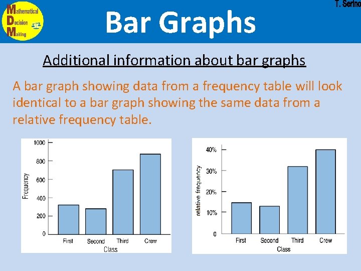
Bar Graphs Additional information about bar graphs A bar graph showing data from a frequency table will look identical to a bar graph showing the same data from a relative frequency table.
- Slides: 18