Displaying Categorical Data Chapter 3 Data and Dirty



- Slides: 18

Displaying Categorical Data Chapter 3

Data and Dirty Laundry needs to be separated into loads for a machine to handle it. Data likewise needs to be organized into manageably small clusters or portions. Laundry should be sorted by color (and other factors potentially) for best results. Data likewise needs to be sorted in some specific, useful way for best results.

Where to Start When Analyzing Data �Step 1: Draw a picture. �Humans are a visual species, and by seeing the data we are better able to think about it. �Step 2: Draw a picture. �With a properly selected picture, we are better able to demonstrate our reasoning and our process. �Step 3: Draw a picture. �Once a conclusion has been reached it is often best expressed as a picture. �Note: On some problems step 1, 2, and 3 might each require their own pictures.

Frequency Vocabulary Frequency – The number of times a value occurred. Relative Frequency – The number of times a value occurred divided by the total number of cases collected. Often expressed as a percent. Frequency Table – A table that displays frequencies. Relative Frequency Table – A table that displays relative frequencies.

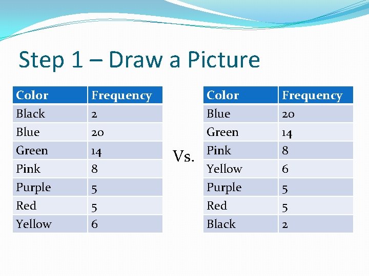
Step 1 – Draw a Picture With categorical data, we want to start with a frequency chart. Your book gave you some examples, but we will use some hypothetical favorite color data.

Step 1 – Draw a Picture Color Black Blue Green Frequency 2 20 14 Pink Purple Red Yellow 8 5 5 6 Vs. Color Blue Green Pink Frequency 20 14 8 Yellow Purple Red Black 6 5 5 2

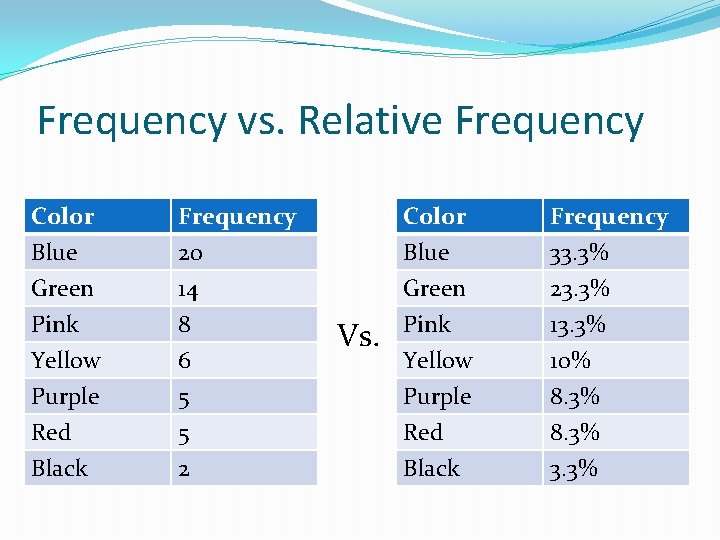
Frequency vs. Relative Frequency With a small data set like 60, these raw counts are not a problem. If you had a data set where 1472 people contributed a favorite color, you would generally be better off getting the relative frequency.

Frequency vs. Relative Frequency Color Blue Green Pink Frequency 20 14 8 Yellow Purple Red Black 6 5 5 2 Vs. Color Blue Green Pink Frequency 33. 3% 23. 3% 13. 3% Yellow Purple Red Black 10% 8. 3% 3. 3%

Step 2 – Draw a Picture If all you are doing is describing the data, then a frequency table or relative frequency table will cover steps 1 and 2. The same picture that helps you think about what is going on also helps to show what is going on. We will come back to what happens when you are doing more than just describing data.

Step 3 – Draw a Picture Even if you are describing the data with a frequency chart to show what is going on, you should use an additional picture to showcase your findings. Two popular choices (for categorical data) are bar charts and pie charts. Bar charts are best when the categories can be put in some sensible order, such as months. They can basically always be used Pie charts are best when the categories do not have a natural order, such as colors. Pie charts can only be used when your data adds up to 100% of the data…with no overlap.

Bar Charts and Pie Charts Bar charts are super crazy easy on Excel once you get the hang of it. Pie charts are also easy. Creating a pie chart by hand is much trickier than a bar chart, so if you are having to work by hand you might do a bar chart instead of a pie chart.

Step 1 – Draw a Picture When we want to look at the relationship between two variables, we will use a contingency table instead of a frequency chart. A contingency table is a table where the rows are categories for one variable and where the columns are categories for the other variable.

Contingency Table Once we have determined the columns and the rows, we fill the table with the frequencies. Each value represents the frequency of the category for that row happening at the same time as the category for that column.

Contingency Table Next we will total each row and total each column. Then we will total the whole table. To do this we total the row totals and total the column totals to make sure they match.

Contingency Tables Relative values get trickier. In a frequency table, there is only one total. In a contingency table there is a row total and a column total and a table total.

Example Time! If you missed class today, this was the really sad part to miss. You should get notes from someone who was here.

Assignments Read Chapter 3 for tomorrow if you haven’t already. The Chapter 1 -3 Quiz will be Friday. Chapter 3: 5, 9, 19 (This is the first half, more will be added before a due date is set) Chapter 2 homework is due Friday. Problems 2 -7, 25, 26 I will not be actively lecturing over the Area Principle. Instead, if you have questions about it, you should bring those tomorrow so that when I ask “Are there any questions about the Area Principle? ” you have a good answer. I will not answer the question, “What even is the Area Principle? ” Nor will I answer any of its ilk.

Quiz Bulletpoints Know what T-S-T stands for and what each one means. Know how to identify the 5 W’s and How in a study. Know the difference between a qualitative and quantitative variable. Know how to find percentages from a contingency table. Know the area principle.