Disney Prophecy The Plutonian Chronicles Intro Pulsars are

- Slides: 19

Disney Prophecy The Plutonian Chronicles

Intro. Pulsars are formed when supernovae go BOOM!!! After the star explodes a neutron star is formed. A pulsar is a neutron star that emits all kinds of energy as it spins. It is extremely dense (~ 1. 0 x 1015 kg m-3 ), reaches speeds to up to 1, 000 km/sec, and they have periods ranging from 1. 4 ms to 8. 5 sec.

Methodology When determining whether or not a certain plot is a pulsar or just RFI, there are certain things you should be looking for. First off, it must have a DM(dispersion measure) of more than zero. If it is zero, the transmission is coming from Earth. Secondly, look at the reduced x 2 on the DM chart. If it is less than the number one, there is a great chance that it is not a pulsar. You also need to check out the pulsar profile. If there are many rapid and spikes and drops, it might not come out to be a pulsar, just noise.

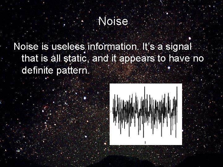
Noise is useless information. It’s a signal that is all static, and it appears to have no definite pattern.

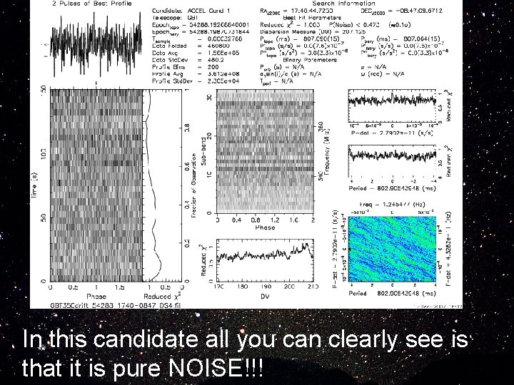
In this candidate all you can clearly see is that it is pure NOISE!!!

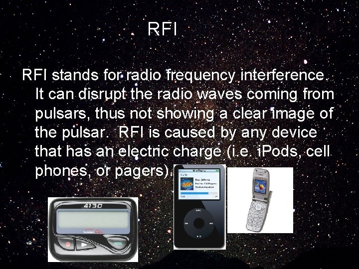
RFI stands for radio frequency interference. It can disrupt the radio waves coming from pulsars, thus not showing a clear image of the pulsar. RFI is caused by any device that has an electric charge (i. e. i. Pods, cell phones, or pagers).

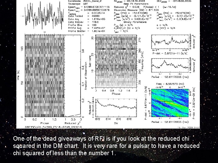
One of the dead giveaways of RFI is if you look at the reduced chi squared in the DM chart. It is very rare for a pulsar to have a reduced chi squared of less than the number 1.

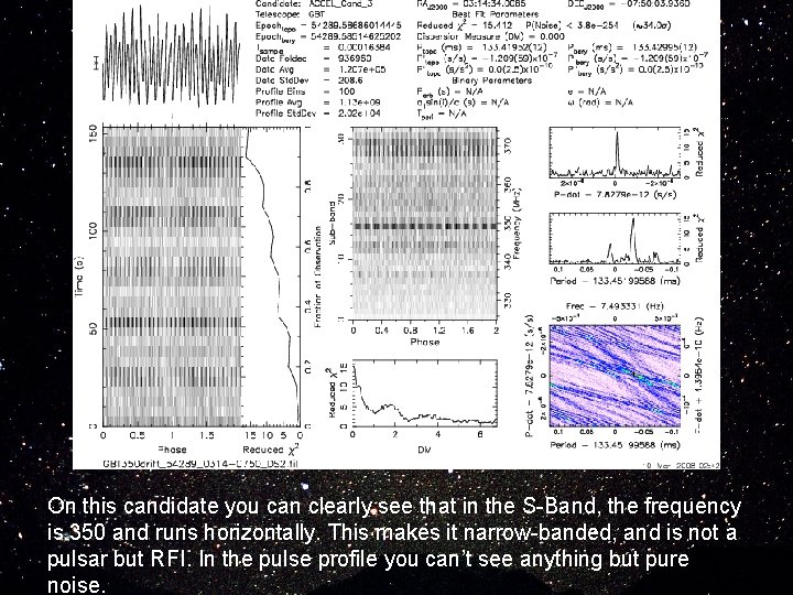
On this candidate you can clearly see that in the S-Band, the frequency is 350 and runs horizontally. This makes it narrow-banded, and is not a pulsar but RFI. In the pulse profile you can’t see anything but pure noise.

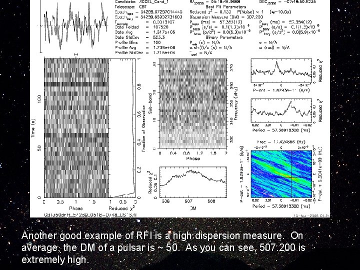
Another good example of RFI is a high dispersion measure. On average, the DM of a pulsar is ~ 50. As you can see, 507. 200 is extremely high.

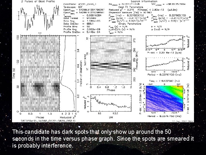
This candidate has dark spots that only show up around the 50 seconds in the time versus phase graph. Since the spots are smeared it is probably interference.

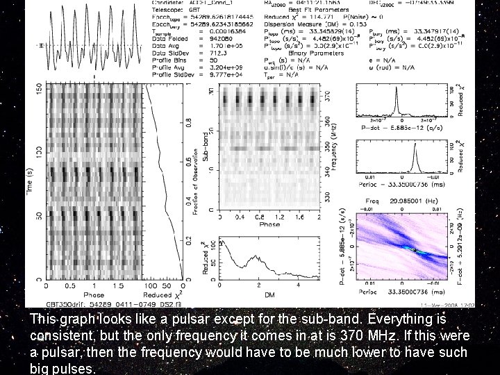
This graph looks like a pulsar except for the sub-band. Everything is consistent, but the only frequency it comes in at is 370 MHz. If this were a pulsar, then the frequency would have to be much lower to have such big pulses.

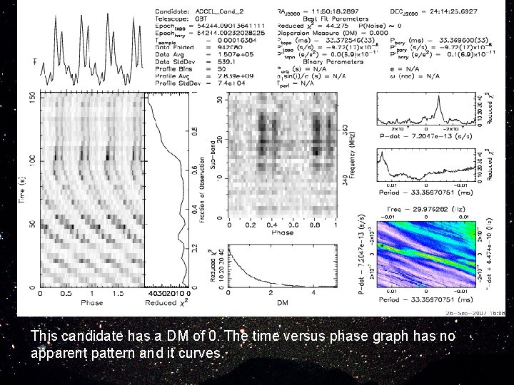
This candidate has a DM of 0. The time versus phase graph has no apparent pattern and it curves.

Good Candidates A good candidate for a pulsar is a lot different than a bad one. It must have a broadband in the Sub-band chart, a decent pulsar profile, and a DM ~ 50. It usually shows up throughout the whole observation time, but is also acceptable if it doesn’t show up through-out the whole observation. Again, most pulsars do not have a reduced chi squared of less than one on the DM chart.

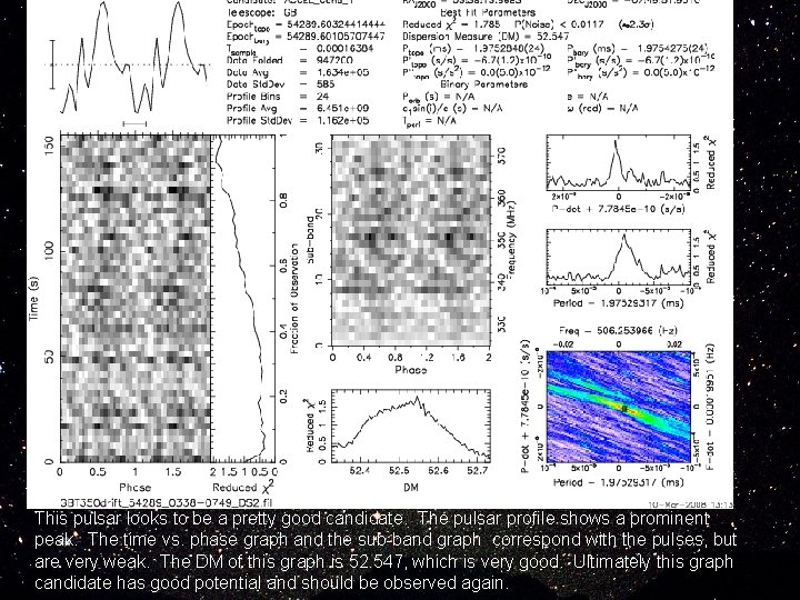
This pulsar looks to be a pretty good candidate. The pulsar profile shows a prominent peak. The time vs. phase graph and the sub-band graph correspond with the pulses, but are very weak. The DM of this graph is 52. 547, which is very good. Ultimately this graph candidate has good potential and should be observed again.

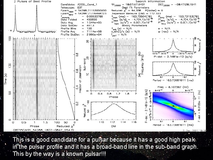
This is a good candidate for a pulsar because it has a good high peak in the pulsar profile and it has a broad-band line in the sub-band graph. This by the way is a known pulsar!!!

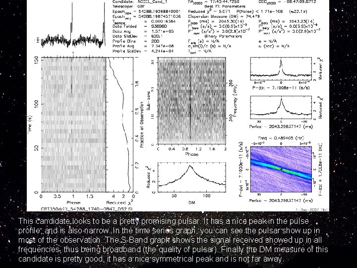
This candidate looks to be a pretty promising pulsar. It has a nice peak in the pulse profile, and is also narrow. In the time series graph, you can see the pulsar show up in most of the observation. The S-Band graph shows the signal received showed up in all frequencies, thus being broadband (the quality of pulsar). Finally the DM measure of this candidate is pretty good, it has a nice symmetrical peak and is not far away.

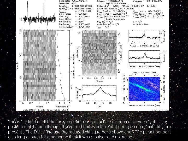
This is the kind of plot that may contain a pulsar that hasn’t been discovered yet. The peaks are high and although the vertical bands in the Sub-band graph are faint, they are present. The DM is fine and the reduced chi squared is above one. The pulsar period is also long enough for a person to think it was a pulsar and not noise.

Conclusion Throughout the ten plots that we analyzed, only three candidates were worthy enough to be followed up, while the remaining plots were RFI and/or noise. With this information, we now have a better understanding on how pulsars look on plots and work.

Credits Trent Jolin Brianna Mc. Court Jonathan Castillo Staci Pritt Jennifer Gore Madonna Lott