
DIGITAL GRAPHICS Colour Theory Contrast Colour contrast is
- Slides: 24
DIGITAL GRAPHICS Colour Theory
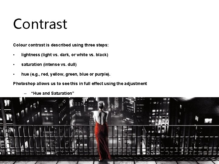
Contrast Colour contrast is described using three steps: • lightness (light vs. dark, or white vs. black) • saturation (intense vs. dull) • hue (e. g. , red, yellow, green, blue or purple). Photoshop allows us to see this in full effect using the adjustment – “Hue and Saturation”
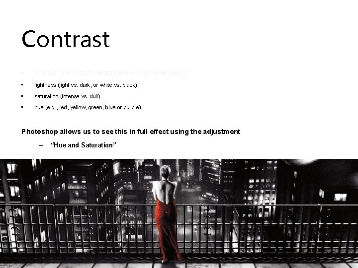
Contrast • Colour contrast is described using three steps: • lightness (light vs. dark, or white vs. black) • saturation (intense vs. dull) • hue (e. g. , red, yellow, green, blue or purple). Photoshop allows us to see this in full effect using the adjustment – “Hue and Saturation”
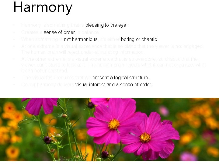
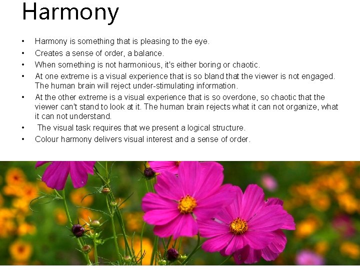
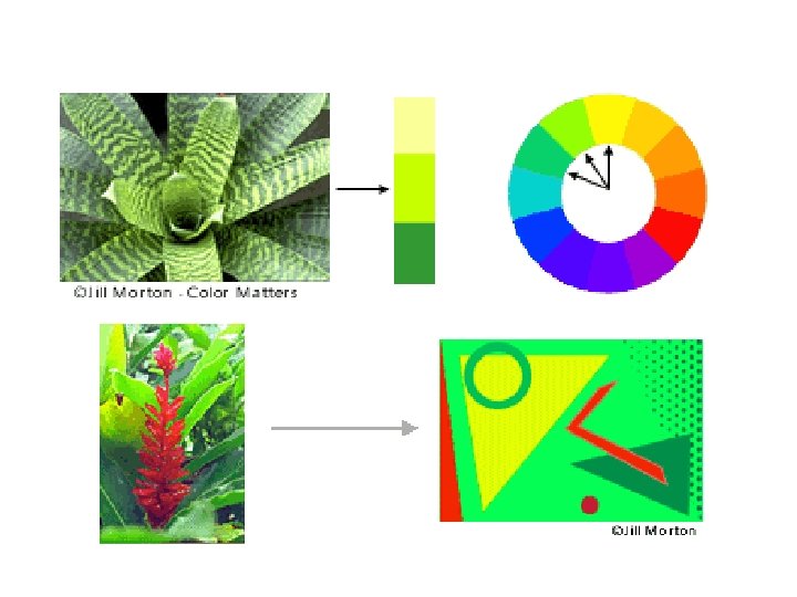
Harmony • • Harmony is something that is pleasing to the eye. Creates a sense of order, a balance. When something is not harmonious, it's either boring or chaotic. At one extreme is a visual experience that is so bland that the viewer is not engaged. The human brain will reject under-stimulating information. At the other extreme is a visual experience that is so overdone, so chaotic that the viewer can't stand to look at it. The human brain rejects what it can not organize, what it can not understand. The visual task requires that we present a logical structure. Colour harmony delivers visual interest and a sense of order.
Harmony • • Harmony is something that is pleasing to the eye. Creates a sense of order, a balance. When something is not harmonious, it's either boring or chaotic. At one extreme is a visual experience that is so bland that the viewer is not engaged. The human brain will reject under-stimulating information. At the other extreme is a visual experience that is so overdone, so chaotic that the viewer can't stand to look at it. The human brain rejects what it can not organize, what it can not understand. The visual task requires that we present a logical structure. Colour harmony delivers visual interest and a sense of order.
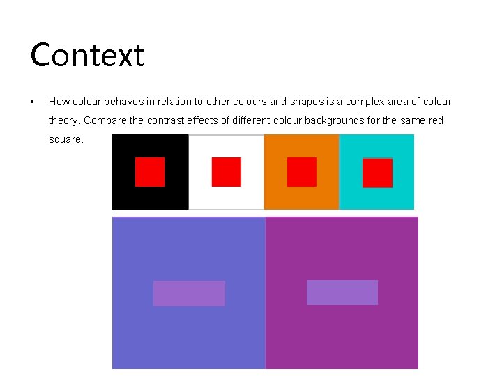
Context • How colour behaves in relation to other colours and shapes is a complex area of colour theory. Compare the contrast effects of different colour backgrounds for the same red square.
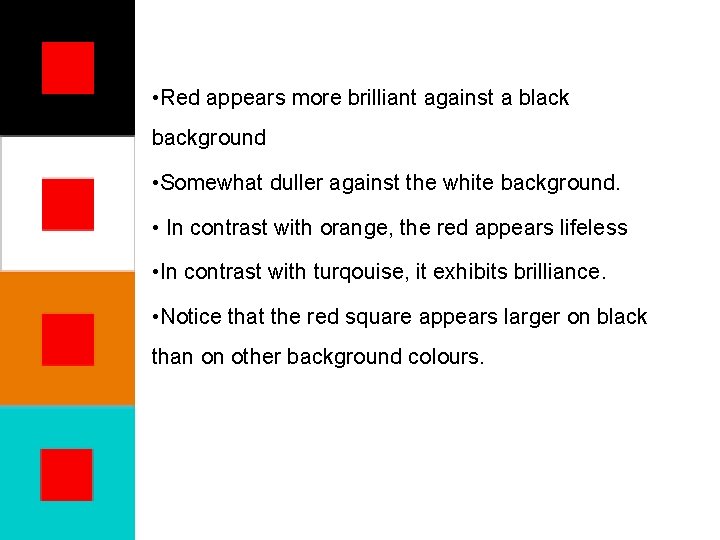
• Red appears more brilliant against a black background • Somewhat duller against the white background. • In contrast with orange, the red appears lifeless • In contrast with turqouise, it exhibits brilliance. • Notice that the red square appears larger on black than on other background colours.
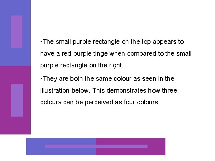
• The small purple rectangle on the top appears to have a red-purple tinge when compared to the small purple rectangle on the right. • They are both the same colour as seen in the illustration below. This demonstrates how three colours can be perceived as four colours.
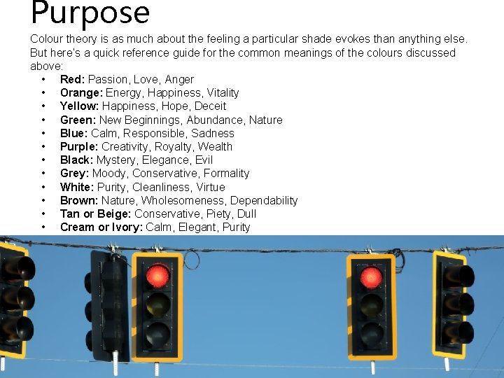
Purpose Colour theory is as much about the feeling a particular shade evokes than anything else. But here’s a quick reference guide for the common meanings of the colours discussed above: • Red: Passion, Love, Anger • Orange: Energy, Happiness, Vitality • Yellow: Happiness, Hope, Deceit • Green: New Beginnings, Abundance, Nature • Blue: Calm, Responsible, Sadness • Purple: Creativity, Royalty, Wealth • Black: Mystery, Elegance, Evil • Grey: Moody, Conservative, Formality • White: Purity, Cleanliness, Virtue • Brown: Nature, Wholesomeness, Dependability • Tan or Beige: Conservative, Piety, Dull • Cream or Ivory: Calm, Elegant, Purity
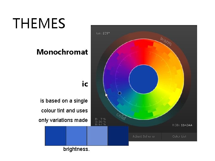
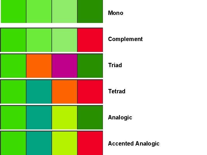
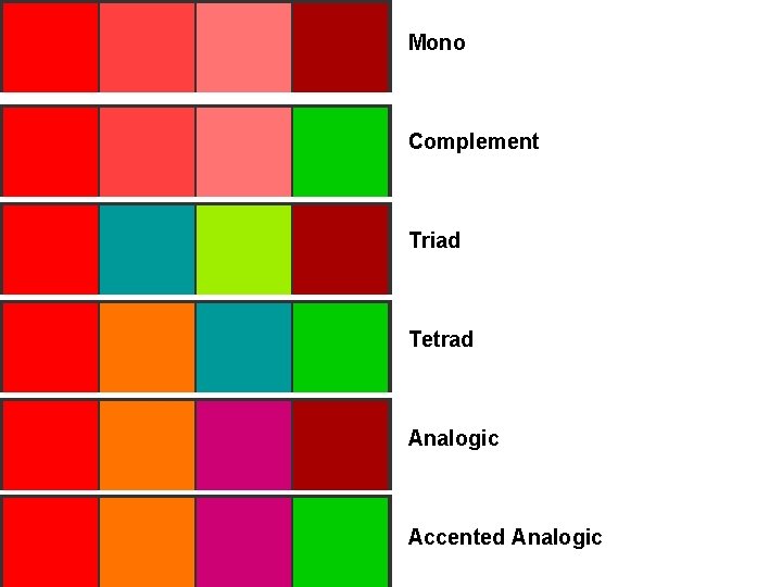
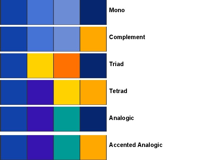
THEMES Monochromat ic is based on a single colour tint and uses only variations made by changing its saturation or brightness.
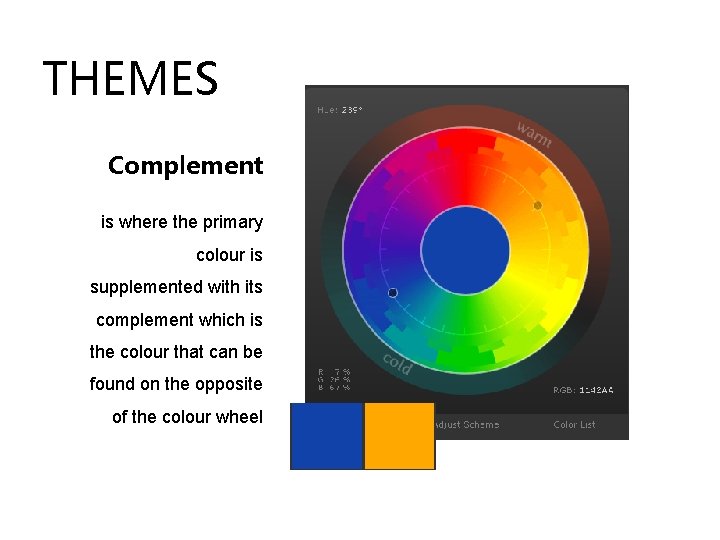
THEMES Complement is where the primary colour is supplemented with its complement which is the colour that can be found on the opposite of the colour wheel
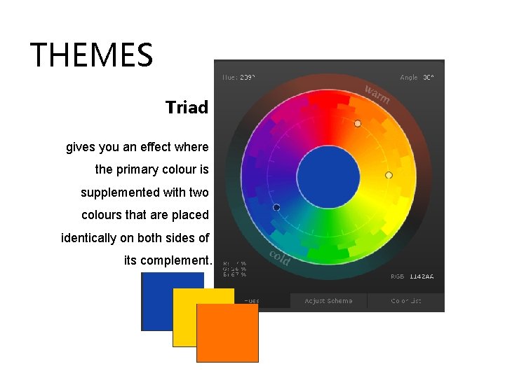
THEMES Triad gives you an effect where the primary colour is supplemented with two colours that are placed identically on both sides of its complement.
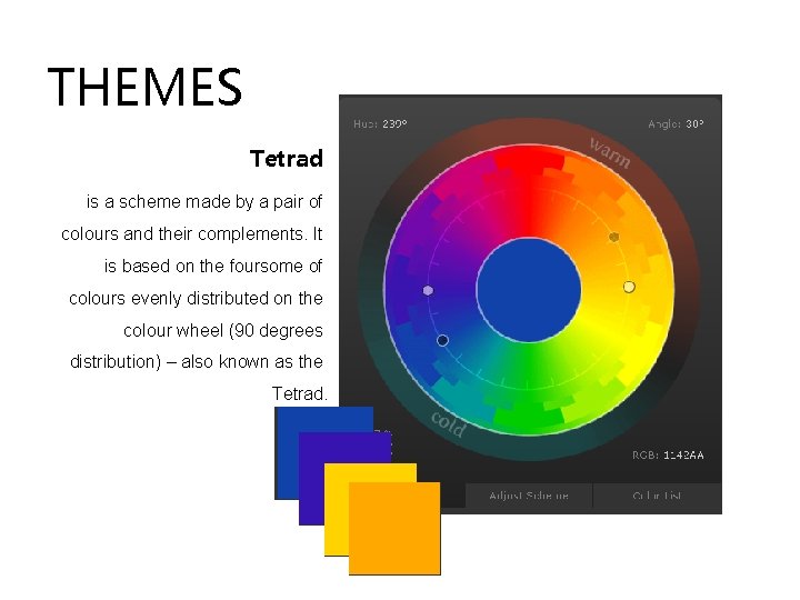
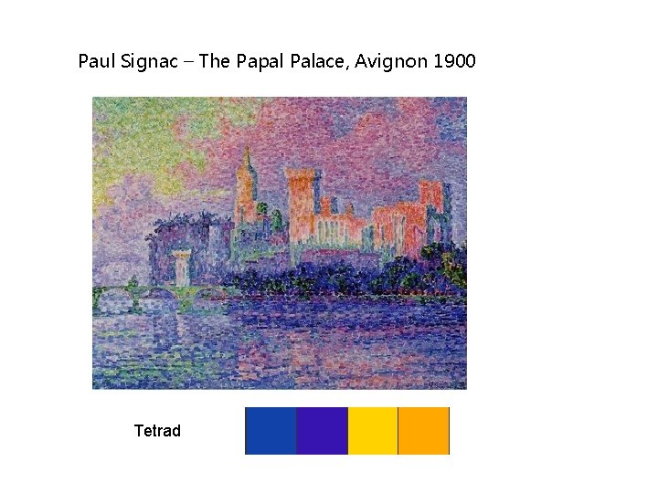
THEMES Tetrad is a scheme made by a pair of colours and their complements. It is based on the foursome of colours evenly distributed on the colour wheel (90 degrees distribution) – also known as the Tetrad.
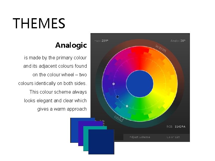
THEMES Analogic is made by the primary colour and its adjacent colours found on the colour wheel – two colours identically on both sides. This colour scheme always looks elegant and clear which gives a warm approach
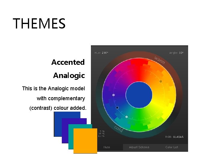
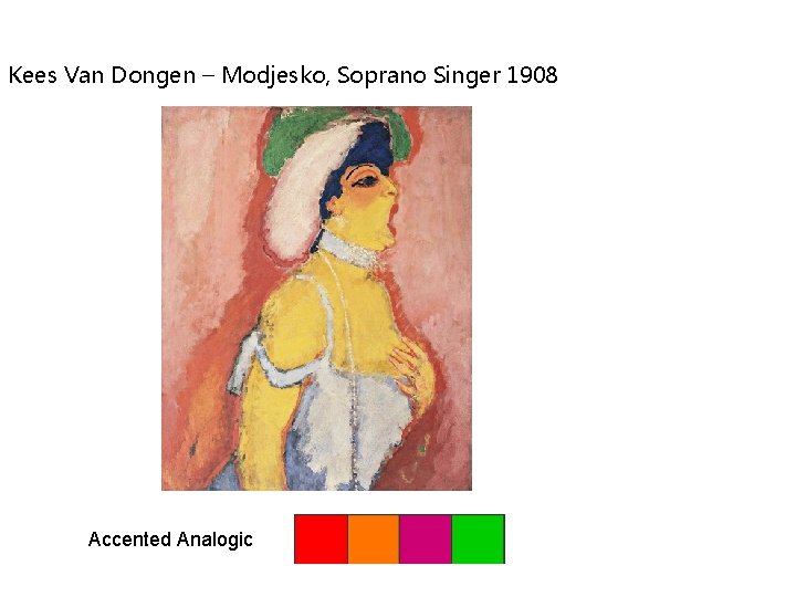
THEMES Accented Analogic This is the Analogic model with complementary (contrast) colour added.
Mono Complement Triad Tetrad Analogic Accented Analogic
Mono Complement Triad Tetrad Analogic Accented Analogic
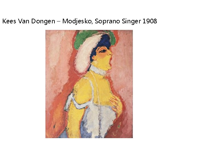
Kees Van Dongen – Modjesko, Soprano Singer 1908
Kees Van Dongen – Modjesko, Soprano Singer 1908 Accented Analogic
Mono Complement Triad Tetrad Analogic Accented Analogic
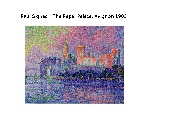
Paul Signac – The Papal Palace, Avignon 1900
Paul Signac – The Papal Palace, Avignon 1900 Tetrad
Task • Choose a colour scheme to use • Visit paletton. com to collect your colour scheme • Use the Snipping Tool to copy the colour scheme to the clipboard • Load this into Adobe Photoshop and keep it as visible layer – Use the dropper tool to select the colour as and when you need it. • Produce a DVD menu using this colour scheme in Adobe Photoshop