Digi pack Lloyd Tyson Digi pack the frey

- Slides: 7

Digi pack Lloyd Tyson

Digi pack- the frey

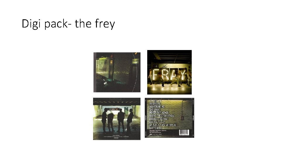
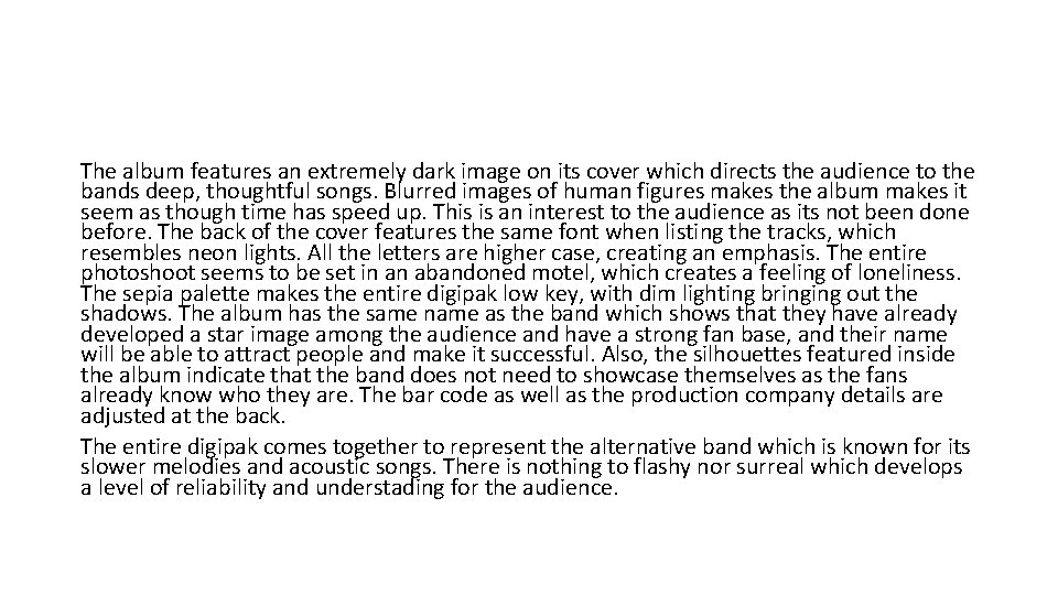
The album features an extremely dark image on its cover which directs the audience to the bands deep, thoughtful songs. Blurred images of human figures makes the album makes it seem as though time has speed up. This is an interest to the audience as its not been done before. The back of the cover features the same font when listing the tracks, which resembles neon lights. All the letters are higher case, creating an emphasis. The entire photoshoot seems to be set in an abandoned motel, which creates a feeling of loneliness. The sepia palette makes the entire digipak low key, with dim lighting bringing out the shadows. The album has the same name as the band which shows that they have already developed a star image among the audience and have a strong fan base, and their name will be able to attract people and make it successful. Also, the silhouettes featured inside the album indicate that the band does not need to showcase themselves as the fans already know who they are. The bar code as well as the production company details are adjusted at the back. The entire digipak comes together to represent the alternative band which is known for its slower melodies and acoustic songs. There is nothing to flashy nor surreal which develops a level of reliability and understading for the audience.


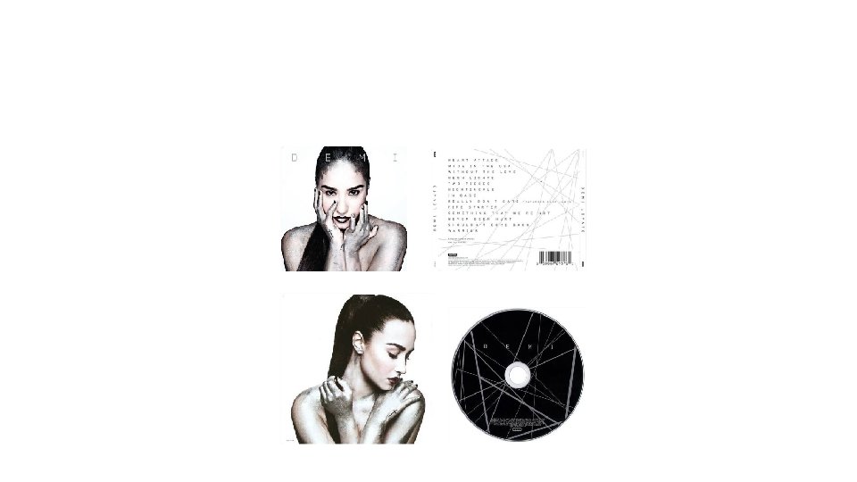
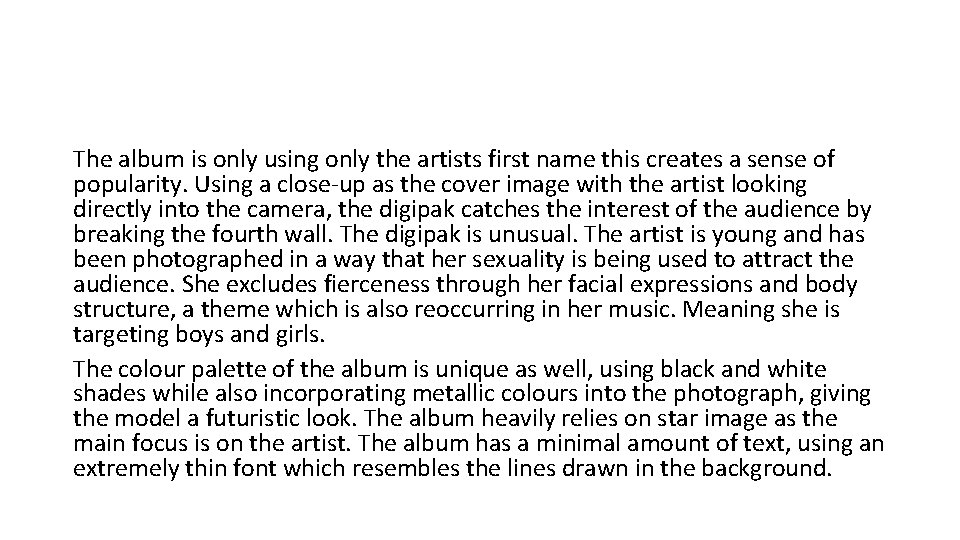
The album is only using only the artists first name this creates a sense of popularity. Using a close-up as the cover image with the artist looking directly into the camera, the digipak catches the interest of the audience by breaking the fourth wall. The digipak is unusual. The artist is young and has been photographed in a way that her sexuality is being used to attract the audience. She excludes fierceness through her facial expressions and body structure, a theme which is also reoccurring in her music. Meaning she is targeting boys and girls. The colour palette of the album is unique as well, using black and white shades while also incorporating metallic colours into the photograph, giving the model a futuristic look. The album heavily relies on star image as the main focus is on the artist. The album has a minimal amount of text, using an extremely thin font which resembles the lines drawn in the background.


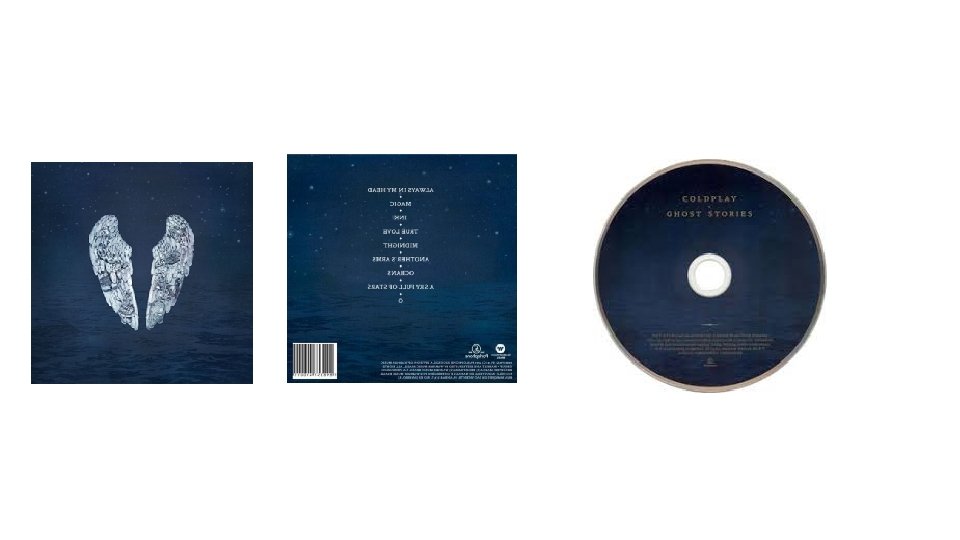
• Throughout the digipak the components used very similar throughout as all the parts of the digipak contain the midnight ocean design background, therefore they all create an overall style of a bright spark within darkness. The digipak doesn’t contain any image of the band, this may be due the fact that Coldplay have a large enough brand image to not require images of them for customers to recognize its their album. they have used the cover to represent some songs, the songs Always In My Head, Magic and Another’s Arm are represented by the wings as they could project a guardian angel, so it's a form of magic in some’s head and he is holding onto the arm. The wings could also represent the title of the album Ghost Stories because it's only angel wings, so it could mean there's a ghost angel. Additionally, the song Midnight and Oceans are represented and reflected on the bottom of the digipak and A Sky Full of Stars at the top. The colour scheme for this digipak it consistent because the same background image is used throughout but only the wings and texts change which have different colours, however the background for the front cover is slightly brighter than the other.