DIFAX Maps Weather maps generated by the NWS

DIFAX Maps • Weather maps generated by the NWS • Before the Internet or AWIPS, these were the basic weather analysis and forecast charts used by meteorologists • They were only available through a fax machine connected to a dedicated landline

• DIFAX maps are gradually being phased out; however, the most important ones are still produced • These maps are unique and contain information which is priceless for operational meteorologists • All meteorology students benefit from knowledge of these maps and their interpretation • If you understand how to interpret the black&white DIFAX chart, you should have no problem interpreting pretty colored charts from other sources

DIFAX Map Access National Weather Service: http: //weather. noaa. gov/fax/nwsfax. html Colorado State Archive: http: //ldm. atmos. colostate. edu/ SUNY Albany: http: //www. atmos. albany. edu/weather/difax. html
")
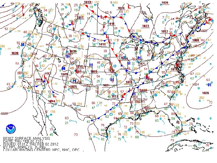
Surface Charts • Analyzed charts issued every 3 hours (00 Z – 21 Z) • Data includes – Hourly synoptic stations – Ship reports – Buoy reports • Maps can be found from the HPC: http: //www. hpc. ncep. noaa. gov/html/sfc 2. shtml

Surface Charts • Isobar analysis: – 4 mb increments labeled with tens and units digits – Lows and Highs labeled with L and H with the pressure value labeled nearby (in whole mb) • Frontal Analysis http: //www. hpc. ncep. noaa. gov/html/fntcodes 2. shtml • Used for current depiction of surface weather features (most valuable weather chart)

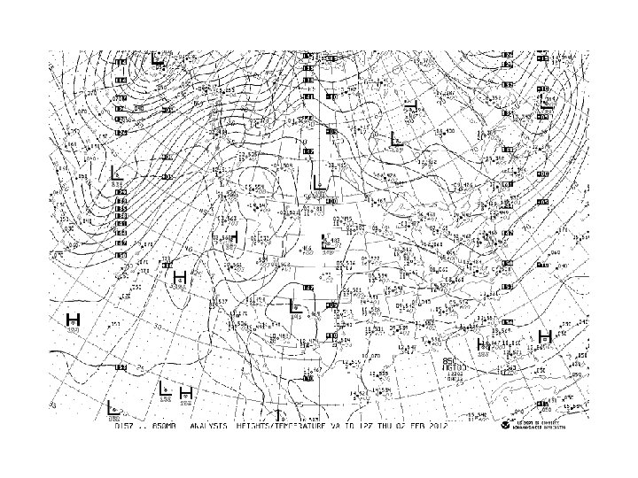
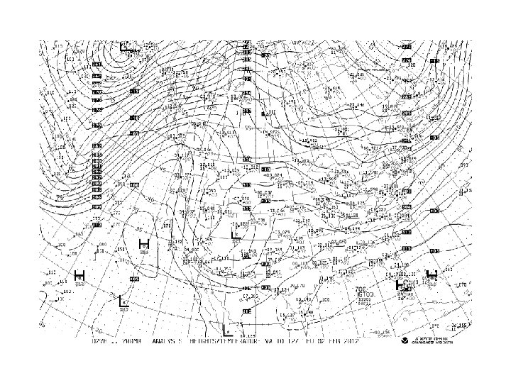
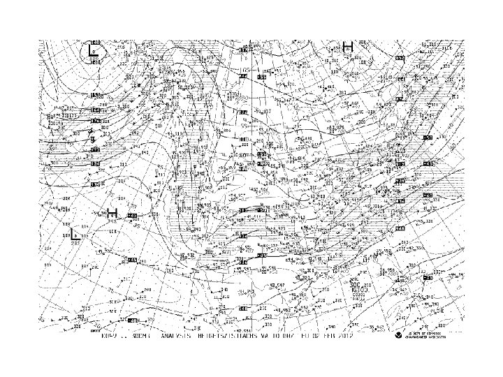
Upper Air Analysis • Generated every 12 hours with 00 Z and 12 Z data • Produced from the NAM Model analysis – The NAM Model uses a first guess from the previous model run 6 or 12 hours earlier as a basis for constructing the analysis fields – Data is incorporated into the first guess field and the analysis is created via Optimal Interpolation (OI) or 4 -D Data Assimilation – Actual data is plotted on the chart, but may not agree with chart’s analysis field
 – 30 m intervals with 1500 m")
850 mb Chart • Isoheights (solid contours) – 30 m intervals with 1500 m (150 decameters) reference line – Contour labels in decameters – Plotted heights are in meters • Isotherms (dashed contours) – 5 C intervals with 0 C as reference line

850 mb Chart • Uses: – Low level jets – Lower tropospheric temperature advection and thermal profile (thermal ridges and troughs) – Lower tropospheric moisture advection and profiles (moist and dry tongues)

 – 30 m intervals with 3000 m")
700 mb Chart • Isoheights (solid contours) – 30 m intervals with 3000 m (300 decameters) reference line – Contour labels in decameters – Plotted heights are in meters • Isotherms (dashed contours) – 5 C intervals with 0 C reference line

700 mb Chart • Uses: – Mid-level jets – Mid-tropospheric temperature advection and thermal profile – Elevated tropospheric moisture advection and profiles – Height changes
 • Isoheights (solid contours) – 60 m intervals with")
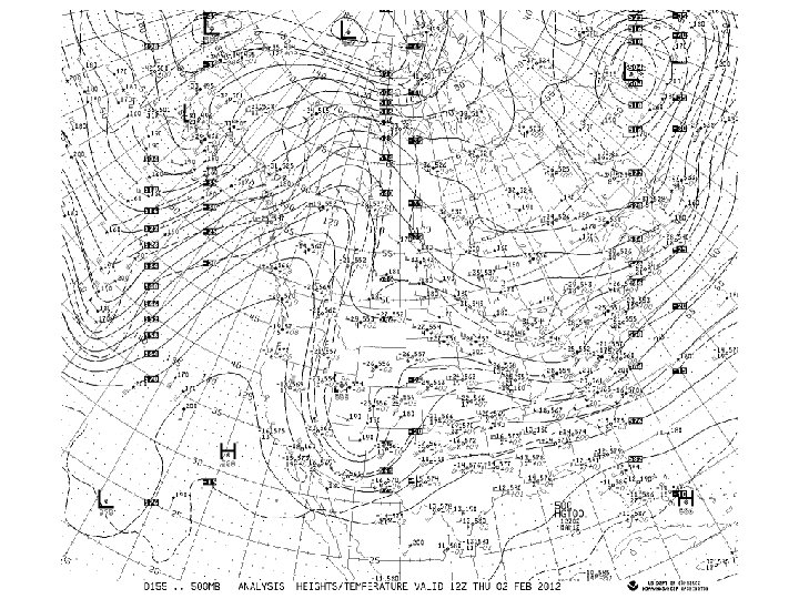
500 mb Chart (North America) • Isoheights (solid contours) – 60 m intervals with 5400 m (540 decameters) reference line – Contour labels in decameters – Plotted heights are in decameters • Isotherms (dashed contours) – 5 C intervals with 0 C reference line
 • Uses: – Mid-tropospheric temperature advection and thermal profile")
500 mb Chart (North America) • Uses: – Mid-tropospheric temperature advection and thermal profile – Mid-tropospheric moisture profile – Wave pattern in the westerlies • ID of longwaves and shortwaves – LND and approximate steering level for surface synoptic systems – Height changes and wave motion – Vertical and horizontal tilt of waves
 • Contains same contours as the 500 mb North American")
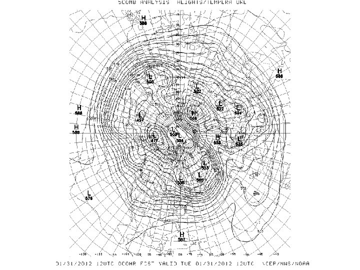
500 mb Chart (Hemispheric) • Contains same contours as the 500 mb North American analysis, except void of data plots • Additional Uses: – Circumpolar vortex – Planetary wave number and pattern – Wave ID
 – 120 m intervals with 9000 m")
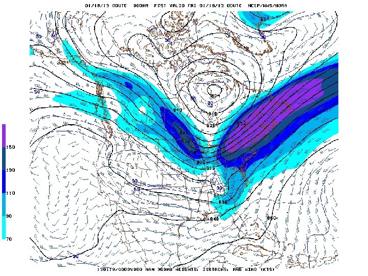
300 mb Chart • Isoheights (solid contours) – 120 m intervals with 9000 m (900 decameter) reference line – Contour labels in decameters – Plotted heights in decameters • Isotachs (light dashed contours) – 20 knot intervals with 10 knot reference line – Stippled regions represent: • 70 -110 knot winds • 150 -190 knot winds

300 mb Chart • Uses: – Polar jet stream location/configuration/intensity – 4 -quadrant jet/divergence relationship – Upper tropospheric wave pattern – Regions of difluence and confluence – Regions of upper-tropospheric vertical shear
 – Vertical")
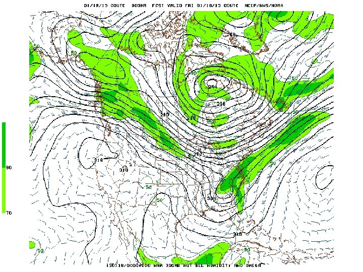
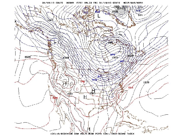
1000 -500 Thickness / MSLP Chart • Thickness Values (usually dashed contours) – Vertical distance in m between 1000 mb and 500 mb pressure levels – Function of avg virtual temperature of 1000 mb to 500 mb layer – Increments of 60 gpm • MSLP (solid black contour)

1000 -500 Thickness / MSLP Chart • Uses – Temperature advection • Thickness is proportionally to temperature • Use MSLP contours as proxy for wind (assume geostrophic – 5400 (540) line generally divides polar air from mid-latitude air (rain-snow line)
 • Contour lines are")
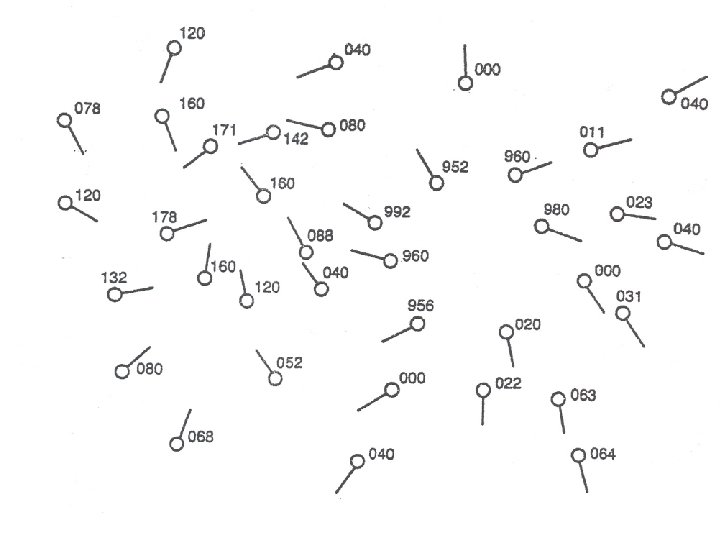
General Rules For Drawing Contours (see handout for more detail) • Contour lines are drawn to identify constant values of an atmospheric variable • A contour is drawn through the station location only if the data for that station has the exact value of the contour; otherwise, the contour is drawn between stations • Higher values are on one side of the contour and lower values on the other side of the contour • Contours never cross or touch each other • More than one contour of a given value may appear on a given map • All contour lines must be clearly labeled • Often easiest to find the highest value or the lowest value and work from there • Keep the surface wind in mind when drawing pressure contours. – Relative to other stations, the stronger the wind, the stronger the pressure gradient, thus the closer the isobars.

1016 mb H L

1016 mb H 1012 mb L

1016 mb H 1012 mb 1008 mb L

1016 mb H 1012 mb 1008 mb L 996 mb

1016 mb H 1012 mb 1008 mb L 996 mb 1000 mb

1016 mb H L 1012 mb 996 mb 1000 mb 1008 mb 1004 mb

1016 mb H L 996 mb 1012 mb 1000 mb 1008 mb 1004 mb
- Slides: 37