DESIGNS MOST EXCITING ELEMENT COLOUR Without light there


- Slides: 42
DESIGN’S MOST EXCITING ELEMENT: COLOUR
Without light there would be no colour. Things we identify as being red, green or orange, for example, are not innately those colours, but we perceive them as such because of what happens when light hits surface. As an experiment, Isaac Newton, in 1666, directed a beam of sunlight into a glass prism. The light bent as it passed through and separated into colours! In other words, the surface of an object reflects some colours and absorbs others. We perceive only the reflected colours.
Light waves enter the eye through the pupil. Light hits the retina and a message is sent through the nerves to the brain. Therefore, the eye and brain work together to translate light into colour. Light receptors within the eye transmit messages to the brain, which produces the familiar sensation of colour.
***An object appears white when it reflects all light waves and black when it absorbs them all. ONLY REFLECTED LIGHT WAVES PRODUCE COLOUR! An object appears white when it reflects all light waves. An object appears black when it absorbs all light waves. ONLY REFLECTED LIGHT WAVES PRODUCE COLOUR!
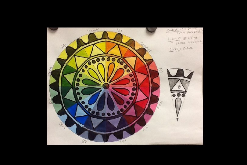
COLOUR HAS THREE QUALITIES: 1. Hue 2. Value 3. Intensity
HUE The name given to a pure colour. RED YELLOW VIOLET
VALUE The lightness or darkness of a colour.
TINT Made by adding white to a colour so that it is lighter. + HUE = WHITE TINT
SHADE Made by adding black to a colour so that it is darker. HUE + BLACK = SHADE
INTENSITY The saturation or purity of a colour. Colours that have been tinted, thinned out or darkened will be less intense. Yellow - HIGH INTENSITY Brown - LOW INTENSITY
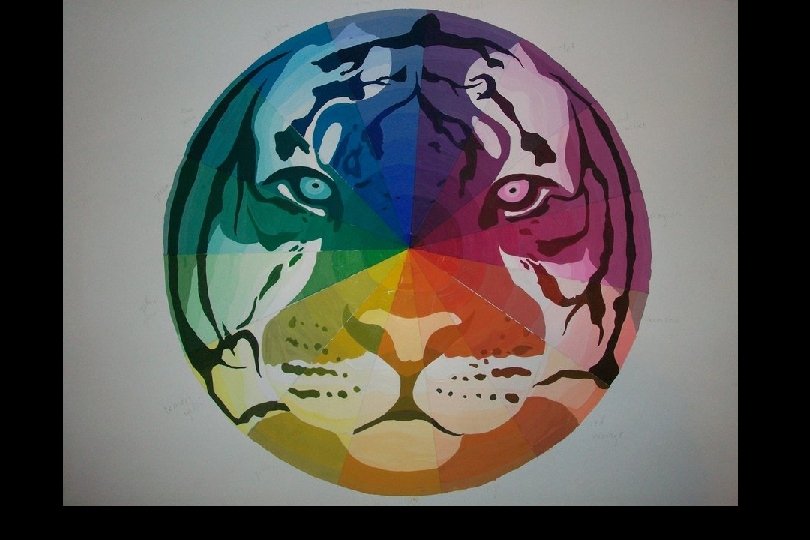
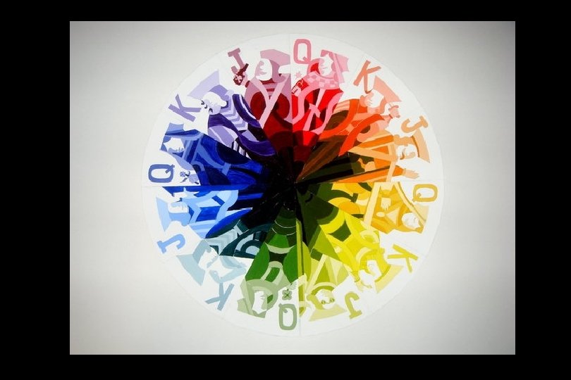
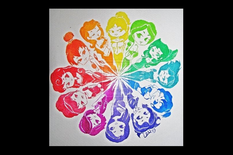
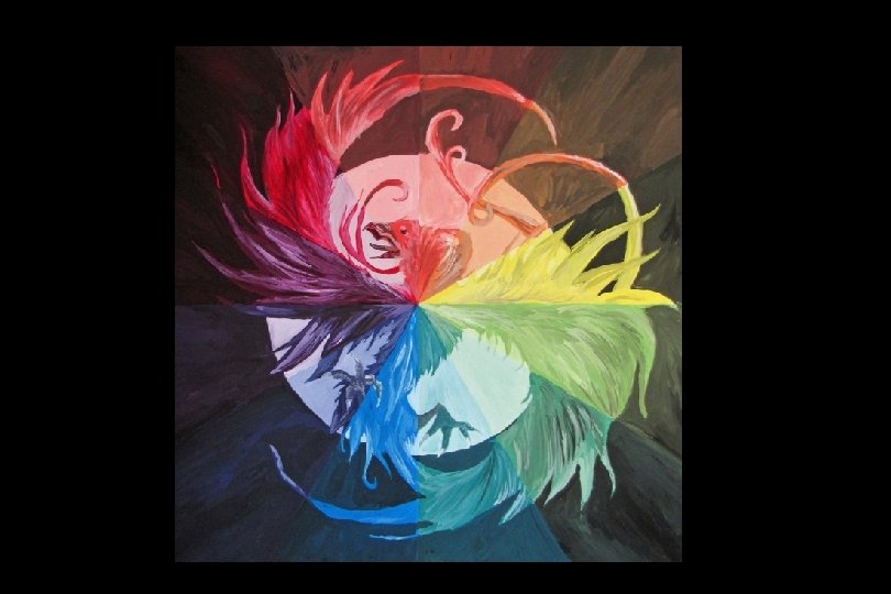
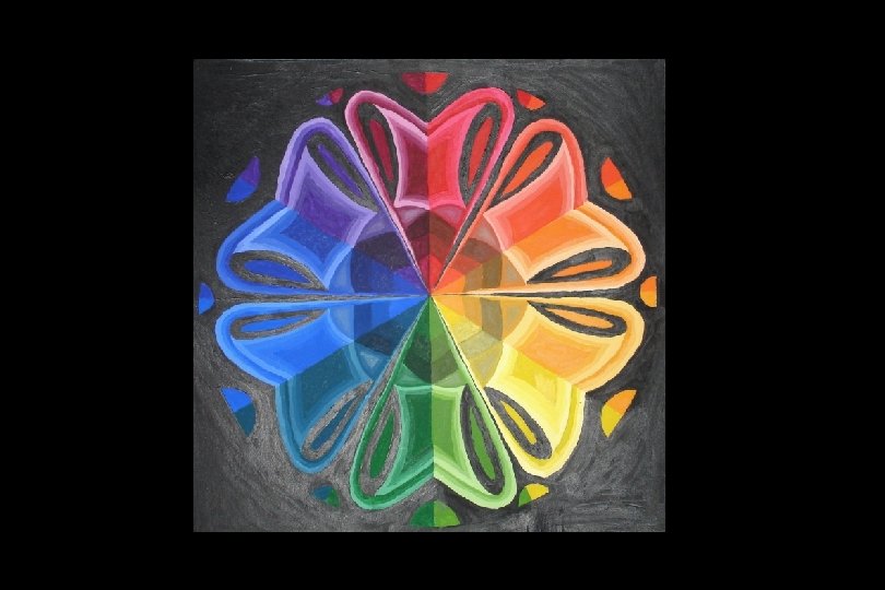
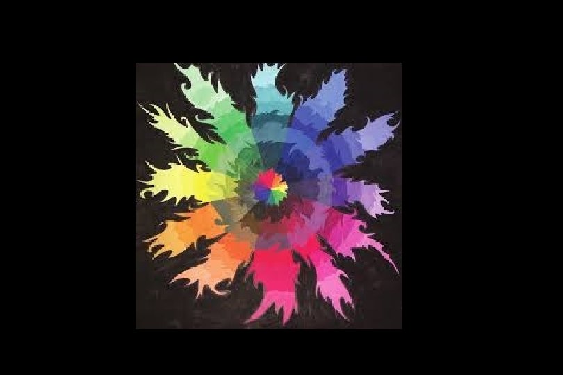
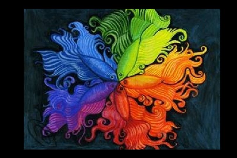
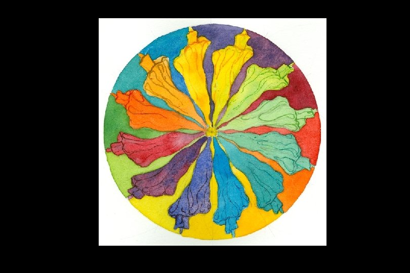
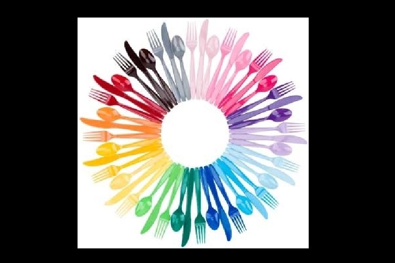
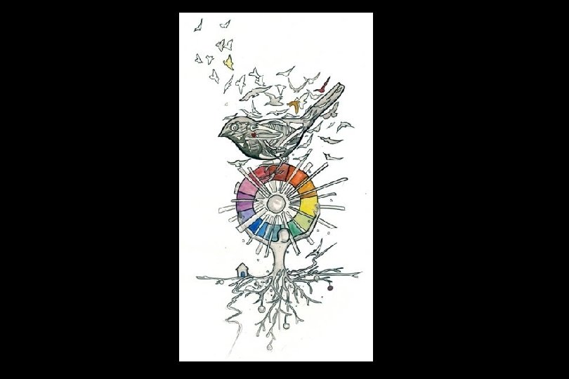
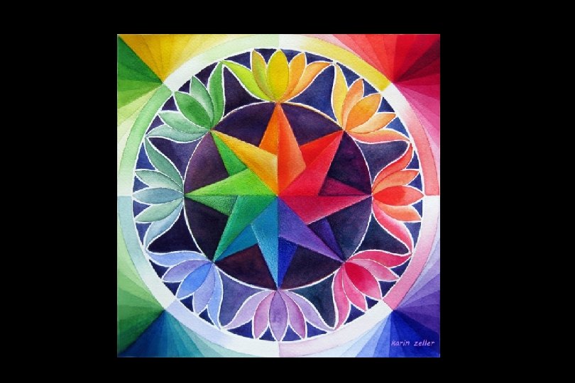
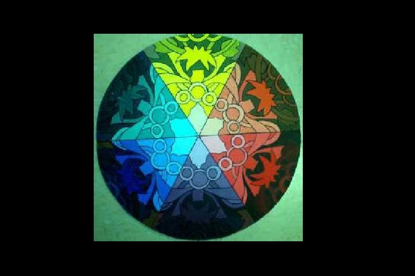
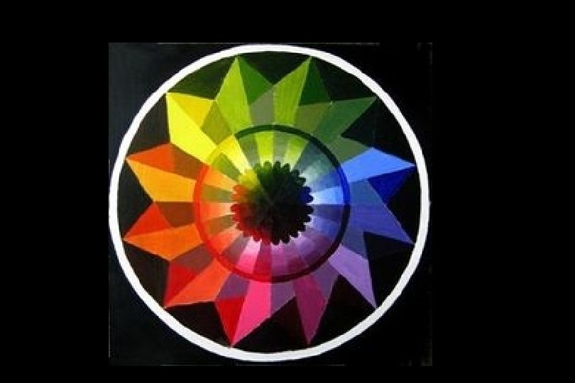
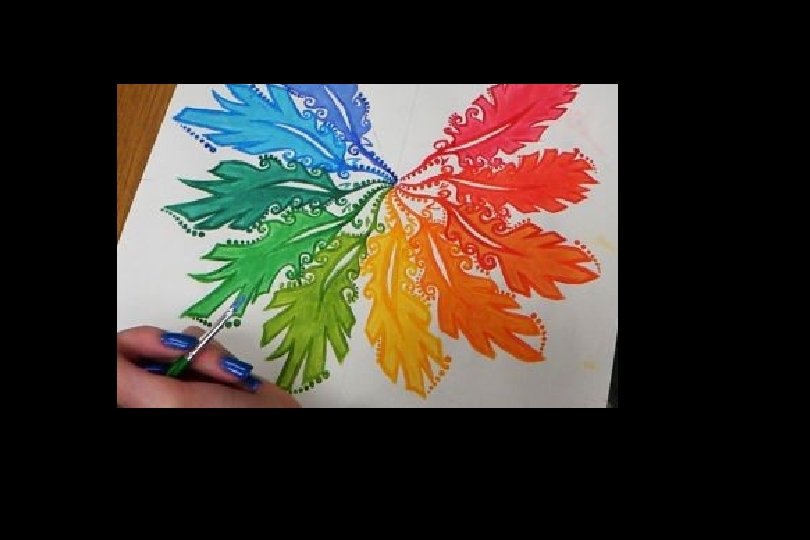
The colour wheel fits together like a puzzle - each colour in a specific place. Being familiar with the colour wheel not only helps you mix colours when painting, but in adding colour to all your art creations.
Primary Colours Primary colours are not mixed from other elements and they generate all other colours. • Red • Yellow • Blue
Secondary Colours Created by mixing two primary colours together. • Red + Yellow = Orange • Yellow + Blue = Green • Blue + Red = Purple
Tertiary/Intermediate Colours Created by mixing a primary and a secondary. • red-orange • yellow-green • blue-green • blue-purple • red-purple
Neutral Colours White, Gray, Black and Brown
Colour Schemes are a systematic way of using the colour wheel to put colours together… in your art work, putting together the clothes you wear, deciding what colours to paint your room…. .
Monochromatic “Mono” means “one”, “chroma” means “colour”… monochromatic colour schemes have only one colour and its values. (adding white and black)
Complementary colours are opposite on the colour wheel and provided a high contrast. Yellow and Purple Red and Green Blue and Orange
Analogous Colours that are beside each other on the colour wheel.
Warm colours are found on the right side of the colour wheel. They are colours found in fire and the sun. Warm colours make objects look closer in a painting or drawing.
Cool colours are found on the left side of the colour wheel. They are the colours found in snow and ice and tend to recede in a composition.
Emotional Qualities of Colour Artists often use colour as part of the expressive content of their art to communicate emotions, moods, and atmosphere. Red – evil, anger, fire, heat, courage, love, and often thought of as sexy. Blue – calm, soothing, tranquil, cool, heavenly, spiritual, sadness or depression. Yellow – cheery, embodies warmth and light. Purple – symbol of royalty or wealth. Green – envy, signifies life or hope, cool and restful colours of nature. White – symbolizes purity, truth, innocence, and light.
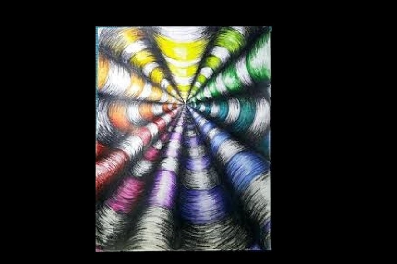
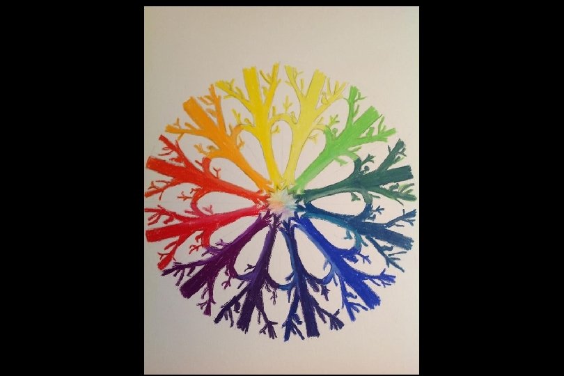
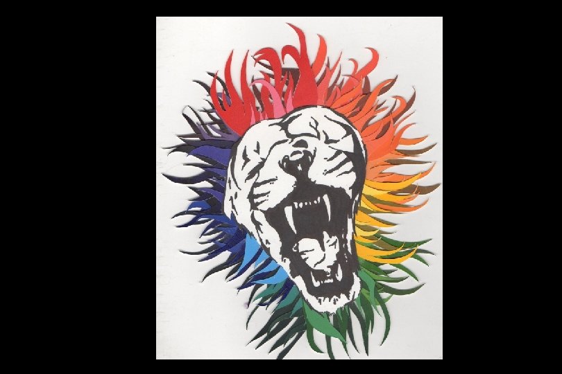
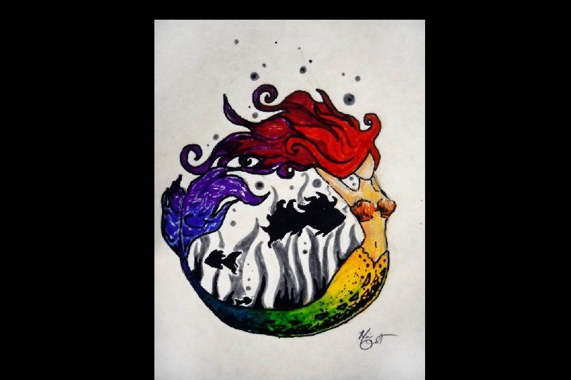
Your TASK: • You will transform a colour wheel in an imaginative and creative way!! • It must include primary, secondary, and tertiary colours • It must also include tints and shades