Designing Your Poster Making decisions Making meaning image
- Slides: 18

Designing Your Poster Making decisions : : Making meaning image found at: http: //www. postnet. com/north-port-fl 169/feature/blueprint-printing-and-scanning

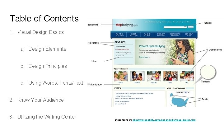
Table of Contents 1. Visual Design Basics a. Design Elements b. Design Principles c. Using Words: Fonts/Text 2. Know Your Audience 3. Utilizing the Writing Center image found at: http: //www. usability. gov/what-and-why/visual-design. html

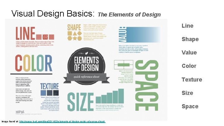
Visual Design Basics: The Elements of Design Line Shape Value Color Texture Size Space image found at: http: //paper-leaf. com/blog/2011/02/elements-of-design-quick-reference-sheet/

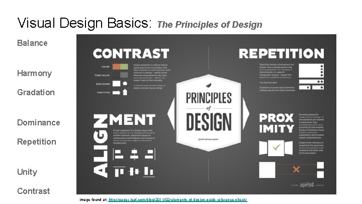
Visual Design Basics: The Principles of Design Balance Harmony Gradation Dominance Repetition Unity Contrast image found at: http: //paper-leaf. com/blog/2011/02/elements-of-design-quick-reference-sheet/

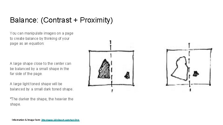
Balance: (Contrast + Proximity) You can manipulate images on a page to create balance by thinking of your page as an equation: A large shape close to the center can be balanced by a small shape in the far side of the page. A large light toned shape will be balanced by a small dark toned shape. *The darker the shape, the heavier the shape. Information & Image from: http: //www. johnlovett. com/test. htm

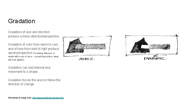
Gradation of size and direction produce a linear direction/perspective. Gradation of color from warm to cool and of tone from dark to light produce aerial perspective (*showing distance or depth with color or tone -- something farther away will look lighter). . Gradation can add interest and movement to a shape. Gradation forces the eyes to follow the direction of change. Information & Image from: http: //www. johnlovett. com/test. htm

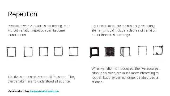
Repetition with variation is interesting, but without variation repetition can become monotonous: If you wish to create interest, any repeating element should include a degree of variation rather than drastic change. The five squares above are all the same. They can be taken in and understood all at once. When variation is introduced, the five squares, although similar, are much more interesting to look at, but they can no longer be absorbed all at once. Information & Image from: http: //www. johnlovett. com/test. htm

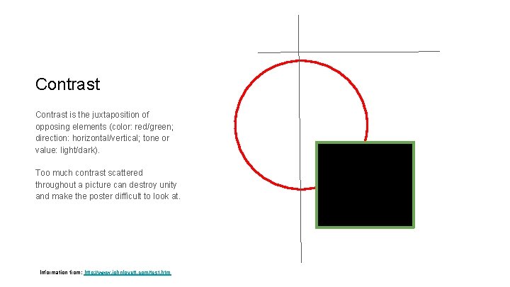
Contrast is the juxtaposition of opposing elements (color: red/green; direction: horizontal/vertical; tone or value: light/dark). Too much contrast scattered throughout a picture can destroy unity and make the poster difficult to look at. Information from: http: //www. johnlovett. com/test. htm

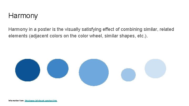
Harmony in a poster is the visually satisfying effect of combining similar, related elements (adjacent colors on the color wheel, similar shapes, etc. ). Information from: http: //www. johnlovett. com/test. htm

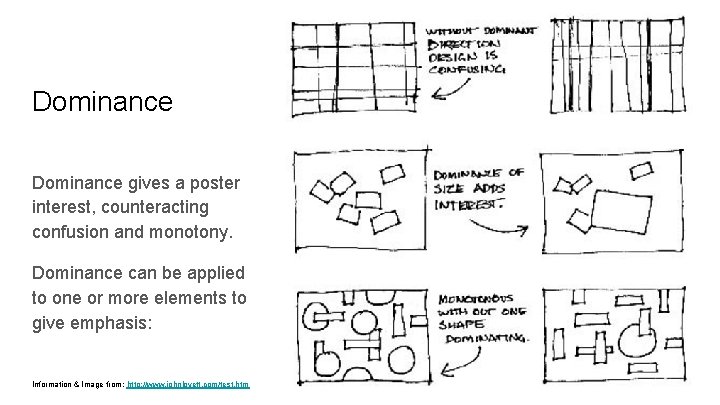
Dominance gives a poster interest, counteracting confusion and monotony. Dominance can be applied to one or more elements to give emphasis: Information & Image from: http: //www. johnlovett. com/test. htm

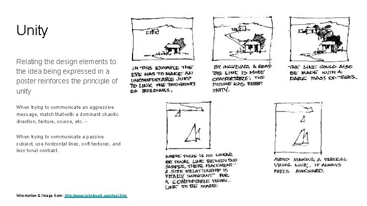
Unity Relating the design elements to the idea being expressed in a poster reinforces the principle of unity When trying to communicate an aggressive message, match that with a dominant chaotic direction, texture, course, etc. -When trying to communicate a passive subject, use horizontal lines, soft textures, and less tonal contrast. Information & Image from: http: //www. johnlovett. com/test. htm

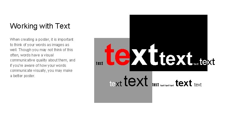
Working with Text When creating a poster, it is important to think of your words as images as well. Though you may not think of this often, words have a visual communicative quality about them, and if you’re aware of how your words communicate visually, you may make a better poster. text text text text

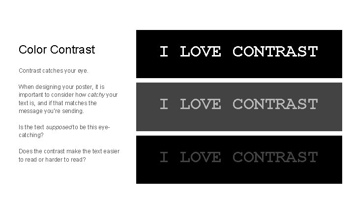
Color Contrast I LOVE CONTRAST Contrast catches your eye. When designing your poster, it is important to consider how catchy your text is, and if that matches the message you’re sending. I LOVE CONTRAST Is the text supposed to be this eyecatching? Does the contrast make the text easier to read or harder to read? I LOVE CONTRAST

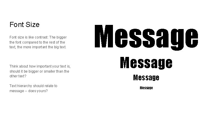
Font Size Font size is like contrast: The bigger the font compared to the rest of the text, the more important the big text. Think about how important your text is, should it be bigger or smaller than the other text? Text hierarchy should relate to message -- does yours? Message

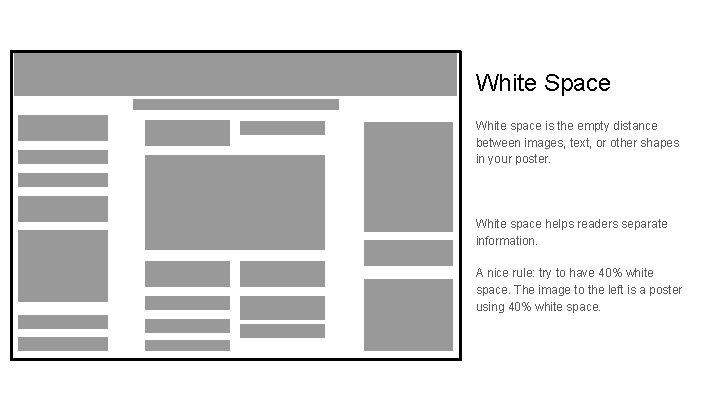
White Space White space is the empty distance between images, text, or other shapes in your poster. White space helps readers separate information. A nice rule: try to have 40% white space. The image to the left is a poster using 40% white space.

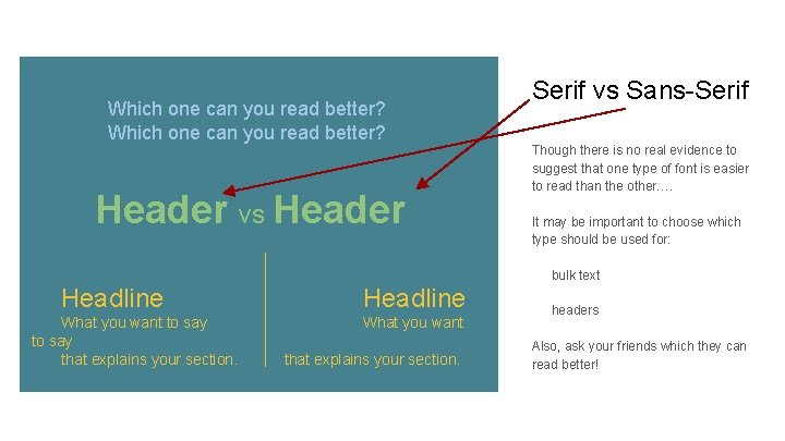
Which one can you read better? Header vs Header Serif vs Sans-Serif Though there is no real evidence to suggest that one type of font is easier to read than the other…. It may be important to choose which type should be used for: bulk text Headline What you want to say that explains your section. Headline What you want that explains your section. headers Also, ask your friends which they can read better!

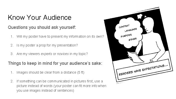
Know Your Audience Questions you should ask yourself: 1. Will my poster have to present my information on its own? 2. Is my poster a prop for my presentation? 3. Are my viewers experts or novices in my topic? Things to keep in mind for your audience’s sake: 1. Images should be clear from a distance (5 ft) 2. If something can be communicated in pictures first, use a picture instead of words (your poster can fit more info when you use images instead of sentences)

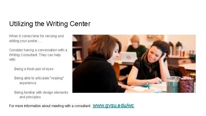
Utilizing the Writing Center When it comes time for revising and editing your poster…. Consider having a conversation with a Writing Consultant. They can help with: Being a fresh pair of eyes Being able to articulate “reading” experience Being familiar with design elements and principles For more information about meeting with a consultant: www. gvsu. edu/wc