Designing With Type part 2 During Middle Ages
- Slides: 18

Designing With Type part 2

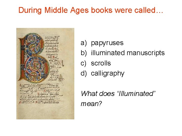
During Middle Ages books were called… a) b) c) d) papyruses illuminated manuscripts scrolls calligraphy What does “Illuminated” mean?

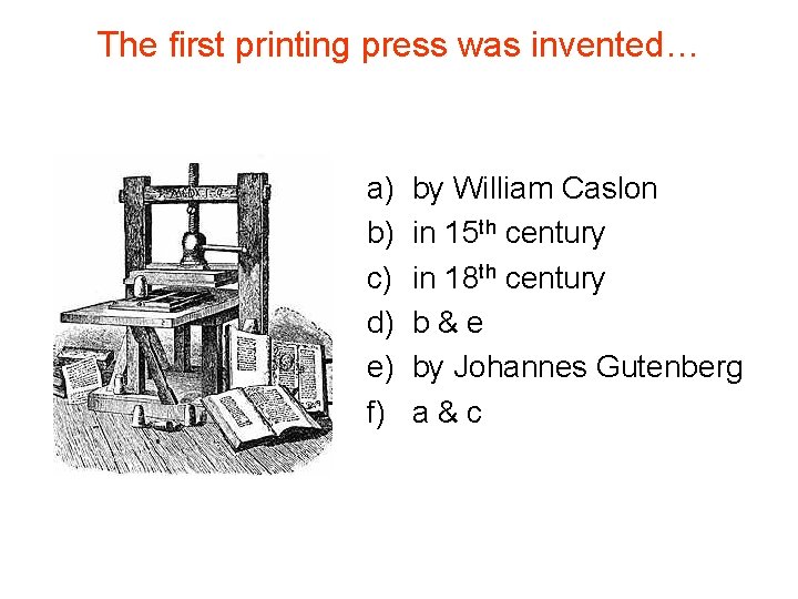
The first printing press was invented… a) b) c) d) e) f) by William Caslon in 15 th century in 18 th century b&e by Johannes Gutenberg a&c

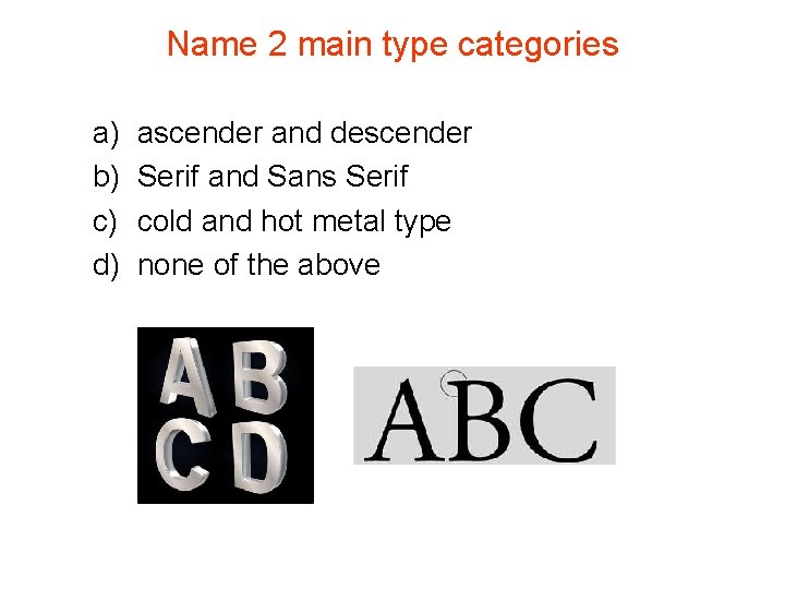
Name 2 main type categories a) b) c) d) ascender and descender Serif and Sans Serif cold and hot metal type none of the above

Which fonts are older, Serif or Sans Serif?

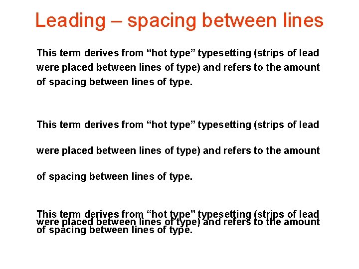
Leading – spacing between lines This term derives from “hot type” typesetting (strips of lead were placed between lines of type) and refers to the amount of spacing between lines of type.

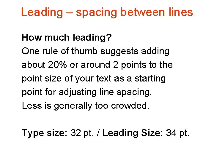
Leading – spacing between lines How much leading? One rule of thumb suggests adding about 20% or around 2 points to the point size of your text as a starting point for adjusting line spacing. Less is generally too crowded. Type size: 32 pt. / Leading Size: 34 pt.

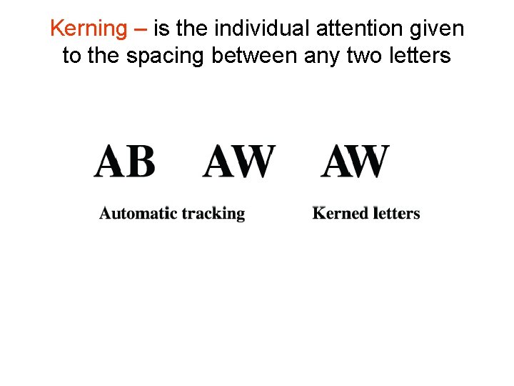
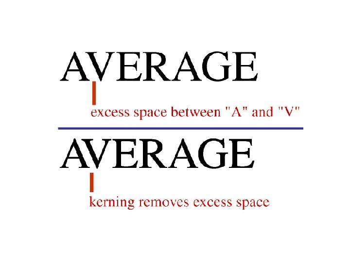
Kerning – spacing between letters

Kerning – is the individual attention given to the spacing between any two letters

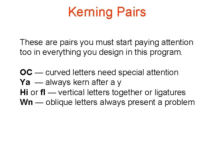
Kerning Pairs These are pairs you must start paying attention too in everything you design in this program. OC — curved letters need special attention Ya — always kern after a y Hi or fl — vertical letters together or ligatures Wn — oblique letters always present a problem


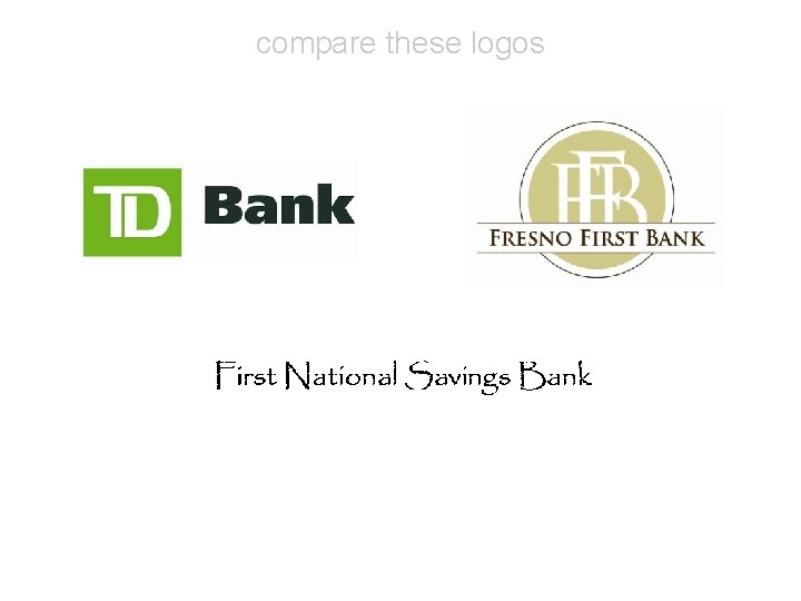
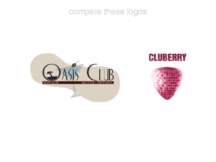
compare these logos

compare these logos

“Typolution” Animation by Olivier Beaudoin: http: //www. youtube. com/watch? v=z. VPf. Tlp. CKaw

Famous Graphic Designers David Carson http: //www. ted. com/talks/lang/en/david_carson_on_design. html Paula Scher http: //www. hillmancurtis. com/index. php? /film/watch/paula_scher/

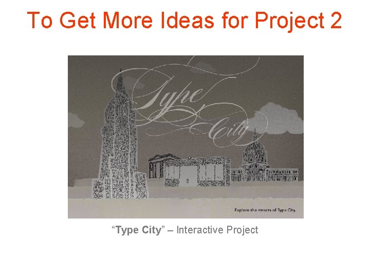
To Get More Ideas for Project 2 “Type City” – Interactive Project

More Useful Links All you need to know about different typefaces: http: //www. paratype. com/help/term/

Need More Fonts? http: //www. dafont. com http: //www. urbanfonts. com