Designing Power Point Slides for Video Power Point



- Slides: 15


Designing Power. Point Slides for Video

Power. Point is a computer application used to produce support materials for delivering instruction.

Design Considerati ons Design rules are applied to n n produce instructional materials for any projected media. Special considerations are required when using computers or video monitors.

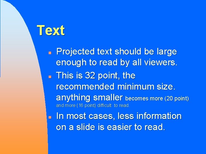
Text n n Projected text should be large enough to read by all viewers. This is 32 point, the recommended minimum size. anything smaller becomes more (20 point) and more (16 point) difficult to read. n In most cases, less information on a slide is easier to read.

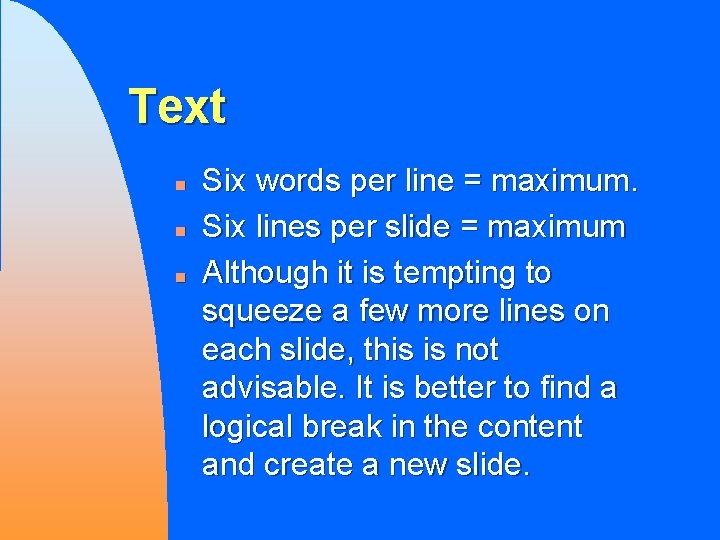
Text n n n Six words per line = maximum. Six lines per slide = maximum Although it is tempting to squeeze a few more lines on each slide, this is not advisable. It is better to find a logical break in the content and create a new slide.

Text n n Use a combination of Upper Case and Lower Case letters. This combination is easier to read THAN ALL UPPERCASE LETTERS.

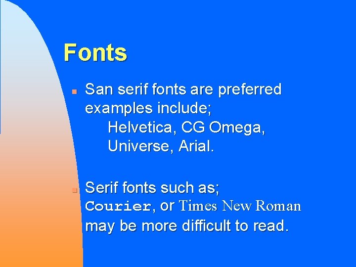
Fonts n n San serif fonts are preferred examples include; Helvetica, CG Omega, Universe, Arial. Serif fonts such as; Courier, or Times New Roman may be more difficult to read.

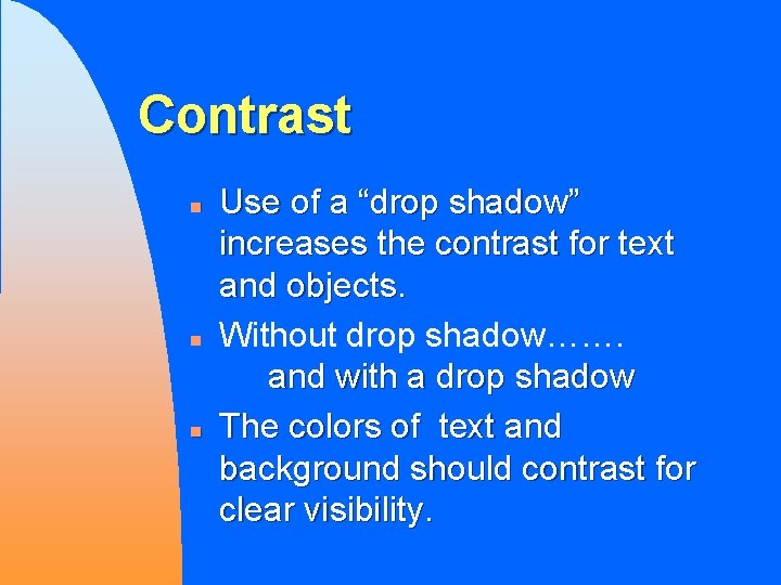
Contrast n n n Use of a “drop shadow” increases the contrast for text and objects. Without drop shadow……. and with a drop shadow The colors of text and background should contrast for clear visibility.

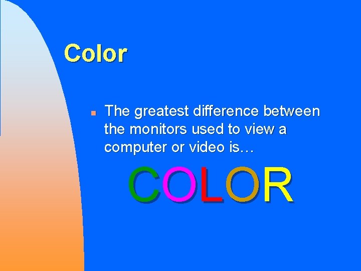
Color n The greatest difference between the monitors used to view a computer or video is… CO LO R

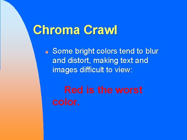
Chroma Crawl n Some bright colors tend to blur and distort, making text and images difficult to view: Red is the worst color.

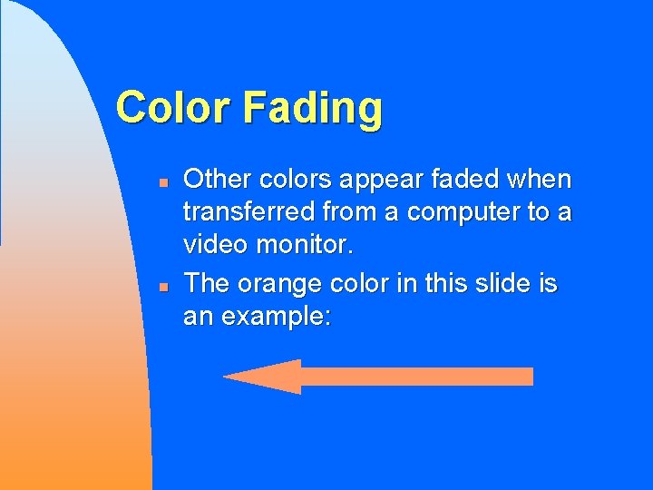
Color Fading n n Other colors appear faded when transferred from a computer to a video monitor. The orange color in this slide is an example:

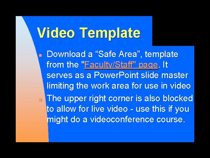
Video Template n n Download a “Safe Area”, template from the "Faculty/Staff" page. It serves as a Power. Point slide master limiting the work area for use in video The upper right corner is also blocked to allow for live video - use this if you might do a videoconference course.

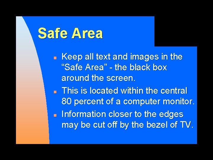
Safe Area n n n Keep all text and images in the “Safe Area” - the black box around the screen. This is located within the central 80 percent of a computer monitor. Information closer to the edges may be cut off by the bezel of TV.

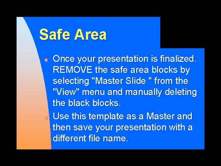
Safe Area n n Once your presentation is finalized. REMOVE the safe area blocks by selecting "Master Slide " from the "View" menu and manually deleting the black blocks. Use this template as a Master and then save your presentation with a different file name.