Designing For Small Screen Mobile Devices Issues associated
Designing For Small Screen Mobile Devices • Issues associated with designing menus for small screens. • Case study: evaluating a small screen device. • Case study: designing a new mobile device. James Tam
Challenges Of Designing For Small Screen Displays Slide No. 2 1. Mobile devices have limited capabilities when compared with desktop computers. • • • Computational capabilities are weaker Display capabilities are limited Interaction/input may be extremely curtailed or it must be done in a more limited fashion. General principle: Limit the amount of input required. General principle: Limit designs to having a limited number of features per screen (e. g. , 3 – 5) and use transitions to access additional features. James Tam
Challenges Of Designing For Small Screen Displays Slide No. 3 2. The mindset of users change when using a mobile device vs. a desktop system (even if the same task is being performed) • The same task may be performed differently with a mobile device vs. a desktop system. - • • e. g. , sending a quick text message response while shopping for groceries Frequent interruptions and distractions may occur during use Typically users focus on actions that can be performed quickly General principle: interfaces must be glance-able and the user can interact quickly and efficiently with the device. General principle: Implement an auto save feature that runs periodically James Tam
Challenges Of Designing For Small Screen Displays Slide No. 4 Overall principle: don’t just design a scaled down version of a desktop system. A successful design must consider the usage context. James Tam
Menus For Small Screen Displays Slide No. 5 • Representing information: some visualizations and methods of interaction may not be possible. • Less elaborate representations may have to be employed: • Iconic representations • Text James Tam
Iconic Representations Slide No. 6 • Small icons • It’s difficult to design an clearly recognizable icon within a very limited space. • Typically requires a text description. • Rarely used. • Large icons • With increased display space allotted they have been used successfully in certain applications. • The mapping of icons to functions may not be immediately self evident but once the mapping is learned then they can be easily recognized. James Tam
Text Slide No. 7 • Requires concise wording • Sometimes every character counts • This must balanced off vs. the need for clarity James Tam
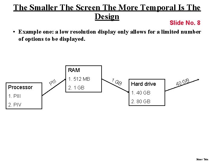
The Smaller The Screen The More Temporal Is The Design Slide No. 8 • Example one: a low resolution display only allows for a limited number of options to be displayed. RAM Processor 1. PIII 2. PIV II PI 1. 512 MB 2. 1 GB 1 G B Hard drive B 40 G 1. 40 GB 2. 80 GB James Tam
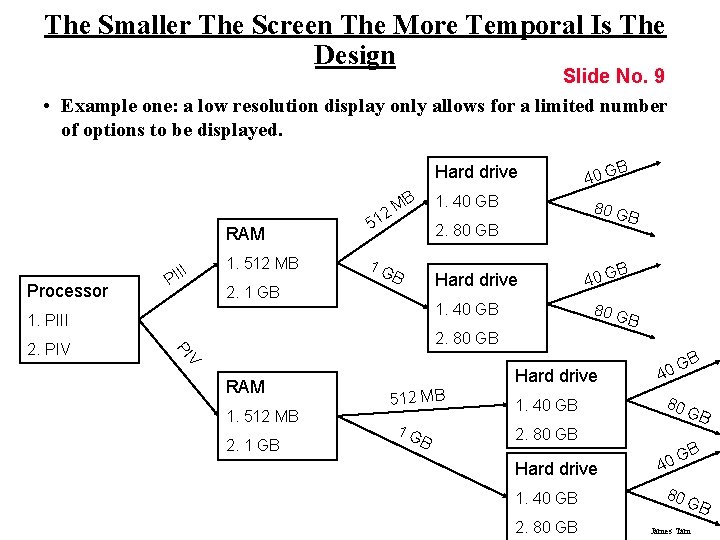
The Smaller The Screen The More Temporal Is The Design Slide No. 9 • Example one: a low resolution display only allows for a limited number of options to be displayed. Hard drive B RAM Processor II PI 1. 512 MB 2. 1 GB 1. 40 GB M 12 5 B B Hard drive 1. 40 GB 1. PIII B 40 G 80 G B 2. 80 GB V PI 2. PIV 80 G 2. 80 GB 1 G B 40 G RAM 1. 512 MB 2. 1 GB Hard drive 512 MB 1 G B 1. 40 GB B G 40 80 2. 80 GB Hard drive 40 GB GB 1. 40 GB 80 2. 80 GB James Tam GB
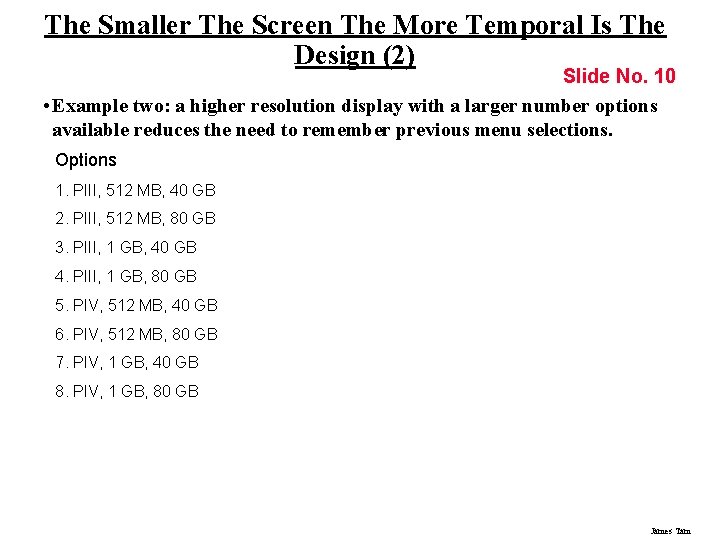
The Smaller The Screen The More Temporal Is The Design (2) Slide No. 10 • Example two: a higher resolution display with a larger number options available reduces the need to remember previous menu selections. Options 1. PIII, 512 MB, 40 GB 2. PIII, 512 MB, 80 GB 3. PIII, 1 GB, 40 GB 4. PIII, 1 GB, 80 GB 5. PIV, 512 MB, 40 GB 6. PIV, 512 MB, 80 GB 7. PIV, 1 GB, 40 GB 8. PIV, 1 GB, 80 GB James Tam
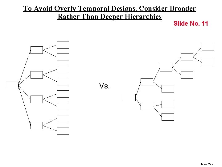
To Avoid Overly Temporal Designs, Consider Broader Rather Than Deeper Hierarchies Slide No. 11 Vs. James Tam
Balance Consistency Vs. Navigation Slide No. 12 While consistency of menus is important, this should be balanced by the need to distinguish between menu types. James Tam
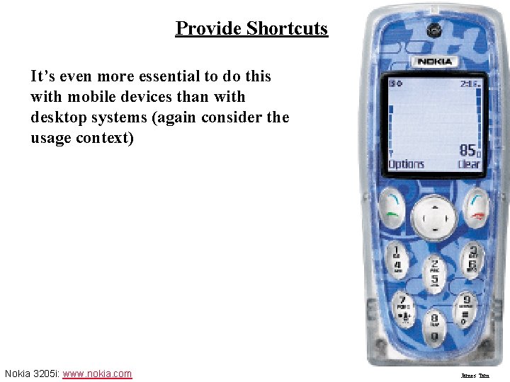
Provide Shortcuts Slide No. 13 It’s even more essential to do this with mobile devices than with desktop systems (again consider the usage context) Nokia 3205 i: www. nokia. com James Tam
Ways Of Creating Shortcuts Slide No. 14 • By redesigning lists • Implement navigational shortcuts • Implementing data entry shortcuts James Tam
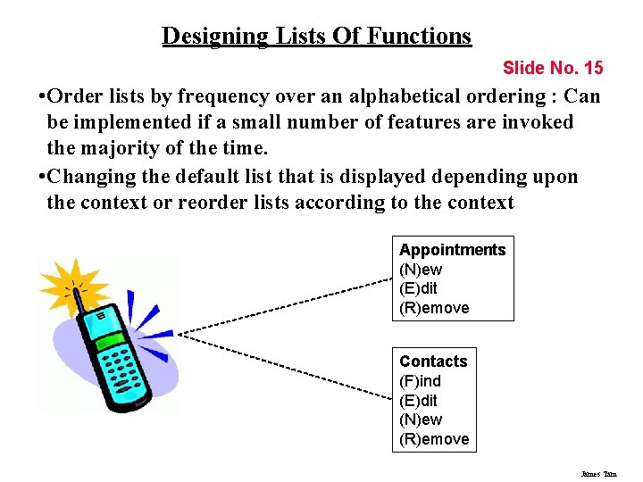
Designing Lists Of Functions Slide No. 15 • Order lists by frequency over an alphabetical ordering : Can be implemented if a small number of features are invoked the majority of the time. • Changing the default list that is displayed depending upon the context or reorder lists according to the context Appointments (N)ew (E)dit (R)emove Contacts (F)ind (E)dit (N)ew (R)emove James Tam
Provide Shortcuts Slide No. 16 Navigational shortcuts • • To the main menu To the previous menu James Tam
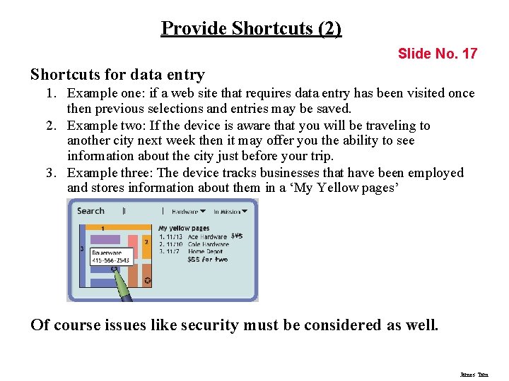
Provide Shortcuts (2) Slide No. 17 Shortcuts for data entry 1. Example one: if a web site that requires data entry has been visited once then previous selections and entries may be saved. 2. Example two: If the device is aware that you will be traveling to another city next week then it may offer you the ability to see information about the city just before your trip. 3. Example three: The device tracks businesses that have been employed and stores information about them in a ‘My Yellow pages’ Of course issues like security must be considered as well. James Tam
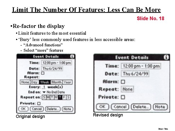
Limit The Number Of Features: Less Can Be More Slide No. 18 • Re-factor the display • Limit features to the most essential • ‘Bury’ less commonly used features in less accessible areas: - “Advanced functions” - Select “more” features Original design Revised design James Tam
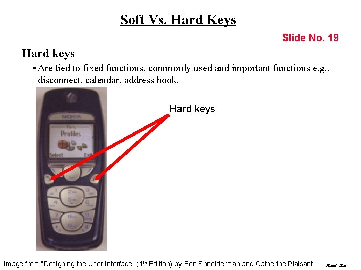
Soft Vs. Hard Keys Slide No. 19 Hard keys • Are tied to fixed functions, commonly used and important functions e. g. , disconnect, calendar, address book. Hard keys Image from “Designing the User Interface” (4 th Edition) by Ben Shneiderman and Catherine Plaisant James Tam
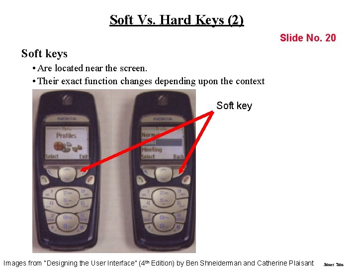
Soft Vs. Hard Keys (2) Slide No. 20 Soft keys • Are located near the screen. • Their exact function changes depending upon the context Soft key Images from “Designing the User Interface” (4 th Edition) by Ben Shneiderman and Catherine Plaisant James Tam
Case Study No. 1: Evaluating A Small Mobile Device 1 Slide No. 21 A usability study was conducted by ‘The GIST’ (Glasgow Interactive Systems) to evaluate the gestural (touch) and audio based interface for the Windows Media Player running on an Hewlett-Packard i. PAQ Pocket PC. 1 From Section 22. 2 of Designing Interactive Systems: People Activities, Contexts, Technologies by Benyon, D. , Turner, P. , and Turner S. Addison-Wesley 2005. James Tam
Study Methodology Slide No. 22 To simulate everyday use participants wore the i. PAD with either: 1. Media Player 2. The experimental ‘Touch. Player’ They were to complete a series of pre-created tasks asked they walked e. g. , “Find the song Wonderwall”. James Tam
Measures Of Performance Slide No. 23 1. 2. 3. 4. 5. Time to complete a single task Time to complete the entire series of tasks The number of errors Mental workload 1 Percentage of normal walking speed 1 Mental Workload was measure using the TLX (Task Load Index) questionnaire. James Tam
Case Study No. 2: The Design Of A Mobile Device 2 Slide No. 24 The User-Interface Research and Development department of Samsung Electronics Corporation approached AM+A (Aaron Marcus and Associates) to develop conceptual user-interface designs for future wireless information devices (WIDs) evolving from cell phones. It was an application of the User-Centered design process to a particular problem domain: mobile devices with small screen displays. 2 From Designing the PDA of the Future by Marcus, A. , and Chen, E. in Interactions of the ACM January-February 2002 James Tam
Discovering The Needs Of User Slide No. 25 • Could not be done using focus groups which can be used to gauge reactions towards existing devices but cannot be used in the design of a new device. • The designers observed users in actual usage conditions in order to understand their mobile experience. • The focus of the study was information use: • How were electronic resources (e. g. , mobile phones, personal digital assistants) currently employed. • How traditional sources of information (e. g. , newspapers, sticky notes) used. James Tam
Profiles Of The Participants In The Study Slide No. 26 • A wide range of people were included in the study: • A minister who used many high tech gadgets • A male college student • A female high school student • A commuting professional • A Silicon Valley entrepreneur who was a female single parent • Etc. James Tam
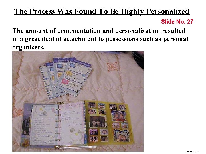
The Process Was Found To Be Highly Personalized Slide No. 27 The amount of ornamentation and personalization resulted in a great deal of attachment to possessions such as personal organizers. James Tam
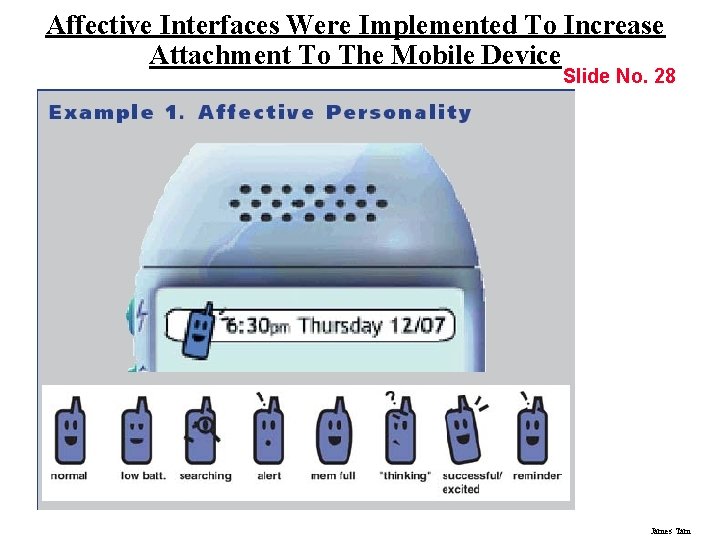
Affective Interfaces Were Implemented To Increase Attachment To The Mobile Device Slide No. 28 James Tam
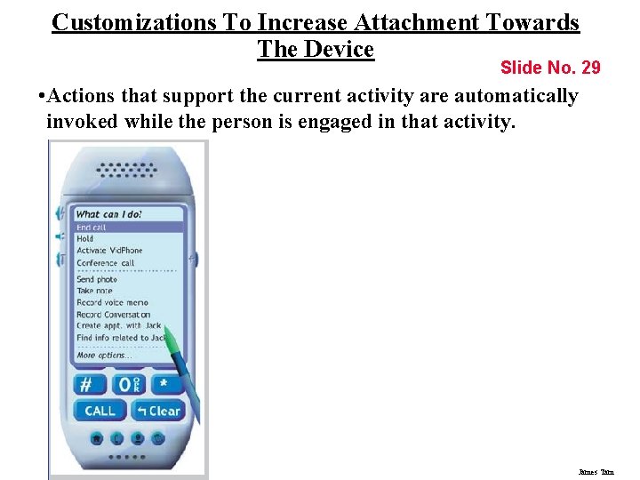
Customizations To Increase Attachment Towards The Device Slide No. 29 • Actions that support the current activity are automatically invoked while the person is engaged in that activity. James Tam
Shortcuts Implemented To Overcome Input And Output Limitations Slide No. 30 • Contextual awareness • Location Awareness • Time-shifting James Tam
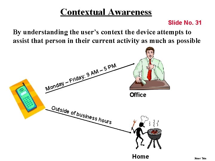
Contextual Awareness Slide No. 31 By understanding the user’s context the device attempts to assist that person in their current activity as much as possible – 5 M : 9 A y da n o M PM iday r F – Outs id Office e of b usine ss ho urs Home James Tam
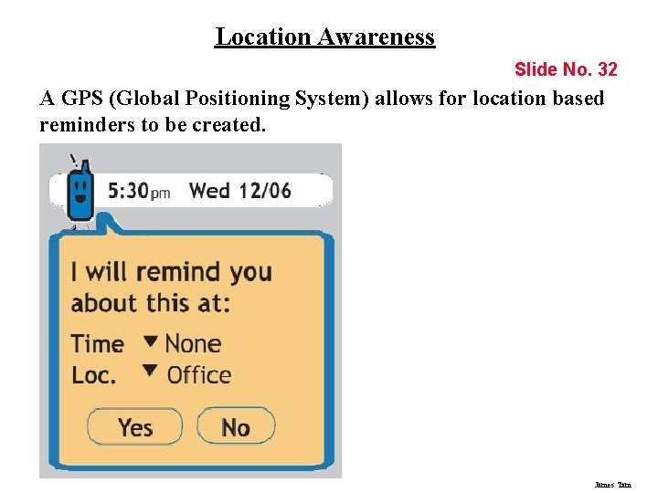
Location Awareness Slide No. 32 A GPS (Global Positioning System) allows for location based reminders to be created. James Tam
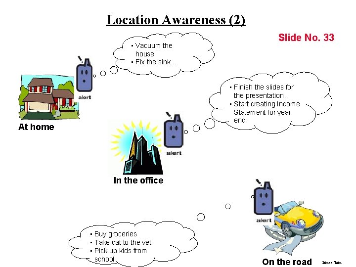
Location Awareness (2) • Vacuum the house • Fix the sink. . . Slide No. 33 • Finish the slides for the presentation. • Start creating Income Statement for year end. At home In the office • Buy groceries • Take cat to the vet • Pick up kids from school On the road James Tam
Time-Shifting Slide No. 34 • “Start now, finish later” • The user can mark tasks that are received now as something to be completed later. • For example, tagging email. James Tam
You Now Know • • Slide No. 35 What are some of the design challenges of small screen displays? Some approaches for designing menus for small screen displays. Ways of creating shortcuts to overcome the input and output limitations of mobile devices. How to simplify screen design by re-factoring the display. How and why hard and soft keys are employed in mobile devices. What are some of the challenges involved in evaluating mobile small screen displays? One way in which User-Centered Design was used to design a mobile device: • How were affective designs implemented in the device? • What shortcuts were used to overcome input and output limitations of the device? James Tam
- Slides: 35