Design Tips for Power Point Design Tips for


- Slides: 15
Design Tips for Power. Point
Design Tips for Power. Point • Choose a suitable template. • Choose clear, easy-to-read fonts. • Plan to communicate your ideas best. • Use images to get your point across.
Design Tips for Power. Point If there are too many words, the slide is hard to read, so… • Not more than 6 bullet points on a slide. • Not more than 30 words on a slide.
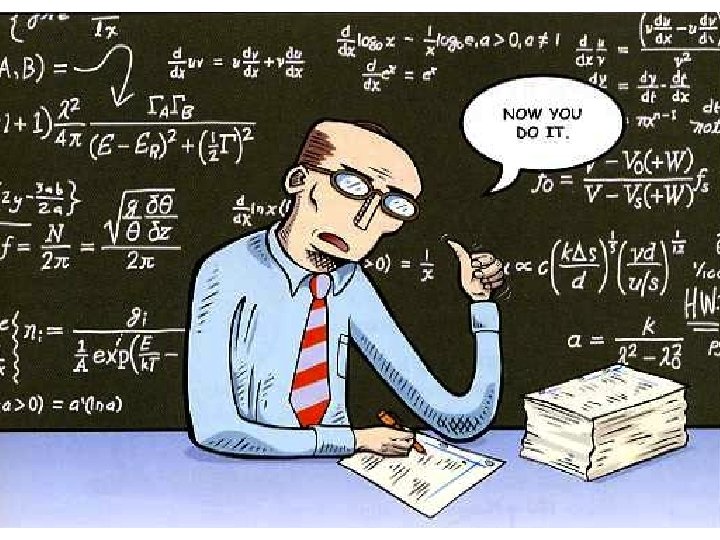
Power. Point is visual. A bad example: Some teachers give very long, complicated explanations of new material, and then they ask their students to use the new concepts right away. This can be confusing and frustrating A forpicture the students. Long lectures are confusing is worth 1, 000 words. and boring, and students forget them right away. Simple, short explanations are more useful, and students will remember them better, so don’t talk too much. Really.
Choosing a template • Choose an appropriate template. • Match the feeling of your presentation. • Look professional. Don’t be crazy.
Choosing colors • Choose colors that look good together. • Use colors that contrast so the words can be read easily.
Choosing colors: good choices Light on dark Dark on light
Choosing colors: bad choices Light on light Dark on dark Too bright! It hurts my eyes!
Which line is easier to read? • Is it easier to read this one?
Fonts: You should know these types: Serif Fonts Sans-serif Fonts Times New Roman Calibri Typewriter Arial Black Courier Futura Tahoma
Sans-serif fonts are easier to read. Serif fonts are a little harder to read. Fancy fonts are a very hard to read. IN ALL CAPITALS, IT’S ALMOST IMPOSSIBLE!
Don’t be too flashy. It can be distracting. Avoid… • Strange, distracting transitions • Too many transitions • Sound effects without a purpose
K. I. S. S. = Keep it short and simple • Plan carefully to convey your message clearly. • Don’t overcrowd your slides. • Make sure everything has a purpose.
Finally, use your Power. Point effectively • Look at the audience, not at the slides. • Don’t just read from your slides. That’s not their purpose. • Your slides are a tool. YOU are the most important part of the presentation.