Design Principles White Space What is White Space
- Slides: 10

Design Principles White Space

What is White Space? l White space is the absence of text and graphics. It breaks up text and graphics. It provides visual breathing room for the eye. Add white space to make a page less cramped, confusing, or overwhelming.

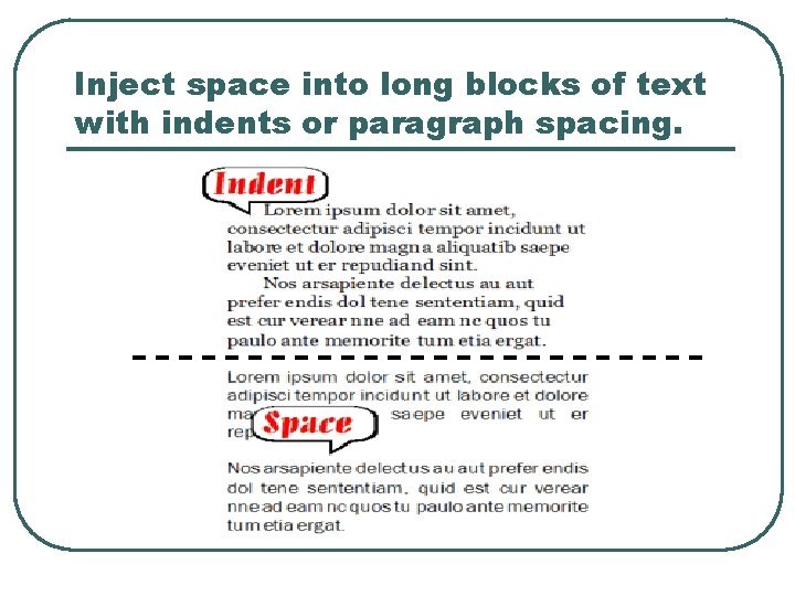
How to get it l l Increase paragraph spacing. Use a line of space or a deep indent (but not both). Increase space between columns of text. Alleys or gutters that are too narrow cause the eye to skip over to the next column. Put space at the end of lines of text. Use ragged-right alignment to add white space between columns and at the end of lines of text. Put more space around outer edges of page. If space is necessarily cramped within the body of the publication, add white space with generous margins or gutters.

How to get it cont. l l l Leave more room around graphics. When wrapping text around graphics or wherever text and graphics meet, provide plenty of standoff white space. Don't run text right up to the edge of graphics. Increase space around headlines. Add white space between headlines or subheads and the preceding copy and a bit below as well. Increase space between lines of type and individual characters. Add typographic white space by increasing the leading of body text, using lighter type, avoiding letterspacing that is too tight, and avoiding unending condensed or heavy type.

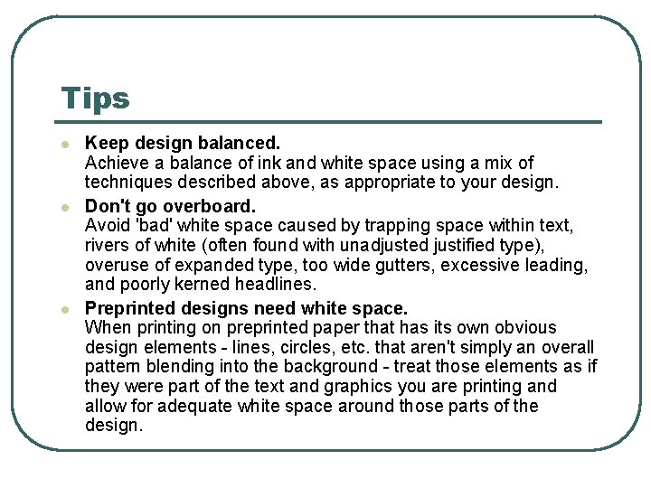
Tips l l l Keep design balanced. Achieve a balance of ink and white space using a mix of techniques described above, as appropriate to your design. Don't go overboard. Avoid 'bad' white space caused by trapping space within text, rivers of white (often found with unadjusted justified type), overuse of expanded type, too wide gutters, excessive leading, and poorly kerned headlines. Preprinted designs need white space. When printing on preprinted paper that has its own obvious design elements - lines, circles, etc. that aren't simply an overall pattern blending into the background - treat those elements as if they were part of the text and graphics you are printing and allow for adequate white space around those parts of the design.

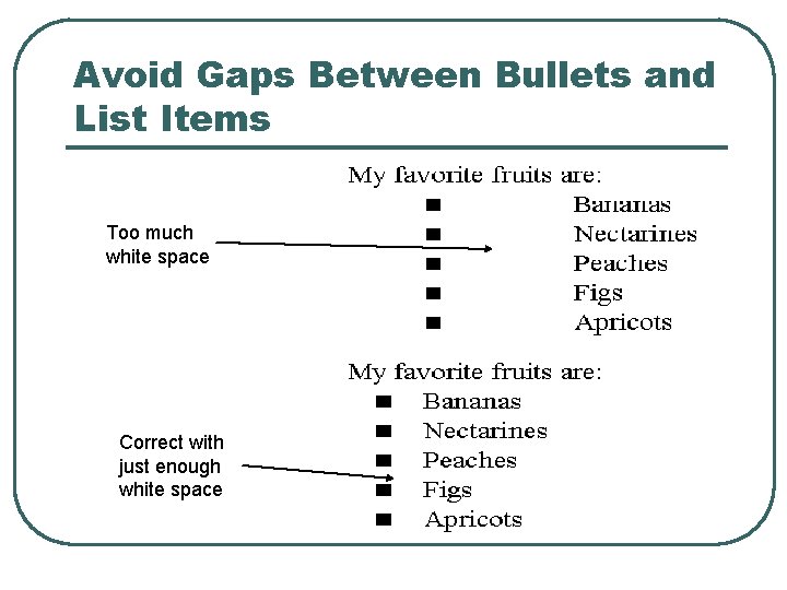
Avoid Gaps Between Bullets and List Items Too much white space Correct with just enough white space

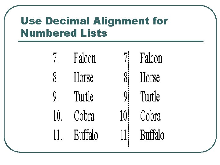
Use Decimal Alignment for Numbered Lists

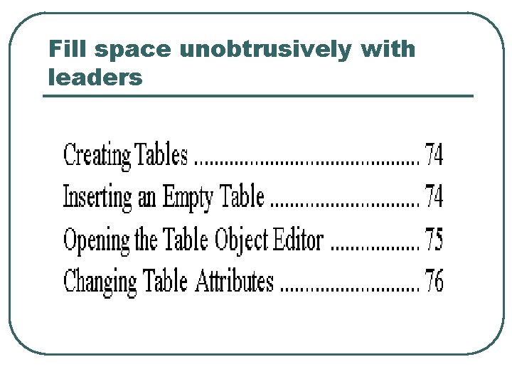
Fill space unobtrusively with leaders

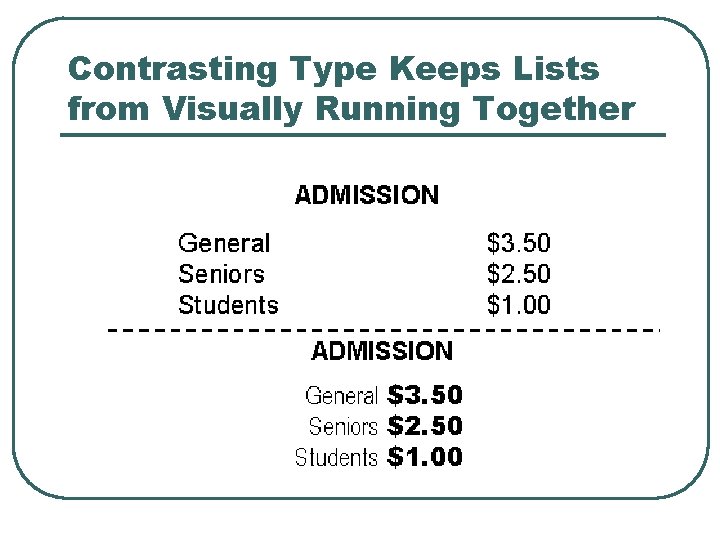
Contrasting Type Keeps Lists from Visually Running Together

Inject space into long blocks of text with indents or paragraph spacing.