Design Principles CONTRAST REPETITION ALIGNMENT PROXIMITY Design Principles
- Slides: 20

Design Principles CONTRAST REPETITION ALIGNMENT PROXIMITY

Design Principles CONTRAST REPETITION ALIGNMENT PROXIMITY

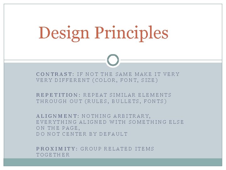
Design Principles CONTRAST: IF NOT THE SAME MAKE IT VERY DIFFERENT (COLOR, FONT, SIZE) REPETITION: REPEAT SIMILAR ELEMENTS THROUGH OUT (RULES, BULLETS, FONTS) ALIGNMENT: NOTHING ARBITRARY, EVERYTHING ALIGNED WITH SOMETHING ELSE ON THE PAGE, DO NOT CENTER BY DEFAULT PROXIMITY: GROUP RELATED ITEMS TOGETHER

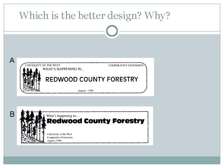
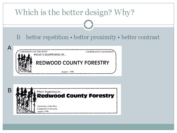
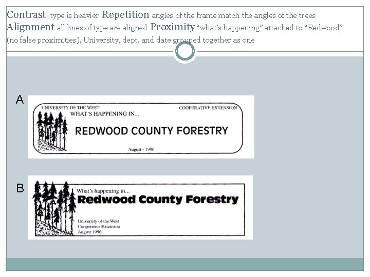
Which is the better design? Why? A B

Which is the better design? Why? B better repetition • better proximity • better contrast A B

Contrast type is heavier Repetition angles of the frame match the angles of the trees Alignment all lines of type are aligned Proximity “what’s happening” attached to “Redwood” (no false proximities), University, dept. and date grouped together as one A B

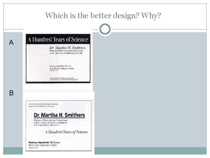
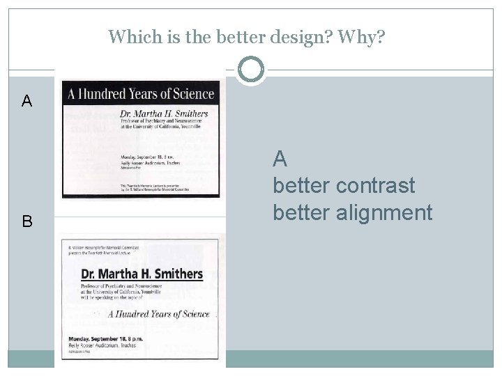
Which is the better design? Why? A B

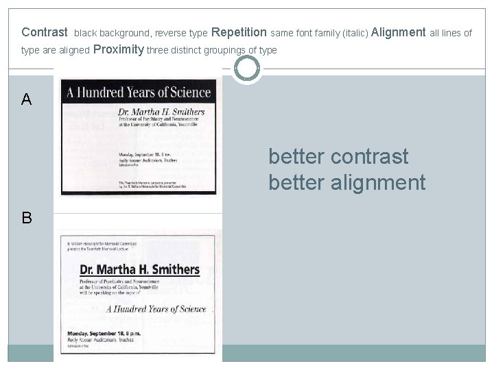
Which is the better design? Why? A B A better contrast better alignment

Contrast black background, reverse type are aligned Repetition same font family (italic) Alignment all lines of Proximity three distinct groupings of type A better contrast better alignment B

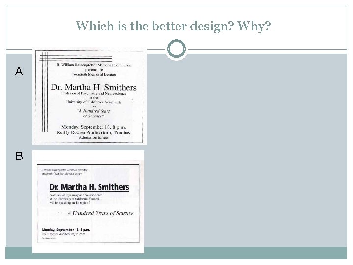
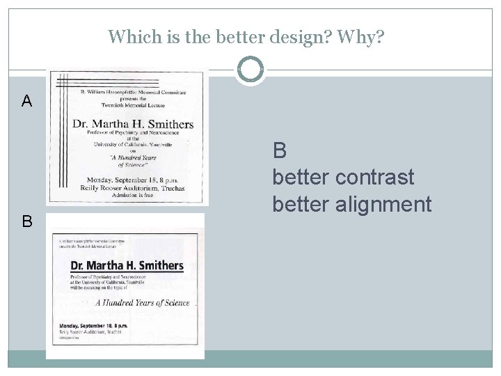
Which is the better design? Why? A B

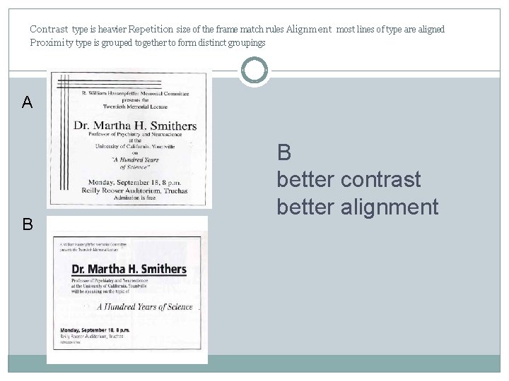
Which is the better design? Why? A B B better contrast better alignment

Contrast type is heavier Repetition size of the frame match rules Alignment most lines of type are aligned Proximity type is grouped together to form distinct groupings A B B better contrast better alignment

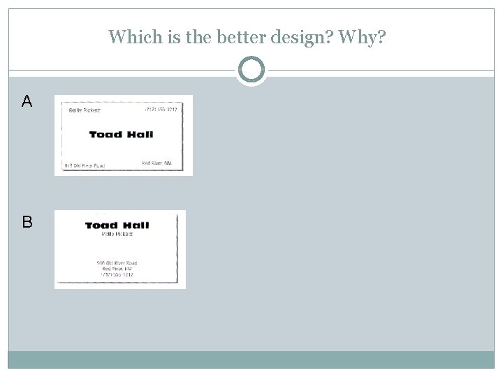
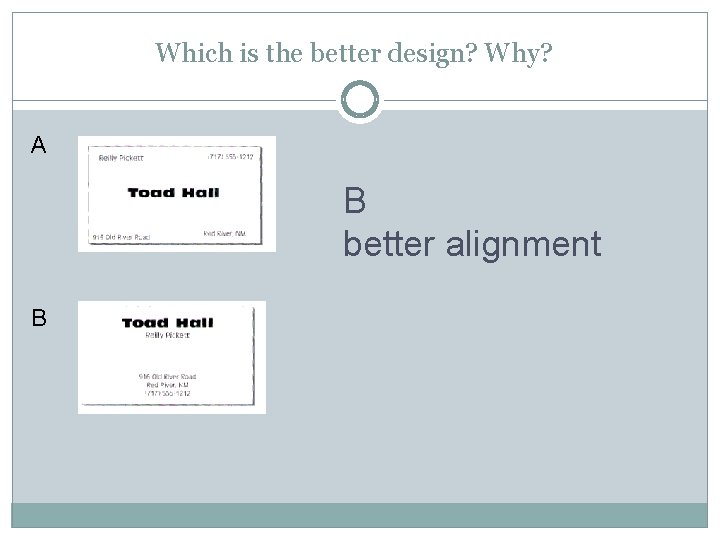
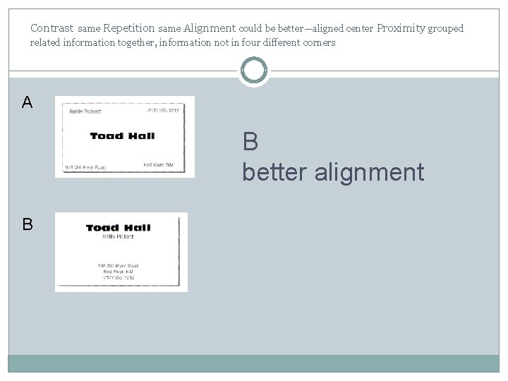
Which is the better design? Why? A B

Which is the better design? Why? A B better alignment B

Contrast same Repetition same Alignment could be better—aligned center Proximity grouped related information together, information not in four different corners A B better alignment B

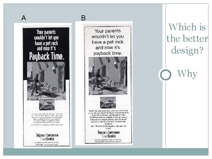
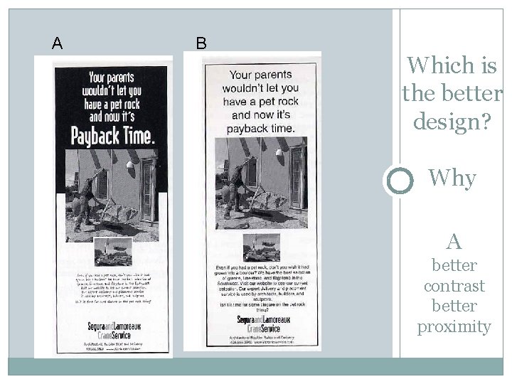
A B Which is the better design? Why

A B Which is the better design? Why A better contrast better proximity

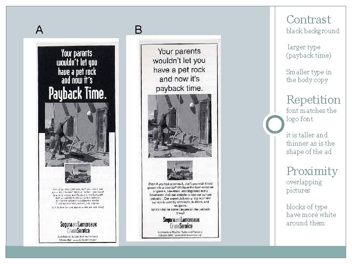
A B Contrast black background larger type (payback time) Smaller type in the body copy Repetition font matches the logo font it is taller and thinner as is the shape of the ad Proximity overlapping pictures blocks of type have more white around them

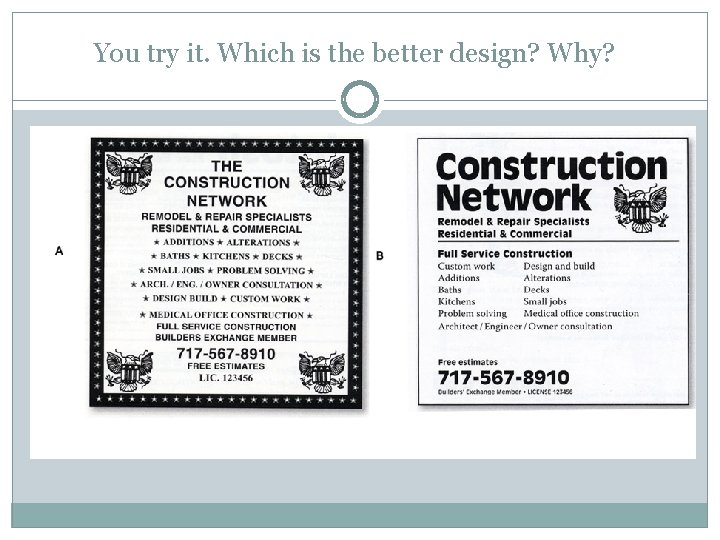
You try it. Which is the better design? Why?

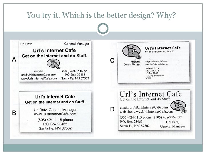
You try it. Which is the better design? Why?