DESIGN PRINCIPLES C R A P Contrast Repetition


- Slides: 27
DESIGN PRINCIPLES
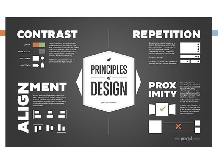
C. R. A. P Contrast Repetition Alignment Proximity
Contrast Contrast is created when two elements are different. The key is--if two items are different--make them really different. Examples of contrast � Font style or size � Colour
Contrast Our eyes like contrast – when there is contrast on a page, we are drawn to it. Purpose: � To create interest on the page � To help organize the page.
Contrast
Repetition You should repeat some aspects of the design throughout the entire piece. � Ex. A bold font, a symbol, a bullet type, a colour � It can be anything that the reader will recognize spatially. Repetition can also be thought of as consistency.
Repetition Purpose: � To unify and add visual interest. � The repetition of visual elements throughout the design unifies and strengthens a piece by tying together the document(s).
Repetition What to avoid: � Avoid repeating an element so much that is becomes annoying or overwhelming.
Alignment Nothing should be placed on the page arbitrarily. Every item should have a visual connection with something else on the page. When items are aligned on a page, even if physically separate, there is an invisible line that connects them.
Alignment To make all elements on a page appear unified and connected there needs to be some visual tie between the elements. Alignment Options � Right justified � Left justified � Centered � Justify (aligned along both sides)
Alignment What to avoid: � Center alignment – it is considered stuffy and safe
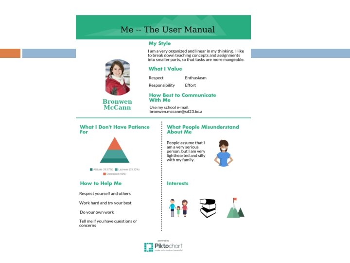
Example
Example
Example
Proximity Items related to each other should be grouped close together. This allows the items to become one visual unit. It makes it easier to understand follow.
Proximity Purpose: � The basic purpose of proximity is to organize. � A more organized document is easier to read.
Proximity What to avoid: � Too many separate elements on page. � Items in corners and in the middle. � Avoid equal amounts of white space between elements. � Don’t create relationships between elements that don’t belong together.
Example
Example
Example
Works Cited Image taken from: � http: //www. webdesignerdepot. com/2010/01/the- principle-of-proximity-in-web-design/ � https: //paper-leaf. com/blog/2012/10/principles-ofdesign-quick-reference-poster/ � https: //vwo. com/blog/crap-design-principles/