Design Principles 3 02 Understand business publications Five
Design Principles 3. 02 Understand business publications
Five Principles of Design 1. Alignment 2. Consistency 3. Contrast 4. Proximity/unity 5. White space 3. 02 Understand business publications 2
Alignment l Arrangement of text ¡ Left or right justified? ¡ Centered? ¡ Is the text laid out in a normal reading pattern (left to right)? 3. 02 Understand business publications 3
Consistency l Color scheme Maintain a uniform color scheme throughout ¡ Choose a color appropriate for the subject ¡ l Font scheme Select a uniform style, size, and effect for all headings and another for the body ¡ Choose a serif font for headings and a sans serif for the body or visa versa. ¡ Do not use all capital letters! ¡ l Graphics ¡ Use a uniformat for graphics – all photographic or all cartoon 3. 02 Understand business publications 4
Contrast l Where first? is the reader’s attention focused ¡ Are the most important objects emphasized by color or size? l Is there a distinct difference in color between the font and the background? l Are headings distinct so that the reader notices a difference between a header and the body? 3. 02 Understand business publications 5
Proximity/Unity l Are the objects grouped appropriately? ¡ Does a relevant graphic appear in close proximity to the text it represents? l Is there uniform and appropriate space between headings and body? ¡ The reader should be able to quickly discern the relationship between headings and related body as well as body and related graphics. 3. 02 Understand business publications 6
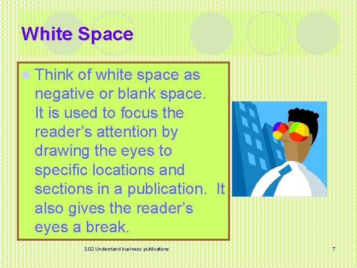
White Space l Think of white space as negative or blank space. It is used to focus the reader’s attention by drawing the eyes to specific locations and sections in a publication. It also gives the reader’s eyes a break. 3. 02 Understand business publications 7

The End 3. 02 Understand business publications 8
- Slides: 8