Design Layout for improving your poster Digital vs


- Slides: 12

Design & Layout for improving your poster

Digital vs. live presentations

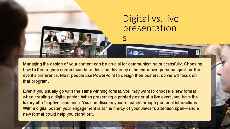
Digital vs. live presentation s Managing the design of your content can be crucial for communicating successfully. Choosing how to format your content can be a decision driven by either your own personal goals or the event’s preference. Most people use Power. Point to design their posters, so we will focus on that program. Even if you usually go with the same winning format, you may want to choose a new format when creating a digital poster. When presenting a printed poster at a live event, you have the luxury of a “captive” audience. You can discuss your research through personal interactions. With a digital poster, your engagement is at the mercy of your viewer’s attention span—and a new format could help you stand out.

Format and layout

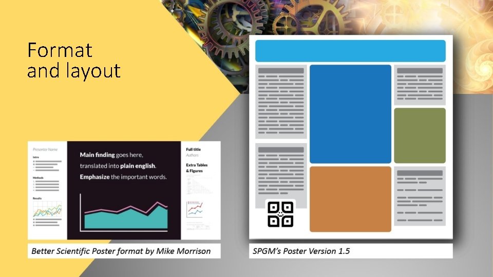
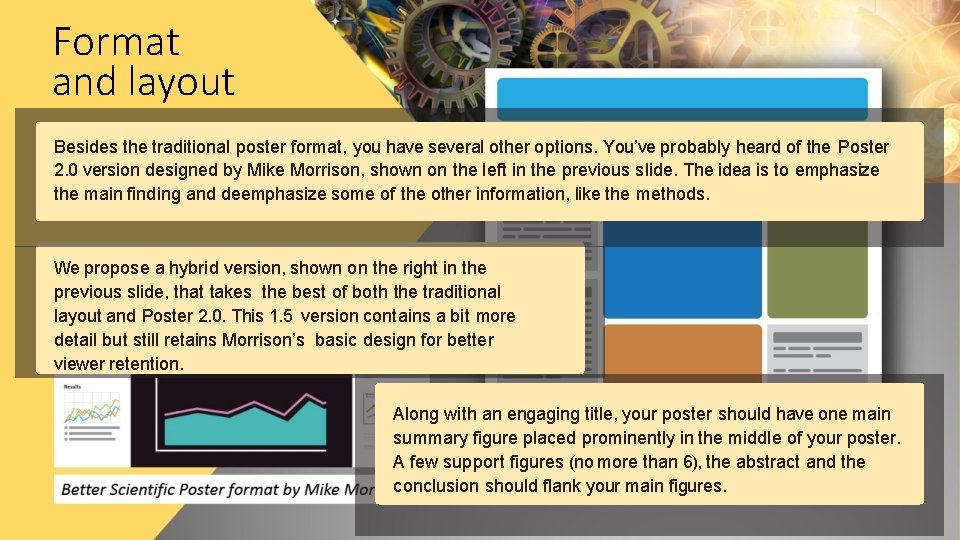
Format and layout Besides the traditional poster format, you have several other options. You’ve probably heard of the Poster 2. 0 version designed by Mike Morrison, shown on the left in the previous slide. The idea is to emphasize the main finding and deemphasize some of the other information, like the methods. We propose a hybrid version, shown on the right in the previous slide, that takes the best of both the traditional layout and Poster 2. 0. This 1. 5 version contains a bit more detail but still retains Morrison’s basic design for better viewer retention. Along with an engaging title, your poster should have one main summary figure placed prominently in the middle of your poster. A few support figures (no more than 6), the abstract and the conclusion should flank your main figures.

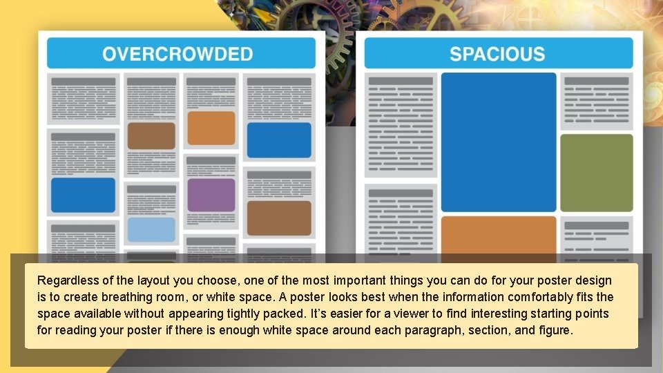
Regardless of the layout you choose, one of the most important things you can do for your poster design is to create breathing room, or white space. A poster looks best when the information comfortably fits the space available without appearing tightly packed. It’s easier for a viewer to find interesting starting points for reading your poster if there is enough white space around each paragraph, section, and figure.

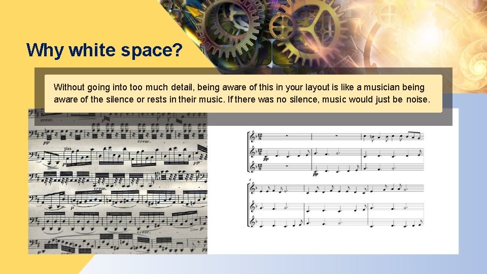
Why white space? Without going into too much detail, being aware of this in your layout is like a musician being aware of the silence or rests in their music. If there was no silence, music would just be noise.

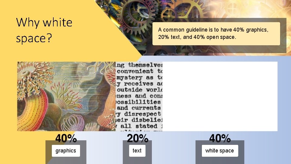
Why white space? graphics A common guideline is to have 40% graphics, 20% text, and 40% open space. text white space

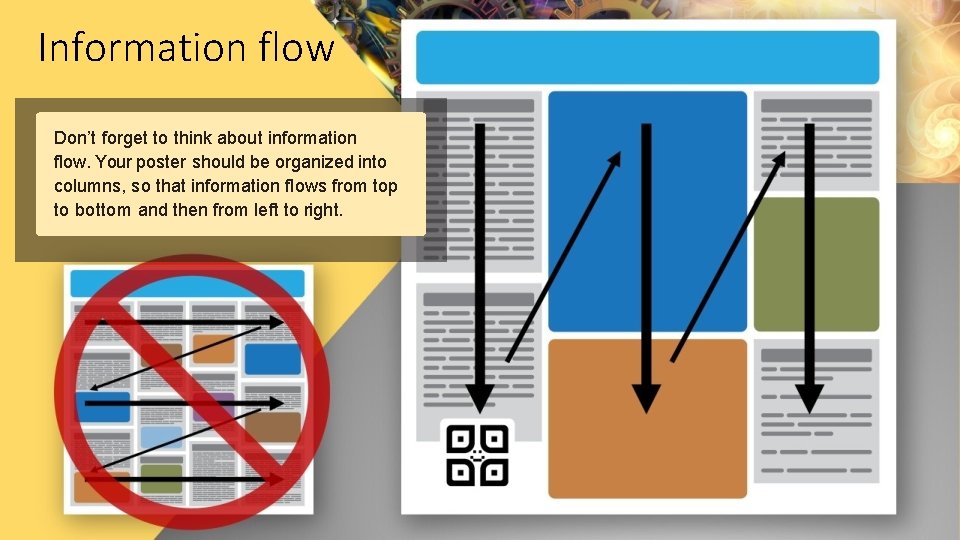
Information flow Don’t forget to think about information flow. Your poster should be organized into columns, so that information flows from top to bottom and then from left to right.

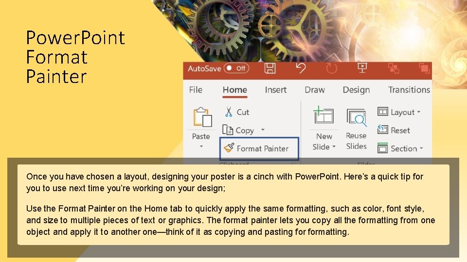
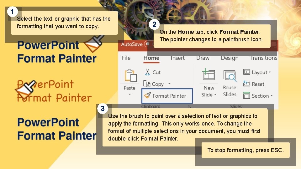
Power. Point Format Painter Once you have chosen a layout, designing your poster is a cinch with Power. Point. Here’s a quick tip for you to use next time you’re working on your design; Use the Format Painter on the Home tab to quickly apply the same formatting, such as color, font style, and size to multiple pieces of text or graphics. The format painter lets you copy all the formatting from one object and apply it to another one—think of it as copying and pasting formatting.

1 Select the text or graphic that has the formatting that you want to copy. 2 On the Home tab, click Format Painter. The pointer changes to a paintbrush icon. 3 Use the brush to paint over a selection of text or graphics to apply the formatting. This only works once. To change the format of multiple selections in your document, you must first double-click Format Painter. To stop formatting, press ESC.

SUMMARY To summarize, find a format that will help your poster stand out, don’t overcrowd your poster, logically organize information, and use tools to help you achieve a consistent, flawless design. The look of your poster will help you look professional and attract positive attention. • Use a format to make your poster stand out • Leave plenty of white space on the poster • Make sure information flows logically • Save time designing with Power. Point’s Format Painter