Design Guidelines for Power Point Content matters the
- Slides: 13

Design Guidelines for Power. Point

Content matters the most � Keep � It content short and to the point doesn’t matter how pretty it is if it doesn’t say anything worthwhile � Limit distracting transitions and effects 2

Keep it simple � Special effects should not distract from the presentation � Use a simple background � Use the same background from slide to slide � Use the same colors, fonts, and bullets (Power. Point does all of these for you! Don’t mess it up!) 3

Keep it short � Too much text won’t be read by the audience � Limit the content of each slide. If a slide starts getting cluttered, split the content into two or more slides � Provide highlights on the slide, and fill in with your talk 4

Fonts � Select simple bold styles � Sans serif fonts (like Verdana) are best � All caps are very difficult to read � Headlines should be 36 -44 point size � Make sub text 34 -36 points ◦ Use 24 -28 for second level text (Power. Point does all of these for you! Don’t mess it up!) 5

Fonts � Use type size to convey information � Use large text for titles and emphasis � Limit: 2 or 3 fonts � Limit: 2 or 3 sizes (Power. Point does all of these for you! Don’t mess it up!) 6

Readability � It doesn’t matter how good your presentation is if nobody can read it. � If you can’t preview your presentation in the room you will be using, view it on your computer screen from a distance of 10 feet to get an idea of how it will look to your audience. 7

Layout � Simple and bold is best � Don’t use busy backgrounds � Make sure there is good contrast between the text and background (Power. Point does all of these for you! Don’t mess it up!) 8

Layout � Keep intense colors to a minimum � Text placement should be consistent � Select colors that are easy on the eye for several minutes of viewing � Don’t hy-phen-ate 9

Consistency � Check for consistency (parallelism) in content � Bullets, fonts, colors, and formatting should also be consistent across all slides (Power. Point does all of these for you! Don’t mess it up!) 10

Additional Presenter Tips � Arrive early to check out the equipment, lights, and set-up � Give yourself time to feel prepared and confident � Get oriented to rooms, lighting, and a-v � Have somebody else proofread! 11

Colors for Presenting � Dark Room – dark background � Light Room – light background � 35 mm slides – dark background � Overheads – light background � Handouts – light background 12

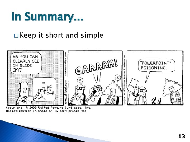
In Summary. . . � Keep it short and simple 13