Design and Layout THE PROJECT Principles By Samuel
Design and Layout THE PROJECT Principles: By Samuel Perez and Amerijha Mclaurin PERIOD 1 GOT DONE 2/4/15
TABLE OF CONTENTS • • • • SLIDE 2 – Variety SLIDE 3 - Emphasis SLIDE 4 - Harmony SLIDE 5 - Symmetry SLIDE 6 - Unity SLIDE 7 - Scale SLIDE 8 – focal point SLIDE 9 - depth SLIDE 10 - proportion SLIDE 12 - balance SLIDE 13 – design principle SLIDE 14 – layout principle SLIDE 15 – Links

GREEN - Variety • the quality or state of being different or diverse; the absence of uniformity, sameness, or monotony EXMAPLE – This pictures have many different colors and are organized.

GREEN - Emphasis • Dominance creating a focal point We show this picture with focal point on emphasis and if you crop it will still be at the same place.

GREEN - Harmony • establishing visual agreement among elements This have a visual agreement among the yin and yang symbol.
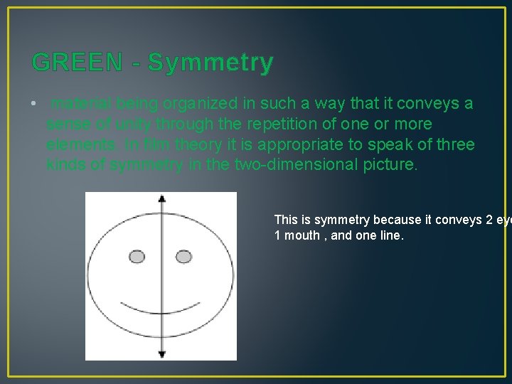
GREEN - Symmetry • material being organized in such a way that it conveys a sense of unity through the repetition of one or more elements. In film theory it is appropriate to speak of three kinds of symmetry in the two-dimensional picture. This is symmetry because it conveys 2 eye 1 mouth , and one line.
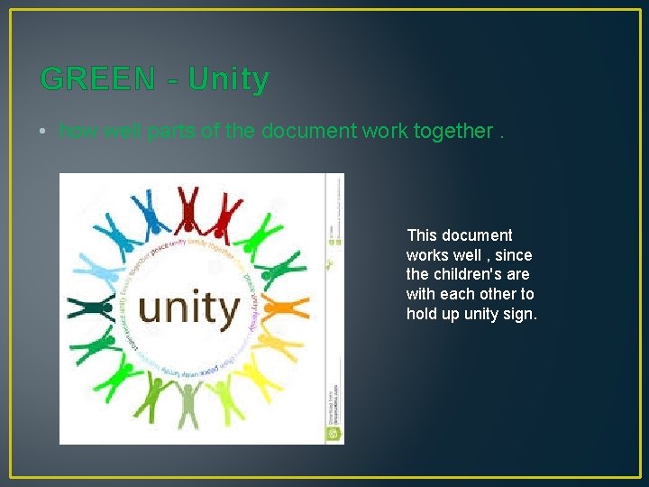
GREEN - Unity • how well parts of the document work together. This document works well , since the children's are with each other to hold up unity sign.
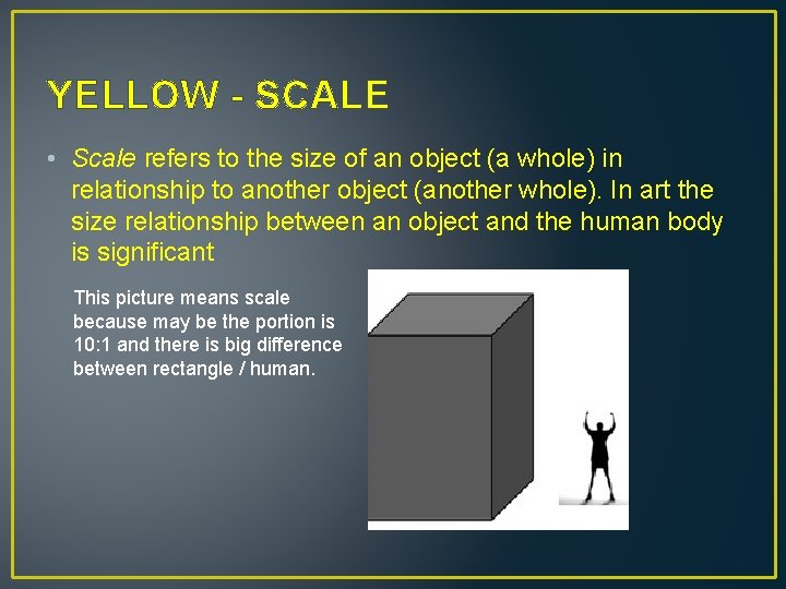
YELLOW - SCALE • Scale refers to the size of an object (a whole) in relationship to another object (another whole). In art the size relationship between an object and the human body is significant This picture means scale because may be the portion is 10: 1 and there is big difference between rectangle / human.
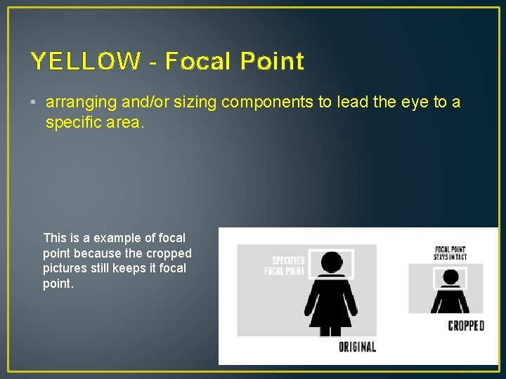
YELLOW - Focal Point • arranging and/or sizing components to lead the eye to a specific area. This is a example of focal point because the cropped pictures still keeps it focal point.
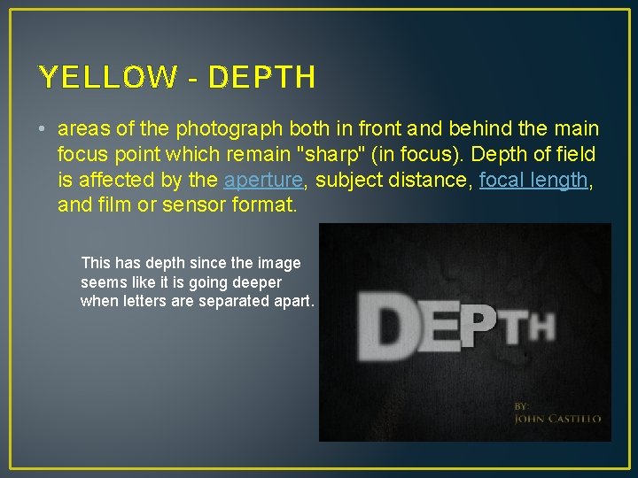
YELLOW - DEPTH • areas of the photograph both in front and behind the main focus point which remain "sharp" (in focus). Depth of field is affected by the aperture, subject distance, focal length, and film or sensor format. This has depth since the image seems like it is going deeper when letters are separated apart.
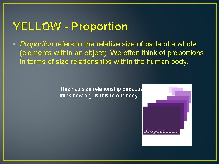
YELLOW - Proportion • Proportion refers to the relative size of parts of a whole (elements within an object). We often think of proportions in terms of size relationships within the human body. This has size relationship because we think how big is this to our body.
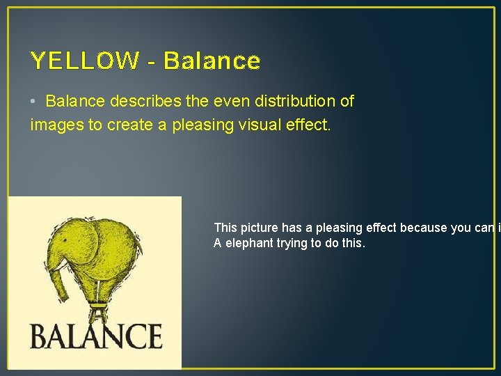
YELLOW - Balance • Balance describes the even distribution of images to create a pleasing visual effect. This picture has a pleasing effect because you can i A elephant trying to do this.

Design principle • Visual Design elements and principles describe fundamental ideas about the practice of good visual design. This picture is a example of design principles because it shows what is it.
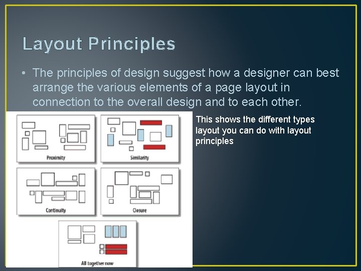
Layout Principles • The principles of design suggest how a designer can best arrange the various elements of a page layout in connection to the overall design and to each other. This shows the different types layout you can do with layout principles
THE LINKS • http: //desktoppub. about. com/cs/basic/g/principles. htm • http: //www. gw. com/pdf/sampchap/9781566379847_ch 05. pdf • http: //www. dpreview. com/glossary/optical/depth-of-field • http: //www. sophia. org/tutorials/design-in-art-scale-andproportion • http: //pov. imv. au. dk/Issue_15/section_5/artc 1 A. html • http: //en. wikipedia. org/wiki/Main_Page
- Slides: 15