Design 2 Screen Layout and Design from Dix
- Slides: 33

Design 2 • Screen Layout and Design (from Dix et al) • Quite a bit of this is Language and culture dependent, • Internationalization brings a whole new set of challenges • Web design

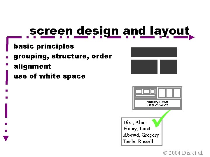
screen design and layout basic principles grouping, structure, order alignment use of white space ABCDEFGHIJKLM NOPQRSTUVWXYZ Dix , Alan Finlay, Janet Abowd, Gregory Beale, Russell © 2004 Dix et al.

basic principles • ask • what is the user doing? • think • what information, comparisons, order • design • form follows function Design 2 © 2004 Dix et al.

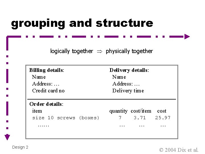
grouping and structure logically together physically together Billing details: Name Address: … Credit card no Delivery details: Name Address: … Delivery time Order details: item quantity cost/item size 10 screws (boxes) …… Design 2 7 … 3. 71 … cost 25. 97 … © 2004 Dix et al.

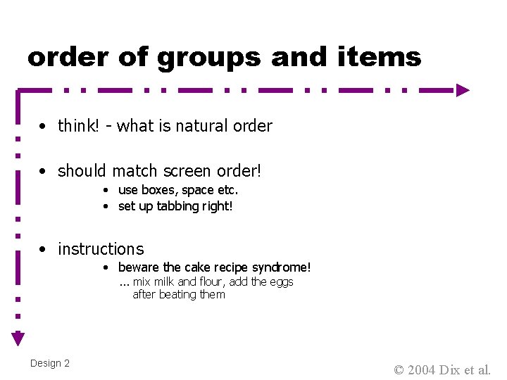
order of groups and items • think! - what is natural order • should match screen order! • use boxes, space etc. • set up tabbing right! • instructions • beware the cake recipe syndrome! … mix milk and flour, add the eggs after beating them Design 2 © 2004 Dix et al.

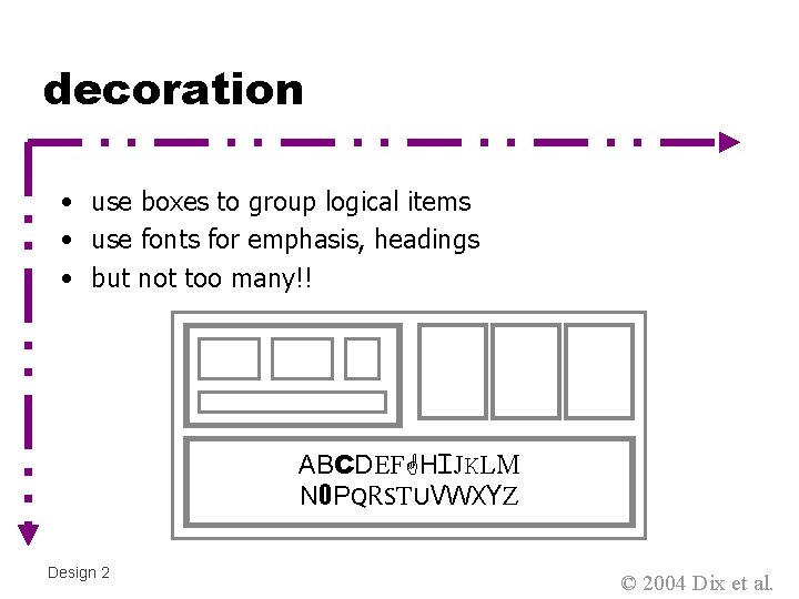
decoration • use boxes to group logical items • use fonts for emphasis, headings • but not too many!! ABCDEFGHIJKLM NOPQRSTUVWXYZ Design 2 © 2004 Dix et al.

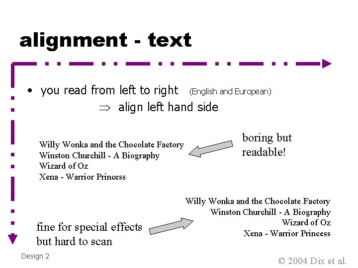
alignment - text • you read from left to right (English and European) align left hand side Willy Wonka and the Chocolate Factory Winston Churchill - A Biography Wizard of Oz Xena - Warrior Princess fine for special effects but hard to scan Design 2 boring but readable! Willy Wonka and the Chocolate Factory Winston Churchill - A Biography Wizard of Oz Xena - Warrior Princess © 2004 Dix et al.

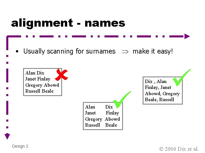
alignment - names • Usually scanning for surnames make it easy! Alan Dix Janet Finlay Gregory Abowd Russell Beale Alan Janet Gregory Russell Design 2 Dix , Alan Finlay, Janet Abowd, Gregory Beale, Russell Dix Finlay Abowd Beale © 2004 Dix et al.

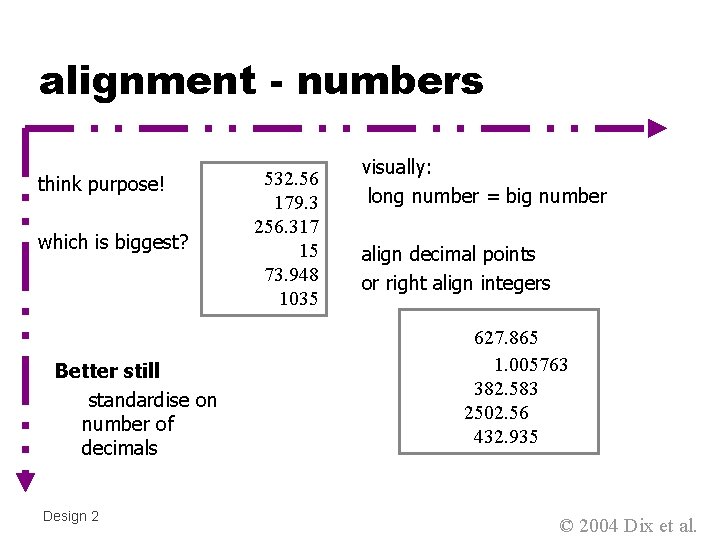
alignment - numbers think purpose! which is biggest? Better still standardise on number of decimals Design 2 532. 56 179. 3 256. 317 15 73. 948 1035 visually: long number = big number align decimal points or right align integers 627. 865 1. 005763 382. 583 2502. 56 432. 935 © 2004 Dix et al.

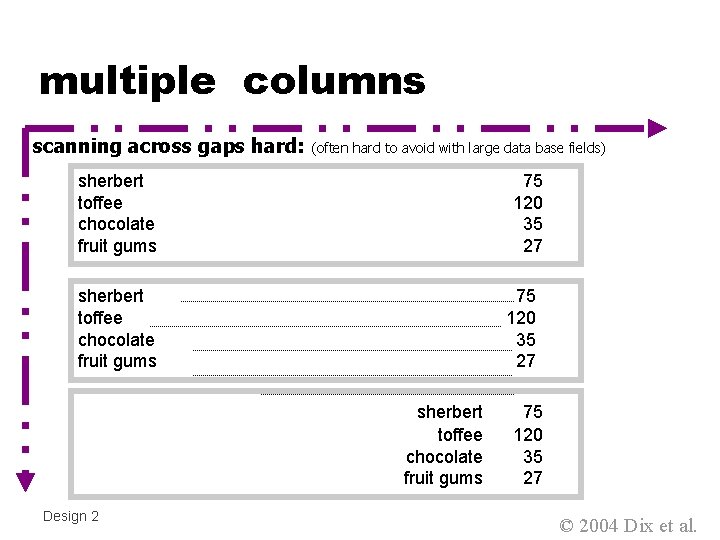
multiple columns scanning across gaps hard: (often hard to avoid with large data base fields) sherbert toffee chocolate fruit gums 75 120 35 27 sherbert toffee chocolate fruit gums Design 2 75 120 35 27 © 2004 Dix et al.

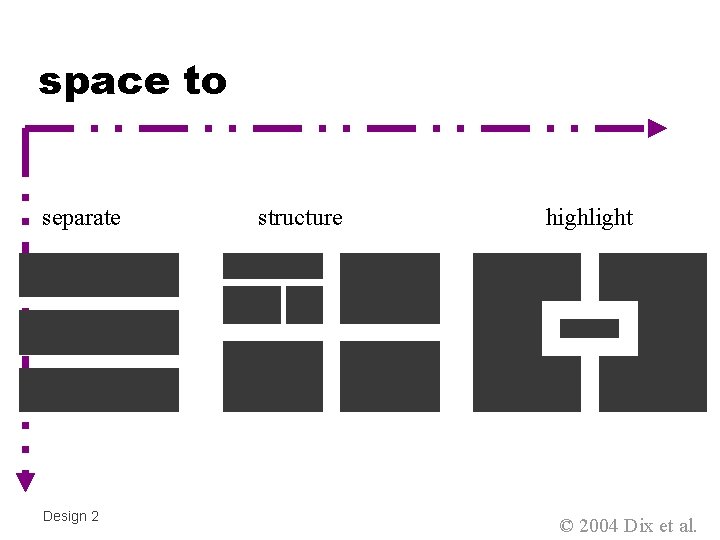
space to separate Design 2 structure highlight © 2004 Dix et al.

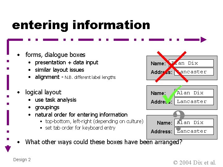
entering information • forms, dialogue boxes • presentation + data input • similar layout issues • alignment - N. B. different label lengths • logical layout • use task analysis • groupings • natural order for entering information • top-bottom, left-right (depending on culture) • set tab order for keyboard entry Name: Alan Dix Address: Lancaster ? Name: Alan Dix Address: Lancaster Name: Alan Dix Address: Lancaster • What other ways could these boxes have been arranged? Design 2 © 2004 Dix et al.

knowing what to do • what is active what is passive • where do you click • where do you type • consistent style helps • e. g. web underlined links • labels and icons • standards for common actions • language – bold = current state or action Design 2 © 2004 Dix et al.

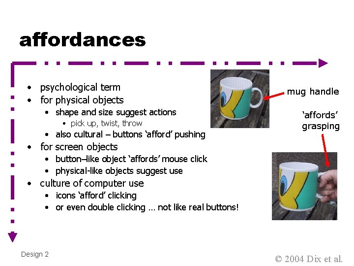
affordances • psychological term • for physical objects • shape and size suggest actions • pick up, twist, throw • also cultural – buttons ‘afford’ pushing mug handle ‘affords’ grasping • for screen objects • button–like object ‘affords’ mouse click • physical-like objects suggest use • culture of computer use • icons ‘afford’ clicking • or even double clicking … not like real buttons! Design 2 © 2004 Dix et al.

appropriate appearance presenting information aesthetics and utility colour and 3 D localisation & internationalisation © 2004 Dix et al.

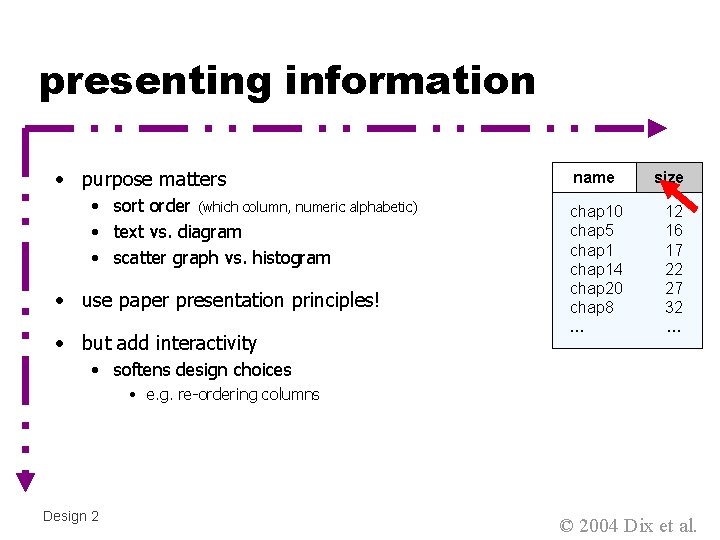
presenting information • purpose matters • sort order (which column, numeric alphabetic) • text vs. diagram • scatter graph vs. histogram • use paper presentation principles! • but add interactivity name size chap 10 chap 1 chap 5 chap 10 chap 11 chap 14 chap 12 chap 20 chap 13 chap 8 chap 14 …… 12 17 16 12 17 51 22 262 27 83 32 22 … • softens design choices • e. g. re-ordering columns Design 2 © 2004 Dix et al.

aesthetics and utility • aesthetically pleasing designs • increase user satisfaction and improve productivity • beauty and utility may conflict • mixed up visual styles easy to distinguish • clean design – little differentiation confusing • backgrounds behind text … good to look at, but hard to read • but can work together • e. g. the design of the counter • in consumer products – key differentiator (e. g. i. Mac) Design 2 © 2004 Dix et al.

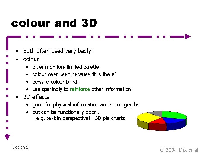
colour and 3 D • both often used very badly! • colour • • older monitors limited palette colour over used because ‘it is there’ beware colour blind! use sparingly to reinforce other information • 3 D effects • good for physical information and some graphs • but can be functionally poor… e. g. text in perspective!! 3 D pie charts Design 2 © 2004 Dix et al.

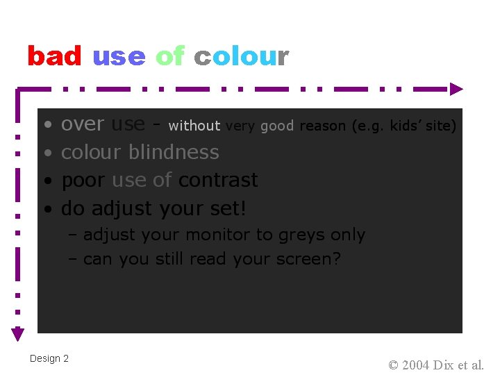
bad use of colour Design 2 © 2004 Dix et al.

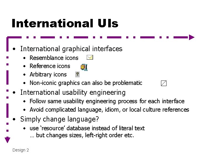
International UIs • International graphical interfaces • • Resemblance icons Reference icons Arbitrary icons Non-iconic graphics can also be problematic • International usability engineering • Follow same usability engineering process for each interface • Avoid complicated language, idiom, or local culture references • Simply change language? • use ‘resource’ database instead of literal text … but changes sizes, left-right order etc. Design 2

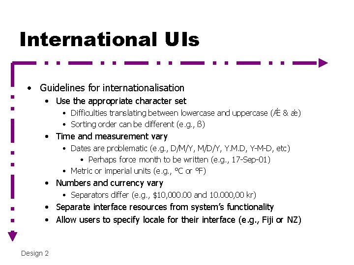
International UIs • Guidelines for internationalisation • Use the appropriate character set • Difficulties translating between lowercase and uppercase (Ǽ & ǽ) • Sorting order can be different (e. g. , ß) • Time and measurement vary • Dates are problematic (e. g. , D/M/Y, M/D/Y, Y. M. D, Y-M-D, etc) • Perhaps force month to be written (e. g. , 17 -Sep-01) • Metric or imperial units (e. g. , °C or °F) • Numbers and currency vary • Separators differ (e. g. , $10, 000. 00 and 10. 000, 00 kr) • Separate interface resources from system’s functionality • Allow users to specify locale for their interface (e. g. , Fiji or NZ) Design 2

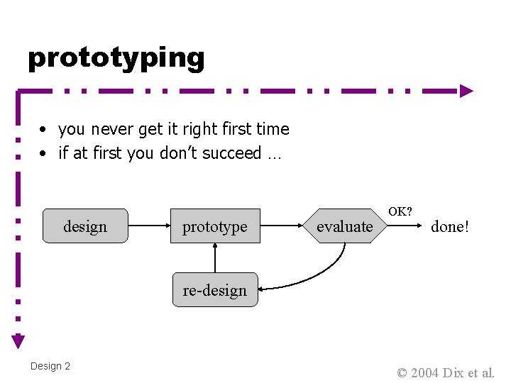
prototyping • you never get it right first time • if at first you don’t succeed … design prototype evaluate OK? done! re-design Design 2 © 2004 Dix et al.

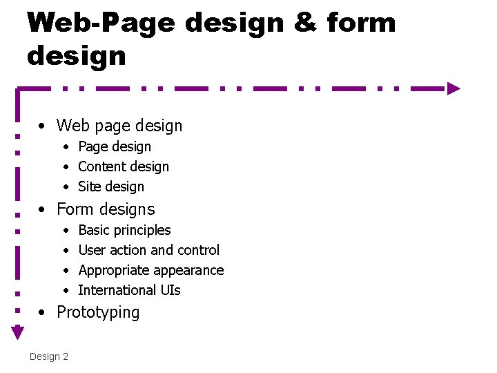
Web-Page design & form design • Web page design • Page design • Content design • Site design • Form designs • • Basic principles User action and control Appropriate appearance International UIs • Prototyping Design 2

Web-page design interlude • Page design • Content design • Site design • `Based on Jakob Nielsen’s “Designing Web Usability” 2000, New Riders Design 2

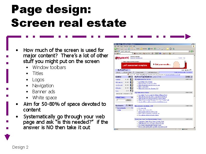
Page design: Screen real estate • How much of the screen is used for major content? There’s a lot of other stuff you might put on the screen • • Window toolbars Titles Logos Navigation Banner ads White space Aim for 50 -80% of space devoted to content Systematically go through your web page and ask “is this needed? ” if the answer is NO then take it out Design 2

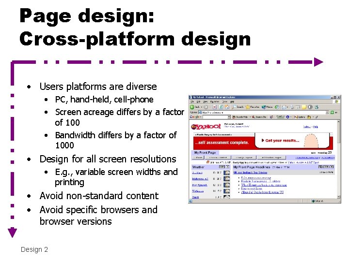
Page design: Cross-platform design • Users platforms are diverse • PC, hand-held, cell-phone • Screen acreage differs by a factor of 100 • Bandwidth differs by a factor of 1000 • Design for all screen resolutions • E. g. , variable screen widths and printing • Avoid non-standard content • Avoid specific browsers and browser versions Design 2

Page design • Separating meaning and presentation • that is the point of markup languages like html and xml • E. g. , heading tags (H 1, H 2, …) • Response times • Fast as possible • 0. 1 second user feels system is ‘instantaneous’ • 1 second user can retain flow of work • 10 second limit for keeping user attention • • Design 2 Predictability, try to smooth out variability at server end Limit use of images (or reduce image size/colour depth) Link to same image to utilise cached copies, tile an image Glimpse the first screenful Assume 0. 5 sec latency

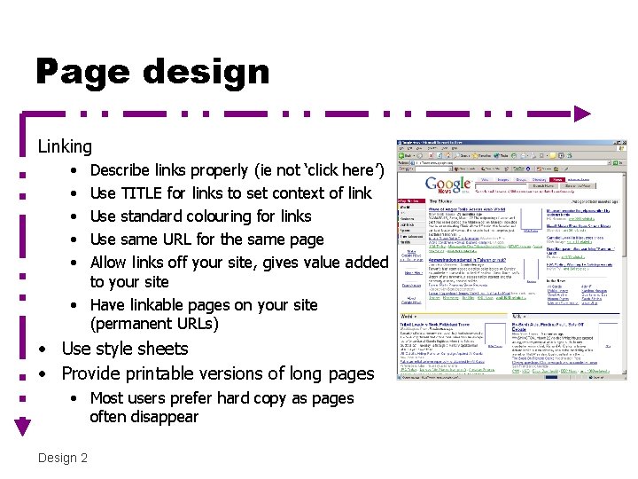
Page design Linking • • • Describe links properly (ie not ‘click here’) Use TITLE for links to set context of link Use standard colouring for links Use same URL for the same page Allow links off your site, gives value added to your site • Have linkable pages on your site (permanent URLs) • Use style sheets • Provide printable versions of long pages • Most users prefer hard copy as pages often disappear Design 2

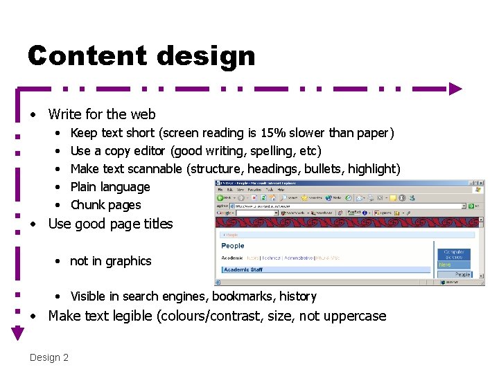
Content design • Write for the web • • • Keep text short (screen reading is 15% slower than paper) Use a copy editor (good writing, spelling, etc) Make text scannable (structure, headings, bullets, highlight) Plain language Chunk pages • Use good page titles • not in graphics • Visible in search engines, bookmarks, history • Make text legible (colours/contrast, size, not uppercase Design 2

Content design • Animation • Most users dislike, ignored because of banner advertising • Good for: showing continuity in transitions, indicating dimensionality in transitions, illustrating change over time, multiplexing the display, enriching graphical representations, visualising 3 D structures, attracting attention • Video/Audio where appropriate • 3 D graphics • Difficult to navigate, rotated text is difficult to read Design 2

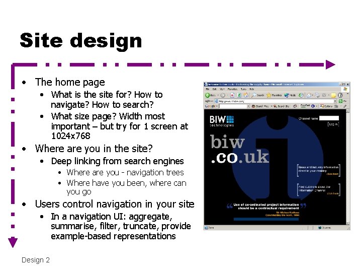
Site design • The home page • What is the site for? How to navigate? How to search? • What size page? Width most important – but try for 1 screen at 1024 x 768 • Where are you in the site? • Deep linking from search engines • Where are you - navigation trees • Where have you been, where can you go • Users control navigation in your site • In a navigation UI: aggregate, summarise, filter, truncate, provide example-based representations Design 2

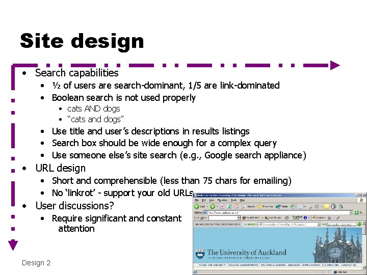
Site design • Search capabilities • ½ of users are search-dominant, 1/5 are link-dominated • Boolean search is not used properly • cats AND dogs • “cats and dogs” • Use title and user’s descriptions in results listings • Search box should be wide enough for a complex query • Use someone else’s site search (e. g. , Google search appliance) • URL design • Short and comprehensible (less than 75 chars for emailing) • No ‘linkrot’ - support your old URLs • User discussions? • Require significant and constant attention Design 2

wider still … • style issues • platform standards, consistency • Style sheets for organisation standards • Side bars and menus – some sites have 3 -4 menus : ( • Just how many layers of frames/logos/menus to put around your content can be tricky in a large organization (Uni, gov’t) • navigation issues • embedded applications • Question of when to pop things up in a separate window – will the user understand, or get lost? • links to other apps, the Web Design 2 © 2004 Dix et al.